
In the landscape of retail branding and intimate apparel design, the push-up bra stands as a quintessential case study in product engineering and marketing psychology. Far more than a mere garment, the push-up bra represents a sophisticated synergy between structural design, consumer behavior research, and identity marketing. To understand what a push-up bra looks like is to understand a specific segment of the fashion industry that prioritizes silhouette optimization through intentional architecture.
The Architecture of Structural Design
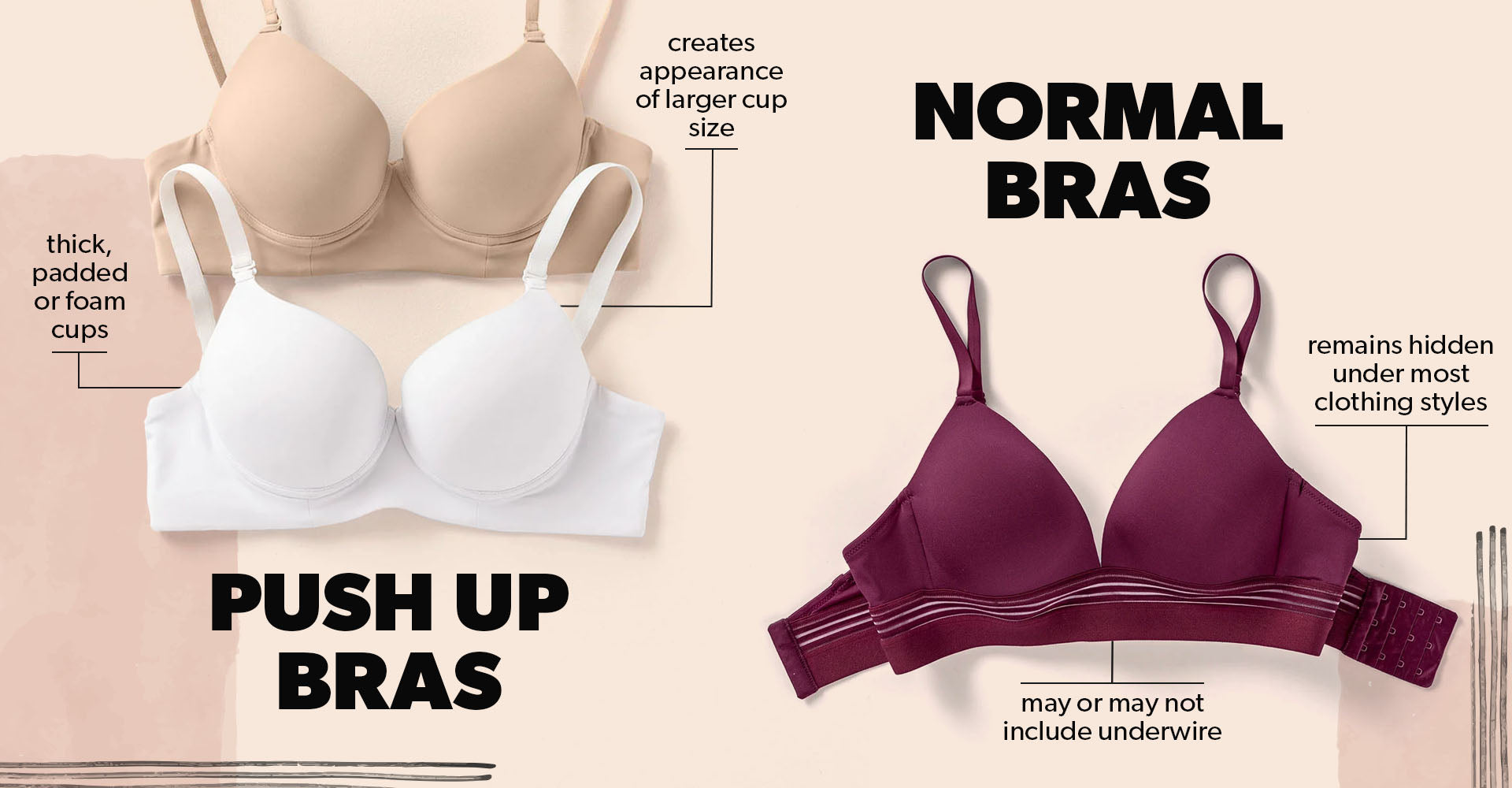
The visual identity of a push-up bra is defined primarily by its internal engineering. Unlike standard bras that aim for natural coverage, the push-up bra is designed with a deliberate focus on volume, elevation, and centering. This is achieved through a combination of structural elements that define its distinct aesthetic.

Padding and Geometric Volume
The most recognizable feature of a push-up bra is the strategically placed padding. In the industry, this is often referred to as “cookies” or “graduated padding.” This foam or gel insert is typically thicker at the base and sides of the cup, tapering off toward the top. Visually, this creates a slope that encourages tissue displacement. When a consumer looks at the interior of the cup, the asymmetrical distribution of the padding is the primary indicator of its functional intent.
The Role of Underwire and Bridge Construction
Beyond padding, the push-up bra’s appearance is dictated by its “bridge”—the piece of fabric connecting the two cups. In push-up designs, this bridge is often narrower or lower than in full-coverage styles. This is a deliberate design choice meant to encourage “cleavage,” or the physical migration of breast tissue toward the center of the chest. The underwire is also typically curved more aggressively in a U-shape, reinforcing the lift mechanism. When viewed on a hanger, a push-up bra often appears more “compact” and “upward-facing” compared to the flatter, wider profile of a bralette or a comfort-focused wire-free garment.
The Marketing Psychology of Visual Identity
From a brand strategy perspective, the push-up bra occupies a unique niche in the intimacy category. Brands spend millions researching the visual cues that trigger a “value-add” perception in consumers. The aesthetic of the push-up bra is not accidental; it is a manifestation of how a brand positions itself within the luxury or confidence-building segments of the fashion market.
Influencing Consumer Perception
When a brand markets a push-up bra, the visual representation is almost always tied to a specific narrative of enhancement and poise. The product photography for these items relies on specific angles—usually three-quarter views—to emphasize the volume created by the padding. Brands cultivate a visual language that associates the bra’s hardware with a sense of “advantage.” This is a classic example of marketing a benefit (the silhouette) rather than just a feature (the fabric).
Brand Differentiation through Design Elements
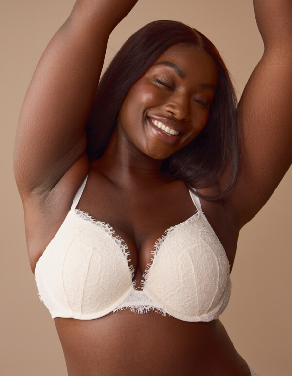
Different retailers use specific visual markers to distinguish their push-up bras from competitors. A luxury brand might utilize delicate lace overlays and intricate strap details to distract from the technical padding, framing the product as “sophisticated lingerie.” Conversely, a mass-market brand may lean into seamless, molded cups that emphasize the “invisible” nature of the push-up technology under tight clothing. By adjusting the external finish—whether through satin, microfiber, or ornate embroidery—brands cater to different psychographic segments while maintaining the core functional DNA of the push-up silhouette.
The Evolution of the “Push-Up” Aesthetic
The visual definition of a push-up bra has undergone significant transformations to align with modern fashion trends and shifting societal standards of beauty. This evolution provides a fascinating look at how product design responds to market feedback and cultural shifts.
From Rigid Sculpting to “Natural” Enhancement
Historically, the push-up bra looked like an exoskeleton of stiff foam and rigid wiring. In recent years, however, there has been a significant shift toward “soft-touch” technology. Modern push-up bras now frequently feature memory foam and flexible, non-poking wires. Visually, these look less like armor and more like a second skin, while still achieving the desired elevation. This transition reflects a broader brand strategy: acknowledging that consumers want the benefit of the push-up (enhanced shape) without the discomfort of historical engineering.
The Impact of Inclusivity on Design
As brands face pressure to embrace body inclusivity, the look of the push-up bra has also expanded. Designers are now tasked with creating push-up aesthetics for a wider range of sizes. This has led to innovative engineering where the “push-up” effect is achieved through mesh layering or side-sling panels rather than heavy, thick pads. As a result, the visual profile of a “modern” push-up bra is becoming more diverse. It no longer looks like a one-size-fits-all rigid cup; it now encompasses a variety of shapes and constructions, each tailored to different body types while maintaining the same marketing promise of lift and definition.
Strategic Product Display and Merchandising
How a push-up bra looks on the sales floor is just as important as how it looks on the body. Visual merchandising is a key component of brand strategy in this sector, as the physical arrangement of these products is designed to influence purchasing decisions through perceived value.
The Visual Hierarchy of Merchandising
In a retail setting, push-up bras are often displayed alongside “plunge” or “convertible” styles to highlight their versatility. Brands use clear, instructional signage—such as “Level 1, 2, or 3 Lift”—to help customers navigate the different degrees of padding. This branding strategy turns a technical product into a simplified, user-friendly choice. By categorizing the bras by the intensity of the “push-up” effect, the brand reduces cognitive load on the consumer, making the decision-making process faster and more satisfying.
Packaging as Brand Experience
For e-commerce, the “unboxing” look of a push-up bra is a critical touchpoint. Because these items are often purchased for specific outfits or events, the packaging is designed to feel like a premium experience. Even the way the bra is folded and presented in its box reinforces the brand’s promise of luxury and efficacy. By aligning the physical presentation with the brand’s digital presence, companies ensure a cohesive identity that bridges the gap between the online advertisement and the physical product in the customer’s hands.
Conclusion: The Synthesis of Utility and Branding
Ultimately, the question of what a push-up bra looks like is answered by its function. It is a calculated piece of design that marries structural engineering—the pads, the wires, and the bridge—with the psychological needs of the consumer. As brands continue to refine their approach, the aesthetic of the push-up bra will keep evolving, moving toward a balance of comfort and form. For designers and marketers, the challenge remains the same: to create a product that not only delivers on its promise of shape and lift but also looks and feels like a luxury accessory that enhances the user’s overall sense of identity. By understanding the intentional design choices behind the push-up bra, we gain insight into the intricate ways brands communicate value and confidence through the medium of apparel.
aViewFromTheCave is a participant in the Amazon Services LLC Associates Program, an affiliate advertising program designed to provide a means for sites to earn advertising fees by advertising and linking to Amazon.com. Amazon, the Amazon logo, AmazonSupply, and the AmazonSupply logo are trademarks of Amazon.com, Inc. or its affiliates. As an Amazon Associate we earn affiliate commissions from qualifying purchases.