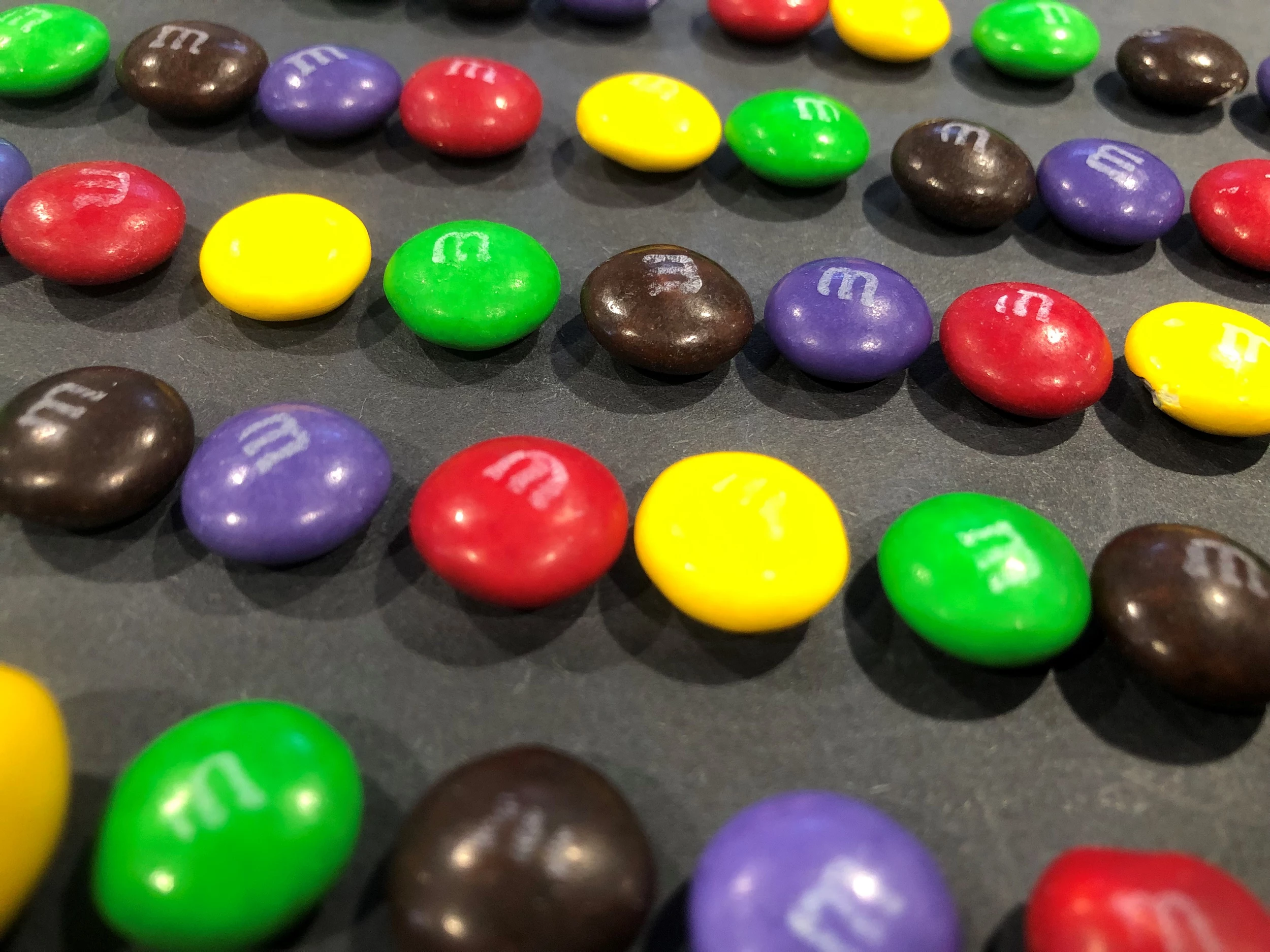
In the world of global commerce, few visual assets are as instantly recognizable as the vibrant, multicolored shell of an M&M’s lentil. While consumers today associate the brand with a specific rainbow—red, yellow, blue, green, orange, and brown—the history of these colors is far more than a matter of aesthetic preference. It is a masterclass in brand strategy, consumer psychology, and corporate adaptability.
When M&M’s were first introduced to the public in 1941, the world was a different place, and the brand’s visual identity was forged in the crucible of utility and wartime necessity. To understand the original M&M colors is to understand the foundation of one of the most successful marketing Case Studies in history.
The Strategic Foundation: Why the Original 1941 Colors Mattered
The inception of M&M’s was not driven by a desire to create a fun snack, but by a strategic need for a durable one. Forrest Mars Sr. famously conceived the idea after seeing soldiers during the Spanish Civil War eating chocolate pellets coated in a hard sugar shell that prevented melting. When the product launched in the United States in 1941, the primary “customer” was the U.S. military.
Necessity Meets Branding: The Wartime Origins
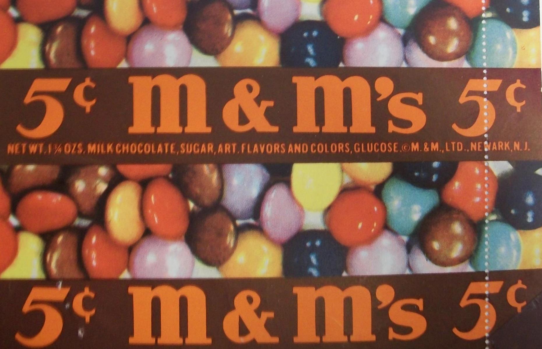
The original color palette of M&M’s in 1941 consisted of brown, yellow, orange, red, and violet. From a brand strategy perspective, this selection was grounded in the manufacturing capabilities and food dye availability of the era. However, the choice of earthy, distinct tones also served a functional purpose. These colors were easy to distinguish under low-light conditions—a crucial factor for soldiers in the field.
During World War II, M&M’s were sold exclusively to the military, meaning the brand’s initial “identity” was synonymous with endurance and reliability. The colors didn’t need to be neon or “fun”; they needed to look consistent and appetizing even when pulled from a soldier’s ration pack in a trench. This early period established the brand’s reputation for quality control, a pillar of corporate identity that Mars, Inc. maintains to this day.
The Psychology of the Initial Five
In branding, color is never accidental. The original palette utilized “warm” colors—reds, yellows, and oranges—which are scientifically proven to stimulate appetite. Brown, the dominant color of the mix, reinforced the product’s core ingredient: chocolate. By focusing on a warm, earthy spectrum, the brand positioned itself as a source of energy and comfort.
Violet, the most unusual of the original five, added a touch of “premium” flair. Historically, purple dyes were expensive and associated with royalty and high quality. Even in a small paper tube of candy, the inclusion of violet signaled that this was a superior product compared to the unrefined chocolate bars of the time.
Managing Brand Consistency Through Decades of Change
As the brand transitioned from a military staple to a household name in the late 1940s and 1950s, the color palette began to shift. This evolution provides a fascinating look at how a brand manages its visual assets to stay relevant to changing consumer tastes while maintaining its core identity.
The Tan to Blue Transition: A Case Study in Consumer Engagement
One of the most significant pivots in M&M’s brand history occurred in the post-war era. Violet was phased out in the late 1940s, replaced by tan. For decades, the mix remained relatively stable: brown, yellow, orange, red, and tan (with green added in the early 1950s).
The decision to replace tan in 1995 remains one of the greatest marketing triumphs in the “Brand” category. Instead of making an executive decision behind closed doors, Mars, Inc. launched a massive “consumer vote.” They asked the public to choose the new color: blue, pink, or purple.
This was a brilliant move in personal branding and consumer loyalty. By giving the audience agency over the brand’s visual identity, Mars, Inc. didn’t just change a color; they created a global event. Blue won with 54% of the vote, effectively modernizing the brand’s palette for the digital age and proving that a brand is not just what the company says it is, but what the consumers feel they own.
Visual Identity and the “M” Stamp: Protecting Intellectual Property
Beyond the colors themselves, the branding strategy involved the iconic “m” printed on each piece. Originally printed in black, it switched to white in 1954. This “m” is more than a logo; it is a mark of authenticity.
From a brand strategy standpoint, the “m” served as a defensive marketing tool. As competitors attempted to replicate the sugar-coated chocolate formula, Mars, Inc. leaned into the slogan, “Look for the m on every piece.” This converted a manufacturing step into a hallmark of corporate identity, ensuring that even if a competitor copied the colors, they could never copy the brand’s “soul.”
Emotional Branding and the Rise of the Character Archetypes
In the 1990s, the brand underwent its most radical strategic shift. Mars, Inc. realized that while people liked the chocolate, they loved the colors. This led to the creation of the “spokescandies,” a move that transformed the brand from a food product into an entertainment franchise.
Anthropomorphizing the Palette: Giving Colors a Voice
Each color was assigned a distinct personality based on archetypes:
- Red: The confident, slightly sarcastic leader.
- Yellow: The naive, lovable goofball.
- Green: The sophisticated, stylish icon.
- Blue: The “cool,” effortless character.
- Orange: The anxious, risk-averse personality.
- Brown: The professional, high-achieving Chief Chocolate Officer.
By giving the colors personalities, the brand moved from “Product Branding” to “Emotional Branding.” Consumers no longer just had a favorite color; they had a favorite character. This increased brand recall and allowed Mars to license the M&M’s identity across merchandise, apparel, and even themed retail stores (M&M’s World), diversifying their revenue streams far beyond the confectionery aisle.
The Impact of Color Associations on Market Positioning
The use of characters allowed the brand to target different demographics simultaneously. Red and Yellow appealed to families and children, while the introduction of Ms. Brown and Ms. Green allowed the brand to play in the fashion and lifestyle spaces. This segmentation is a key reason why M&M’s remains the top-selling candy brand globally; it has a “face” for every type of consumer.
Modern Marketing: Seasonal Variations and Limited Editions
In the contemporary market, the original colors serve as a “home base,” but the brand’s strength lies in its elasticity. Mars, Inc. has mastered the art of “limited-time branding” to drive urgency and seasonal sales.
Leveraging Scarcity and Exclusivity
Every holiday season, the standard M&M’s palette is swapped for curated selections: red and green for Christmas; pastel pinks, blues, and yellows for Easter; orange and black for Halloween. This strategy utilizes the psychological principle of scarcity. By temporarily removing the “standard” colors, the brand creates a “must-buy-now” sentiment for the seasonal variants.
This flexibility is a hallmark of a mature brand. Because the “m” stamp and the shape of the lentil are so iconic, the brand can afford to change its colors entirely for months at a time without losing its identity. This is a level of brand equity that few companies ever achieve.
Brand Elasticity: How Far Can the Identity Stretch?
In recent years, the brand has experimented with even more daring strategies, such as “Messages” packaging where the colors are secondary to text, or monochromatic “all-blue” or “all-red” bags for specific promotions. Each of these moves is a test of brand elasticity—the ability of a brand to bend its rules without breaking its image.
The fact that M&M’s can launch a “Purple” character in 2022 to represent inclusivity—honoring the original 1941 violet color while infusing it with modern social values—shows the brand’s ability to come full circle. They are using their history to inform their future, a classic strategy in corporate identity management.

Conclusion: The Legacy of the Rainbow
The original M&M colors—brown, yellow, orange, red, and violet—were the starting point for a brand that would eventually define how we think about visual marketing. What began as a functional choice for military rations evolved into a complex system of emotional archetypes and consumer-driven identity.
By analyzing the evolution from those first five colors to the global “spokescandy” empire of today, it becomes clear that M&M’s success isn’t just about the chocolate. It’s about a relentless commitment to brand strategy, the courage to let consumers participate in the brand’s evolution, and the sophisticated use of color to create a lasting emotional connection. Whether it’s the original violet or the modern blue, every hue in the M&M’s bag is a carefully calculated component of a multi-billion-dollar brand legacy.
aViewFromTheCave is a participant in the Amazon Services LLC Associates Program, an affiliate advertising program designed to provide a means for sites to earn advertising fees by advertising and linking to Amazon.com. Amazon, the Amazon logo, AmazonSupply, and the AmazonSupply logo are trademarks of Amazon.com, Inc. or its affiliates. As an Amazon Associate we earn affiliate commissions from qualifying purchases.