In an increasingly data-driven world, the ability to translate visual information into actionable mathematical models is a cornerstone of innovation across all technology sectors. A graph, whether it’s depicting sensor readings, financial trends, user behavior, or scientific observations, is essentially a visual narrative of relationships between variables. Extracting an equation from such a graph is not merely a mathematical exercise; it’s a critical skill that underpins predictive analytics, system design, algorithm development, and informed decision-making in myriad tech applications. This process transforms abstract visual patterns into concrete, quantifiable expressions, enabling engineers, data scientists, and developers to build robust, intelligent systems.
This article delves into the methodologies and digital tools that empower tech professionals to accurately derive mathematical equations from graphical representations. We will explore how this fundamental skill translates into practical advantages, offering a step-by-step guide enhanced by modern technological aids, and showcasing its indispensable role in various real-world tech domains.
The Fundamental Role of Graph-to-Equation Conversion in Tech
The conversion of graphical data into an algebraic equation is far more than a theoretical concept; it’s a practical necessity that bridges raw observations with sophisticated computational models. In the fast-evolving landscape of technology, where data is generated at an unprecedented pace, understanding and utilizing this skill is paramount.
Data Visualization as a Starting Point
Before an equation can be formed, data is often visualized to reveal underlying patterns. Whether it’s a scatter plot of experimental results, a line chart of network traffic, or a bar graph of software bug reports, visualization provides the initial qualitative insights. These visual cues — linearity, curvature, periodicity, or asymptotic behavior — are the first hints towards selecting the appropriate mathematical model. In tech, tools like D3.js, Tableau, Power BI, Matplotlib, and Seaborn are routinely used to create these initial visualizations, setting the stage for quantitative analysis. The ability to discern a linear trend from an exponential rise, or a parabolic curve from a logarithmic decay, directly impacts the accuracy and utility of the derived equation.
Bridging Raw Data and Predictive Models
Equations derived from graphs serve as the mathematical backbone for predictive models. In fields like machine learning, engineering simulations, and AI development, these equations allow systems to forecast future states, simulate outcomes, and generalize from limited observations. For instance, in IoT, an equation derived from a graph of sensor data (e.g., temperature over time) can be used to predict future temperature spikes, enabling proactive system adjustments. Without this conversion, predictions would remain heuristic or confined to interpolation, lacking the robust mathematical framework required for reliable extrapolation and deeper analytical insights. The equation provides a compact, portable, and computable representation of the relationship, which can then be fed into algorithms or embedded into software.
Essential for Algorithm Development and System Design
At the core of many technological innovations lies an algorithm, and frequently, these algorithms are built upon mathematical relationships identified through graphical analysis. Whether designing a control system for a robot, optimizing resource allocation in a cloud environment, or developing a signal processing filter, the governing equations are often first observed visually as system responses. For example, a software engineer might analyze a graph of CPU utilization versus task load to derive an equation that helps optimize scheduling algorithms. Similarly, in embedded systems, the characteristic curve of a component might be converted into an equation to accurately model its behavior under varying conditions. This foundational understanding allows for the creation of more efficient, accurate, and resilient technological solutions.
Core Methodologies: Deciphering Graph Patterns
The process of translating a graph into an equation begins with a keen understanding of common mathematical functions and their characteristic visual signatures. Different patterns on a graph correspond to different families of equations.
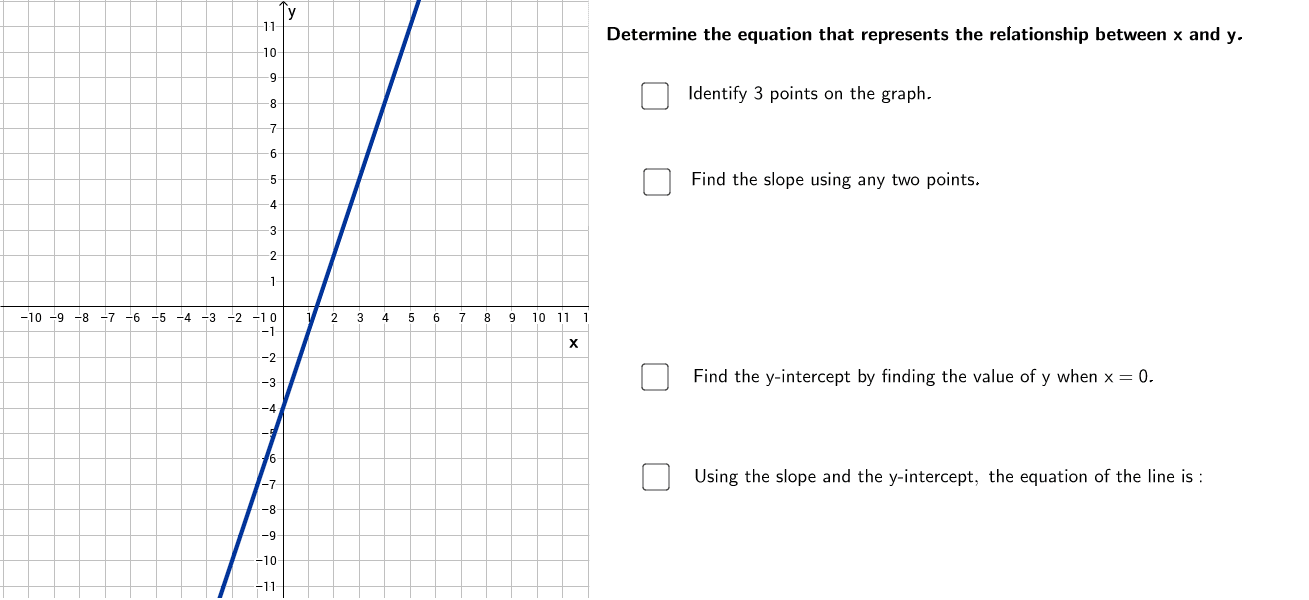
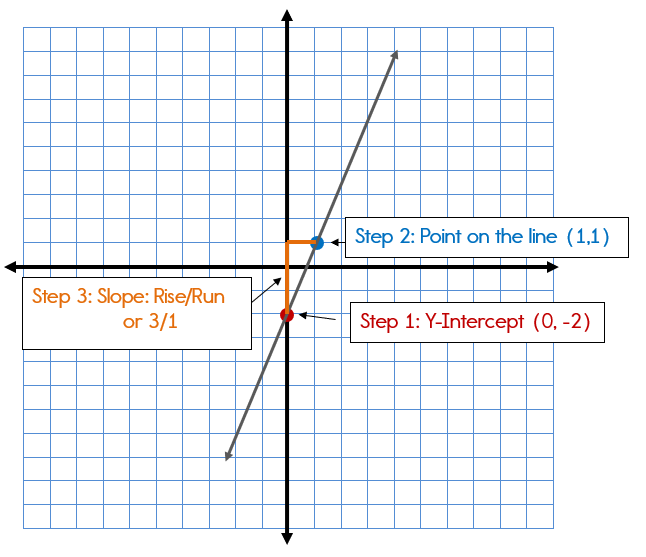
Linear Relationships: The Foundation (y = mx + b)
The simplest and most common relationship is linear, represented by a straight line. The general form is y = mx + b, where m is the slope and b is the y-intercept.
- Identifying: A graph is linear if the points appear to fall along a straight line.
- Calculating Slope (m): Choose any two distinct points on the line, (x1, y1) and (x2, y2). The slope
mis calculated as(y2 - y1) / (x2 - x1). This represents the rate of change ofywith respect tox. - Finding Y-intercept (b): The y-intercept is the point where the line crosses the y-axis (i.e., where
x = 0). If the graph doesn’t explicitly show this, you can substitute one point (x, y) from the line and the calculated slopeminto the equationy = mx + band solve forb. - Tech Relevance: Used extensively in basic trend analysis, cost modeling, simple regression in data science, and approximating complex functions over small intervals.
Unpacking Non-Linearity: Polynomial and Exponential Forms
Many real-world phenomena exhibit non-linear behavior, requiring more complex equations.
- Polynomial Functions: These are characterized by curves that can change direction multiple times.
- Quadratic (Parabolic):
y = ax^2 + bx + c. Identified by a U-shape (parabola) opening upwards or downwards. Key features include a vertex and symmetry. To derive, one typically needs at least three points to solve fora,b, andc, or can use vertex formy = a(x-h)^2 + kif the vertex (h, k) is clear. - Cubic and Higher Order:
y = ax^3 + bx^2 + cx + d, etc. These graphs have more turning points and can model more complex curvatures. The number of turning points is generally one less than the highest power ofx. Derivation often involves regression techniques with multiple data points. - Tech Relevance: Used in modeling trajectories, optimization problems, curve fitting in engineering, and understanding complex system responses.
- Quadratic (Parabolic):
- Exponential Functions:
y = a * b^xory = a * e^(kx). Characterized by rapid growth or decay.- Identifying: The curve gets steeper or flatter at an increasing rate. It typically passes through (0, a) and exhibits growth if
b > 1(ork > 0) or decay if0 < b < 1(ork < 0). - Derivation: One point can give
a(often the y-intercept). A second point can then be used to solve forb(ork). Logarithmic transformation can linearize exponential data, simplifying parameter estimation. - Tech Relevance: Crucial for modeling population growth, radioactive decay, compound interest, viral spread (e.g., in network diffusion), cooling/heating processes, and algorithmic complexity.
- Identifying: The curve gets steeper or flatter at an increasing rate. It typically passes through (0, a) and exhibits growth if
Advanced Patterns: Logarithmic, Power, and Periodic Functions
Beyond the basics, other non-linear forms are vital for specialized applications.
- Logarithmic Functions:
y = a log_b(x) + c. These are often inverses of exponential functions, growing slowly after an initial rapid increase.- Identifying: The graph increases rapidly initially then flattens out, or decreases rapidly then flattens. Often has a vertical asymptote.
- Tech Relevance: Used in signal processing (decibel scales), pH calculations, information theory, and modeling diminishing returns.
- Power Functions:
y = ax^b. Similar to polynomials butbcan be any real number, not just a positive integer.- Identifying: Often appears as a curve through the origin (if
b > 0) or with an asymptote atx=0(ifb < 0). Log-log plots can linearize power relationships. - Tech Relevance: Important in scaling laws (e.g., biological scaling, network effects), fluid dynamics, and certain physics problems.
- Identifying: Often appears as a curve through the origin (if
- Periodic Functions (e.g., Sinusoidal):
y = A sin(Bx + C) + Dory = A cos(Bx + C) + D. Characterized by repeating cycles.- Identifying: The graph repeats a distinct pattern over a regular interval (period). Key features include amplitude (
A), period (2π/B), phase shift (-C/B), and vertical shift (D). - Derivation: Requires identifying the amplitude (half the difference between max and min y-values), the period (length of one cycle), any horizontal shift from the origin, and the vertical midpoint.
- Tech Relevance: Essential for signal processing, audio engineering, oscillations in mechanical systems, alternating current (AC) circuits, and modeling seasonal trends in data.
- Identifying: The graph repeats a distinct pattern over a regular interval (period). Key features include amplitude (
Leveraging Digital Tools for Precision and Efficiency
While manual derivation is foundational, modern tech professionals rely heavily on digital tools to enhance accuracy, speed, and handle complex datasets. These tools range from ubiquitous spreadsheet software to specialized programming libraries.
Spreadsheet Software for Initial Data Extraction and Plotting
Applications like Microsoft Excel, Google Sheets, or LibreOffice Calc are often the first port of call for handling tabular data.
- Functionality: They allow users to input raw data points (x, y), generate various types of charts (scatter plots, line graphs), and visualize trends.
- Preliminary Analysis: Trendlines can be added to plots, which often include an option to display the equation and R-squared value directly on the chart. This provides a quick estimate for linear, polynomial, exponential, and logarithmic fits, offering a strong starting point for more rigorous analysis.
- Data Manipulation: Spreadsheets are excellent for cleaning data, performing simple transformations (e.g., taking logarithms to linearize data), and organizing information before exporting to more powerful tools.
Symbolic Calculators and Graphing Utilities
These online and desktop applications provide interactive environments for exploring functions and fitting curves.
- Desmos & GeoGebra: Highly intuitive, visual tools that allow users to plot points, define functions, and often perform regression analysis. Desmos’s regression feature (e.g.,
y1 ~ mx1 + b) is particularly user-friendly for quickly fitting equations to plotted data points. GeoGebra offers a broader suite of geometric, algebraic, and calculus features. - Wolfram Alpha: A computational knowledge engine that can take raw data points and attempt to find a best-fit curve, often suggesting multiple function types and their corresponding equations. Its natural language processing makes it very accessible.
- Benefits: These tools are invaluable for visualizing the fit, comparing different models, and quickly adjusting parameters to achieve a better match between the graph and the equation. They are excellent for educational purposes and rapid prototyping.
Programming Libraries for Automated Curve Fitting
For complex datasets, high precision, or integration into automated workflows, programming languages with dedicated libraries are indispensable.
- Python (SciPy, NumPy, Matplotlib):
- NumPy: Provides powerful array manipulation capabilities, crucial for numerical operations.
- SciPy (specifically
scipy.optimize.curve_fit): This function is a robust, non-linear least squares algorithm that can fit virtually any user-defined function to data. Users provide theirxandydata, a function definition, and optionally initial guesses for parameters. It returns the optimal parameters and their covariance matrix. - Matplotlib: For professional-grade plotting and visualization of data and the fitted curve.
- R (lm, nls, ggplot2):
lm()(linear model): For linear regression.nls()(non-linear least squares): Similar tocurve_fitin Python, used for fitting non-linear models.ggplot2: A powerful data visualization package for creating highly customized and informative plots.
- Benefits: These libraries offer unparalleled flexibility, control, and scalability. They are essential for handling large datasets, performing statistical analysis of the fit (e.g., confidence intervals for parameters), and integrating equation derivation into larger data processing pipelines or machine learning models.
A Step-by-Step Tech-Driven Approach to Equation Derivation
Applying these methodologies and tools in a structured manner ensures accuracy and efficiency in converting graphs to equations.
Data Acquisition and Pre-processing
The initial phase involves gathering the numerical data represented by the graph and preparing it for analysis.
- Data Extraction: If the data points are not explicitly provided (e.g., only an image of a graph is available), tools like image-to-data converters (e.g., WebPlotDigitizer) or manual extraction (carefully reading coordinates from the axes) might be necessary.
- Cleaning and Formatting: Ensure data is in a suitable format (e.g., two columns for x and y). Handle missing values, outliers, and any measurement errors.
- Initial Plotting: Use spreadsheet software or a Python/R plotting library (Matplotlib, ggplot2) to create a scatter plot. This visual check is crucial for the next step.
Visual Inspection and Model Selection
Once the data is plotted, visually inspect the graph to identify the underlying pattern.
- Pattern Recognition: Does it look like a straight line (linear)? A U-shape (quadratic)? Rapid growth/decay (exponential)? A repeating wave (periodic)? This qualitative assessment is vital for choosing the correct family of functions.
- Hypothesis Formulation: Based on the visual pattern and any domain knowledge (e.g., physics dictates an exponential decay), hypothesize a potential equation form (e.g.,
y = mx + b,y = ae^(kx),y = A sin(Bx + C) + D). - Transformation (if necessary): For certain non-linear relationships (e.g., exponential, power), taking the logarithm of one or both variables can linearize the data, allowing for easier initial parameter estimation using linear regression techniques.
Parameter Estimation and Validation
With a chosen model, the next step is to find the specific values for its parameters (e.g., m and b for a line, a, b, and c for a quadratic).
- Manual Calculation (for simple cases): For linear graphs, pick two points to calculate
mandb. For other simple cases where key features are obvious, direct calculation might be possible. - Regression Tools: For most scenarios, use digital tools:
- Spreadsheet Trendlines: A quick way to get estimates for common functions.
- Symbolic Calculators (Desmos, Wolfram Alpha): Use their regression features by inputting data points and the hypothesized equation structure (e.g.,
y1 ~ m*x1 + b). - Programming Libraries (SciPy’s
curve_fit, R’slm/nls): These offer the most robust and statistically sound methods for fitting any arbitrary function to data, providing not only the optimal parameters but also their statistical confidence.
- Validation Metrics: After obtaining the equation, assess its “goodness of fit.”
- R-squared (R²): Indicates the proportion of variance in the dependent variable that can be predicted from the independent variable(s). Higher R² (closer to 1) generally means a better fit.
- Residual Plot: Plot the differences between the actual y-values and the y-values predicted by the equation. A good fit will show a random scatter of residuals around zero, with no discernible pattern. Patterns in residuals (e.g., a curved shape) suggest the chosen model is inappropriate.
- Visual Overlay: Plot the derived equation directly onto the original scatter plot of data. This visual comparison is often the most intuitive way to assess how well the equation represents the graph.
Iteration and Refinement for Optimal Fit
It’s rare to get a perfect fit on the first attempt, especially with complex data.
- Adjusting Model Type: If validation metrics are poor or residual plots show patterns, reconsider the chosen function type. Perhaps a quadratic is a better fit than a linear one, or an exponential is more appropriate than a power function.
- Outlier Handling: Re-evaluate outliers. Are they genuine anomalies or data entry errors? Removing or transforming them might significantly improve the fit.
- Parameter Tuning (for complex models): In some advanced cases, especially with non-linear functions, providing better initial guesses for
curve_fitornlscan help the algorithm converge to a more optimal solution. - Domain Expertise: Always integrate domain knowledge. A mathematically perfect fit that contradicts scientific principles or real-world behavior is likely incorrect or misleading.
Real-World Applications Across Tech Domains
The ability to derive equations from graphs is a foundational skill that manifests in critical ways across various specialized fields within technology.
Engineering and Physics: Modeling Systems and Phenomena
In engineering disciplines, understanding the relationship between inputs and outputs is paramount for design, simulation, and control.
- Control Systems: Graphs of system response (e.g., temperature vs. time, motor speed vs. voltage) are used to derive transfer functions or state-space equations, which are then used to design controllers for automation.
- Material Science: Stress-strain curves help derive constitutive equations that model how materials behave under load, critical for structural design.
- Fluid Dynamics & Thermodynamics: Experimental data plotted graphically can be converted into empirical equations for fluid flow, heat transfer, and other physical phenomena, aiding in component design and efficiency optimization.
- Circuit Design: Analyzing voltage-current characteristics (IV curves) of components to derive their operating equations for circuit simulation and design.
Data Science and Machine Learning: Feature Engineering and Model Interpretation
For data scientists, converting visual patterns into mathematical expressions is crucial for building robust predictive models.
- Feature Engineering: Identifying non-linear relationships from scatter plots can inform transformations of raw features (e.g., creating polynomial terms, logarithmic scaling) to improve model performance.
- Model Interpretation: Understanding the underlying equation allows for better interpretation of how input variables influence outputs, enhancing transparency in complex models.
- Time Series Analysis: Deriving equations from time series graphs helps in forecasting future values (e.g., predicting server load, stock prices) by identifying trends, seasonality, and cycles.
Financial Technology: Trend Analysis and Forecasting
Fintech relies heavily on quantitative analysis, and graphical data is abundant.
- Market Prediction: Analyzing graphs of stock prices, currency exchange rates, or cryptocurrency values to derive trend equations (linear, exponential, or even more complex stochastic models) for forecasting future market movements.
- Risk Modeling: Plotting historical default rates against economic indicators to derive equations for credit risk assessment.
- Algorithmic Trading: Developing algorithms that recognize specific graph patterns and translate them into mathematical rules for executing trades.

Software Development: Algorithmic Optimization and UI/UX Design
Even in software development, this skill proves invaluable.
- Algorithmic Complexity: Graphing an algorithm’s execution time against input size can help derive its Big O notation (e.g., linear O(n), quadratic O(n²), logarithmic O(log n)), guiding optimization efforts.
- Performance Tuning: Analyzing graphs of system resource usage (CPU, memory) versus user load to identify bottlenecks and derive equations that help predict scaling limits.
- UI/UX Animation: Designing smooth and realistic animations often involves defining easing functions, which are essentially equations derived from desired motion graphs (e.g., acceleration and deceleration curves).
In conclusion, the ability to make an equation from a graph is a foundational analytical skill that transcends pure mathematics, becoming an indispensable tool in the arsenal of any tech professional. From the initial visual inspection to the precise parameter estimation using advanced software and programming libraries, this process transforms abstract graphical information into concrete, actionable mathematical models. By mastering this skill, individuals empower themselves to not only understand the complex relationships inherent in data but also to build, predict, and innovate across the diverse and ever-expanding landscape of technology.
aViewFromTheCave is a participant in the Amazon Services LLC Associates Program, an affiliate advertising program designed to provide a means for sites to earn advertising fees by advertising and linking to Amazon.com. Amazon, the Amazon logo, AmazonSupply, and the AmazonSupply logo are trademarks of Amazon.com, Inc. or its affiliates. As an Amazon Associate we earn affiliate commissions from qualifying purchases.