In an age dominated by data and complex systems, the ability to visualize abstract mathematical relationships is more crucial than ever. Functions, the bedrock of mathematics, science, engineering, and increasingly, data science, describe how one quantity depends on another. While equations offer a precise definition, a plot provides an intuitive, immediate understanding of a function’s behavior, its trends, anomalies, and critical points. From predicting stock market movements to modeling celestial mechanics or designing the next generation of AI algorithms, visualizing functions empowers professionals and students alike to grasp intricate concepts and make informed decisions.
This comprehensive guide will delve into the world of function plotting, exploring the fundamental concepts, the array of technological tools at your disposal, and step-by-step methods to bring mathematical expressions to life. Whether you’re a student grappling with calculus, a data scientist seeking to understand model performance, or an engineer designing a new system, mastering function plotting is an indispensable skill in your tech toolkit.
The Fundamental Concepts of Function Plotting
Before diving into the mechanics of plotting, it’s essential to solidify the foundational mathematical and graphical concepts that underpin every visualization. Understanding these elements ensures you can not only plot functions but also interpret them correctly and effectively.
What is a Function?
At its core, a function is a rule that assigns each input value (from its domain) to exactly one output value (in its range). Often represented as y = f(x), where x is the independent variable (input) and y is the dependent variable (output). Examples include f(x) = 2x + 1 (a linear function), g(x) = x^2 (a quadratic function), or h(x) = sin(x) (a trigonometric function). The goal of plotting is to represent this input-output relationship graphically.
The Cartesian Coordinate System
The standard method for plotting functions is using the Cartesian coordinate system, a two-dimensional plane defined by two perpendicular axes: the horizontal x-axis and the vertical y-axis. Their intersection point is called the origin (0,0). Every point on this plane is uniquely identified by an ordered pair (x, y), where x is its horizontal position and y is its vertical position. When plotting y = f(x), we essentially plot a series of (x, f(x)) points, which, when connected, form the graph of the function.
Domain, Range, and Data Generation
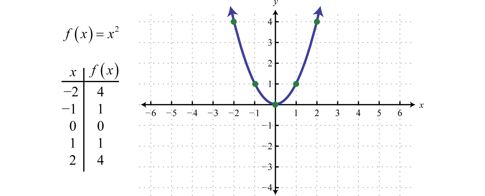
The domain of a function is the set of all possible input values (x-values) for which the function is defined. The range is the set of all possible output values (y-values) that the function can produce. When plotting, you typically choose a specific interval within the domain to visualize. For instance, to plot f(x) = x^2, you might choose x-values from -5 to 5.
To plot a function digitally, you need to generate a series of (x, y) coordinate pairs. This involves:
- Selecting a range of x-values: Determine the start and end points for your x-axis.
- Choosing a step size (or resolution): How many x-values do you want to calculate within your range? A smaller step size (more points) results in a smoother, more accurate plot.
- Calculating corresponding y-values: For each selected x-value, substitute it into the function’s equation to find its
y = f(x)value. - Plotting the points: Once you have a sufficient number of
(x, y)pairs, a plotting tool can connect them to form the continuous graph of the function.
Essential Tools for Visualizing Functions
The technological landscape offers a diverse array of tools for plotting functions, catering to different needs, skill levels, and complexities. From simple online utilities to powerful programming environments, choosing the right tool can significantly enhance your visualization workflow.
Online Graphing Calculators: Instant Visualization
For quick, interactive, and accessible function plotting, online graphing calculators are unparalleled. They require no installation and offer immediate feedback.
- Desmos: Renowned for its intuitive interface and powerful capabilities, Desmos allows users to simply type in equations, and it instantly plots them. It supports a wide range of functions, including parametric, polar, and even inequalities, with easy customization of colors, line styles, and interactive sliders for variable manipulation.
- GeoGebra: A dynamic mathematics software covering geometry, algebra, calculus, and statistics. Its graphing calculator is highly versatile, supporting symbolic calculations, interactive geometry, and 3D plotting.
- Wolfram Alpha: More than just a calculator, Wolfram Alpha is a computational knowledge engine. You can type in almost any mathematical expression or question, and it will not only plot the function but also provide detailed information about its properties, derivatives, integrals, and more.
These tools are ideal for students, educators, and anyone needing quick insights without diving into complex software.
Spreadsheet Software: Data-Driven Plots
While not designed specifically for mathematical functions, spreadsheet applications like Microsoft Excel or Google Sheets can be effectively used to plot functions, especially when you need to visualize discrete data points or create plots from tabular data.
The process typically involves:
- Creating a column of x-values (your independent variable).
- Creating a second column where you apply the function to each x-value to calculate the corresponding y-value.
- Using the spreadsheet’s charting features (e.g., “Scatter with Smooth Lines” or “Line Chart”) to plot the two columns.
Spreadsheets offer good control over data input and can be useful for functions where you want to manually inspect the (x, y) pairs or integrate plotting into data analysis workflows.
Programming Libraries: Precision and Power
For advanced users, data scientists, engineers, and researchers, programming languages with dedicated plotting libraries offer the highest degree of flexibility, customization, and automation. They allow for programmatic control over every aspect of a plot, integration with data analysis pipelines, and the creation of highly complex or interactive visualizations.
- Python with Matplotlib: Python, with its extensive ecosystem, is a dominant force in data science and scientific computing. Matplotlib is its foundational plotting library, offering a MATLAB-like interface for creating static, animated, and interactive visualizations in Python. It’s incredibly versatile, capable of producing publication-quality figures across various plot types, including line plots, scatter plots, histograms, and 3D graphs. For more aesthetic and statistical plots, libraries like Seaborn and Plotly are built on top of or integrate well with Matplotlib.
- R with ggplot2: R is a programming language specifically designed for statistical computing and graphics. ggplot2, part of the Tidyverse, is R’s most popular and powerful plotting library. Based on “Grammar of Graphics,” it allows users to build complex plots layer by layer, providing exceptional control over data mapping, aesthetics, and facets, making it a favorite for statistical visualizations and exploratory data analysis.
- MATLAB/Octave: MATLAB is a proprietary programming language and numerical computing environment widely used in engineering and scientific fields. Octave is its open-source equivalent. Both provide robust built-in plotting functions (
plot(),fplot(), etc.) that are highly optimized for mathematical operations, matrix manipulations, and complex scientific visualizations. They are particularly strong for advanced mathematical modeling, signal processing, and control systems.
These tools offer a steep learning curve but unlock unparalleled capabilities for complex visualization and integration within larger computational projects.
A Step-by-Step Guide to Plotting Functions
Let’s walk through the practical steps of plotting functions using popular tools, starting from the simplest to more advanced programmatic approaches.
Plotting with Desmos: An Intuitive Approach
Desmos is arguably the easiest way to start plotting.
- Open Desmos: Navigate to desmos.com/calculator in your web browser.
- Enter the Function: In the left-hand panel, click on the “expression” input field (it often shows
y =). Type your function, for example,y = x^2 - 3x + 2. - Observe the Plot: As you type, Desmos instantly graphs the function on the right-hand side.
- Adjust View (Optional): You can zoom in/out using your mouse wheel or the +/- buttons in the top right. Click and drag to pan the graph.
- Add More Functions/Sliders: Click the “+” button to add another expression or a slider for a variable (e.g.,
y = ax^2and add a slider fora).
Desmos makes exploring function behavior incredibly interactive and immediate.
Plotting with Microsoft Excel: Practical for Data Sets
For functions involving discrete data or integration with existing spreadsheets, Excel is a practical choice.
- Set up X-values: In cell A1, type “x”. In A2, enter your starting x-value (e.g.,
-5). In A3, enter the next x-value (e.g.,-4.5). Select A2 and A3, then drag the small square at the bottom right of A3 downwards to auto-fill a range of x-values (e.g., up to5). - Calculate Y-values: In cell B1, type “y = f(x)”. In B2, enter your function using cell A2 as the
xvariable. Forf(x) = x^2 - 3x + 2, you’d type=A2^2 - 3*A2 + 2. - Apply Function to all X-values: Drag the small square at the bottom right of B2 downwards to apply the formula to all corresponding x-values in column A.
- Create the Chart: Select both columns of data (A and B). Go to the “Insert” tab in the Excel ribbon. In the “Charts” group, click on “Scatter” and choose “Scatter with Smooth Lines.”
- Customize (Optional): You can add chart titles, axis labels, change colors, and adjust scales using the Chart Design and Format tabs.
Plotting with Python and Matplotlib: The Developer’s Choice
For programmatic control and advanced plotting, Python with Matplotlib is a powerful combination.
-
Install Matplotlib (if not already):
pip install matplotlib numpy(NumPy is essential for numerical operations). -
Import Libraries:
python

import matplotlib.pyplot as plt

import numpy as np
-
Define the Function (implicitly or explicitly):
# Define a range of x-values using NumPy x = np.linspace(-5, 5, 400) # 400 points between -5 and 5 # Calculate corresponding y-values for your function y = x**2 - 3*x + 2 # Example: f(x) = x^2 - 3x + 2 # For a sine wave: y = np.sin(x) -
Create the Plot:
python

plt.figure(figsize=(10, 6)) # Optional: set figure size

plt.plot(x, y, label='y = x^2 - 3x + 2', color='blue', linestyle='-')
-
Add Labels and Title:
python

plt.title('Graph of a Quadratic Function')

plt.xlabel('x-axis')

plt.ylabel('y-axis')

plt.grid(True) # Add a grid for readability

plt.axhline(0, color='black', linewidth=0.5) # Add x-axis line

plt.axvline(0, color='black', linewidth=0.5) # Add y-axis line

plt.legend() # Show the label for the function
-
Display the Plot:
python

plt.show()
This script will generate a high-quality, customizable plot of the function.
Enhancing Your Function Plots for Clarity and Impact
Simply plotting a function is often just the first step. To make your visualizations truly effective and insightful, it’s crucial to enhance them for clarity, accuracy, and impact.
Customizing Visual Elements
Most plotting tools offer extensive options to customize the appearance of your graph:
- Colors and Line Styles: Use different colors, line thicknesses, and styles (solid, dashed, dotted) to distinguish between multiple functions or highlight specific parts of a graph.
- Markers: Add markers (dots, squares, triangles) to individual data points, especially for discrete plots or to emphasize certain values.
- Labels, Titles, and Legends: Always include clear axis labels (with units if applicable), a descriptive plot title, and a legend if you have multiple plotted items. These contextual elements are vital for understanding.
- Axis Limits: Manually set x and y axis limits (
plt.xlim(),plt.ylim()in Matplotlib) to focus on a particular region of interest or remove unnecessary white space.
Plotting Multiple Functions
Often, you’ll need to compare the behavior of several functions on the same graph. All the tools mentioned support this:
- In Desmos, simply add multiple expressions.
- In Excel, add more data series to your chart.
- In Matplotlib, call
plt.plot()multiple times beforeplt.show().
When plotting multiple functions, ensure they are easily distinguishable through color, line style, or markers, and always include a legend.
Understanding Plot Types and Context
While line plots are the default for continuous functions, other plot types can be relevant:
- Scatter Plots: Useful when your data points are not meant to be connected, or you want to show individual observations rather than a continuous trend.
- Bar Charts/Histograms: Not typically used for
y = f(x)continuous functions, but crucial for visualizing discrete functions or distributions of data derived from functions. - 3D Plots: For functions with two independent variables, e.g.,
z = f(x, y), you’ll need 3D plotting capabilities, which advanced libraries like Matplotlib (withmpl_toolkits.mplot3d) and MATLAB/Octave support.
Always choose the plot type that best conveys the information and insights you want to highlight.
Interactive Plotting and Advanced Considerations
Modern plotting libraries offer interactive features that allow users to zoom, pan, hover for data points, and even manipulate parameters dynamically. Libraries like Plotly (for Python, R, and JavaScript) excel at creating interactive web-based visualizations. For very large datasets or complex visualizations, performance optimization and efficient data handling become important considerations. Techniques like data aggregation or specialized rendering backends might be necessary.
The Broader Impact and Applications of Function Plotting
The ability to plot functions extends far beyond academic exercises; it’s a foundational skill with profound applications across diverse technological and scientific domains.
Scientific Research and Engineering
In physics, engineers plot force-displacement curves to analyze material properties, electrical engineers visualize signal waveforms, and aerospace engineers graph trajectories of spacecraft. In biology, researchers plot growth curves of organisms or reaction rates of enzymes. Function plotting is indispensable for hypothesis testing, model validation, and presenting complex scientific findings in an understandable format.
Data Analysis and Machine Learning
Data scientists frequently plot functions to:
- Understand Data Distributions: Histograms and density plots derived from functions reveal underlying patterns.
- Visualize Model Performance: Plotting predicted values against actual values, or error functions, helps evaluate the accuracy and fit of machine learning models.
- Explore Feature Relationships: Plotting a target variable against a feature can reveal linear or non-linear relationships that inform feature engineering.
- Interpret Algorithms: Visualizing activation functions in neural networks or decision boundaries in classification algorithms aids in comprehending how AI models make decisions.
Education and Conceptual Understanding
For students and educators, function plotting is a powerful pedagogical tool. It transforms abstract equations into tangible visual representations, making concepts like derivatives, integrals, limits, and transformations intuitively accessible. It allows for experimentation, enabling learners to see how changing parameters in an equation alters its graph.
In conclusion, plotting functions is far more than a mere mathematical task; it is a critical skill in the modern technological landscape. By leveraging the right tools—from intuitive online calculators to powerful programming libraries—and adhering to best practices in visualization, you can unlock deeper insights, communicate complex ideas more effectively, and drive innovation across virtually every scientific and technical discipline. Embrace the power of visual mathematics, and you will find yourself equipped to tackle a world increasingly defined by data and functional relationships.
aViewFromTheCave is a participant in the Amazon Services LLC Associates Program, an affiliate advertising program designed to provide a means for sites to earn advertising fees by advertising and linking to Amazon.com. Amazon, the Amazon logo, AmazonSupply, and the AmazonSupply logo are trademarks of Amazon.com, Inc. or its affiliates. As an Amazon Associate we earn affiliate commissions from qualifying purchases.