
In an increasingly data-driven world, the ability to visualize relationships between variables is not just a mathematical curiosity but a fundamental skill with wide-ranging applications. From understanding financial trends to designing engineering solutions, visualizing equations through graphing transforms abstract algebraic expressions into intuitive geometric representations. This transformation allows us to readily identify patterns, predict behaviors, and solve complex problems with greater clarity. While the underlying mathematical principles of graphing remain constant, the tools and techniques available have evolved dramatically, moving from laborious manual plotting to sophisticated software and AI-driven platforms.
This article serves as a comprehensive guide for anyone looking to master the art of graphing equations. We will explore the foundational concepts that underpin all graphical representations, delve into the traditional methods that build a strong conceptual understanding, and then pivot to the powerful technological tools that have revolutionized the process. By the end, you’ll not only know how to graph an equation but also understand why it’s an indispensable skill in the digital age, equipping you with the knowledge to choose the most effective graphing strategy for any given scenario.
Understanding the Fundamentals of Graphing
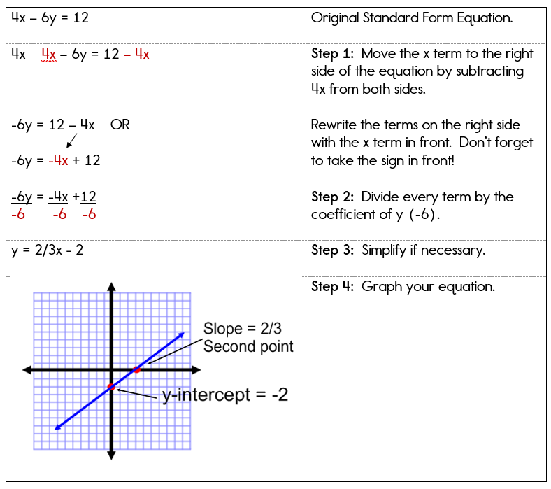
Before diving into the mechanics of plotting, it’s crucial to grasp the basic concepts that form the bedrock of all graphical representations. An equation typically expresses a relationship between one or more variables. When we graph an equation, we are essentially drawing a picture of all the pairs of values for these variables that satisfy the equation.
The Cartesian Coordinate System
At the heart of most graphing lies the Cartesian Coordinate System, also known as the rectangular coordinate system. Developed by René Descartes, this system provides a way to uniquely specify every point in a plane by a pair of numerical coordinates.
- X-axis and Y-axis: These are two perpendicular number lines that intersect at a point called the origin (0,0). The horizontal line is the x-axis, and the vertical line is the y-axis.
- Coordinates (x, y): Every point on the plane is defined by an ordered pair (x, y), where ‘x’ represents the horizontal distance from the origin along the x-axis, and ‘y’ represents the vertical distance from the origin along the y-axis. Positive values move right (x) and up (y), while negative values move left (x) and down (y).
- Quadrants: The axes divide the plane into four regions called quadrants, numbered counter-clockwise starting from the top-right (Quadrant I: x>0, y>0).
Understanding this system is paramount, as all points generated from an equation will be plotted within this framework.
Variables, Constants, and Functions
An equation often contains variables and constants.
- Variables: Symbols (usually letters like x, y, z) that represent values that can change. In graphing, we often deal with independent variables (whose values are chosen or set, typically ‘x’) and dependent variables (whose values are determined by the independent variable, typically ‘y’).
- Constants: Fixed numerical values that do not change within the context of the equation (e.g., 2, -5, π).
- Functions: Many equations we graph are functions, where for every input value of the independent variable (x), there is exactly one output value of the dependent variable (y). This is often written as
y = f(x). While not all equations are functions (e.g., a circle equation like x² + y² = r²), the concept of input-output relationships is central to graphing.
Types of Equations and Their Visual Signatures
Different types of equations produce distinct graphical shapes, and recognizing these can greatly aid in both manual and digital graphing.
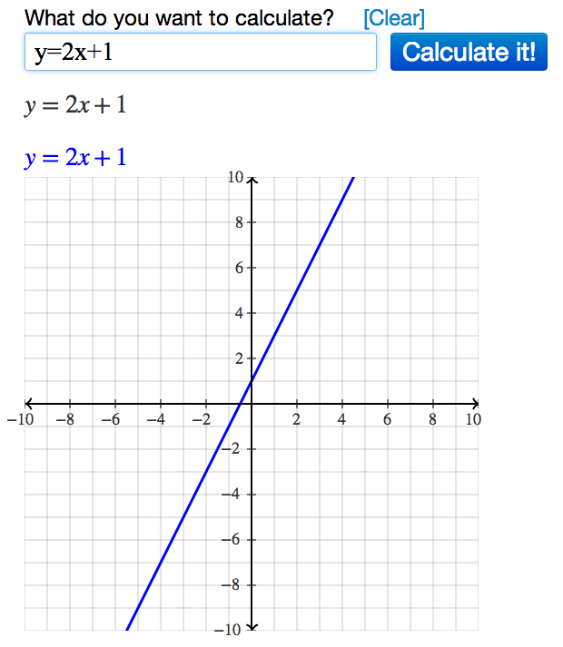
- Linear Equations: Equations where the highest power of the variable is one (e.g.,
y = 2x + 1). Their graphs are always straight lines. The ‘m’ iny = mx + brepresents the slope, and ‘b’ is the y-intercept. - Quadratic Equations: Equations where the highest power of the variable is two (e.g.,
y = x² - 4). Their graphs are parabolas, which are U-shaped curves. - Polynomial Equations: Equations with multiple terms involving different powers of a variable (e.g.,
y = x³ - 2x² + x - 1). Their graphs can have multiple turns and curves. - Exponential Equations: Equations where the variable is in the exponent (e.g.,
y = 2^x). Their graphs show rapid growth or decay. - Trigonometric Equations: Equations involving sine, cosine, tangent, etc. (e.g.,
y = sin(x)). Their graphs are periodic waves.
Recognizing these inherent shapes helps in verifying the accuracy of a graph, whether drawn by hand or by software.
Traditional Methods: A Foundational Approach
Before the advent of powerful computing tools, graphing was a meticulous, manual process. While less efficient for complex equations, understanding these traditional methods builds a crucial conceptual foundation, fostering a deeper appreciation for what graphing software accomplishes.
Manual Plotting: Creating a Table of Values
The most fundamental way to graph an equation manually is by creating a table of values. This method is universally applicable and provides a clear demonstration of how an equation translates into points on a plane.
- Select a Range of X-values: Choose several input values for the independent variable (x). It’s generally good practice to select a mix of positive, negative, and zero values to capture the behavior of the equation across different quadrants. For linear equations, two points are sufficient, but more points improve accuracy and reveal curve shapes for non-linear equations.
- Calculate Corresponding Y-values: For each chosen x-value, substitute it into the equation and solve for the dependent variable (y).
- Form Ordered Pairs: Pair each (x, y) result to create a set of ordered pairs, which represent specific points on the coordinate plane.
- Plot the Points: On a sheet of graph paper, locate and mark each ordered pair according to its x and y coordinates.
- Connect the Points: Once all points are plotted, connect them with a smooth line or curve. For linear equations, use a ruler to draw a straight line. For non-linear equations, try to draw a curve that smoothly passes through all the plotted points, inferring the shape between them.
Example for y = 2x + 1:
| x | y = 2x + 1 | (x, y) |
|---|---|---|
| -2 | 2(-2) + 1 = -3 | (-2, -3) |
| -1 | 2(-1) + 1 = -1 | (-1, -1) |
| 0 | 2(0) + 1 = 1 | (0, 1) |
| 1 | 2(1) + 1 = 3 | (1, 3) |
| 2 | 2(2) + 1 = 5 | (2, 5) |
Plotting these points and connecting them would yield a straight line.
Identifying Key Features
For certain types of equations, identifying key features can streamline manual graphing and help verify accuracy.
- Intercepts: Where the graph crosses the x-axis (x-intercept, where y=0) or the y-axis (y-intercept, where x=0). These are often easy to calculate and serve as anchor points.
- Slope: For linear equations, the slope (
m) indicates the steepness and direction of the line. A positive slope rises from left to right, a negative slope falls. - Vertex: For quadratic parabolas, the vertex is the turning point – either the lowest or highest point on the curve. Its coordinates can be found using formulas like
x = -b / 2afory = ax² + bx + c.
Limitations of Manual Graphing
While foundational, manual graphing has significant drawbacks in modern contexts:
- Time-Consuming: Especially for complex equations or when high precision is required.
- Prone to Error: Miscalculations in the table of values or inaccuracies in plotting can lead to incorrect graphs.
- Difficult for Complex Equations: Equations with fractional exponents, transcendental functions, or multiple variables become exceedingly difficult or impossible to graph accurately by hand in a 2D plane.
- Limited Scope: Manual graphing usually only allows for a limited range of x-values, potentially missing important features outside the chosen window.
These limitations underscore the necessity and utility of technological solutions in contemporary graphing.
Embracing Technology: Modern Graphing Tools
The digital age has brought forth a plethora of tools that transform the process of graphing equations from a painstaking chore into an intuitive, interactive experience. These tools not only save time but also offer unparalleled precision, flexibility, and visualization capabilities.
Online Graphing Calculators
These web-based applications are often the first port of call for students and professionals alike due to their accessibility and ease of use.
- Desmos: Renowned for its user-friendly interface and real-time plotting. Users can simply type an equation, and the graph appears instantly. It supports multiple equations, inequalities, regressions, and interactive sliders to explore parameter changes.
- GeoGebra: A more comprehensive dynamic mathematics software that combines geometry, algebra, statistics, and calculus into a single package. It offers robust graphing capabilities alongside tools for constructing geometric figures.
- Wolfram Alpha: While not exclusively a graphing tool, Wolfram Alpha excels at computational knowledge. Entering an equation often yields not only its graph but also key features like roots, intercepts, derivatives, and integrals.

These platforms are invaluable for quick visualizations, exploring “what-if” scenarios, and understanding the impact of parameter changes on a graph.
Dedicated Software and Applications
For more advanced needs, dedicated software offers deeper functionality and integration into specific workflows.
- Grapher (macOS): A built-in application on Apple’s macOS that provides powerful 2D and 3D graphing capabilities. It can handle a wide array of equation types, including parametric, polar, and differential equations.
- Mathlab/Mathematica: High-level programming languages and environments for numerical computation and symbolic mathematics. They offer extensive plotting functions for highly customized and complex visualizations, often used in scientific research and engineering.
- Microsoft Mathematics: A free program that provides a graphing calculator that plots in 2D and 3D, solves equations, and helps students with a variety of mathematical tasks.
- Mobile Apps: Apps like Photomath (which can solve and graph equations from a photo), Graphing Calculator by Mathlab, and various Desmos/GeoGebra mobile versions bring powerful graphing capabilities directly to smartphones and tablets.
These tools are particularly useful for professionals who regularly work with complex mathematical models and require advanced customization or computational power.
Spreadsheet Software: Beyond Data Analysis
While primarily designed for data organization and analysis, spreadsheet programs like Microsoft Excel and Google Sheets can also be used to graph equations, especially when you want to visualize discrete points or data derived from an equation.
- Create X-values: In one column, generate a series of x-values.
- Calculate Y-values: In an adjacent column, enter the equation using cell references for x. Dragging the fill handle down will apply the formula to all chosen x-values.
- Generate a Chart: Select both columns of data and choose a scatter plot or line chart option. The spreadsheet will then plot the points and connect them, effectively graphing your equation.
This method is excellent for integrating graphing into data reports or when needing to perform further calculations on the data points.
Programming Libraries: The Power of Code
For those with programming skills, libraries in languages like Python and R offer the ultimate flexibility and control over graphing.
- Python (Matplotlib, NumPy, SciPy): Matplotlib is a widely used 2D plotting library that produces publication-quality figures. Combined with NumPy for numerical operations and SciPy for scientific computing, Python becomes an incredibly powerful tool for graphing any equation, from simple functions to complex data visualizations.
- R (ggplot2): R is a language and environment for statistical computing and graphics. The ggplot2 package is particularly celebrated for its elegant and highly customizable approach to creating sophisticated plots based on the grammar of graphics.
Using programming libraries allows for automated graphing, batch processing of multiple equations, and the creation of highly specialized and interactive visualizations, making them indispensable in data science, machine learning, and advanced scientific modeling.
AI-Powered Tools and Features
The integration of Artificial Intelligence is beginning to enhance graphing capabilities, making them even more accessible and insightful.
- Natural Language Processing: Some AI tools can interpret equations or even descriptions of functions provided in natural language, automatically generating the graph.
- Intelligent Analysis: Beyond just plotting, AI can potentially identify key features of a graph (e.g., asymptotes, inflection points, regions of interest) and even offer interpretations or suggestions for optimizing parameters.
- Predictive Graphing: In some advanced applications, AI might predict the behavior of a function based on limited data points or infer relationships from complex datasets to suggest suitable mathematical models and their corresponding graphs.
While still evolving, AI integration promises to make graphing even more intuitive and powerful, transforming how users interact with mathematical visualizations.
Best Practices for Effective Graphing
Regardless of the tool or method used, adhering to certain best practices ensures that your graphs are not only accurate but also clear, informative, and effectively communicate the underlying mathematical relationships.
Choosing the Right Tool for the Job
The most effective graphing strategy depends on your specific needs:
- For quick checks or exploratory learning: Online calculators like Desmos or GeoGebra are ideal.
- For detailed analysis, complex functions, or classroom use: Dedicated software or apps are more appropriate.
- For integrating graphs into data reports or business contexts: Spreadsheet software offers a good balance.
- For advanced scientific research, custom visualizations, or automation: Programming libraries are the way to go.
Matching the tool to the task saves time and yields better results.
Setting Appropriate Scales and Domains
A poorly scaled graph can distort the true representation of an equation.
- X and Y Ranges (Domain and Range): Ensure that the chosen range for both x and y axes adequately captures the critical features of the graph (intercepts, peaks, valleys, asymptotes). Many digital tools offer automatic scaling, but manual adjustment is often necessary for clarity.
- Tick Marks and Intervals: Space tick marks appropriately and ensure labels are legible. Avoid excessive detail that clutters the graph.
- Zooming and Panning: Utilize these features in digital tools to explore different sections of the graph in detail or to get a broader overview.
Labeling and Annotating Graphs
A graph without proper labeling is often meaningless.
- Axis Labels: Always label your x and y axes, clearly indicating what each axis represents (e.g., “Time (seconds),” “Temperature (°C)”).
- Equation Labels: If graphing multiple equations on the same plane, use different colors or line styles and provide a legend or label each line directly.
- Titles: Give your graph a concise, descriptive title that immediately tells the viewer what the graph illustrates.
- Annotations: Add specific points, text boxes, or arrows to highlight important features like intercepts, points of intersection, or maximum/minimum values.
Interpreting Your Graphs
The act of graphing is a means to an end: understanding the relationship it represents.
- Identify Trends: Is the graph increasing or decreasing? What is its overall shape?
- Locate Critical Points: Where are the intercepts, turning points, or points of discontinuity?
- Analyze Behavior: What happens to y as x approaches positive or negative infinity? Are there any asymptotes?
- Draw Conclusions: What insights can you derive from the visual representation? How does it help you understand the original equation or the real-world phenomenon it models?
Conclusion
Graphing an equation is far more than a simple mathematical exercise; it is an act of visualization that unlocks profound insights into relationships, trends, and behaviors. From the foundational understanding provided by the Cartesian plane and manual plotting to the incredible precision and versatility offered by modern software, programming libraries, and emerging AI tools, the methods available for graphing have never been more powerful or accessible.
By mastering the fundamentals, strategically leveraging technology, and adhering to best practices, you can transform abstract mathematical expressions into clear, compelling, and insightful visual narratives. Whether you’re a student grappling with algebra, an engineer designing systems, a data scientist analyzing patterns, or a curious mind exploring the beauty of mathematics, the ability to graph an equation remains an essential skill in navigating and understanding our complex, data-rich world. The future of graphing promises even greater interactivity and intelligence, further solidifying its role as a cornerstone of technical literacy.
aViewFromTheCave is a participant in the Amazon Services LLC Associates Program, an affiliate advertising program designed to provide a means for sites to earn advertising fees by advertising and linking to Amazon.com. Amazon, the Amazon logo, AmazonSupply, and the AmazonSupply logo are trademarks of Amazon.com, Inc. or its affiliates. As an Amazon Associate we earn affiliate commissions from qualifying purchases.