In the mid-20th century, the American retail landscape was dominated by the “five-and-dime” variety store. These were the community hubs that preceded the era of big-box “everything stores” and digital marketplaces. Among the most iconic names of this era was TG&Y. For many, the sight of the bold, blocky letters against a bright yellow background evokes deep nostalgia. However, beyond the sentimental value, TG&Y serves as a masterclass in brand identity, community-centric positioning, and the eventual challenges of brand dilution in the face of corporate consolidation.
To understand the brand’s history is to understand the evolution of the American corporate identity. While many consumers jokingly invented their own meanings for the acronym, the true story of the TG&Y brand is rooted in a strategic partnership that would grow into a retail empire spanning over 900 stores across 29 states.

The Origins of the Identity: More Than Just Initials
In the world of brand strategy, naming is often the most critical first step. In the 1930s, the trend for retail businesses was often to use the surnames of the founders—think Sears, Roebuck & Co. or F.W. Woolworth. TG&Y followed this tradition, but with a collaborative twist that signaled a powerhouse merger of talent and resources.
The Men Behind the Letters
The letters “TG&Y” stood for the surnames of its three founders: Rawdon Tomlinson, Enoch Gosselin, and Raymond Young. The brand was officially born in 1935 in Oklahoma City, born from a desire to consolidate several independent variety stores under a single, recognizable banner. Each founder brought a specific strength to the table: Tomlinson was the seasoned veteran, Gosselin was the operational strategist, and Young was the visionary who eventually led the company’s massive expansion as president.
From Tomlinson, Gosselin, and Young to a Household Name
Initially, the full names were used, but as the company expanded, the leadership realized that a concise, punchy acronym was more effective for signage and marketing. This move toward “TG&Y” was a precursor to modern branding trends where companies like International Business Machines became IBM. By moving to initials, the brand became a “vessel” that could be filled with the company’s reputation for value and variety, rather than just being associated with three specific individuals.
Brand Positioning: The “Neighborhood Store” Strategy
Every successful brand requires a unique value proposition (UVP). For TG&Y, that UVP was proximity and accessibility. While larger department stores required a trip to the city center or a major shopping mall, TG&Y positioned itself as the “neighborhood store.”
Defining the Five-and-Dime Niche
TG&Y thrived in the “variety store” niche. This meant they didn’t specialize in one category; instead, they curated a selection of high-turnover household goods, toys, school supplies, and notions. From a branding perspective, this required a delicate balance. The brand had to be perceived as “cheap” enough for daily errands but “quality” enough to retain customer loyalty. They achieved this by maintaining clean, well-lit environments that felt more organized and welcoming than the cluttered general stores of the past.
The Power of Localized Variety
One of TG&Y’s most effective brand strategies was its ability to feel local despite its massive scale. Store managers were often given the autonomy to tailor their inventory to the specific needs of their community. This created a brand image of a “corporate entity with a local heart.” In marketing terms, this is often referred to as “glocalization”—applying global (or national) standards to local contexts. It allowed TG&Y to build an emotional connection with consumers that larger, more rigid competitors struggled to replicate.
The “Turtles, Girdles, and Yo-Yos” Phenomenon: Consumer-Driven Branding
![]()
One of the most fascinating aspects of the TG&Y brand is how it lived in the public consciousness. When a brand becomes large enough, the public often “reclaims” it through nicknames. For TG&Y, this resulted in the popular backronym: “Turtles, Girdles, and Yo-Yos.”
When the Public Names the Brand
While the company never officially adopted “Turtles, Girdles, and Yo-Yos” in its formal corporate identity, they were smart enough not to fight it. In branding, organic word-of-mouth is more valuable than any paid advertisement. The nickname highlighted the sheer variety of the store—from pets (turtles) and apparel (girdles) to toys (yo-yos). It reinforced the brand’s core message: We have everything you need.
Leveraging Cultural Word-of-Mouth
By allowing this nickname to flourish, TG&Y benefited from a humanized brand persona. It made the corporation feel approachable and slightly whimsical. In today’s social media landscape, brands spend millions trying to go viral or create “memes.” TG&Y achieved this organically in the 1950s and 60s. The nickname became a linguistic shorthand for the brand’s versatility, proving that sometimes the best brand strategy is to let the customers tell your story for you.
Visual Identity and Expansion: Scaling the TG&Y Image
As TG&Y grew from an Oklahoma-based chain into a national powerhouse, its visual identity had to work harder. A brand’s visual cues—colors, fonts, and store layouts—are the silent ambassadors of the company.
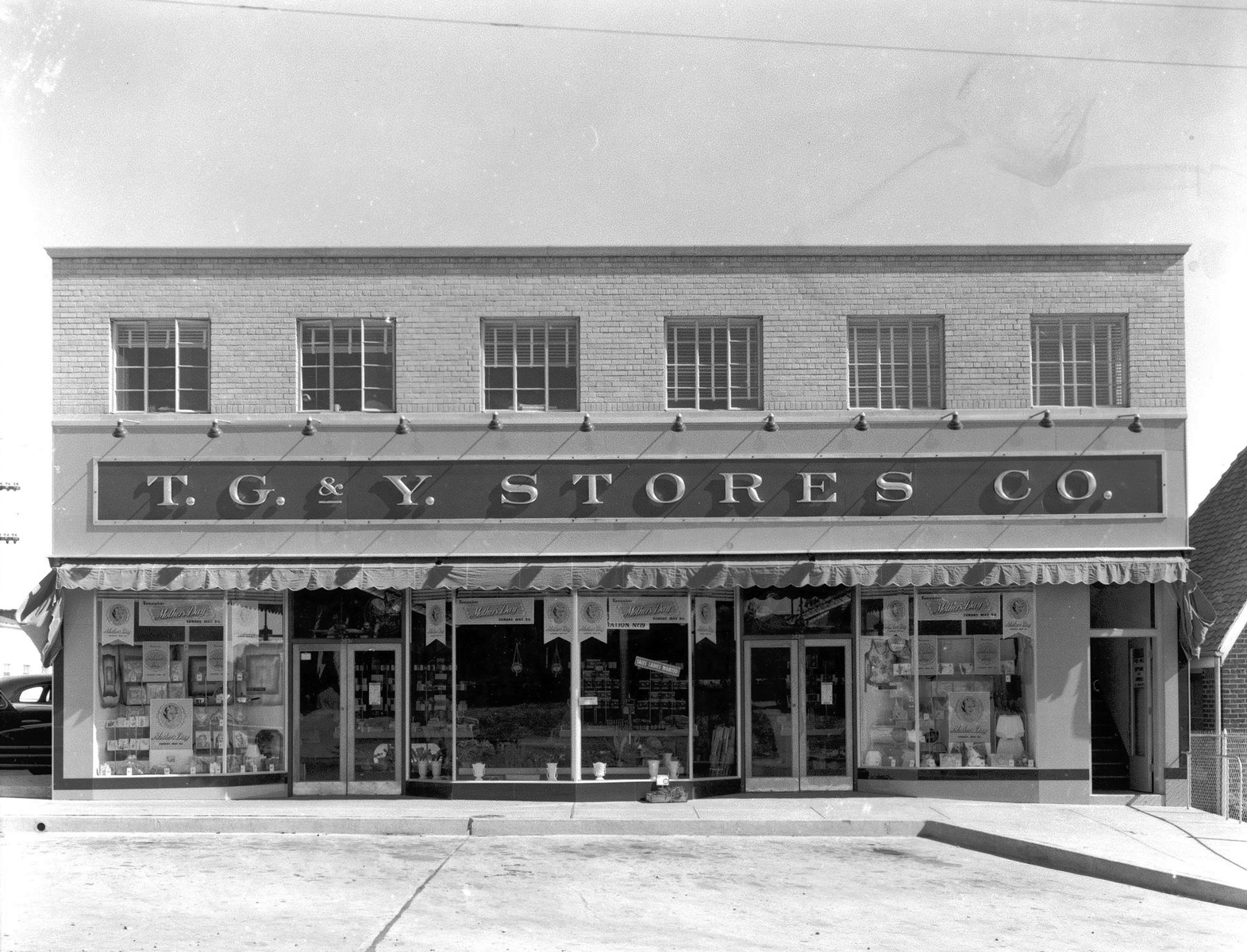
The Significance of the Iconic Yellow Signage
TG&Y was famous for its bright yellow signs with bold, black lettering. From a design psychology perspective, yellow is associated with optimism, clarity, and, most importantly, affordability. It is a high-visibility color that grabs attention from the road—a crucial factor during the post-war boom of car culture and suburban development. When a shopper saw that yellow sign, the brand promise was immediate: “You are welcome here, and you can afford what’s inside.”
Operational Consistency as a Brand Pillar
A brand is more than a logo; it is a promise of a consistent experience. TG&Y’s expansion was fueled by a “cookie-cutter” approach to store layout. Whether a customer was in a small town in Texas or a suburb in Kansas, the TG&Y experience was identical. This reliability is a cornerstone of brand equity. By the 1970s, the brand had successfully scaled its operations so that “TG&Y” was synonymous with a specific standard of retail convenience.
The Decline and Legacy: Why Brands Fade and What We Learn
The story of TG&Y is not just one of growth, but also a cautionary tale about brand dilution and the challenges of staying relevant in a changing market. In the 1980s, the retail landscape shifted toward massive “superstores” like Walmart and Target.
The Acquisition Era and Strategic Dilution
In 1986, TG&Y was acquired by McCrory Stores. This began a period of identity crisis. The new ownership attempted to pivot the brand, introducing “TG&Y Family Centers,” which were larger and aimed to compete directly with the burgeoning big-box retailers. However, this move diluted the “neighborhood store” brand that had made TG&Y successful. By trying to be a “mini-Walmart,” the brand lost its unique positioning. It was no longer the convenient corner variety store, and it couldn’t compete with the massive scale and lower prices of the new industry giants.
The Enduring Brand Equity of Nostalgia
By the early 2000s, the last TG&Y signs were taken down, but the brand didn’t truly die; it moved into the realm of “nostalgia branding.” Today, the name TG&Y still carries significant brand equity among older generations. It represents a lost era of retail—a time when shopping was a social, local experience.
For modern brand strategists, the lesson of TG&Y is clear: a strong brand is built on a foundation of clear identity (the founders’ initials), a specific market niche (the neighborhood variety store), and a willingness to embrace the community’s perception (Turtles, Girdles, and Yo-Yos). However, even the strongest brand can falter if it loses sight of its core identity in an attempt to chase competitors. TG&Y stood for more than just Tomlinson, Gosselin, and Young; it stood for an era of American retail that prioritized community accessibility above all else. Though the stores are gone, the acronym remains a powerful symbol of mid-century corporate success and the enduring power of a well-defined brand identity.
aViewFromTheCave is a participant in the Amazon Services LLC Associates Program, an affiliate advertising program designed to provide a means for sites to earn advertising fees by advertising and linking to Amazon.com. Amazon, the Amazon logo, AmazonSupply, and the AmazonSupply logo are trademarks of Amazon.com, Inc. or its affiliates. As an Amazon Associate we earn affiliate commissions from qualifying purchases.