In the traditional landscape of brand identity, “colour” has long been defined by a static hex code or a specific Pantone chip. Brands fought for ownership of “Tiffany Blue” or “Coca-Cola Red,” seeking a singular, unwavering anchor in the consumer’s mind. However, as we transition into an era defined by digital dynamism and a rejection of the binary, the question “what colour is iridescent?” has moved from the realm of physics into the core of high-level brand strategy.
Iridescent is not a single color; it is an optical phenomenon where a surface appears to change color as the angle of view or the angle of illumination changes. In branding, it represents the ultimate tool for differentiation: a visual identity that refuses to be pinned down. From the sleek interfaces of fintech startups to the high-concept packaging of luxury cosmetics, iridescence is being leveraged to signal innovation, premium positioning, and a futuristic outlook.
The Psychology of Iridescence in Modern Branding
The shift toward iridescent palettes reflects a deeper psychological evolution in consumer behavior. We are moving away from the “Flat Design” era of the 2010s, which prioritized utility and minimalism, toward a “New Sentimentalism” that values depth, texture, and wonder.
The Shift from Flat Design to Dimensionality
For nearly a decade, the corporate world was dominated by “Blanding”—the process of stripping away gradients and shadows in favor of ultra-simple, two-dimensional logos. While this served the purpose of mobile-first readability, it eventually led to a sea of sameness. Iridescence provides a strategic antidote. By incorporating a color that shifts and reacts to light, brands can reintroduce a sense of tactility and three-dimensionality. It signals that a brand is multi-faceted and complex, rather than a flat, one-dimensional service provider.
Evoking Emotional Responses: Wonder and Novelty
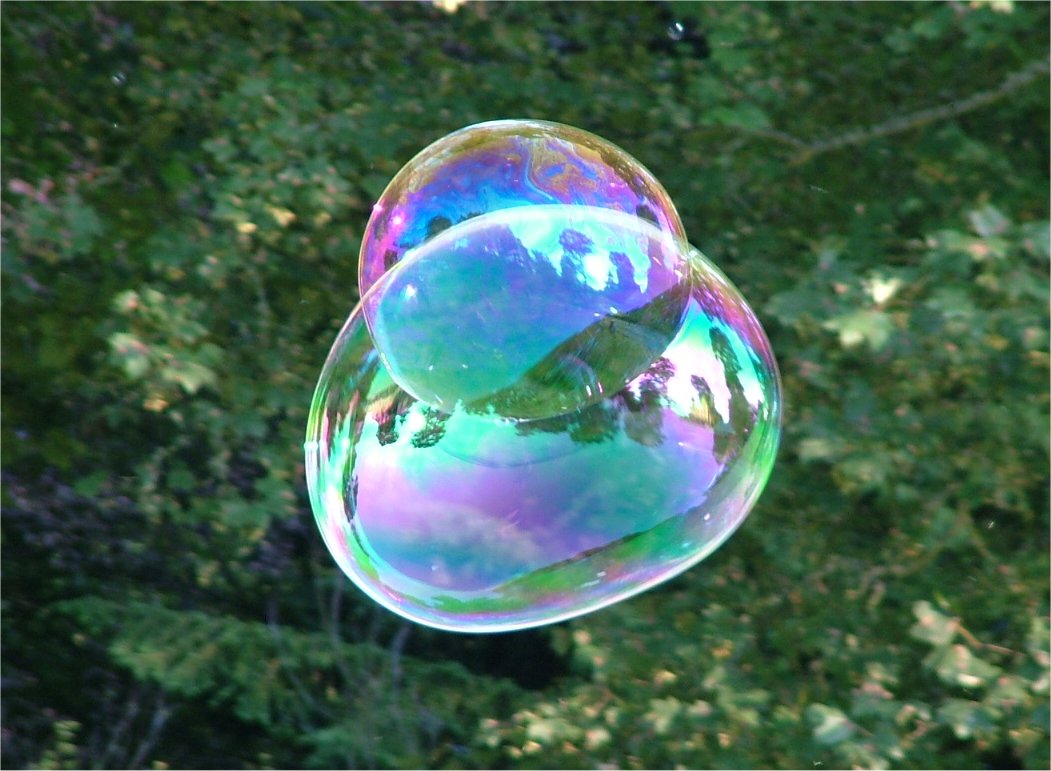
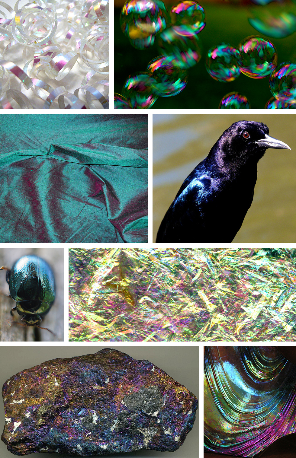
Iridescence mimics the natural world—think of peacock feathers, soap bubbles, or the interior of a seashell. These elements trigger an evolutionary response of curiosity and delight. In a crowded marketplace, the “chameleon effect” of iridescent branding captures the eye longer than a static color does. When a consumer interacts with a product that changes hue as they move it, they are engaged in a micro-moment of play. This engagement increases brand recall and fosters a more emotional, sensory connection with the product.
Iridescence as a Tool for Premium Positioning
In the niche of luxury and premium brand strategy, iridescence is often used to signify exclusivity. Because high-quality iridescent finishes are difficult and expensive to produce—whether in print or physical manufacturing—they serve as a subtle “wealth signal” for the brand itself.
Luxury and Exclusivity in Packaging
In the world of high-end cosmetics and spirits, the packaging is often as important as the product. An iridescent finish on a bottle or box communicates a “limited edition” feel. It suggests that the product is not just a commodity but a piece of art. Brands like Pat McGrath Labs or high-end fragrance houses use iridescent foils to create a sense of ethereal beauty that justifies a premium price point. The message is clear: this brand is rare, evolving, and cannot be easily replicated.
The “Chameleon Effect” in High-End Automotive and Tech
The automotive and consumer tech industries have embraced iridescence to highlight engineering prowess. When a smartphone manufacturer releases a “Pearlescent” or “Prism” backplate, they are leveraging the physics of light to emphasize the sleekness of their hardware. In branding terms, this is “visual equity.” It positions the tech as cutting-edge—something that exists on the border between the physical and the digital. For the consumer, owning an iridescent device is a statement of being “future-proof.”
Implementing Iridescent Palettes in Corporate Identity
Integrating iridescence into a brand’s visual identity system requires a sophisticated understanding of both color theory and technical execution. It is not as simple as applying a rainbow gradient; it requires a strategic balance between the “anchor” colors and the “shifting” accents.
Color Theory: Combining Structural Color with Pigment
In branding, iridescence is often achieved through a combination of a base “hero” color and a translucent overlay. A brand might choose a deep midnight blue as its foundation, using an iridescent finish to pull out hints of violet and teal. This maintains brand recognition (the “Blue” brand) while adding a layer of sophisticated mystery. The strategy here is to ensure that the iridescence enhances the brand’s core values rather than distracting from them. It should feel like an “aura” around the brand identity.
Digital vs. Physical Application Challenges
One of the greatest challenges for a Brand Manager is maintaining consistency across platforms. An iridescent finish looks stunning on a physical shopping bag but can look like a cluttered gradient on a low-resolution mobile screen. Strategic branding solves this by creating “Digital Iridescence”—using motion graphics and CSS animations to mimic the way light hits a surface. Instead of a static image, the digital brand assets move slightly, creating the illusion of a color shift. This ensures the brand remains dynamic and “alive” across all touchpoints, from a physical storefront to a TikTok ad.
Case Studies: Brands Leading the Holographic Revolution
To understand how “what colour is iridescent” translates into market share, we must look at the leaders who have successfully moved away from the traditional color wheel.
Tech Giants and the Futuristic Aesthetic
Microsoft and Apple have both experimented with iridescence to soften their corporate images. Microsoft’s “Fluent Design System” uses acrylic-like textures and iridescent-adjacent gradients to make software feel more human and less “robotic.” By using soft, shifting colors, they communicate that their AI and cloud tools are fluid and adaptive to the user’s needs. This is a deliberate move away from the cold, “Big Brother” blue of the early 2000s.
Beauty and Fashion: The Vanguard of Fluid Identity
The fashion industry has used iridescence to lead the conversation on gender fluidity and identity. Brands that target Gen Z often use holographic and iridescent motifs to signal that they are “unfiltered” and “limitless.” In this context, iridescence isn’t just a design choice; it’s a political and social statement. It represents a spectrum of possibilities, mirroring a generation that refuses to be categorized by a single label or a single “color.”
The Future of Brand Identity: Beyond Static Palettes
As we look toward the future of brand strategy, the concept of a “brand color” may become obsolete, replaced by “brand behaviors” or “brand textures.” Iridescence is the precursor to this shift.
Adaptive Branding in the Digital Age
In the near future, we may see “smart branding” that changes its iridescent hue based on the time of day, the user’s mood, or the local weather. Imagine a fitness app that shifts from a calming iridescent violet in the evening to an energizing iridescent orange in the morning. This level of personalization is the ultimate goal of modern brand strategy, and iridescence provides the visual framework to make it possible. It allows a brand to be “everything to everyone” without losing its core essence.
Sustainability and Iridescent Finishes
As brands face increasing pressure to be eco-friendly, iridescence is seeing a resurgence through “structural color.” This is a method of creating color through microscopic textures that reflect light, rather than using toxic chemical dyes. Forward-thinking brands are beginning to use this technology in their packaging to reduce their environmental footprint while actually increasing their visual appeal. Here, iridescence becomes a hallmark of the “Green Luxury” movement—proving that a brand can be both visually spectacular and ethically responsible.
In conclusion, when we ask “what colour is iridescent,” the answer for a brand strategist is: the colour of change. Iridescence is a powerful tool for brands that want to communicate innovation, luxury, and fluidity. By moving beyond the static constraints of the traditional color palette, brands can create a visual identity that is as dynamic and multifaceted as the modern consumer. In a world of fixed screens and flat images, iridescence offers a glimpse into a more vibrant, dimensional, and engaging future for global branding.
aViewFromTheCave is a participant in the Amazon Services LLC Associates Program, an affiliate advertising program designed to provide a means for sites to earn advertising fees by advertising and linking to Amazon.com. Amazon, the Amazon logo, AmazonSupply, and the AmazonSupply logo are trademarks of Amazon.com, Inc. or its affiliates. As an Amazon Associate we earn affiliate commissions from qualifying purchases.