In the modern professional landscape, your image is often the first touchpoint of your brand strategy. Whether you are an executive, an entrepreneur, or a creative professional, the visual cues you project communicate your values, your authority, and your attention to detail long before you speak. At the heart of this visual communication lies a fundamental question that transcends fashion and enters the realm of strategic design: What colors suit my skin tone?
Understanding the science of color harmony is not merely an exercise in vanity; it is a critical component of personal branding. When the colors you wear align with your natural complexion, they create a “halo effect” that suggests health, vitality, and competence. Conversely, clashing tones can make a leader appear fatigued or disconnected. This article explores how to leverage color theory to build a cohesive, high-impact personal brand that resonates across digital and physical platforms.
1. The Psychology of Visual Harmony in Personal Branding
In branding, consistency is the bedrock of trust. Just as a corporation selects a specific Pantone palette to evoke certain emotions, a professional must select a palette that enhances their physical presence. This is the concept of visual harmony—where the observer’s eye perceives an effortless alignment between the individual and their aesthetic choices.
The Impact of First Impressions and Brand Equity
Research in color psychology suggests that people make a subconscious judgment about a person or environment within 90 seconds of initial viewing, and up to 90% of that assessment is based on color alone. In a high-stakes business meeting or a keynote presentation, your skin tone serves as the “background” of your brand. If your clothing or your brand’s background colors fight against your skin tone, it creates cognitive dissonance for the viewer. Mastering your colors ensures that your brand equity remains high by presenting an image of polished, intentional leadership.
Seasonal Color Theory in a Professional Context
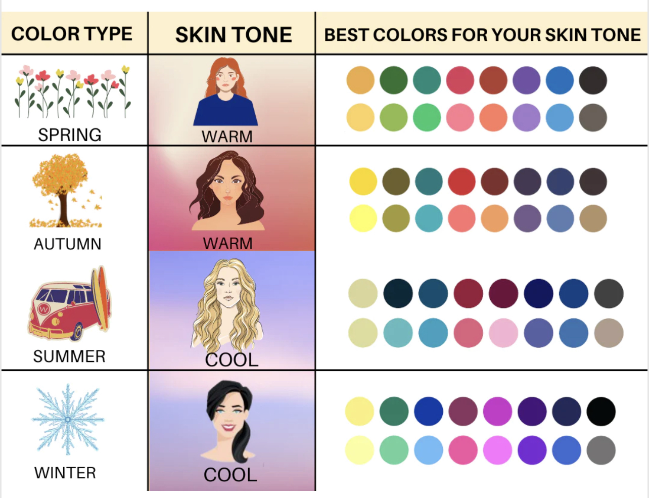
Personal branding often borrows from “Seasonal Color Analysis,” a system that categorizes skin tones into Four Seasons: Winter, Spring, Summer, and Autumn.
- Winters and Summers have cool undertones (blue or pinkish).
- Springs and Autumns have warm undertones (yellow or golden).
In brand strategy, identifying your “season” allows you to curate a wardrobe and a digital presence that feels authentic. For instance, a “Winter” entrepreneur might lean into high-contrast, bold corporate colors like navy and stark white, whereas an “Autumn” leader might opt for rich, earth-toned palettes that suggest stability and groundedness.
2. Identifying Your Undertone: The Foundation of Your Corporate Image
To build a brand, you must first understand your “raw materials.” Your skin tone is composed of two layers: the surface tone (which can change with sun exposure) and the undertone (which is permanent). For a brand strategist, the undertone is the most critical element because it dictates the “temperature” of your brand identity.
Warm, Cool, and Neutral Profiles
The first step in determining what colors suit your skin tone is identifying whether you are Warm, Cool, or Neutral.
- Warm Undertones: Your skin has hints of peach, yellow, or gold. In a branding context, warm-toned individuals often project an aura of energy, approachability, and warmth.
- Cool Undertones: Your skin has hints of pink, red, or bluish-purple. Cool-toned individuals often project an aura of calm, logic, and classic professionalism.
- Neutral Undertones: You have a balance of both, allowing for the most versatility in your brand palette.
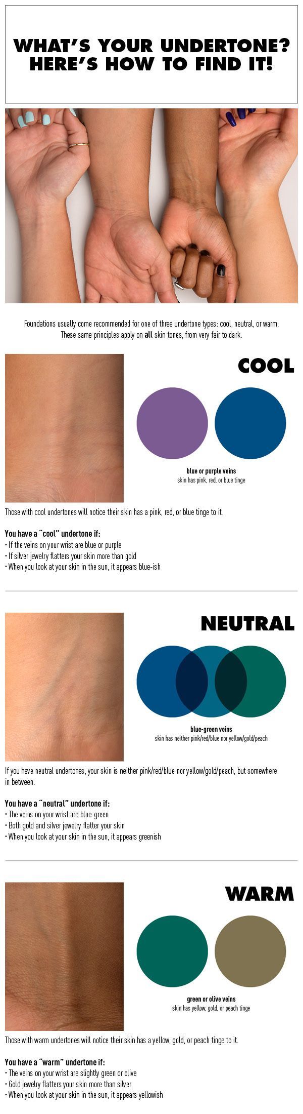
The White Paper and Vein Test for Professionals
Before commissioning a professional photoshoot or designing a website, perform a quick audit of your undertones. The “White Paper Test” involves holding a piece of stark white paper up to your face in natural light. If your skin looks yellowish or sallow, you are warm; if it looks pinkish or rosy, you are cool. Similarly, checking the veins on your wrist is a standard diagnostic tool: greenish veins indicate warm undertones, while blue or purple veins indicate cool undertones. This technical understanding prevents “brand washing,” where a professional chooses a color because it is trendy, only to find it diminishes their physical presence in video content or live appearances.
3. Strategic Color Selection for Different Brand Archetypes
Once you understand your skin tone, you can align it with your brand archetype. Your color palette should not only flatter you but also tell the story of your business role.

The Authority Palette: High Contrast for Cool Tones
For individuals with cool skin tones (Winters) who occupy roles requiring high authority—such as CEOs, legal consultants, or financial advisors—a high-contrast palette is often the most effective. This involves pairing deep jewel tones (emerald green, royal blue, or true black) with crisp, bright accents. This contrast mimics the clarity and decisiveness required in leadership. If your skin tone is cool, these colors will make your features pop, ensuring that you remain the focal point during a presentation rather than the clothes you are wearing.
The Creative Catalyst: Vibrant Palettes for Warm Tones
If you are a creative director or a tech innovator with warm skin tones (Springs), your brand might benefit from vibrant, high-energy colors. Think of corals, turquoise, and bright golds. These colors complement the golden undertones of your skin, creating a look that is both energetic and approachable. In the world of personal branding, these colors signal innovation and “out-of-the-box” thinking. By selecting colors that suit your warm skin tone, you reinforce your brand’s identity as a dynamic and forward-thinking force.
The Empathetic Leader: Muted Tones for Soft Complexions
For those with Summer or Autumn complexions (cool-muted or warm-muted), the brand strategy should focus on sophistication and approachability. Soft mauves, sage greens, and terracotta provide a sense of reliability and empathy. These colors are particularly effective for coaches, therapists, or HR executives. Wearing these “muted” colors ensures that your skin doesn’t look washed out by overly bright tones, allowing your natural warmth and sincerity to lead your brand interactions.
4. Digital and Physical Integration: Applying Your Palette Across Platforms
In the digital age, your brand is not confined to your physical person. It extends to your LinkedIn profile, your personal website, and your video presence. Understanding which colors suit your skin tone allows you to create a seamless “omni-channel” personal brand.
Photography and Video Production
When planning brand photography, the background color of your studio or the environment of your “lifestyle” shots should be chosen based on your skin’s undertone. A cool-toned professional standing against a warm, orange-tinted brick wall may appear sickly due to the color clash. Conversely, choosing a slate grey or deep blue background would enhance their features. This level of detail in art direction is what separates amateur branding from professional-tier corporate identity. In video conferencing—now a staple of business—lighting and background color choice can significantly impact how “awake” and “prepared” you look to your clients.
Social Media Consistency and UI Design
Personal branding often requires a personal website or a curated social media grid. If you know that earthy tones like olive and mustard suit your skin tone, these should ideally be the primary colors in your brand’s UI/UX design. When your profile picture (featuring you in your best colors) is surrounded by a website color palette that complements your skin tone, it creates a visual “flow.” This consistency reduces the friction for the user, making your brand feel more professional and well-thought-out. It creates a holistic identity where the founder and the company mission are visually unified.
5. Case Studies: The ROI of Color-Aligned Branding
To understand the value of skin-tone-aligned color choices, we can look at the evolution of major personal brands. Many high-level public figures undergo “color resets” when transitioning from one phase of their career to another.
The Executive Pivot
Consider a tech executive transitioning into public speaking. Early in their career, they might wear “standard” corporate grey, which may not suit their warm skin tone, making them appear tired on stage. By shifting to a warm navy or charcoal with golden accessories, they suddenly appear more vibrant and commanding. This shift isn’t about fashion; it’s about increasing their “stage presence,” which directly impacts their booking fees and brand authority.
The Design Influence
Top-tier designers often use themselves as a canvas. When a designer understands their skin tone, they use their clothing as a “proof of concept” for their aesthetic taste. A designer with a “Summer” skin tone who wears soft, cool pastels demonstrates an innate understanding of harmony and color theory. Clients see this and subconsciously trust the designer’s ability to handle the client’s own brand colors.
Conclusion: The Competitive Advantage of Visual Alignment
Mastering the colors that suit your skin tone is a sophisticated brand strategy that pays dividends in every interaction. By identifying your undertones and aligning them with your professional archetype, you move beyond “getting dressed” and into “designing an identity.”
Visual harmony reduces the noise between you and your audience. When your colors are right, the audience stops looking at your clothes and starts looking at you—your eyes, your expressions, and your message. In an economy where attention is the most valuable currency, having a color-optimized personal brand ensures that you are seen in the best possible light, quite literally. Whether you are updating your LinkedIn headshot or preparing for a global summit, let the science of skin tone be the foundation upon which you build your professional legacy.
aViewFromTheCave is a participant in the Amazon Services LLC Associates Program, an affiliate advertising program designed to provide a means for sites to earn advertising fees by advertising and linking to Amazon.com. Amazon, the Amazon logo, AmazonSupply, and the AmazonSupply logo are trademarks of Amazon.com, Inc. or its affiliates. As an Amazon Associate we earn affiliate commissions from qualifying purchases.