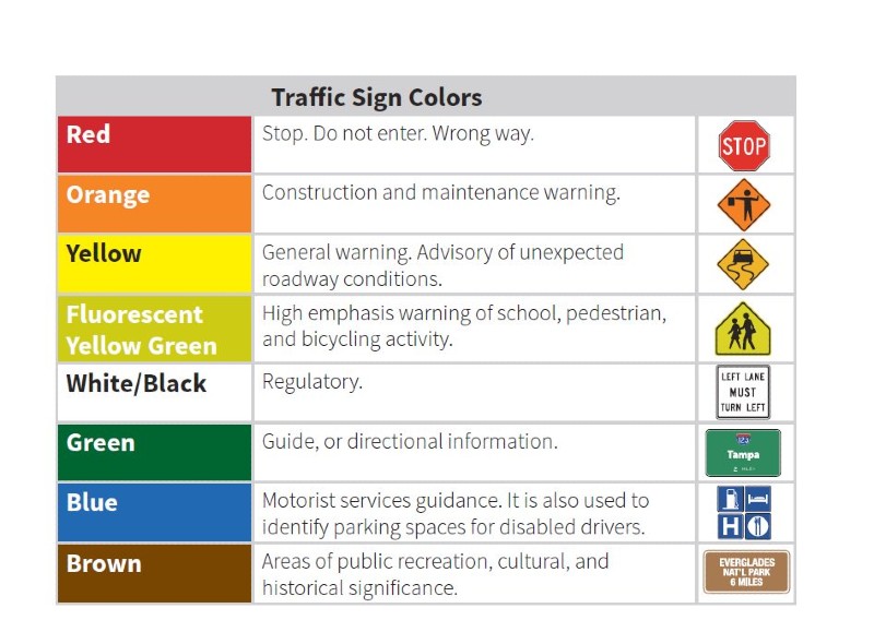
When we ask, “What color is a service sign?” the immediate response for most is instinctive: blue. Whether navigating the interstate highways of the United States or the motorways of Europe, the blue rectangular sign is the universal herald of motorist services—gas, food, lodging, and hospitals. However, in the world of brand strategy and corporate identity, the answer is far more complex. The “service sign” is not just a piece of painted metal on a roadside; it is a critical touchpoint in a brand’s physical ecosystem.
For brand strategists and designers, the color of a service sign represents the intersection of psychological triggers, regulatory standards, and consumer trust. It is the visual shorthand that tells a customer, “We are here to help.” This article explores the strategic importance of service signs within brand identity, the psychological underpinnings of color selection, and how businesses leverage these visual cues to build long-term brand equity.
The Blue Standard: Decoding the Universal Language of Service Signs
In the context of international transit and public infrastructure, blue is the gold standard for service-related information. This is not a coincidence or a mere aesthetic choice; it is a calculated decision rooted in safety and clarity. To understand the “Brand” behind the service sign, one must first understand the regulatory framework that established blue as the color of assistance.
Why Blue? Trust, Reliability, and Accessibility
In color psychology, blue is almost universally associated with stability, trust, and calmness. From a branding perspective, these are the primary attributes any service-oriented business wants to project. When a traveler is low on fuel or looking for a place to rest, they are in a state of mild cognitive stress. The color blue acts as a psychological “coolant,” signaling a solution to their problem without the urgency of red (danger) or the instructional nature of green (direction).
For a brand, occupying the “blue space” on a service sign allows them to inherit these pre-existing psychological associations. When a hotel chain or a fuel station appears on a blue service board, they are immediately framed as a reliable provider within a standardized system of care.
The Regulatory Framework of Wayfinding
The Manual on Uniform Traffic Control Devices (MUTCD) in the United States, and similar protocols globally, dictate that blue is reserved for “Motorist Services.” This creates a rigid but highly effective visual hierarchy. By adhering to these standards, brands participate in a larger “Environmental Graphic Design” (EGD) strategy.
In this niche, the brand identity must be flexible enough to fit within the constraints of regulatory blue while remaining distinct. The challenge for a corporate identity is to ensure that their logo—often designed with a completely different palette—still resonates and remains legible when placed against the mandatory blue background of a service sign.
Beyond the Road: Translating Service Signs into Brand Identity
While the physical highway sign is blue, the “service sign” within a retail environment or a corporate headquarters can take on many forms. In brand strategy, wayfinding and signage are extensions of the brand’s voice. A service sign in a high-end hotel might be brushed gold, while in a tech hub, it might be minimalist neon.
Establishing Authority through Environmental Branding
Environmental branding is the practice of using a physical space as a medium to communicate a brand’s values. In this context, a service sign—whether it points to a “Customer Experience Center” or a “Service Desk”—must align with the brand’s visual DNA.
If a brand positions itself as premium and exclusive, its service signs should reflect that through materials like marble, glass, or dark-toned metals. Conversely, a brand that focuses on speed and efficiency, like a fast-food giant or a logistics firm, will use high-contrast colors (often yellows and reds) to ensure their service points are found instantly. The “color” of the service sign, therefore, is dictated by the brand’s positioning in the market.
Consistency Across Physical and Digital Touchpoints
In the modern era, the “service sign” has migrated from the roadside to the smartphone screen. The “Help” icon or the “Customer Support” button on an app is the digital evolution of the blue highway sign.
Strategic branding requires that the visual cues used in the physical world (like the color of a service desk) match the digital UI. If a brand uses a specific shade of teal for its physical service kiosks, using that same shade for “Live Chat” icons creates a cohesive brand experience. This consistency reduces friction for the customer, as they are trained to look for a specific color whenever they require assistance.
Color Theory and Consumer Behavior in Service-Based Industries
The selection of color for service-related branding is a science that balances visibility with emotional impact. Brands do not choose colors because they “look good”; they choose them because they drive specific consumer behaviors.
The Emotional Impact of Cold vs. Warm Tones
The distinction between “cold” colors (blues, greens, purples) and “warm” colors (reds, oranges, yellows) is vital in service branding.
- Cold Tones: These are typically used for professional services, healthcare, and finance. A service sign in a bank is rarely bright red because red signifies “stop” or “danger.” Blue or green suggests “flow” and “security.”
- Warm Tones: These are used when a service requires immediate, high-energy engagement. Emergency services or “Express” pick-up lanes often use oranges and yellows to create a sense of urgency and speed.
A brand strategist must decide: Does the service we provide require the customer to feel calm and patient, or fast and energized? The answer determines the color of the signage.
High Visibility and Action-Oriented Design
In high-traffic environments like airports or shopping malls, the color of a service sign must prioritize “conspicuity”—the ability of an object to draw attention even when the viewer isn’t actively looking for it.
This is why “Service Recovery” areas—places where customers go when something has gone wrong—are often branded with high-contrast colors. The goal is to minimize the “search time” for a frustrated customer. In this scenario, the brand strategy shifts from “aesthetic harmony” to “functional utility.” The color must be bold enough to be seen through a crowd, often utilizing “safety yellow” or “vibrant magenta” to cut through visual noise.
Case Studies: Brands that Mastered the “Service Sign” Aesthetic
Looking at industry leaders reveals how the concept of a “service sign” can be manipulated to strengthen corporate identity.
Automotive and Travel: Engineering Trust
Companies like Hertz, AAA, and various airline lounges have turned their service signs into iconic brand assets. Hertz, for instance, uses a bright, signature yellow. While yellow is usually a warning color, in the context of car rentals, it has become a “service sign” for speed and accessibility. When a traveler sees that yellow glow in a dark airport terminal, it signals the end of their journey and the beginning of a seamless service experience.
Hospitality and Healthcare: Communicating Safety
In healthcare branding, the service sign is almost always a combination of white and blue or white and green. This “sterile” palette communicates cleanliness and professional competence. Mayo Clinic and similar institutions use subdued, professional tones in their wayfinding to lower the heart rate of patients and visitors. The “color” of the service here is not just an identifier; it is a part of the therapeutic process.
The Future of Signage: Digital Integration and Brand Evolution
As we move toward a more integrated, “Phygital” (Physical + Digital) world, the concept of the service sign is evolving. The color of a service sign is no longer static; it is becoming dynamic.
Interactive Wayfinding and User Experience (UX)
The next generation of brand strategy involves augmented reality (AR) wayfinding. Imagine a customer walking through a store and seeing a digital “service sign” hovering in their field of vision through a smartphone or AR glasses.
In this future, the color of the service sign might change based on the user’s needs. If a user is in a hurry, the brand’s service icons might shift to a high-contrast orange. If they are browsing, the icons might fade into a subtle, branded gold. This level of personalization allows the brand to provide “Service on Demand,” where the visual identity of the brand adapts to the psychological state of the consumer.
Adapting Visual Identity for a High-Speed Economy
As drone delivery and autonomous vehicles become mainstream, “service signs” will no longer be for humans alone. Brands will need to develop “Machine-Readable” signage. This might involve infrared colors or QR-coded patterns that are invisible to the human eye but act as a “service sign” for a delivery robot.
For the brand strategist, this means the “color” of service is expanding into spectrums we cannot see, yet it remains anchored in the same goal: providing a clear, unmistakable path to a solution.

Conclusion
So, what color is a service sign? While the highway department might insist on blue, the brand strategist knows the answer depends entirely on the “Service Value Support” a company aims to provide.
A service sign is a promise. Whether it is the trust-inducing blue of a roadside rest stop, the high-energy yellow of a rental hub, or the calming teal of a digital support app, the color is a strategic tool. It serves to guide, to reassure, and ultimately, to define the relationship between a brand and its customer. In the competitive landscape of modern business, mastering the color and placement of these signs is not just about design—it is about claiming a permanent spot in the consumer’s mental map.
aViewFromTheCave is a participant in the Amazon Services LLC Associates Program, an affiliate advertising program designed to provide a means for sites to earn advertising fees by advertising and linking to Amazon.com. Amazon, the Amazon logo, AmazonSupply, and the AmazonSupply logo are trademarks of Amazon.com, Inc. or its affiliates. As an Amazon Associate we earn affiliate commissions from qualifying purchases.