In the world of visual communication, color is never just a decorative choice; it is a psychological trigger, a historical marker, and a strategic asset. When a brand asks, “What color combo makes purple?” they are rarely looking for a simple primary school lesson in mixing paint. Instead, they are inquiring about the chemical, digital, and psychological components that create one of the most complex hues in the visible spectrum.
For brand strategists and designers, purple represents the ultimate balance between the visceral energy of red and the stable serenity of blue. This intersection creates a color that is unique, evocative, and—if leveraged correctly—highly profitable. To master the use of purple in branding, one must understand its composition, its digital rendering, and the specific emotional weight it carries in the global marketplace.

The Science of the Mix: Understanding the Components of Purple
To understand how to build a brand identity around purple, we must first master its physical and digital construction. Purple does not exist as a primary color in the traditional RYB (Red, Yellow, Blue) model used by artists, nor in the CMYK model used by printers. It is a secondary color, born from the marriage of opposites.
Primary Foundations: The Balance of Red and Blue
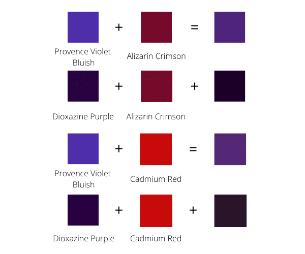
At its most basic level, purple is created by mixing red and blue. However, the specific “combo” used determines the brand’s personality. A purple with a higher concentration of red leans toward “plum” or “magenta,” evoking warmth, passion, and high energy. This is often seen in brands that want to appear creative yet approachable.
Conversely, a purple with a higher concentration of blue results in “violet” or “indigo.” These shades are cooler, more reserved, and suggest a sense of deep mystery, reliability, and wisdom. For a brand, the ratio of the mix is the difference between being perceived as a daring innovator (red-dominant) or a sophisticated authority (blue-dominant).
The Digital Shift: Hex Codes and CMYK
In the modern branding landscape, the “mix” happens in two distinct environments: light and ink.
- RGB (Red, Green, Blue): In the digital space, purple is created by combining high levels of red and blue light while keeping green at a minimum. For example, a classic royal purple might have a Hex code of #6A0DAD.
- CMYK (Cyan, Magenta, Yellow, Key/Black): For physical branding—packaging, business cards, and signage—the mix is different. Achieving a vibrant purple in print is notoriously difficult because “Purple” often requires a high percentage of Magenta and Cyan. If the balance is off by even 5%, the result can look “muddy” or overly dark, which can damage brand perception.
The Psychology of Purple in Modern Branding
Once the technical “combo” is understood, a brand must consider the psychological implications of the result. Purple is rare in nature, which historically made it the most expensive dye to produce. This rarity has hard-coded certain associations into the human subconscious.
Luxury, Exclusivity, and the “Royal” Heritage
Historically, “Tyrian Purple” was reserved for emperors and monarchs because it was derived from thousands of tiny sea snails, making it more valuable than gold. In modern brand strategy, this heritage translates to “Premium” and “Exclusivity.”
Brands like Hallmark or Asprey use purple to signal that they are the keepers of tradition and high standards. When a brand chooses a deep, rich purple combo, they are silently telling the consumer: “This product is worth more. It is not for everyone; it is for those who appreciate the finer things.”
Creativity, Innovation, and the Supernatural
Because purple sits at the end of the visible light spectrum, just before it turns into invisible ultraviolet light, it has long been associated with the “unseen”—imagination, spirituality, and the future. This makes it an ideal choice for brands in the creative or tech sectors that want to position themselves as “disruptors.”
Purple suggests that the brand is not afraid to think differently. It is the color of the dreamer and the visionary. By mixing a vibrant, neon-leaning purple, a brand can distance itself from the “boring” corporate blues of the financial world and the “aggressive” reds of the fast-food industry.
Creating a Cohesive Brand Palette with Purple

A brand is rarely defined by a single color. The “combo” that makes purple must also play well with other colors to create a functional brand identity system.
Choosing the Right Complementary Colors
In design strategy, purple’s natural complement on the color wheel is yellow. This high-contrast pairing creates visual vibrations that are attention-grabbing and energetic (think of the Los Angeles Lakers or FedEx). However, for a more sophisticated corporate identity, brand designers often look toward “analogous” schemes—pairing purple with blues and magentas—to create a sense of harmony and depth.
Gold is another frequent partner for purple in branding. This combination doubles down on the “luxury” narrative, creating an aesthetic of opulence and high-tier service. When building a brand palette, the “purple combo” serves as the anchor, but the accent colors determine whether the brand feels “playful” or “professional.”
Maintaining Consistency Across Media
One of the greatest challenges in brand management is “color drift.” Because the mix of red and blue reacts differently to different materials, a purple that looks stunning on a MacBook Pro screen might look dull on a recycled cardboard shipping box.
To combat this, brands must establish strict “Brand Guidelines.” This includes identifying the exact Pantone Matching System (PMS) spot color for purple. Using a spot color ensures that the “combo” remains identical whether it is printed in London, New York, or Tokyo, maintaining the integrity of the corporate identity.
Strategic Implementation: Case Studies in Purple Branding
To see how the “red plus blue” combo translates into market share, we can look at several industry leaders who have claimed purple as their primary brand equity.
The Tech Disruption: Twitch and Yahoo
Twitch is perhaps the most famous modern example of “Digital Purple.” Their specific shade is vibrant and saturated, designed to pop against the dark mode interfaces favored by the gaming community. For Twitch, purple represents a “third space”—neither the work-centric blue of LinkedIn nor the social red of YouTube. It is a space for community and creativity.
Yahoo, on the other hand, used purple to differentiate itself during the early days of the internet. In a sea of blue links and primary-colored logos (like Google), Yahoo’s purple was a signal of personality and a more “lifestyle-oriented” approach to the web.
The Premium Experience: Cadbury and FedEx
In the FMCG (Fast-Moving Consumer Goods) sector, Cadbury’s use of purple is so iconic that they famously attempted to trademark the specific shade (Pantone 2685C). For Cadbury, the purple combo conveys a sense of “velvety richness,” elevating a simple chocolate bar into a small luxury.
FedEx utilizes purple in a more functional, “Split-Complementary” way. By pairing a deep purple with a vibrant orange, they create a brand mark that is highly visible on the road and implies both “Authority” (Purple) and “Speed/Action” (Orange). This strategic mix has made their logo one of the most recognized in the world.
Future-Proofing Your Brand Identity
As we move further into a digital-first economy, the “purple combo” is evolving. With the rise of OLED screens and high-dynamic-range (HDR) displays, brands are now able to utilize purples that were previously impossible to render. These “Electric Purples” are becoming the shorthand for AI, Biotech, and Future-Tech brands.
However, the core principles of brand strategy remain the same. To use purple effectively, a brand must:
- Define the Ratio: Is your brand more “Blue” (Reliable) or more “Red” (Exciting)?
- Audit the Environment: Will your purple live primarily on a smartphone screen or a physical storefront?
- Respect the Heritage: Are you leaning into the luxury of the past or the innovation of the future?
In conclusion, “what color combo makes purple” is a question that opens the door to the very heart of brand design. It is a color of complexity, requiring a delicate balance of light, pigment, and psychology. By mastering the mix, a brand can occupy a unique space in the consumer’s mind—one that feels both established and imaginative, royal yet rebellious. Whether you are a startup looking to disrupt a stagnant market or a legacy firm looking to refresh your identity, the strategic application of purple offers a path to a truly distinctive brand presence.
aViewFromTheCave is a participant in the Amazon Services LLC Associates Program, an affiliate advertising program designed to provide a means for sites to earn advertising fees by advertising and linking to Amazon.com. Amazon, the Amazon logo, AmazonSupply, and the AmazonSupply logo are trademarks of Amazon.com, Inc. or its affiliates. As an Amazon Associate we earn affiliate commissions from qualifying purchases.