
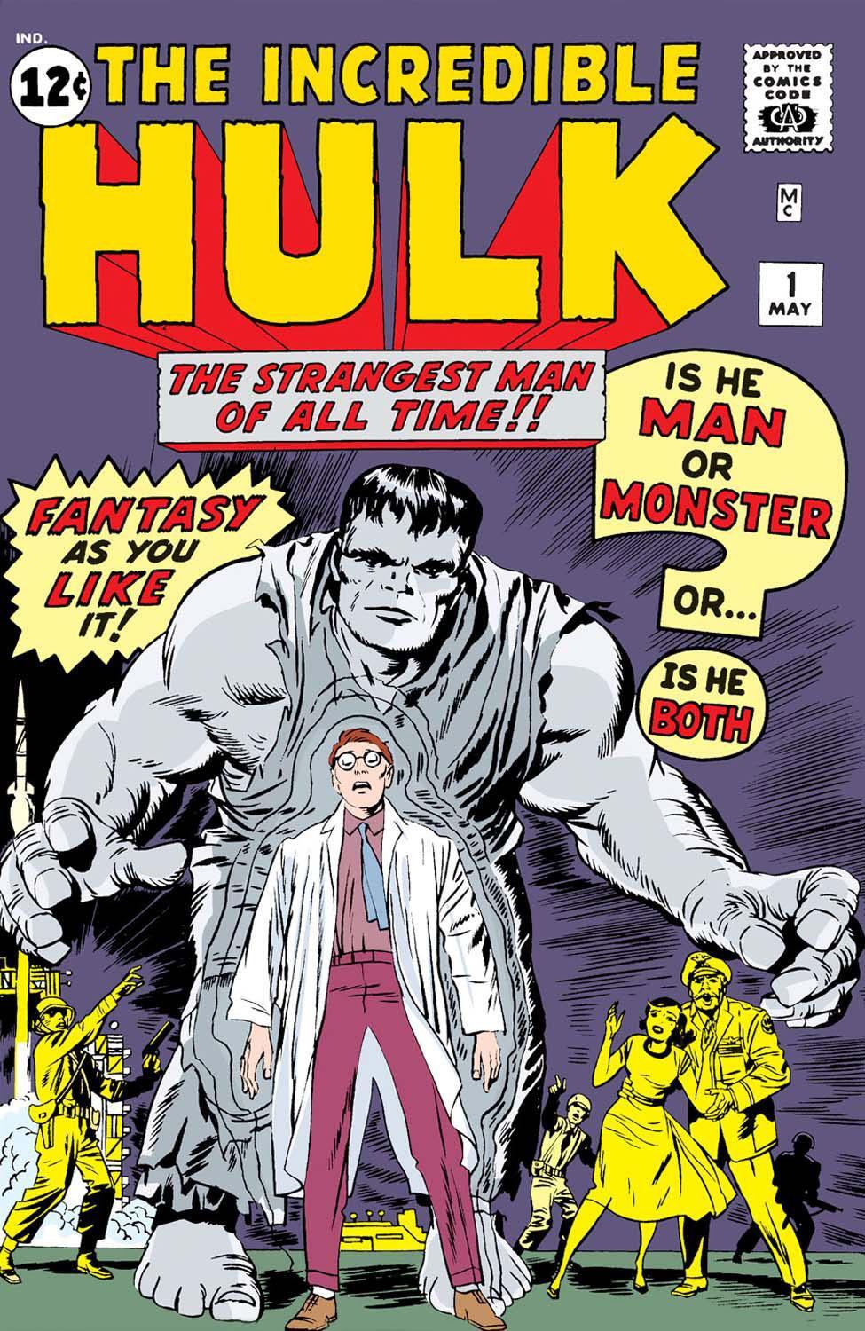
In the world of corporate identity and character marketing, few transformations are as iconic—or as accidental—as the color shift of the Incredible Hulk. While the world today recognizes the Marvel powerhouse as a towering jade giant, the initial vision for the character was starkly different. When Stan Lee and Jack Kirby first introduced the character in The Incredible Hulk #1 in 1962, the Hulk was not green; he was grey.
This shift from grey to green is more than a fun fact for comic historians; it is a profound case study in brand evolution, the impact of technical constraints on design, and the power of visual psychology in building a global franchise. For modern brand strategists, the story of the Hulk’s color provides invaluable insights into how flexibility, market feedback, and visual consistency can define the longevity of a brand.
The Origin of the Grey Hulk: A Branding Misstep or a Creative Vision?
When Stan Lee conceptualized the Hulk, his goal was to create a character that transcended the traditional tropes of superheroes. Drawing inspiration from Mary Shelley’s Frankenstein and Robert Louis Stevenson’s Dr. Jekyll and Mr. Hyde, Lee wanted a protagonist who lived in the shadows of morality. The choice of grey was a deliberate branding decision intended to evoke a specific emotional response.
The Psychology of Grey: Why Stan Lee Chose it Initially
In the early 1960s, the superhero landscape was dominated by primary colors. Superman wore bright blue and red; the Fantastic Four were clad in sky blue. By choosing grey for the Hulk, Lee intended to signify neutrality. He didn’t want the character to be associated with any specific ethnic group or political ideology. Grey represented the “monster” within—a character that was neither hero nor villain, but a tragic figure caught in a cycle of rage.
From a branding perspective, grey was meant to suggest sophistication and a departure from the “kid stuff” of earlier decades. It was a somber, muted choice that reflected the Cold War anxieties of the era. However, while the creative vision was strong, the brand failed to account for the physical medium through which it would be delivered.
Visual Consistency and the “Everyman” Appeal
A brand’s identity is only as strong as its ability to be recognized consistently across different touchpoints. In the premiere issue, the grey Hulk struggled with this. Depending on the page, the character appeared light grey, dark charcoal, or even slightly silver. This inconsistency weakened the brand’s visual hook. For a new intellectual property (IP) to gain traction, the audience needs a clear, unchanging visual anchor. The grey Hulk, though philosophically sound, lacked the visual “pop” required to dominate a crowded newsstand.
Technical Constraints as a Catalyst for Rebranding
The pivot from grey to green was not the result of a high-level boardroom strategy or a focus group. Instead, it was a reaction to the technical limitations of 1960s printing technology. This serves as a reminder to modern designers that brand identity is often dictated by the limitations of the medium, whether that medium is a 4-color printing press or a smartphone screen.
The Printing Limitations of the 1960s
During the Silver Age of comics, publishers relied on a limited palette of CMYK (Cyan, Magenta, Yellow, and Black) inks. Creating a consistent shade of grey was notoriously difficult for printers. Grey is achieved by mixing small percentages of these colors, and the slightest variation in ink flow would result in a character that looked green on one page and purple on the next.
Stan Lee noticed that in the first issue, the Hulk’s color was wildly inconsistent. To maintain the integrity of the brand and ensure that the character looked the same in every panel, a change was mandatory. This illustrates a key rule in brand strategy: functional reliability often supersedes aesthetic preference. If you cannot reproduce your brand assets consistently, your brand identity will eventually erode.
Turning a Glitch into a Feature: The Decision to Go Green
Faced with the printing debacle, Lee asked the production team what color would be the easiest and most consistent to print. The answer was green. Unlike grey, green was a primary secondary color (within the context of comic ink mixing) that remained vibrant and stable across high-volume print runs.
By making the Hulk green, Marvel inadvertently stumbled upon one of the most successful rebrands in history. They took a technical “bug” and turned it into the character’s defining feature. This agility—the ability to pivot based on production reality while keeping the core narrative intact—is what allowed the Hulk brand to survive its rocky start.
The Power of Green: Color Psychology in Modern Marketing
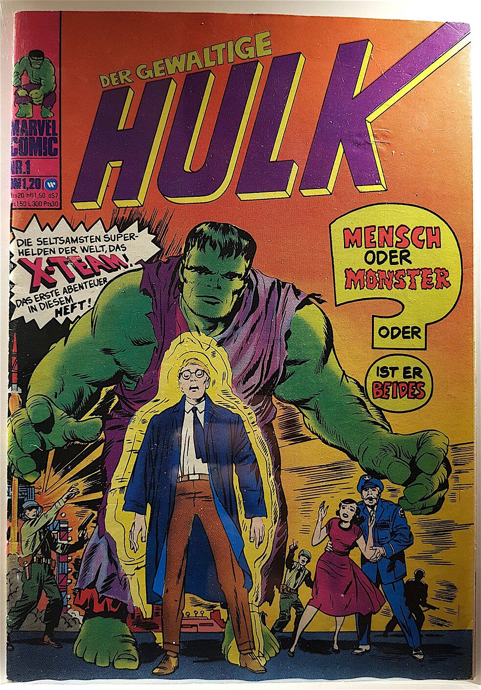
Once the transition to green was finalized, the Hulk’s popularity exploded. This wasn’t just because the printing was better; it was because green tapped into a different set of psychological triggers that resonated more deeply with the audience.
Why Green Resonates with Global Audiences
In the realm of brand strategy, color is a silent communicator. Green is often associated with growth, nature, and vitality, but in its darker or more fluorescent shades, it signifies toxicity, envy, and radioactive danger. For a character birthed from a gamma bomb, green was the perfect visual metaphor.
The “Hulk Green” became a brand asset in its own right. It stood out against the red-and-yellow uniforms of other characters, providing a visual contrast that made the character instantly recognizable from a distance. In branding, being “different” is often more valuable than being “better.” The Hulk didn’t need to be the most complex character; he just needed to be the most visible one.
Establishing Visual Dominance in a Crowded Market
The green skin of the Hulk allowed Marvel to own a specific color territory. When consumers saw that specific shade of vibrant green on a lunchbox, a t-shirt, or a toy, they didn’t need to see a logo to know it was a Marvel product. This is the pinnacle of brand identity—when a single attribute of the product (the color) acts as the logo itself. By moving away from the “muddy” and “uncertain” grey, the brand adopted a “bold” and “unapologetic” green that demanded attention.
Maintaining Brand Integrity Across Multi-Platform Media
As the Hulk moved from comic books to television and eventually the Marvel Cinematic Universe (MCU), the challenge shifted from printing consistency to digital fidelity. The brand had to ensure that the “Hulk” identity remained intact across drastically different formats.
The “Incredible Hulk” Brand Consistency in the MCU
When bringing the Hulk to the big screen, Marvel Studios faced a new challenge: making a giant green man look “realistic” in a live-action setting. They couldn’t just use any shade of green; they had to develop a digital skin tone that felt organic yet maintained the “brand green” established in 1962.
Modern branding requires this type of cross-platform adaptability. Whether a brand is viewed on a billboard, a 4K television, or a low-resolution mobile ad, the core brand elements must feel unified. Marvel’s success lies in their ability to evolve the Hulk’s texture and physiology while never compromising on the signature green that defines the brand.
Leveraging the Grey Hulk (Joe Fixit) as a Sub-Brand
Interestingly, Marvel didn’t abandon the grey Hulk entirely. Decades later, they reintroduced the grey version as a separate persona named “Joe Fixit.” This was a brilliant move in brand architecture. Instead of discarding the original, failed design, they repurposed it as a “prestige” or “niche” sub-brand for dedicated fans.
This taught marketers a valuable lesson: your early iterations and “mistakes” can eventually be mined for nostalgia and used to expand your product line. By segmenting the “Green Hulk” as the mass-market brand and the “Grey Hulk” as the collector-tier brand, Marvel maximized the value of their IP.
Lessons for Modern Brands: Flexibility and Evolution
The journey from a grey monster to a green icon offers several high-level takeaways for anyone involved in brand management, marketing, or design.
Embracing Accidental Success
Sometimes, the best branding decisions are made for you by external circumstances. The shift to green was forced by the “tech” of the time, but the brand’s stewards were wise enough to embrace it rather than fight it. A brand that is too rigid to change in the face of technical or market reality is a brand that is destined to fail.
The Longevity of a Strong Visual Identity
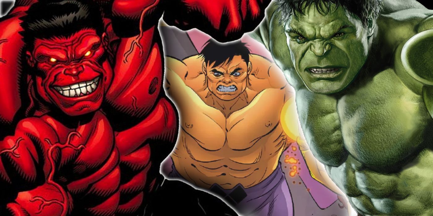
The Hulk has remained a top-tier global brand for over 60 years because his visual identity is simple, scalable, and distinct. You don’t need a complicated brand story if your visual hook is strong enough to be understood by a five-year-old in any country. Green + Muscle = Hulk. This simplicity is the ultimate goal of brand strategy.
In conclusion, the Hulk was originally grey because of a creative desire for nuance, but he became green because of a practical need for consistency. This evolution transformed a struggling comic book character into a multi-billion dollar brand. It serves as a permanent reminder that in the world of branding, how your audience perceives you is often shaped by the tools you use, the colors you choose, and your willingness to turn a technical limitation into a global trademark.
aViewFromTheCave is a participant in the Amazon Services LLC Associates Program, an affiliate advertising program designed to provide a means for sites to earn advertising fees by advertising and linking to Amazon.com. Amazon, the Amazon logo, AmazonSupply, and the AmazonSupply logo are trademarks of Amazon.com, Inc. or its affiliates. As an Amazon Associate we earn affiliate commissions from qualifying purchases.