When someone asks, “What color is Coca-Cola?” the answer depends entirely on whether you are looking at the liquid inside the bottle or the emblem on the outside. This duality—the deep, caramel-hued mystery of the beverage and the vibrant, high-octane red of the packaging—represents one of the most successful brand strategies in corporate history.
In the world of brand identity, color is never an accident. For Coca-Cola, color is a multi-billion-dollar asset. It is a psychological trigger, a historical marker, and a global shorthand for a specific type of consumer experience. To understand why Coca-Cola is the color it is, we must look beyond the surface and examine the intersection of marketing psychology, visual consistency, and brand equity.

The Liquid vs. The Logo: Understanding the Dual Color Identity
To provide a comprehensive answer, we must first distinguish between the physical product and the corporate identity. While the world recognizes the brand by its primary red, the product itself occupies a very different space on the color spectrum.
The Mystery of the Dark Liquid (Caramel E150d)
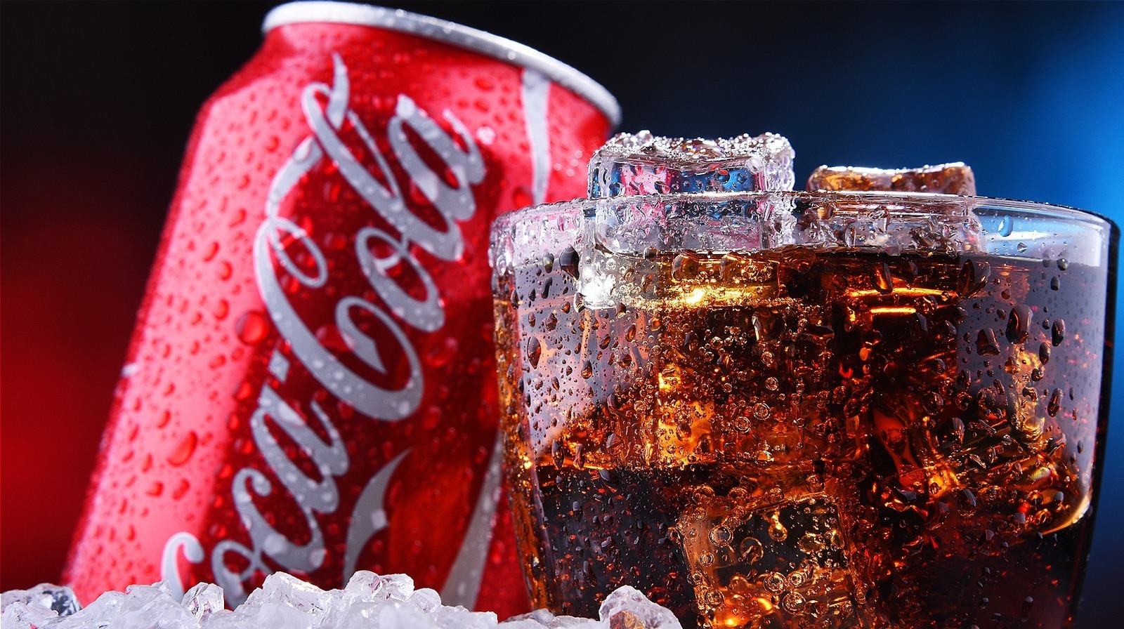
Technically, the liquid color of Coca-Cola is a deep, translucent brown. This is achieved through the use of “Caramel E150d,” a coloring agent produced through the controlled heat treatment of carbohydrates. Without this coloring, the beverage would likely be clear or slightly off-white, given its primary ingredients of carbonated water, sugar, and phosphoric acid.
From a brand strategy perspective, this dark hue serves a functional and emotional purpose. Dark liquids are often perceived by consumers as “richer” and “bolder” in flavor. The deep brown creates an aesthetic of density and tradition, distancing the product from the “thinness” associated with clear sodas. It provides a visual weight that matches the complexity of its secret formula.
The Iconic Red: More Than Just a Pigment
When marketers speak about the “color” of Coca-Cola, they are almost always referring to “Coke Red.” This specific shade is so synonymous with the company that it is often cited as the second most recognized “word” or symbol in the world, trailing only behind the word “Okay.”
The origin of the red color dates back to the late 19th century. During the early days of the company, Coca-Cola was sold in barrels at drugstores and soda fountains. To distinguish their product from alcohol shipments—which were taxed heavily at the time—the company painted their barrels red so that tax commissioners could easily identify them during transport. What began as a logistical necessity evolved into a cornerstone of the brand’s visual DNA.
The Strategy of Red: Why Color Defines Market Leadership
In brand management, color is used to bypass the logical brain and speak directly to the emotional centers. Coca-Cola’s choice to lean into red as its primary identifier is a masterclass in sensory marketing.
Psychological Triggers of the Coca-Cola Red
Red is a color of high physiological impact. It is known to increase heart rates, stimulate the appetite, and evoke feelings of urgency and excitement. For a brand that sells “happiness” and “refreshment,” these triggers are vital. By associating the product with a color that demands attention, Coca-Cola ensures that it remains the focal point of any retail environment.
Furthermore, red is culturally associated with passion and energy. By consistently utilizing this hue, the brand positions itself as an active participant in the consumer’s life—whether at a sporting event, a holiday dinner, or a casual gathering. The color does the heavy lifting of the brand promise before the consumer even takes a sip.
Consistency Across Continents
One of the greatest challenges for a global brand is maintaining visual fidelity across different markets, printing technologies, and materials. Coca-Cola’s brand strategy hinges on “Extreme Consistency.” Whether you are looking at a billboard in Tokyo, a glass bottle in Mexico, or a digital ad in New York, the red must be identical.
This consistency creates a “trust bridge.” When a consumer sees that specific shade of red, they subconsciously expect a specific taste and quality. Any deviation in color—a faded sign or a misprinted can—can lead to a perceived drop in product quality. For Coca-Cola, maintaining the exact specifications of their red is a logistical feat that involves rigorous quality control across thousands of global suppliers.
Visual Branding as a Competitive Moat
In the hyper-competitive beverage industry, visual identity acts as a defensive barrier, or “moat,” that protects market share from competitors and private labels.
Standing Out on the Shelf (The Contrast Principle)
The retail “shelf war” is won in milliseconds. Because Coca-Cola has claimed red so effectively, its main competitor, Pepsi, was forced to pivot toward blue to create a distinct visual contrast. This “Red vs. Blue” dichotomy has defined the soda wars for decades.
By occupying the most aggressive end of the color spectrum, Coca-Cola forces competitors to find alternative visual spaces. This creates a clear mental map for the consumer: Red equals the “original,” the “classic,” and the “standard.” The color itself becomes a shorthand for market leadership, making it difficult for new entrants to gain traction without being perceived as “imitators.”
Protection of Intellectual Property Through Color
While you cannot trademark a color in the abstract, you can protect a specific “color in commerce” if it has acquired secondary meaning. Coca-Cola’s use of red is so inextricably linked to its brand that it enjoys significant legal protections.
This visual property is part of the brand’s intangible assets, valued in the billions. The company’s legal and marketing teams work in tandem to ensure that no other beverage brand utilizes a similar shade of red in a way that could cause consumer confusion. In this sense, the color isn’t just a design choice—it’s a legal fortress.
Evolution of the Brand Palette: Can Coca-Cola Exist in Other Colors?
A common question in brand strategy is how much a brand can deviate from its core identity without losing its essence. Coca-Cola has experimented with this, providing valuable case studies on the limits of visual branding.
The White Can Controversy and Seasonal Shifts
In 2011, as part of a partnership with the World Wildlife Fund (WWF) to protect polar bears, Coca-Cola released a limited-edition white can. While the intention was noble, the result was a marketing catastrophe. Consumers were confused, with many claiming that the soda tasted different in a white can, even though the formula was unchanged.
This incident highlighted the power of the “Color-Taste Connection.” The red can is so mentally linked to the flavor profile of the drink that changing the color actually altered the perceived sensory experience. The company quickly reverted to red, proving that for Coca-Cola, red is not just a package; it is an ingredient in the consumer’s mind.
Diet Coke and Coke Zero: Expanding the Visual Language
To diversify its product line while maintaining brand equity, Coca-Cola introduced silver for Diet Coke and black for Coca-Cola Zero Sugar. These were strategic moves to signal different value propositions:
- Silver/Grey: Associated with “lightness,” “modernity,” and “dietary sophistication.”
- Black: Associated with “premium,” “boldness,” and “masculinity,” intended to appeal to male consumers who might be deterred by the “Diet” label.
Even in these variations, the “Coke Red” often remains present in the logo or as a secondary accent, acting as an anchor to the parent brand’s heritage.
The Future of Brand Color in a Digital-First World
As we move further into a digital and sustainable era, the way Coca-Cola utilizes its color identity is evolving. The transition from physical shelves to mobile screens and from plastic bottles to eco-friendly packaging presents new challenges.
Adaptability in Digital Marketing
On high-resolution OLED screens, the Coca-Cola red looks more vibrant than ever. In the digital realm, the brand uses its color to create “thumb-stopping” content. The red acts as a high-contrast backdrop for liquid photography and social media assets, ensuring that the brand is recognizable even when scaled down to a smartphone icon.
The strategy here is “Digital Saturation.” By flooding its digital presence with its signature hue, the brand maintains its mental real estate in an increasingly crowded information economy.
Sustainability and Packaging Evolution
One of the biggest shifts in brand identity today is the move toward “naked” or sustainable packaging. As Coca-Cola explores label-less bottles and 100% recycled plastics to meet environmental goals, the question arises: How does the brand maintain its red identity without a plastic sleeve or a painted can?
The answer lies in the “Structural Branding.” The silhouette of the contour bottle, combined with subtle red accents on the cap or via laser-engraved logos, ensures that the brand identity survives even as the materials change. The “color” of Coca-Cola is becoming less about the literal paint and more about the “aura” of the brand—a combination of shape, history, and a flash of red that signals the presence of the icon.

Conclusion
So, what color is Coca-Cola? Physically, it is a complex, caramel-toned brown. Strategically, it is a proprietary, high-energy red.
For the modern marketer or brand strategist, Coca-Cola serves as the ultimate example of how color can be leveraged to build a global empire. It teaches us that a color is not just a visual choice; it is a promise of consistency, an emotional anchor, and a competitive shield. Whether it’s the liquid in the glass or the logo on the billboard, every pigment is a deliberate step toward maintaining one of the most powerful brand identities in human history. By mastering its color, Coca-Cola has ensured that it doesn’t just sell a drink—it sells a visual experience that is recognized in every corner of the globe.
aViewFromTheCave is a participant in the Amazon Services LLC Associates Program, an affiliate advertising program designed to provide a means for sites to earn advertising fees by advertising and linking to Amazon.com. Amazon, the Amazon logo, AmazonSupply, and the AmazonSupply logo are trademarks of Amazon.com, Inc. or its affiliates. As an Amazon Associate we earn affiliate commissions from qualifying purchases.