In the competitive landscape of regional identity and place branding, symbols serve as the visual and emotional shorthand for a location’s values, history, and aspirations. For the state of Colorado, few symbols carry as much weight or architectural elegance as the Colorado Blue Spruce (Picea pungens). Designated as the official state tree in 1939, this evergreen has transcended its botanical roots to become a cornerstone of the “Colorado Brand.”
In the world of brand strategy, a state symbol is more than a legislative gesture; it is a primary asset in a jurisdictional portfolio. Understanding the Colorado Blue Spruce through the lens of brand identity allows us to see how natural heritage is leveraged to build global recognition, drive tourism, and foster a sense of corporate and civic belonging.
The Power of Regional Symbolism in Corporate and Civic Branding
Branding is the art of differentiation. In a globalized economy, regions must compete for talent, investment, and tourism. The Colorado Blue Spruce provides a distinct visual and conceptual differentiator that positions the state as a bastion of resilience, symmetry, and rugged sophistication.
Decoding the Visual Language of the Blue Spruce
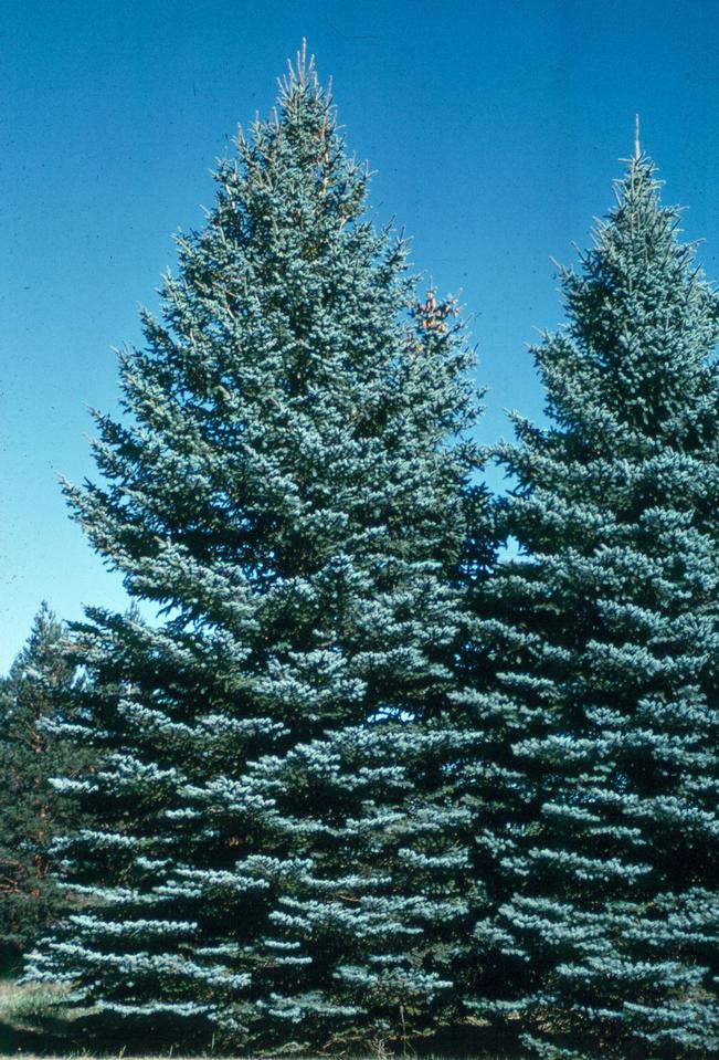
From a design perspective, the Blue Spruce offers a unique palette. Its signature silvery-blue needles provide a “cool” color temperature that differentiates it from the standard forest greens of the Pacific Northwest or the muddy browns of the high desert. In branding, color psychology plays a vital role. The “Colorado Blue” evokes a sense of stability, trust, and clarity—traits that are highly sought after by both state agencies and private enterprises looking to align themselves with the Colorado ethos.
The tree’s conical shape also serves as a geometric foundation for graphic design. Its symmetry suggests order and growth, making it an ideal motif for logos that need to communicate reliability. When a brand incorporates the silhouette of a spruce, it is not just showing a tree; it is signaling an alignment with the verticality and “peak performance” associated with the Rocky Mountains.
From Botanical Asset to State Trademark
The adoption of the Blue Spruce was a strategic move in establishing Colorado’s “Mountain Majesty” brand. By claiming a specific species as a state representative, Colorado successfully trademarked a specific aesthetic in the minds of the public. This is a classic example of brand positioning: by associating the state with a tree that is both hardy (resilient to cold) and beautiful (ornamental value), the state communicates its own dual nature as a place that is both a rugged frontier and a sophisticated cultural hub.
Strategic Integration: How Colorado Brands Leverage Natural Heritage
Effective branding requires the seamless integration of core symbols into marketing collateral. The Colorado Blue Spruce is utilized across various sectors to anchor the state’s identity in authenticity and natural beauty.
Tourism and the “Great Outdoors” Aesthetic
The Colorado Tourism Office (CTO) and various regional visitors’ bureaus use the imagery of the Blue Spruce to sell an experience. In the “Come to Life” campaigns, the tree acts as a backdrop for the Colorado lifestyle. It serves as a visual anchor that tells a story of year-round vitality—from snow-covered winter landscapes to the lush, high-altitude summers.
By centering the brand on a living organism like the state tree, marketers tap into the “biophilia effect,” where consumers feel a natural affinity and positive emotional response to nature-based imagery. This enhances the brand equity of the state, making it not just a destination on a map, but a sensory experience defined by the scent of pine and the visual shimmer of blue needles.
Logo Design and the Rule of Local Authenticity
For local businesses, the Blue Spruce is a shortcut to establishing “local salt.” In brand strategy, authenticity is a high-value currency. A startup in Denver or a brewery in Fort Collins that incorporates spruce elements into its packaging is signaling its roots.

This is particularly evident in the craft beverage and outdoor gear industries. By using the state tree in their corporate identity, these brands piggyback on the existing positive associations of the Colorado brand. They aren’t just selling a product; they are selling a piece of the Colorado landscape. This strategic alignment helps small to medium enterprises (SMEs) gain immediate trust with a local audience while projecting a “premium” image to out-of-state consumers who associate Colorado with quality and outdoor purity.
Case Studies: Branding Excellence Rooted in Colorado’s Soil
To understand the practical application of this natural brand asset, we can look at how various sectors have successfully integrated the essence of the Colorado Blue Spruce into their market positioning.
The Tech Sector’s Rebrand Toward Nature
In recent years, Colorado—specifically the Boulder-Denver-Fort Collins corridor—has emerged as a “Silicon Mountain.” Interestingly, many tech firms in the region have moved away from the sterile, minimalist “Silicon Valley” aesthetic in favor of a brand identity that reflects their environment.
Software companies and AI labs in the region often use the Blue Spruce or its abstracted forms in their office design and digital branding. This serves a dual purpose: it aids in talent acquisition by emphasizing the “work-life balance” and “outdoor access” that Colorado offers, and it softens the cold perception of technology. By branding a tech firm with the silver-blue hues of the state tree, the company positions itself as “natural tech”—innovative yet grounded.
Small Business and the “Made in Colorado” Seal
The “Made in Colorado” program is a masterclass in collective branding. While the program uses various symbols, the presence of the Blue Spruce is ubiquitous in the marketing of artisanal goods. From skincare lines that use spruce-infused scents to furniture makers who highlight the wood’s aesthetic, the tree acts as a seal of quality.
When a consumer sees the spruce associated with a product, the brand strategy at play is “provenance branding.” The consumer assumes the product is durable, sustainably sourced, and representative of the high-altitude excellence that the tree itself symbolizes. This collective branding effort allows individual small businesses to punch above their weight class on a national scale.
Sustainability as a Brand Pillar: Protecting the Living Asset
In the modern era, a brand is only as strong as its values. As climate change impacts the health of subalpine forests, the Colorado Blue Spruce has moved from a static symbol to a dynamic component of the state’s Corporate Social Responsibility (CSR) narrative.
Conservation as Corporate Social Responsibility (CSR)
Forward-thinking Colorado brands are increasingly linking their corporate identity to the preservation of the state tree. We see this in “One Tree Planted” initiatives where Colorado-based companies pledge to plant Blue Spruces for every product sold.
This is a strategic move in brand architecture. By taking an active role in the conservation of their state symbol, these companies move from “using” the brand to “stewarding” it. This builds immense brand loyalty among Gen Z and Millennial consumers, who prioritize environmental impact in their purchasing decisions. A brand that protects the Colorado Blue Spruce is seen as a brand that protects the Colorado future.

The Future of the Blue Spruce in Colorado’s Global Brand Positioning
As Colorado continues to grow as a global hub for aerospace, renewable energy, and outdoor recreation, the Blue Spruce remains a vital asset in its brand portfolio. The challenge for brand strategists moving forward is to keep the symbol fresh and relevant.
The evolution of the “Colorado Brand” will likely see a shift from the literal representation of the tree to more metaphorical and abstract uses. We are seeing this in modern architecture within the state, where the “Blue Spruce aesthetic”—characterized by verticality, silver-toned materials, and glass that reflects the mountain sky—is becoming a dominant design language. This ensures that even as the state urbanizes, its foundational brand identity remains rooted in the natural icon that was chosen nearly a century ago.
In conclusion, the Colorado Blue Spruce is far more than a “state tree.” It is a sophisticated branding tool that communicates the state’s unique value proposition. Whether through the cool tones of its needles, the resilience of its bark, or the symmetry of its growth, the spruce provides a blueprint for an authentic, enduring, and prestigious brand identity. For any business or entity operating within the state, the Blue Spruce offers a masterclass in how to root a brand in the power of place.
aViewFromTheCave is a participant in the Amazon Services LLC Associates Program, an affiliate advertising program designed to provide a means for sites to earn advertising fees by advertising and linking to Amazon.com. Amazon, the Amazon logo, AmazonSupply, and the AmazonSupply logo are trademarks of Amazon.com, Inc. or its affiliates. As an Amazon Associate we earn affiliate commissions from qualifying purchases.