
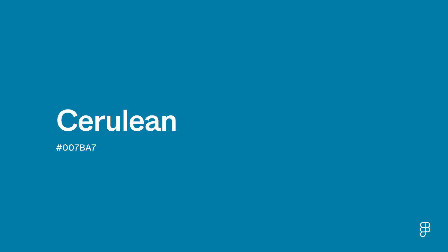
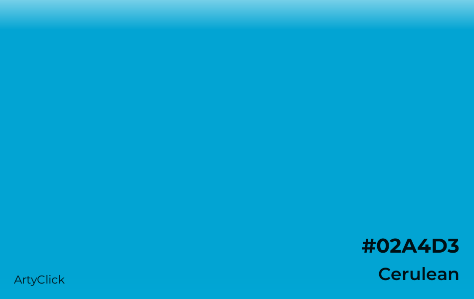
In the high-stakes world of corporate identity and marketing, a color is rarely just a color. It is a psychological trigger, a cultural signifier, and a strategic asset. When we ask, “What colour is cerulean?” we are diving into a spectrum that sits precisely between the deep reliability of navy and the playful vibrancy of sky blue. Cerulean is a rich, calming, yet authoritative shade of blue that has become a cornerstone of modern brand strategy.
For brand architects and designers, cerulean represents more than just a hex code; it represents a bridge between tradition and innovation. Understanding its nuances is essential for any professional looking to master the art of visual communication and personal branding.
1. The Psychology of Cerulean: Why Brands Choose This Specific Hue
In branding, color is the first thing a consumer notices—often subconsciously. Blue, in general, is the most globally preferred color for corporate identities because it invokes feelings of trust, security, and intelligence. However, cerulean occupies a unique niche within the blue family.
The Emotional Impact of Cerulean
Cerulean is frequently described as the color of the sky on a perfectly clear day. Psychologically, this evokes feelings of “expansive thinking” and “limitless potential.” Unlike darker blues, which can sometimes feel heavy or overly conservative, cerulean retains a sense of lightness and approachability. It suggests a brand that is established but forward-looking. When a brand adopts cerulean, it is signaling to its audience that it is dependable enough to trust, yet modern enough to innovate.
Color Theory and Consumer Trust
In the context of brand strategy, cerulean functions as a “neutral” power color. It does not demand attention with the aggression of red or the neon-distraction of yellow. Instead, it earns attention through perceived competence. Research in color psychology suggests that cerulean can lower the pulse rate and promote a sense of calm. For service-based brands or high-stakes industries like healthcare and finance, using cerulean can mitigate consumer anxiety and foster a relationship built on perceived stability.
2. The Cultural Capital of Cerulean: From Pantone to the Global Market
To understand the strategic importance of cerulean, one must look at its history as a trendsetter in the design world. It is a color that was literally selected to lead the industry into the new millennium.
The Pantone Effect and the “Trickle-Down” Theory
In 1999, the Pantone Color Institute named “Cerulean Blue” the first-ever Color of the Year for the year 2000. This wasn’t a random selection; it was a calculated move to represent the “inner peace and spiritual fulfillment” people sought at the dawn of a new era. This decision fundamentally changed how the color was perceived in the marketplace.
The famous monologue in the film The Devil Wears Prada perfectly encapsulates the branding significance of this shade. It explains how a color chosen by a small group of elite designers eventually “trickles down” to influence mass-market retail and corporate branding. For a brand manager, this serves as a case study in how a specific visual choice can gain massive cultural capital through deliberate positioning.
Cerulean in the Digital Age
As we transitioned from print-first to digital-first branding, cerulean found a second life. On digital screens, cerulean offers high visibility without the eye strain associated with brighter cyans. It has become a staple in UI/UX design (User Interface/User Experience) because it creates a “clean” look that resonates with tech-savvy audiences. It manages to look “premium” without feeling exclusionary, making it an ideal choice for brands that want to appeal to a broad demographic while maintaining an upscale feel.
3. Integrating Cerulean into Corporate Identity: A Strategic Approach
Choosing cerulean for a brand’s primary palette requires a deep understanding of the brand’s core values and its competitive landscape. It is a versatile color, but its success depends on its application and the secondary colors that support it.
Communicating Innovation and Reliability
Many of the world’s most successful brands utilize variations of cerulean to communicate a specific message. Think of social media platforms, telecommunications giants, and software companies. They use this shade to bridge the gap between “hard tech” and “human connection.”
- For Tech Brands: It suggests clarity and high-speed data.
- For Financial Brands: It suggests transparency and long-term security.
- For Personal Brands: It suggests a personality that is calm, professional, and intellectually curious.

When developing a corporate identity, the use of cerulean often signifies that the company is “user-centric.” It is the color of the sky—accessible to everyone, yet vast and impressive.
Visual Accessibility and Design Standards
From a practical design standpoint, cerulean is a powerhouse. In the world of brand design, we must adhere to WCAG (Web Content Accessibility Guidelines). Cerulean, when balanced correctly with white or light gray text, often meets the necessary contrast ratios for readability.
Furthermore, cerulean is highly effective in “minimalist” branding. In an era where “less is more,” a single splash of cerulean against a white background can carry the entire weight of a brand’s visual identity. It provides enough saturation to be memorable but enough restraint to remain elegant.
4. Building a Brand Palette Around Cerulean
A brand is rarely defined by a single color. The way cerulean interacts with other hues determines the “voice” of the brand. Strategically pairing cerulean can shift a brand’s message from “traditional” to “disruptive.”
Pairing for Professionalism vs. Playfulness
If a brand wants to emphasize its heritage and authority, pairing cerulean with deep charcoal or navy creates a sophisticated, multi-tonal blue palette. This is common in law firms or high-end consulting agencies.
On the other hand, if a brand wants to appear disruptive and energetic, pairing cerulean with a “pop” color like coral, tangerine, or a lime green creates a high-energy visual contrast. This strategy is frequently seen in startups and consumer-packaged goods (CPG) that need to stand out on a crowded digital or physical shelf.
The Role of Secondary and Accent Hues
The versatility of cerulean allows it to act as either a primary brand color or a powerful accent. In personal branding, wearing cerulean or using it in a logo can make an individual appear more trustworthy during presentations or networking events.
- Gold/Brass accents: Create a sense of luxury and “old world” prestige.
- Slate/Silver accents: Create a sleek, futuristic, and industrial aesthetic.
- White/Cream accents: Create a “spa-like” or wellness-oriented brand identity that feels fresh and breathable.
5. Case Studies: Cerulean as a Market Leader
To truly appreciate the power of cerulean, we must look at how it functions in real-world market scenarios. These examples illustrate how the color has been leveraged to build massive brand equity.
The Evolution of Tech Blue
Consider the evolution of tech branding over the last twenty years. We have seen a shift from the dark, heavy blues of the 1980s (IBM’s “Big Blue”) to the brighter, more “cerulean-adjacent” blues of modern giants like Intel, LinkedIn, and Meta. This shift represents the industry’s desire to appear more “social” and “open.” By lightening the shade toward cerulean, these brands have successfully repositioned themselves as platforms for connection rather than just hardware manufacturers.
Luxury Lifestyle and Travel Branding
The travel and hospitality industry frequently uses cerulean to evoke the imagery of tropical waters and clear skies. For a luxury resort, cerulean isn’t just a color—it is a promise of a specific experience. It represents the “destination.” When a potential customer sees a cerulean-heavy marketing campaign, they are being sold the concept of tranquility and escape. This is a masterclass in using color to sell an aspirational lifestyle.
Conclusion: The Strategic Future of Cerulean
So, what colour is cerulean? It is the colour of strategic clarity. It is a hue that carries the weight of history while remaining perfectly suited for the digital future. For brand managers, marketers, and designers, cerulean is a tool of immense power. It allows a brand to speak without shouting, to lead without intimidating, and to build a lasting connection with an audience based on the universal human response to the sky and the sea.
In an increasingly noisy world, the “cerulean strategy”—choosing a path of calm, clear, and confident communication—is more relevant than ever. Whether you are building a global conglomerate or a personal brand, the thoughtful application of this specific shade of blue can be the difference between being lost in the crowd and becoming a recognizable icon of trust.
aViewFromTheCave is a participant in the Amazon Services LLC Associates Program, an affiliate advertising program designed to provide a means for sites to earn advertising fees by advertising and linking to Amazon.com. Amazon, the Amazon logo, AmazonSupply, and the AmazonSupply logo are trademarks of Amazon.com, Inc. or its affiliates. As an Amazon Associate we earn affiliate commissions from qualifying purchases.