In the high-stakes world of brand strategy, color is far more than an aesthetic choice; it is a psychological trigger that communicates values, evokes emotions, and drives consumer behavior. While vibrant blues and aggressive reds often dominate the corporate landscape, one of the most sophisticated yet underutilized tools in the designer’s arsenal is brown. Often misunderstood as dull or dated, brown is experiencing a renaissance in corporate identity, representing stability, organic luxury, and grounded reliability.
The question “what colour does brown go with” is central to creating a cohesive visual language. In branding, the answer depends on the story a company wishes to tell. Whether you are building a boutique artisan label or a global logistics powerhouse, understanding how to pair brown with a complementary palette is essential for establishing brand equity.
The Psychology of Brown in Brand Identity
Before exploring specific color pairings, a brand strategist must understand the inherent semiotics of brown. Brown is the color of the earth, wood, and stone. It is fundamentally associated with resilience and dependability. Unlike the “flash-in-the-pan” energy of neon colors, brown suggests longevity and heritage.
Reliability and Groundedness
In an era of digital volatility, consumers are increasingly drawn to brands that feel “real.” Brown provides a sense of structural integrity. This is why it is a staple for companies that handle physical assets—logistics, construction, and outdoor equipment. It signals that the brand has a foundation that won’t easily crumble.
The New Luxury: Minimalist Sophistication
Historically, brown was associated with the working class (the “earthy” labor). However, modern luxury branding has reclaimed brown as a symbol of exclusivity. When paired correctly, it evokes the richness of dark chocolate, aged leather, and fine espresso. It suggests a brand that doesn’t need to shout to be heard, prioritizing quality over trendiness.
Sustainability and the Organic Movement
As corporate social responsibility (CSR) becomes a core pillar of brand strategy, brown has become the shorthand for “eco-friendly.” It moves away from the clinical feel of pure white and the sometimes-forced vibrancy of “eco-green,” offering a more honest, raw representation of nature and compostable materials.
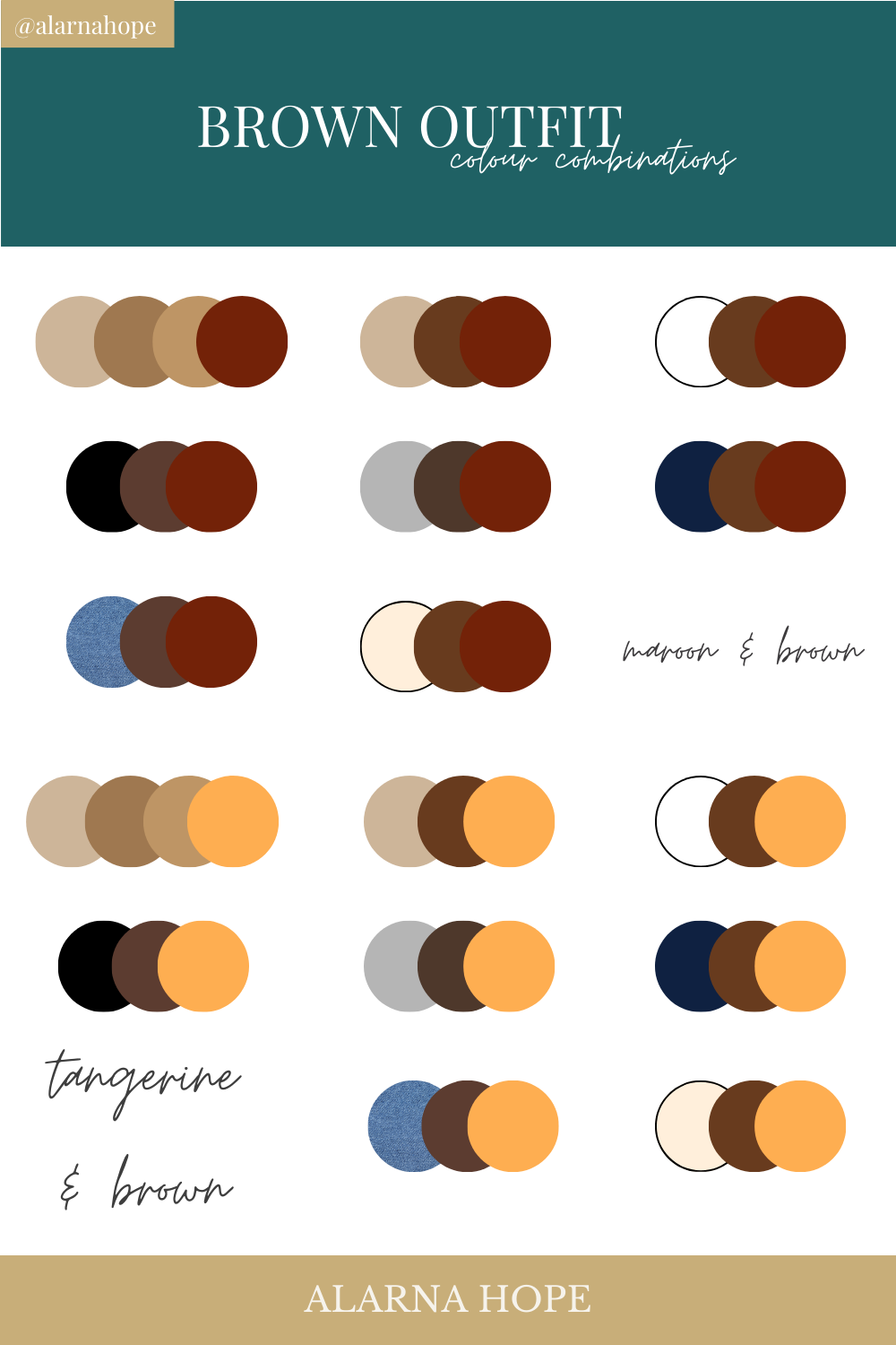
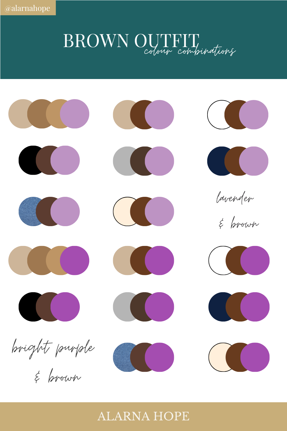
Strategic Color Pairings: What Colour Does Brown Go With?
Selecting a secondary color for a brown-based brand identity requires an understanding of color harmony. The goal is to either accentuate the warmth of the brown or provide a crisp contrast that modernized the aesthetic.
Brown and Cream: The Heritage Duo
When asking what colour goes with brown to create an atmosphere of timelessness, cream or off-white is the definitive answer. Pure white can often feel too clinical against the warmth of brown, whereas cream creates a “soft-focus” luxury.
- Brand Application: This pairing is ideal for high-end hospitality, artisanal food brands, and heritage fashion labels. It communicates a sense of “quiet luxury” and approachable elegance.
Brown and Gold: The Premium Standard
For brands looking to elevate their status, gold is the ultimate companion to chocolate or espresso tones. This combination taps into the psychological association of gold with wealth and brown with substance.
- Brand Application: We see this frequently in the confectionery and spirits industries. It suggests that the product is a “treasure” or a premium experience worth the investment.
Brown and Teal: Modern Contrast
To steer brown away from looking “old-fashioned,” designers often look toward the cooler side of the color wheel. Teal or muted turquoise provides a striking, modern contrast. The warmth of the brown balances the coolness of the teal, creating a visual “pop” that is both professional and creative.
- Brand Application: This is an excellent choice for tech startups focused on environmental solutions or modern furniture designers who want to bridge the gap between organic materials and contemporary living.
Brown and Sage Green: The Eco-Conscious Palette
This is perhaps the most natural pairing available. Because these colors coexist in the natural world, they feel inherently “correct” to the human eye.
- Brand Application: This palette is the gold standard for sustainable skincare, organic farming, and “farm-to-table” dining concepts. It communicates growth, health, and environmental stewardship without appearing overly aggressive.
Industry-Specific Applications of Brown Branding
Not every industry can carry a brown-centric identity effectively. However, in the right sectors, it can provide a significant competitive advantage by differentiating a brand from a sea of blue and gray competitors.
Logistics and Service: The “UPS Effect”
United Parcel Service (UPS) famously trademarked their specific shade of Pullman Brown. Why? Because it hides dirt, suggests a “no-nonsense” work ethic, and conveys a level of reliability that a lighter color could not sustain. In logistics, brown says, “We get the job done, regardless of the conditions.”
Luxury Goods and Fashion: The Heritage Factor
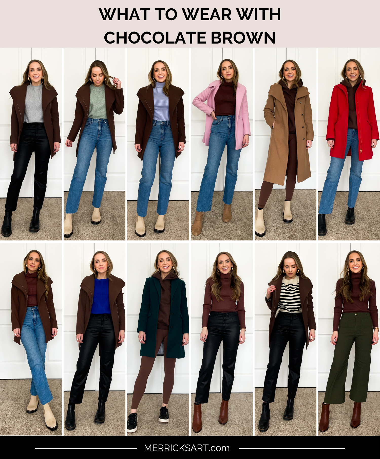
Brands like Louis Vuitton and Hermès utilize brown and tan tones to emphasize the longevity of their leather goods. In this context, brown represents an investment. A brown brand identity tells the customer that the product will age gracefully rather than going out of style next season.
Food and Beverage: Sensory Branding
Brown is one of the few colors that can trigger a gustatory response. It is the color of roasting coffee, baking bread, and tempering chocolate. For brands in this space, brown isn’t just a visual choice; it’s a sensory one. It triggers the consumer’s memory of smell and taste, making the brand more memorable and appetizing.
Implementing Brown in a Modern Digital Identity
While brown has deep roots in physical branding (packaging, signage), implementing it in a digital-first environment requires technical precision. Brown can be difficult to render on screens if the saturation isn’t handled correctly.
Typography and Readability
Using brown as a primary text color instead of black can soften the user interface (UI) and make a website feel more welcoming. However, designers must ensure high contrast ratios to meet accessibility standards (WCAG). A dark “Ebony Brown” is often more readable and sophisticated than a harsh “True Black” on a light-colored background.
Photography Style and Art Direction
A brand using brown must ensure its photography follows suit. This involves using “warm” filters, natural lighting, and textures like wood, linen, or craft paper. The visual content must reinforce the grounded nature of the color palette to maintain brand consistency.
Digital Textures and Skeuomorphism
As design trends cycle, we are seeing a return to subtle textures. Brown lends itself well to “skeuomorphic” elements—digital designs that mimic real-world materials. Subtle grain or leather-like textures in a mobile app can provide a tactile feel that differentiates the brand from the flat, “plastic” look of many modern SaaS platforms.
Conclusion: Why Brown is a Strategic Powerhouse
In conclusion, “what colour does brown go with” is a question that leads to some of the most versatile and evocative palettes in brand strategy. By moving beyond the misconception that brown is “boring,” brand managers can tap into a deep well of psychological associations—reliability, luxury, and sustainability.
Whether paired with the regal shimmer of gold, the organic softness of sage green, or the crisp modernity of teal, brown offers a foundation of stability that few other colors can match. In a world of fleeting digital trends, a brown-based identity offers a brand the one thing that money cannot buy: the appearance of having been here all along, and the promise that it will remain for years to come. Choosing brown is a declaration of substance over shadow, and in the modern market, substance is the ultimate brand currency.
aViewFromTheCave is a participant in the Amazon Services LLC Associates Program, an affiliate advertising program designed to provide a means for sites to earn advertising fees by advertising and linking to Amazon.com. Amazon, the Amazon logo, AmazonSupply, and the AmazonSupply logo are trademarks of Amazon.com, Inc. or its affiliates. As an Amazon Associate we earn affiliate commissions from qualifying purchases.