
In the modern digital landscape, data is the currency of decision-making. Among the most accessible yet frequently misunderstood tools in the technologist’s arsenal is Google Trends. Whether you are a software developer tracking the adoption of a new framework, a cybersecurity analyst monitoring the rise of a specific vulnerability, or a data scientist looking for behavioral patterns, the “numbers” provided by Google Trends are often the first port of call.
However, a common misconception persists: many users mistake the numbers on a Google Trends graph for absolute search volumes. They see a “100” and assume it represents millions of searches, or they see a “50” and assume it means exactly half as many people are interested as before. In reality, the Google Trends number is a sophisticated piece of normalized data. To leverage this tool effectively within the tech sector, one must understand the underlying mechanics of relative popularity, data sampling, and algorithmic filtering.
The Mechanics of Relative Popularity
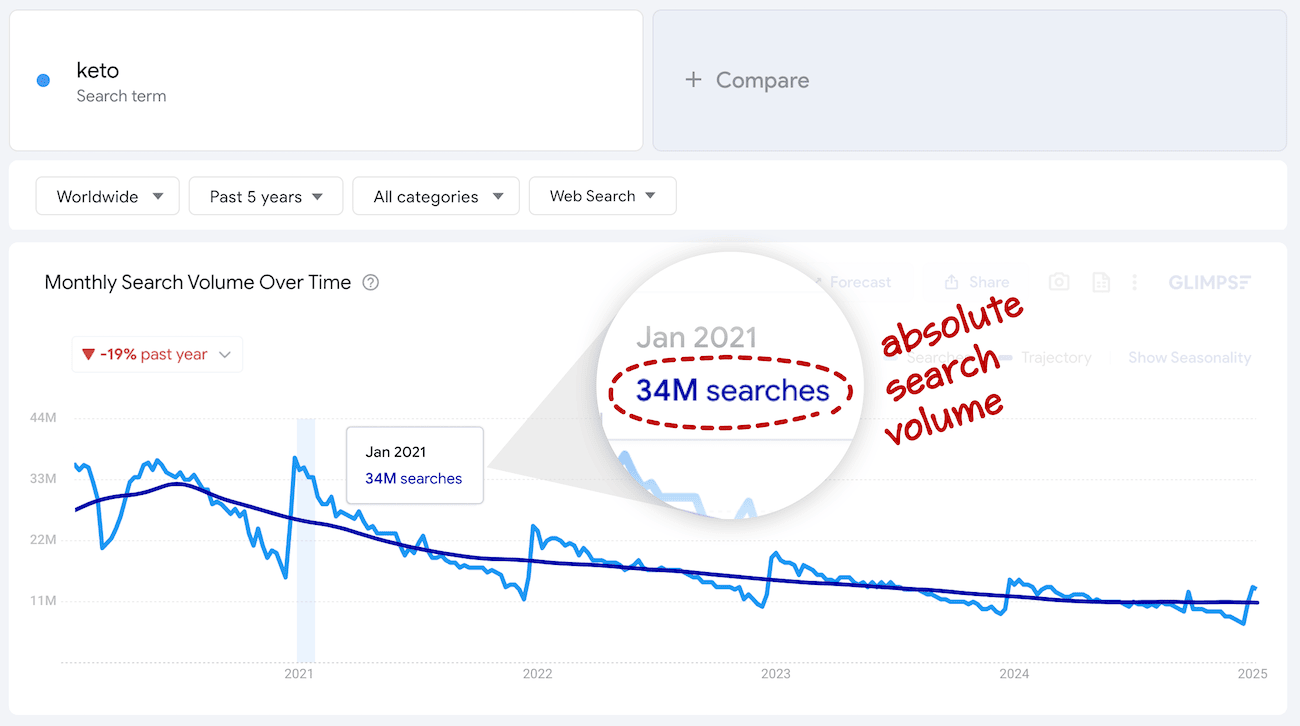
The most critical distinction to make when interpreting Google Trends is the difference between absolute search volume and relative popularity. While tools like Google Keyword Planner provide raw estimates of how many times a term was searched, Google Trends utilizes a proprietary normalization process to make data comparable across different regions and timeframes.
Absolute vs. Relative Search Volume
If Google displayed raw search volumes, the data would be heavily skewed toward high-population areas. For example, a niche programming language like Rust might have 10,000 searches in New York City and only 500 searches in a smaller tech hub like Tallinn, Estonia. In a raw data model, New York would appear to have “more interest.”
However, Google Trends calculates interest as a proportion of total searches in that specific location and time. If those 500 searches in Tallinn represent 5% of all local searches, while the 10,000 in New York represent only 0.1% of its total volume, Google Trends will show Tallinn as having a much higher “interest” level. This relative approach allows tech professionals to identify where a technology is truly gaining traction relative to the local ecosystem’s capacity.
The 0–100 Scaling System
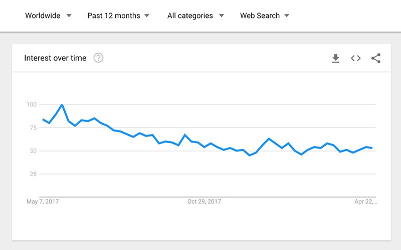
The numbers you see on a Google Trends graph range from 0 to 100. This is a linear scale of “Search Interest.”
- 100: This represents the peak popularity for the term within the specific time and location selected. It is the “high water mark.”
- 50: This indicates that the term is half as popular as it was at its peak.
- 0: This does not necessarily mean there were zero searches. Rather, it means there was not enough data for the term to reach a measurable threshold of significance.
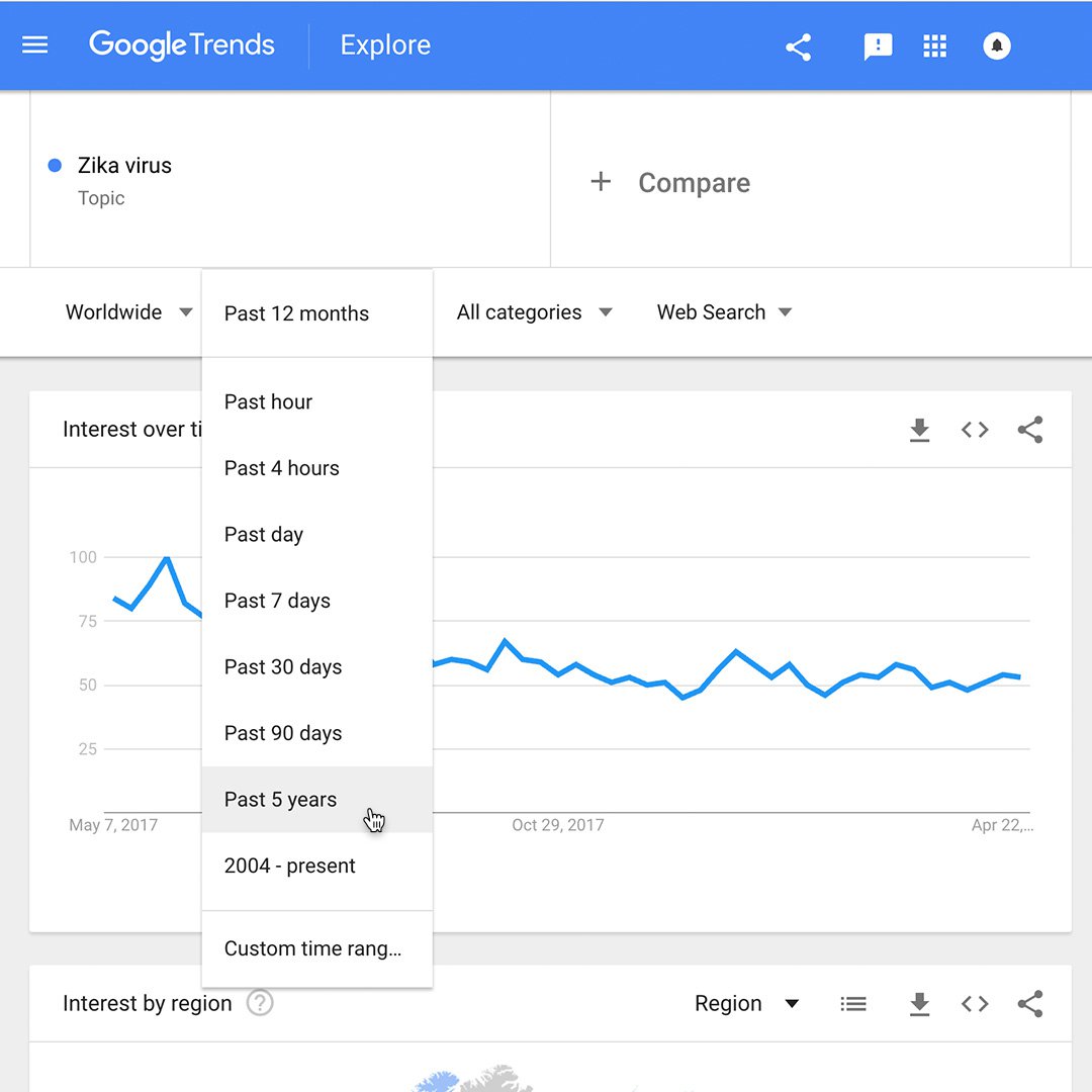
This scaling is dynamic. If you change the timeframe from “Past 12 Months” to “2004–Present,” the value of “100” will shift to the absolute highest point in that nearly twenty-year span, and all other data points will be recalculated relative to that new peak.
How Google Processes the Search Index
Behind the simple interface of Google Trends lies a complex data processing engine. Because Google handles billions of searches every day, it is computationally impossible (and unnecessary) to calculate every single query in real-time for public-facing trend reports. Understanding how this data is sampled is vital for technical accuracy.
Sample Data and Real-Time Processing
Google Trends uses a random sample of the total Google search dataset. By analyzing a representative subset, Google can provide nearly instantaneous results that are statistically significant. There are two main types of data available:
- Real-time data: A sample from the last seven days.
- Non-real-time data: A separate sample of historical data that can go back as far as 2004.
For developers and systems architects, it is important to note that because these are samples, very low-volume search terms may show high volatility or “jagged” lines. This is not necessarily a reflection of erratic human behavior, but rather a technical byproduct of sampling small datasets.
Filtering Out Noise and Non-Human Traffic
To maintain the integrity of the “Trend Number,” Google’s algorithms perform significant cleaning of the raw logs. One of the most important filters is the removal of repeated searches from the same user or IP address over a short period. This prevents “gaming the system,” where a botnet or a dedicated group of enthusiasts could artificially inflate the popularity of a specific software tool or gadget.
Additionally, Google filters out queries containing apostrophes, special characters, and common “stop words” unless they are essential to the search intent. This ensures that the numbers reflect genuine human interest rather than automated pings or technical artifacts.
Geographic and Temporal Context
A number in Google Trends is meaningless without its surrounding context. A “75” in the United States does not carry the same weight as a “75” in Japan, nor does a “100” during a holiday season mean the same as a “100” during a work week.
Comparing Regions: Why Per-Capita Matters
For tech companies looking to localize software or deploy data centers, the geographic breakdown in Google Trends is invaluable. Because the numbers are normalized by population and total search activity, a high number in a specific region indicates a high density of interest.
If you are tracking the search term “Cloud Computing,” and you see a spike in a specific province in India or a state in the US, you are seeing an increase in the intensity of interest. This “Per-Capita” logic allows tech researchers to identify emerging tech hubs that might be overlooked if one were looking only at raw global totals.
Understanding Seasonality vs. Viral Growth
In the tech world, distinguishing between a seasonal trend and a fundamental shift in the stack is crucial. For instance, searches for “Security software” or “Tax software” often follow predictable seasonal cycles.
A “100” in December for a consumer gadget might be a result of holiday shopping (seasonality), whereas a “100” for a new AI model like “GPT-4” usually represents a breakthrough event (viral growth). When analyzing the trend number, tech analysts must look at the “baseline” of the graph. If the numbers consistently return to a higher floor after each peak, it indicates sustained technological adoption rather than a fleeting hype cycle.
Leveraging Google Trends for Advanced Technical Analysis
Beyond simply looking at a graph, technical professionals can use the nuances of the Google Trends number to perform predictive analysis and competitive benchmarking.
Identifying Emerging Tech Stacks
One of the most powerful applications of interpreting the trend number is in “Interest Over Time” comparisons. By plotting multiple technologies against each other—for example, “Kubernetes” vs. “Docker Swarm” vs. “Apache Mesos”—a developer can see the exact moment one technology eclipsed another in terms of relative developer mindshare.
When the trend number for one technology stays at 100 while its competitors drop to 20 or 10, it provides a data-backed justification for migrating a tech stack or investing in specific certifications. It acts as a lagging indicator of industry standard shifts.
Predictive Analytics and Forecasting Search Interest
While Google Trends is primarily a historical tool, the trajectory of the numbers allows for basic forecasting. In the tech industry, a “breakout” (a term Google uses when a search term grows by more than 5000%) often precedes a major shift in the market.
By monitoring the velocity at which a number moves from 0 to 50, data scientists can apply regression models to predict when a topic might reach peak saturation. For example, by tracking the trend numbers for “Zero Trust Architecture” over five years, security firms could have predicted the eventual mandates for this framework long before they became standard enterprise policy.
Conclusion: The Number as a Compass, Not a Ruler
Understanding what the Google Trends number means requires a shift in perspective. It is not a ruler that measures the exact size of an audience; it is a compass that points toward the direction and intensity of interest.
For those in the technology sector, the value of this data lies in its relativity. By normalizing for population, filtering for bots, and scaling the results to a 0-100 index, Google provides a leveled playing field for comparing the “vibe” of the internet. Whether you are debugging the popularity of a library or forecasting the next big shift in artificial intelligence, remembering that “100” represents a peak—not a total—is the first step toward masterly data literacy in the digital age.
aViewFromTheCave is a participant in the Amazon Services LLC Associates Program, an affiliate advertising program designed to provide a means for sites to earn advertising fees by advertising and linking to Amazon.com. Amazon, the Amazon logo, AmazonSupply, and the AmazonSupply logo are trademarks of Amazon.com, Inc. or its affiliates. As an Amazon Associate we earn affiliate commissions from qualifying purchases.