In the realm of design and brand strategy, geometry is far more than a mathematical necessity; it is a silent language that communicates values, emotions, and aspirations. When a brand strategist or a graphic designer asks, “What does an acute triangle look like?” they aren’t merely looking for a definition involving angles less than 90 degrees. They are looking for a visual catalyst that represents precision, upward momentum, and a “cutting-edge” philosophy.
In visual identity, the acute triangle is one of the most potent tools in a designer’s arsenal. Its sharp points and narrow profile distinguish it from the stability of a square or the softness of a circle. This article explores the visual anatomy of the acute triangle through the lens of brand strategy, detailing how its unique form shapes consumer perception and builds iconic corporate identities.
Understanding the Geometry of the Acute Triangle in Design
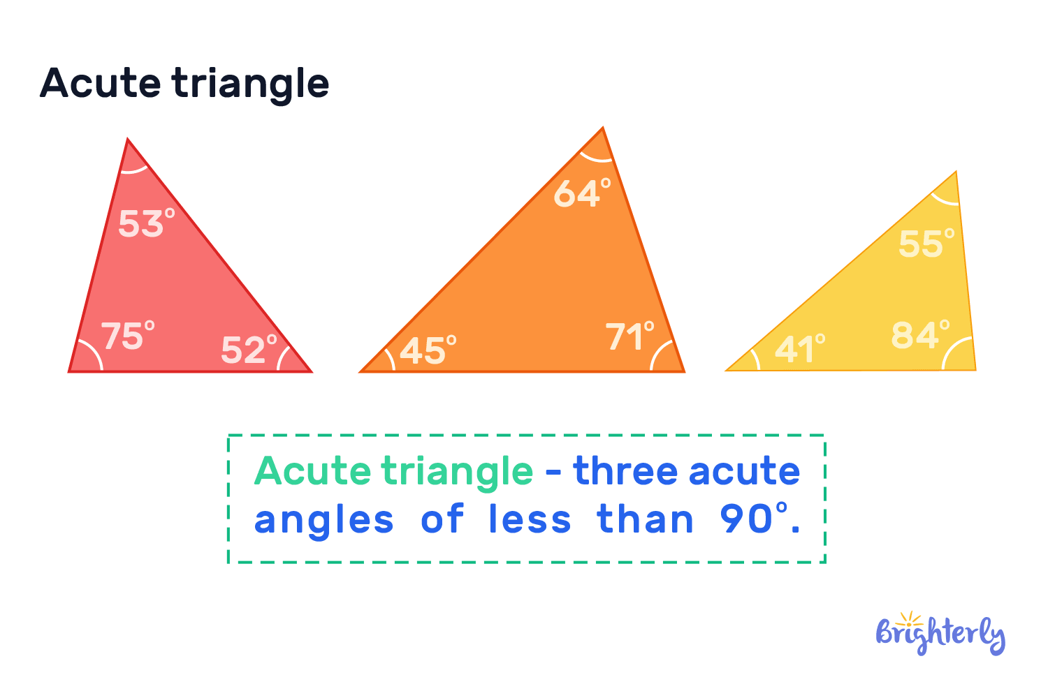
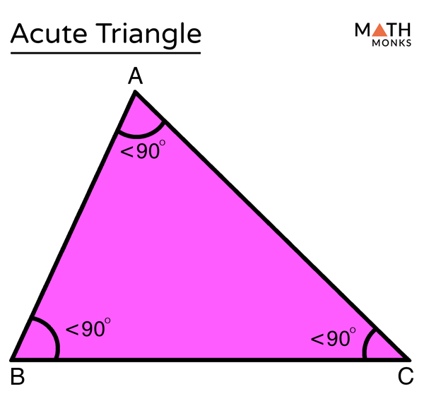
To understand what an acute triangle looks like in a branding context, one must first look at its physical properties. An acute triangle is defined by having three interior angles that are all less than 90 degrees. This results in a shape that appears more “pinched” or “stretched” than a right or obtuse triangle.
Defining the Acute Form: More Than Just Three Sides
Visually, the acute triangle often manifests as a tall, narrow pyramid or a sleek, slanted wedge. Unlike the equilateral triangle—which is a specific type of acute triangle representing perfect balance—the varied acute triangle offers a sense of lean athleticism. In design, this “leanness” is used to convey efficiency. When a brand utilizes a narrow acute triangle, it looks like a needle or a compass, suggesting a high degree of specialization and focus.
Visual Contrast: Acute vs. Obtuse and Right Angles
The “look” of an acute triangle is defined largely by its sharpness. While an obtuse triangle (with one angle greater than 90 degrees) feels heavy, grounded, or even sluggish, the acute triangle feels light and aerodynamic. Right triangles often imply structural stability and architectural rigidity. In contrast, the acute triangle looks like it is in motion. For a brand, this visual difference is the difference between appearing established and traditional versus appearing disruptive and fast-moving.
The Psychological Impact of Acute Angles on Consumer Perception
The reason brand strategists obsess over the specific angles of a logo is that human psychology reacts viscerally to shapes. The acute triangle, with its sharp vertices, triggers specific cognitive responses that can be leveraged to align a brand with its intended market position.
The Symbolism of Upward Momentum and Aspiration
When an acute triangle is oriented so that one of its sharpest angles points upward, it becomes a universal symbol for “the peak” or “the summit.” It looks like a mountain, which in branding translates to leadership and high achievement. This is why financial consulting firms, outdoor equipment brands, and luxury high-rises often favor the acute aesthetic. It tells the consumer that the brand is focused on growth and reaching the pinnacle of its industry.
Precision, Speed, and the “Cutting Edge” Aesthetic
Because the acute triangle tapers to a fine point, it mimics the look of a blade, an arrow, or a jet wing. This creates a psychological association with speed and precision. In the world of tech-driven branding and automotive design, the acute triangle doesn’t just look like a shape; it looks like progress. It suggests that a company can “cut through” the noise of the market or “point” the way to the future. If a brand wants to be seen as innovative, the “look” of the acute triangle provides an immediate visual shorthand for being on the cutting edge.
Implementing the Acute Triangle in Logo Design and Corporate Identity
Translating a geometric concept into a corporate identity requires a nuanced understanding of visual hierarchy. Designers don’t just “place” a triangle; they curate its angles to direct the viewer’s experience.
Directing the Viewer’s Eye: The Triangle as a Pointer
One of the most functional aspects of what an acute triangle looks like in practice is its role as a directional cue. Because of its sharp angles, the eye is naturally drawn toward the points (vertices). In brand design, this is used to lead the consumer’s gaze toward a specific piece of information, such as a brand name or a call to action. An acute triangle looks like an arrow without the shaft, providing a sophisticated way to imply movement and direction without being as literal as a standard pointer.
Dynamic Balance in Minimalist Visual Systems
In modern minimalist branding, the acute triangle is used to create “dynamic balance.” Unlike a square, which is static, an acute triangle can be tilted or skewed to create a sense of tension. This tension makes a brand look more modern and energetic. When used in a grid system for a website or a corporate brochure, the repeating pattern of acute angles creates a “zigzag” or “diamond” effect that keeps the viewer engaged. It breaks the monotony of the standard horizontal and vertical lines that dominate corporate design.
Case Studies: Famous Brands Utilizing Acute Geometry
To truly see what an acute triangle looks like in the wild, we must look at the giants of industry who have built multi-billion dollar equities on this specific geometry.
The Tech and Apparel Sectors: Sharp Angles for Innovation
Consider the Adidas “mountain” logo. It consists of three slanted rectangles that effectively form the silhouette of an acute triangle. It looks like a hurdle to be jumped or a mountain to be climbed, perfectly aligning with the brand’s focus on athletic performance. Similarly, many tech startups utilize stylized, acute “A”s or “V”s in their logos. These shapes look sleek and digital, fitting the high-speed nature of the software industry. The sharpness of the angles reflects the “sharpness” of the code and the intellect behind the product.
Luxury and High-Performance: Designing for Exclusivity
In the luxury sector, the acute triangle often appears in the form of diamonds or specialized monograms. High-performance automotive brands, like Mitsubishi or various supercar manufacturers, use acute geometry to mimic the aerodynamic silhouettes of their vehicles. In these contexts, the acute triangle looks like exclusivity and high-speed engineering. It is a visual promise that the product is built for those who value performance over comfort.
Best Practices for Integrating Acute Triangles into Your Brand Strategy
While the acute triangle is a powerful tool, its “look” can be polarizing if not handled with strategic care. Because it is sharp, it can occasionally be perceived as aggressive or unapproachable.
Avoiding Visual Harshness: Softening the Points
One way brand designers manage the look of an acute triangle is by “rounding” the vertices. This maintains the energetic, aspirational silhouette of the acute form while removing the “danger” associated with sharp points. A rounded acute triangle looks more friendly and consumer-centric, making it suitable for lifestyle brands or service-oriented businesses that still want to appear forward-thinking.
Color Theory and the Sharp Geometric Form
The impact of what an acute triangle looks like is also heavily dependent on color. When rendered in high-contrast colors like black and neon or deep navy and silver, the triangle looks high-tech and corporate. When rendered in earth tones or pastels, the sharp angles are softened, and the triangle looks more like a natural element, such as a leaf or a mountain range. Strategists must ensure that the “sharpness” of the geometry is balanced by a color palette that reflects the brand’s desired personality—whether that is “disruptive and bold” or “stable and organic.”
In conclusion, when we ask what an acute triangle looks like, we are exploring the very foundation of visual strategy. It is a shape that embodies the spirit of the modern era: fast, focused, and perpetually moving upward. By understanding the geometric properties, psychological impacts, and practical applications of this sharp form, brands can craft identities that don’t just sit on a page, but actively point the way toward their future success.
aViewFromTheCave is a participant in the Amazon Services LLC Associates Program, an affiliate advertising program designed to provide a means for sites to earn advertising fees by advertising and linking to Amazon.com. Amazon, the Amazon logo, AmazonSupply, and the AmazonSupply logo are trademarks of Amazon.com, Inc. or its affiliates. As an Amazon Associate we earn affiliate commissions from qualifying purchases.