
In the competitive landscape of modern marketing, brands are moving beyond simple geometric shapes and minimalist typography to embrace deeper, more visceral forms of communication. One of the most potent, yet often overlooked, tools in a brand strategist’s arsenal is floral semiotics—the study of signs and symbols related to flowers. When asking “what do carnations represent” through the lens of brand strategy, we find a rich tapestry of resilience, distinction, and emotional versatility.
The carnation (scientific name Dianthus caryophyllus) has been a staple of human culture for over 2,000 years. Known as the “flower of the gods,” its name carries a weight that translates seamlessly into corporate identity. For a brand, selecting the carnation as a motif or a core value symbol is a deliberate move toward a narrative of longevity and layered meaning.

The Semiotics of the Carnation in Visual Branding
Visual branding is the art of communicating a brand’s essence without saying a single word. Every curve, color, and texture sends a message to the consumer’s subconscious. The carnation, with its uniquely ruffled petals and sturdy stem, offers a specific set of visual cues that can be harnessed to define a brand’s market position.
Color Psychology and Brand Messaging
In brand strategy, color is never “just a color.” It is a psychological trigger. When a brand adopts the carnation as part of its visual identity, the specific hue of the flower dictates the brand’s voice.
- Deep Red Carnations: These represent profound love, admiration, and energy. Brands in the luxury or high-end lifestyle space use these tones to signal passion and a strong, unapologetic presence.
- White Carnations: Representing purity, luck, and “unspoiled” quality, white carnations are often used by brands focusing on wellness, bridal services, or high-end minimalism. They suggest a clean slate and a commitment to transparency.
- Pink Carnations: Historically associated with a mother’s undying love, pink carnations are the ultimate symbol of reliability and gratitude. In branding, this translates to “care-focused” corporate identities, such as those in healthcare, non-profits, or customer-centric service industries.
The Power of Texture: Complex Simplicity
The physical structure of the carnation—the “ruffled” look—is a designer’s dream. In the world of logo design and brand aesthetics, the carnation represents a “complex simplicity.” It is a flower that looks delicate but is actually one of the hardiest blooms in existence. For a tech firm or a consulting agency, this duality is invaluable. It communicates that the company handles complex problems (the many petals) but delivers a unified, beautiful solution (the singular bloom).
Building Brand Equity through Natural Metaphors
Brand equity is the commercial value that derives from consumer perception of the brand name, rather than from the product or service itself. To build this equity, brands often lean on metaphors to create a relatable story. The carnation serves as a powerful metaphor for endurance and versatility.
The “Resilient Flower” Narrative
Unlike the rose, which is often seen as fragile and fleeting, the carnation is known for its long vase life. It can stay fresh for weeks after being cut. In branding, this is a symbol of “Resilience.” A brand that aligns itself with the carnation is telling its investors and customers: “We are built to last. We are durable. We are consistent.”
This narrative is particularly effective for financial institutions or legacy brands undergoing a rebrand. By integrating the symbolism of the carnation, they signal a shift from being “old” to being “enduring.” It creates a sense of trust that the brand will not wither under market pressure or economic shifts.
Why Specificity Matters in Floral Branding
General “floral” branding can often feel generic or overly “feminine” in a way that limits market reach. However, the specificity of the carnation allows a brand to pivot. Because the carnation is also a symbol of “distinction” and “fascination,” it appeals to a more intellectual or avant-garde demographic.
Strategic branding involves choosing symbols that have a high “recognition value.” The carnation is universally recognized but underutilized compared to the rose or the lily. This provides a “blue ocean” opportunity for brands to claim the symbol as their own, creating a unique visual hook that separates them from competitors.
Case Studies: From Florists to High-Fashion Logos
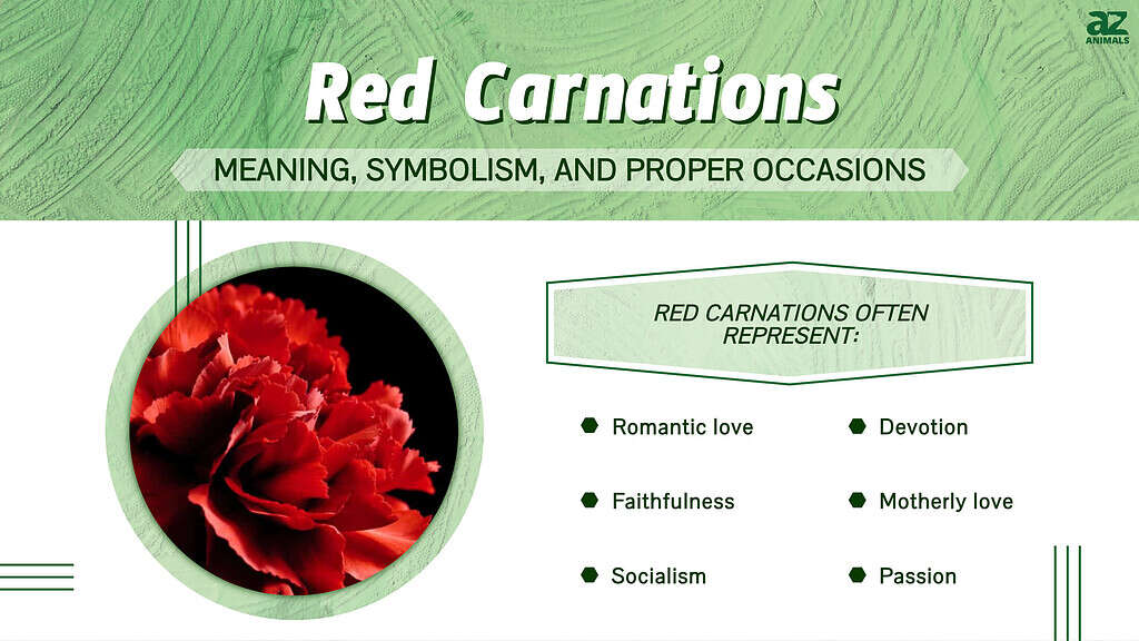
To understand what carnations represent in a practical business context, we must look at how they have been utilized by global entities to shape consumer perception.
The Carnation as a Symbol of Distinction
In the world of high fashion and luxury menswear, the carnation has long been the flower of choice for the “boutonnière.” This isn’t just a stylistic choice; it is a brand statement. Brands like Oscar de la Renta and various Savile Row tailors have used the carnation to signify a gentleman’s attention to detail.
In this context, the carnation represents “The Individual.” It’s for the brand that doesn’t want to follow the crowd. When a brand incorporates the carnation into its packaging or its flagship store design, it is targeting the consumer who values craftsmanship over mass production.
Navigating Cultural Nuances in Global Branding
A critical part of brand strategy is understanding how symbols translate across borders. In some cultures, such as in France or certain parts of Latin America, carnations are associated with funerals or bad luck. Conversely, in the United States, they are the official flower of Mother’s Day and a symbol of pride in Ohio.
For a global brand, “what carnations represent” depends entirely on the geography of the target market. A savvy brand manager will use the carnation in American marketing materials to evoke warmth and nostalgia, while perhaps opting for a different floral motif in European markets to avoid negative associations. This level of cultural sensitivity is what separates a good brand from a great one.
Strategic Implementation: Using the Carnation Motif in Marketing Materials
Once a brand has decided to adopt the carnation as its symbol, the next step is implementation. This involves more than just putting a picture of a flower on a business card; it requires a holistic approach to the brand experience.
Packaging and Tactile Brand Experience
The “ruffled” edge of the carnation can be translated into tactile brand elements. Think of deckle-edged paper, embossed textures on luxury packaging, or the specific “crimped” edges of a high-end shopping bag. These physical touches remind the consumer of the carnation’s complexity and beauty.
In the premium beverage or perfume industry, the carnation’s scent profile—spicy, clove-like, and floral—is often used as a core “brand scent” in retail environments. This creates a multi-sensory brand identity that reinforces the visual symbolism of the flower. When a customer smells that specific scent, they subconsciously associate it with the brand’s values of resilience and distinction.
Digital Assets and Iconography
In the digital space, the carnation must be simplified into iconography. A successful brand will strip the flower down to its most recognizable silhouette. This icon can then be used as a favicon, a watermark on social media content, or an animated element in a mobile app.
The digital representation of the carnation should focus on the “symmetry” and “fullness” of the bloom. This projects a brand image of “abundance” and “completeness.” For a fintech app or an e-commerce platform, using such iconography can subtly suggest that the user’s financial life or shopping experience will be “full” and “flourishing.”

Conclusion: The Strategic Value of the Carnation
So, what do carnations represent in the world of brand strategy? They represent a sophisticated blend of resilience, historical depth, and visual intrigue. While other symbols may come and go with the trends of the season, the carnation remains a steadfast icon of enduring quality.
For a brand looking to carve out a niche in a crowded marketplace, the carnation offers a path toward a more meaningful identity. It allows a company to speak to its history while looking toward the future, combining the “divine” origins of the flower with the modern need for durable, trustworthy branding. By understanding the layered meanings of this ancient bloom, brand strategists can craft narratives that resonate on a deeply human level, ensuring that their brand—much like the carnation itself—stays fresh and relevant for years to come.
aViewFromTheCave is a participant in the Amazon Services LLC Associates Program, an affiliate advertising program designed to provide a means for sites to earn advertising fees by advertising and linking to Amazon.com. Amazon, the Amazon logo, AmazonSupply, and the AmazonSupply logo are trademarks of Amazon.com, Inc. or its affiliates. As an Amazon Associate we earn affiliate commissions from qualifying purchases.