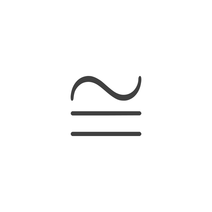
In the world of geometry, the congruent symbol—represented as an equal sign topped with a tilde ($cong$)—denotes that two shapes are identical in form and size. It signifies a perfect relationship where one object mirrors another with absolute precision. However, when we step out of the classroom and into the boardroom, the “congruent symbol” evolves into a powerful metaphor for brand strategy. In the context of corporate identity, congruence is the holy grail of marketing; it is the state in which a brand’s internal values, external visuals, and consumer perceptions are in perfect alignment.
Understanding what the congruent symbol represents—both mathematically and metaphorically—is essential for any designer, strategist, or business leader. It is the silent language of consistency that tells a customer, “What you see is exactly what you get.”
The Geometry of Brand Identity: Defining the Congruent Symbol
To understand the application of congruence in branding, one must first appreciate its technical origins. In mathematics, congruence is more than just equality. While equality refers to numerical value, congruence refers to the total harmony of shape, angle, and dimension.
From Mathematics to Marketing: The Meaning of $cong$
The symbol itself is a hybrid. The equal sign (=) represents the foundation of stability and equivalence, while the tilde (~) represents similarity. When combined, they suggest that two things are not just “similar” but are essentially the same. In brand strategy, this translates to the relationship between a brand’s promise and its execution.
A brand that utilizes the concept of the congruent symbol ensures that its logo (the visual symbol) is an exact reflection of its corporate DNA. If a company claims to be “cutting-edge” but uses a dated, serif-heavy logo from the 1980s, there is a lack of congruence. The “congruent symbol” in branding is achieved when the visual identity (the symbol) and the brand’s behavior are mathematically aligned in the mind of the consumer.
Why Visual Symmetry Matters in Corporate Design
Symmetry and congruence are deeply rooted in human psychology. We are evolutionarily programmed to find symmetry attractive and trustworthy. In corporate design, using congruent geometric principles in logo construction—such as the Golden Ratio or grid-based alignment—creates a sense of “rightness.”
When a brand’s visual elements are congruent across different touchpoints (from a mobile app icon to a massive billboard), it reduces the cognitive load on the consumer. They don’t have to work to recognize the brand; the congruence does the heavy lifting, fostering immediate recognition and a sense of professional stability.
Building Trust Through Brand Congruence
The ultimate goal of any brand strategy is to build a “brand equity” that converts into long-term loyalty. This cannot be achieved without congruence. The congruent symbol serves as a reminder that any deviation from the core identity creates friction, and friction is the enemy of trust.
The Psychology of Consistency in Consumer Behavior
Consumers are inherently skeptical. When they encounter a brand, they are looking for reasons to doubt its authenticity. Brand Congruence Theory suggests that consumers feel a sense of “cognitive harmony” when a brand’s personality matches their own self-image or the expectations set by the brand’s marketing.
If a luxury brand uses cheap packaging, the “congruent symbol” is broken. The consumer experiences cognitive dissonance—a psychological discomfort that arises when visual cues and brand promises clash. By maintaining a congruent identity, a brand reinforces the “truth” of its message every time it interacts with a customer.
Aligning Voice, Visuals, and Values
A truly congruent brand is a three-dimensional entity.
- Visual Congruence: The logo, typography, and color palette must be consistent across all platforms.
- Verbal Congruence: The tone of voice—whether it’s playful, authoritative, or clinical—must match the visual aesthetic.
- Value Congruence: The brand’s actions (sustainability efforts, customer service, employee relations) must match its public-facing claims.
When these three pillars are aligned, the brand achieves a state of “strategic congruence,” becoming a singular, unshakable symbol in the marketplace.
Technical Implementation: Displaying the Symbol in Digital Branding
For designers and tech-savvy brand managers, the congruent symbol ($cong$) isn’t just a metaphor; it’s a character that must be rendered correctly in digital spaces. Whether you are creating a brand manual for a STEM-focused company or designing a UI for a financial tool, the technical execution of this symbol matters.
Unicode and Typography in Modern UI
In the digital realm, the congruent symbol is identified by the Unicode character U+2245. In HTML, it can be rendered using the entity ≅ or ≅. From a brand design perspective, the choice of typeface for this symbol is critical.
Many standard fonts treat mathematical symbols as afterthoughts, leading to a “glitchy” appearance when they are placed next to high-end corporate typography. A sophisticated brand strategy involves selecting or designing a typeface where mathematical glyphs—like the congruent symbol—match the weight, x-height, and stroke width of the primary brand font. This is technical congruence in its purest form.
Vector Scalability and Geometric Precision
When using the congruent symbol as a literal part of a visual identity (for example, in a logo for a consulting firm called “Congruent Solutions”), vector precision is non-negotiable. Because the symbol represents “perfect fit,” any slight imbalance in the tilde’s curve or the equal sign’s spacing will be magnified.
Modern brand assets must be “responsive.” This means the symbol must remain congruent—identical in perceived form—whether it is rendered as a 16×16 pixel favicon or scaled up for a skyscraper wrap. This requires a deep understanding of geometric construction and “optical adjustments,” where shapes are slightly altered to look congruent to the human eye, even if they aren’t mathematically identical.
Case Studies in Brand Congruence
To see the power of the congruent symbol in action, we can look at global leaders who have mastered the art of alignment, as well as those who suffered when their symbols lost their meaning.
Tech Giants and the Power of Symbolic Consistency
Consider Apple. The congruence between their hardware design (sleek, minimalist, premium), their software interface (intuitive, clean), and their retail stores (open, glass-heavy, modern) is legendary. The Apple logo is a “congruent symbol” because it perfectly encapsulates the company’s “Think Different” and “Simplicity” ethos. There is no gap between what the logo promises and what the product delivers.
Similarly, brands like Nike use the “Swoosh” as a congruent symbol for movement and achievement. Every marketing campaign, every athlete partnership, and every shoe design is filtered through the lens of that single, congruent identity.
Lessons from Rebranding Failures
On the flip side, we can look at the 2010 Gap logo redesign. Gap attempted to replace its classic, congruent blue box logo with a modern sans-serif font and a small gradient square. The new symbol was not congruent with the brand’s heritage as a provider of classic, “American cool” staples. The backlash was so severe that the company reverted to the original logo within a week. The lesson was clear: you cannot force a symbol onto a brand if it is not congruent with the brand’s established soul.
Strategy for Longevity: Maintaining a Congruent Presence
A brand is not a static object; it is a living entity that must evolve. The challenge for brand strategists is maintaining the “congruent symbol” even as the company grows, pivots, or enters new markets.
Auditing Your Brand Symbols
Every few years, a brand should undergo a “congruence audit.” This involves looking at every touchpoint—from social media headers to invoices—and asking: “Is this symbol still congruent with who we are today?”
As companies lean into AI and digital transformation, their symbols often need to become more “fluid.” However, fluidity should not come at the expense of congruence. The core essence—the “equal sign” of the brand—must remain stable, even if the “tilde” (the expression) adapts to new trends.

Future-Proofing Identity in an AI-Driven Market
We are entering an era where AI can generate thousands of logo variations in seconds. In this high-speed environment, the human element of “congruence” becomes a competitive advantage. AI can create “pretty” symbols, but it cannot inherently understand the deep, strategic alignment between a founder’s vision and the consumer’s emotional needs.
Strategists who focus on the “congruent symbol” approach will find that their brands have a “gravity” that AI-generated fluff lacks. By ensuring that every visual cue is an honest and identical representation of the brand’s core, businesses can create an identity that isn’t just a logo, but a promise of quality that stands the test of time.
In conclusion, whether you are looking at the congruent symbol through a mathematical lens or a branding lens, the message is the same: alignment is everything. In a world of noise and distraction, the brands that succeed are those that remain congruent—identical in their promise and their performance, forever mirrored in the eyes of their customers.
aViewFromTheCave is a participant in the Amazon Services LLC Associates Program, an affiliate advertising program designed to provide a means for sites to earn advertising fees by advertising and linking to Amazon.com. Amazon, the Amazon logo, AmazonSupply, and the AmazonSupply logo are trademarks of Amazon.com, Inc. or its affiliates. As an Amazon Associate we earn affiliate commissions from qualifying purchases.