The phrase “OD Green” might initially evoke images of military uniforms or outdoor equipment. However, in the realm of branding and marketing, its significance extends far beyond mere aesthetics. OD Green, a specific shade of olive drab, has a rich history and a potent psychological impact that can profoundly influence how a brand is perceived by consumers. Understanding this color’s nuances and strategic application is crucial for any business aiming to cultivate a distinct and resonant corporate identity. This article delves into the multifaceted nature of OD Green within the context of branding, exploring its historical associations, its psychological implications, and its effective utilization in marketing and design strategies.

The Historical Roots and Cultural Resonance of OD Green
To fully grasp the power of OD Green in branding, it’s essential to acknowledge its deep-seated historical and cultural connections. This color is not a recent invention; its origins are firmly rooted in the practicalities of warfare and utility.
From Military Utility to Cultural Symbol
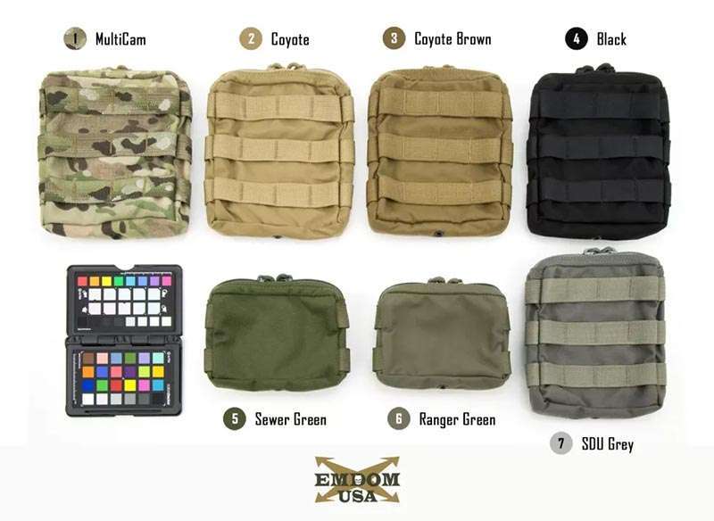
OD Green, or Olive Drab Green, gained prominence during the early 20th century as the standard color for U.S. Army uniforms. Its selection was driven by practical considerations: the color offered excellent camouflage in natural environments, blending seamlessly with foliage and earth tones. This inherent association with military service and outdoor activities has since evolved into a broader cultural symbolism. Beyond the battlefield, OD Green became synonymous with durability, ruggedness, and a no-nonsense approach. It was adopted by outdoor gear manufacturers, workwear brands, and even elements of civilian fashion, all capitalizing on these established connotations. The color evokes a sense of reliability, resilience, and a connection to the natural world. This deep-seated association allows brands to tap into a pre-existing emotional landscape, leveraging established perceptions to their advantage.
The Evolution of its Perception: From Uniformity to Versatility
While its military origins are undeniable, the perception of OD Green has broadened considerably. It is no longer solely confined to an austere, utilitarian context. In contemporary design, OD Green has found its way into diverse applications, demonstrating its versatility. From fashion runways to interior design, the color has been reinterpreted, offering a sophisticated and grounded aesthetic. This evolution means that brands can employ OD Green without necessarily invoking direct military comparisons, instead drawing on its broader associations with nature, stability, and a grounded, authentic presence. This adaptability makes it a valuable tool for brands seeking to project a range of attributes, from robust dependability to understated elegance.
The Psychology of OD Green: Evoking Specific Emotions and Perceptions
Colors are not merely visual elements; they are powerful psychological triggers that can elicit specific emotional responses and shape consumer perception. OD Green, with its unique blend of characteristics, offers a rich palette of psychological associations for brands to harness.
Groundedness, Stability, and Trust
One of the most potent psychological impacts of OD Green is its ability to convey a sense of groundedness and stability. As a color found abundantly in nature, it connects us to the earth, to organic forms, and to fundamental elements. This inherent association translates into a feeling of reliability and trustworthiness for consumers. Brands that utilize OD Green in their visual identity often aim to project an image of steadfastness, dependability, and a solid foundation. This can be particularly effective for businesses in sectors that require a high degree of trust, such as financial services, insurance, or established manufacturing. The color suggests that the brand is not prone to fleeting trends or superficial changes, but rather possesses enduring value and a commitment to its principles.
Naturalness, Sustainability, and Authenticity
The strong connection of OD Green to the natural world also makes it a powerful symbol of sustainability and authenticity. In an era where consumers are increasingly conscious of environmental impact and the provenance of products, a brand that embraces OD Green can subtly communicate its commitment to eco-friendly practices or a more natural, unadulterated approach. This resonates with audiences seeking genuine, ethically produced goods and services. For brands in the organic food sector, outdoor recreation, or those with a strong emphasis on natural ingredients, OD Green can serve as a visual shorthand for their core values. It suggests transparency, a connection to the earth, and a rejection of artificiality, fostering a sense of trust and alignment with environmentally aware consumers.
Resilience, Durability, and Strength
The historical association of OD Green with military equipment and outdoor gear also imbues it with connotations of resilience, durability, and strength. This makes it an excellent choice for brands that want to emphasize the robustness and longevity of their products or services. Think of workwear, adventure equipment, or even certain types of rugged technology. The color communicates that the brand is built to withstand challenges, perform under pressure, and last the test of time. This perception of strength and reliability can be a significant differentiator, appealing to consumers who prioritize quality and performance over superficial aesthetics.
Strategic Application of OD Green in Branding and Marketing
The effectiveness of OD Green in branding lies not just in its inherent associations, but in its strategic and intentional application across various touchpoints of the consumer experience.
Logo Design and Visual Identity
The most immediate impact of a color is often seen in a brand’s logo and overall visual identity. Incorporating OD Green into a logo can immediately establish a desired tone. For a tech company, a touch of OD Green might suggest innovation with a grounded approach, contrasting with the often sterile blues and grays. For a food brand, it could signify natural ingredients and a connection to the earth. Beyond the logo, the consistent use of OD Green in brand collateral – from packaging and website design to marketing materials and stationery – reinforces the brand’s message. This consistency is crucial for building a strong and memorable corporate identity. When consumers encounter OD Green in conjunction with a brand, they should intuitively connect it with the established attributes of reliability, nature, or resilience, depending on the brand’s positioning.
Product Design and Packaging
The color of a product or its packaging is a critical element in its appeal and market positioning. OD Green can be used to differentiate products, signal specific features, or evoke a particular lifestyle. For outdoor gear, it’s an obvious choice that aligns directly with intended use. For other industries, its application can be more nuanced. A sustainable cleaning product might use OD Green to highlight its natural ingredients, while a premium coffee brand might employ it to suggest a sense of artisanal quality and grounded experience. Packaging is often the first physical interaction a consumer has with a product, and the choice of OD Green can significantly influence initial perceptions and purchasing decisions. It acts as a silent communicator, conveying valuable information before the consumer even reads a label.
Marketing Campaigns and Storytelling
The narrative of a brand is powerfully enhanced by its visual language. OD Green can be a central theme or a subtle accent in marketing campaigns, helping to tell a compelling story. A campaign featuring natural landscapes and OD Green elements can effectively convey a brand’s connection to the environment and its adventurous spirit. Conversely, a more minimalist campaign using OD Green against a clean background might highlight a brand’s focus on essentialism and durable design. Storytelling through imagery and color is a fundamental aspect of effective marketing. When OD Green is woven into a brand’s narrative, it amplifies the message, making it more visceral and memorable for the target audience. It helps to create an emotional connection that transcends mere product features.
Considerations and Nuances in Using OD Green
While OD Green offers significant branding potential, its effective implementation requires careful consideration of context and audience. Misapplication can lead to unintended perceptions.
Avoiding Negative Connotations
Given its military origins, there’s a potential for OD Green to evoke associations with conflict, aggression, or an overly utilitarian, perhaps even drab, aesthetic. Brands must be mindful of this and strategically position the color to emphasize its more positive attributes. This often involves balancing OD Green with other colors that soften its edges or align with a broader, more approachable narrative. For instance, pairing OD Green with warmer, natural tones like beige, cream, or wood textures can create a more inviting and less austere feel. The specific shade of OD Green also matters; subtle variations can shift the perception from rugged to sophisticated.
Target Audience and Market Context
The effectiveness of OD Green is heavily dependent on the brand’s target audience and the market in which it operates. A brand targeting outdoor enthusiasts or military surplus collectors will find OD Green a natural and expected choice. However, for a luxury fashion brand, its use would require a very specific and well-articulated rationale to avoid appearing out of place. Similarly, in certain cultural contexts, colors can carry different meanings. Researching audience perception and market trends is crucial to ensure that the use of OD Green aligns with, rather than alienates, the intended customer base. Understanding how OD Green is perceived within a specific cultural milieu is paramount to its successful integration into a brand’s identity.
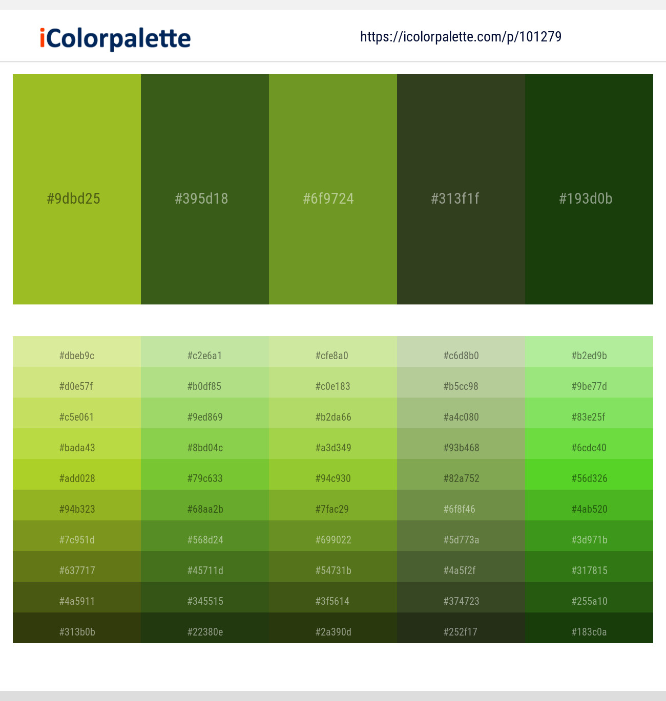
The Importance of Hue and Saturation
The specific hue and saturation of OD Green are critical factors in its impact. “Olive drab” itself is a spectrum, and slight variations can dramatically alter the feeling it evokes. A darker, more desaturated OD Green might suggest seriousness, durability, and a connection to the earth, while a slightly lighter, more vibrant shade could convey a sense of outdoor adventure and vitality. Experimenting with different variations and testing them against target audience preferences is essential. The precise shade can be the difference between a brand feeling grounded and trustworthy, and one feeling outdated or overly aggressive. Careful attention to these chromatic details ensures that the intended message is communicated clearly and effectively.
In conclusion, OD Green is far more than just a color; it is a powerful branding tool imbued with historical significance, psychological weight, and remarkable versatility. By understanding its deep roots in utility and nature, and by strategically applying it across logos, products, and marketing campaigns, brands can effectively cultivate a corporate identity that resonates with consumers. When employed with careful consideration of its nuances and potential associations, OD Green can powerfully communicate groundedness, trust, sustainability, resilience, and authenticity, ultimately contributing to a stronger, more memorable, and more impactful brand presence in the market.
aViewFromTheCave is a participant in the Amazon Services LLC Associates Program, an affiliate advertising program designed to provide a means for sites to earn advertising fees by advertising and linking to Amazon.com. Amazon, the Amazon logo, AmazonSupply, and the AmazonSupply logo are trademarks of Amazon.com, Inc. or its affiliates. As an Amazon Associate we earn affiliate commissions from qualifying purchases.