The choice of a university’s typeface is far more than a stylistic preference; it’s a critical component of its brand identity. For Quinnipiac University, this decision reflects a deliberate strategy to convey specific attributes and ensure consistency across all its communications. This article delves into the typography that defines Quinnipiac, exploring not only the primary fonts used but also the strategic considerations behind their selection and implementation. Understanding these elements provides insight into how the university cultivates its image and connects with its diverse audiences.
The Foundation of Quinnipiac’s Visual Identity: Primary Typefaces
A university’s brand is built upon a consistent and recognizable visual language. For Quinnipiac, this language is anchored by a carefully chosen set of primary typefaces. These are the fonts that will be encountered most frequently in official communications, marketing materials, websites, and academic publications. Their selection is not arbitrary; it’s a strategic decision aimed at projecting specific qualities that align with the university’s mission and values.
![]()
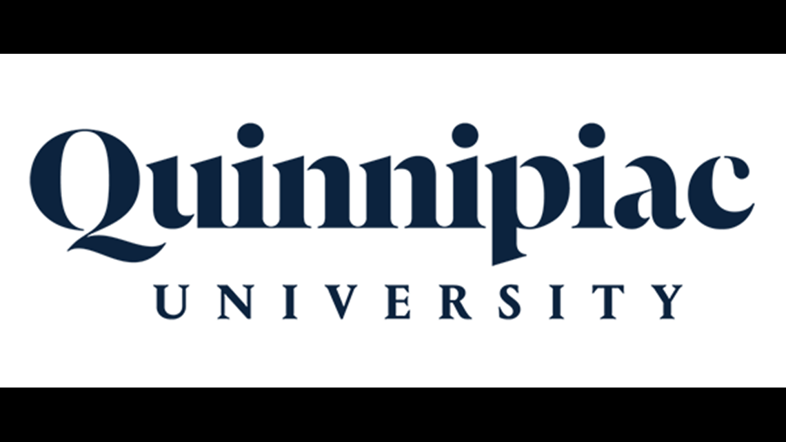
Serif for Authority and Tradition: Georgia
When examining Quinnipiac’s branding, a prominent serif font frequently appears, particularly in headings and more formal applications. While specific official brand guidelines may evolve, the characteristic of this font strongly suggests Georgia. Georgia is a widely respected and versatile serif typeface known for its excellent legibility, both on screen and in print. Its design, with its slightly softened edges and generous x-height, lends an air of approachability while retaining a sense of gravitas.
For a higher education institution, a serif font like Georgia serves several crucial purposes:
- Conveying Authority and Credibility: Serif fonts have a long history in print and are often associated with academic texts, books, and scholarly journals. This historical association imbues Georgia with an inherent sense of authority and intellectual depth, qualities that are paramount for a university seeking to establish and maintain its academic credibility. It signals to prospective students, faculty, alumni, and the wider community that Quinnipiac is a serious institution committed to academic rigor and tradition.
- Enhancing Readability in Long-Form Content: Academic content, from course descriptions and research papers to website articles and brochures, often involves significant amounts of text. Georgia’s open counters, clear ascenders and descenders, and balanced stroke weight contribute to exceptional readability, even in smaller sizes and for extended reading sessions. This ensures that information is communicated effectively and accessibly to its intended audience, preventing reader fatigue.
- Projecting a Sense of Stability and Trust: The enduring nature of serif typography, combined with Georgia’s robust design, evokes feelings of stability, reliability, and trustworthiness. In an educational landscape that can sometimes feel dynamic and uncertain, a consistent and familiar typographic style can be a comforting anchor, reinforcing the enduring value of a Quinnipiac education.
- Balancing Modernity with Tradition: While Georgia possesses a traditional serif structure, its design is also considered relatively modern and adaptable. This allows Quinnipiac to present itself as an institution that respects its heritage while embracing contemporary approaches to education and research. It avoids appearing overly archaic, striking a balance that appeals to a broad demographic.
The strategic deployment of Georgia within Quinnipiac’s branding helps to anchor its visual identity, making it instantly recognizable and reinforcing its core values through the very structure of its written communication.
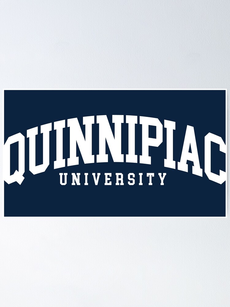
Sans-Serif for Modernity and Clarity: Open Sans (or Similar)
Complementing the established presence of a serif font, Quinnipiac’s branding also incorporates a sans-serif typeface. This choice is essential for creating visual contrast, ensuring clarity in digital environments, and projecting a more modern and accessible image. While the specific sans-serif might vary slightly based on design trends or specific applications, a strong candidate that aligns with contemporary professional branding is Open Sans. Open Sans is a humanist sans-serif typeface renowned for its exceptional legibility across a wide range of sizes and resolutions, making it a popular choice for web design and user interfaces.
The incorporation of a sans-serif like Open Sans into Quinnipiac’s brand offers several strategic advantages:
- Modernity and Digital Accessibility: Sans-serif fonts are inherently perceived as more modern and less formal than their serif counterparts. For a university operating in the digital age, this is crucial. Open Sans, with its clean lines and open letterforms, renders exceptionally well on screens, ensuring that the university’s online presence – from its website and social media to digital advertisements – is clear, crisp, and user-friendly. This adaptability to digital mediums is vital for reaching a tech-savvy student population and stakeholders.
- Clarity and Directness: The straightforward nature of sans-serif typography lends itself to clear and direct communication. When used for body text in digital contexts or for concise messaging in marketing materials, Open Sans ensures that information is easily digestible. This is particularly important for conveying key facts, calls to action, or important announcements.
- Versatility and Contrast: The pairing of a serif and a sans-serif font creates essential visual hierarchy and contrast. The serif font, like Georgia, can be used for more formal titles or elements that require a sense of gravitas, while the sans-serif can be employed for body copy, subheadings, or elements that need to feel more contemporary and approachable. This dynamic pairing allows for flexibility in design, enabling the creation of visually engaging and informative layouts.
- Approachability and Inclusivity: Sans-serif fonts can often feel more informal and welcoming than serifs, which can contribute to a perception of approachability and inclusivity. For a university that aims to attract a diverse student body and engage with a broad community, a sans-serif font helps to project an image of openness and accessibility.
The strategic use of a sans-serif like Open Sans, alongside its serif counterpart, allows Quinnipiac to navigate the complexities of modern communication, balancing tradition with innovation and ensuring its message is clear, accessible, and impactful across all platforms.
Strategic Implementation: Beyond Font Selection
The effectiveness of a university’s chosen typography extends far beyond simply selecting the right fonts. It involves a comprehensive strategy for their application, ensuring consistency, hierarchy, and impact across all communication channels. This strategic implementation is what transforms mere font choices into a powerful brand asset.
Establishing a Clear Typographic Hierarchy
A well-defined typographic hierarchy is essential for guiding the reader’s eye and ensuring that information is presented in a logical and easily understandable order. For Quinnipiac, this means establishing clear rules for how its primary fonts, Georgia (serif) and Open Sans (sans-serif), are used in relation to each other and for different types of content.
- Headings and Subheadings: Typically, a bolder weight of Georgia might be used for main headings to convey authority and importance. Subheadings, perhaps in a lighter weight of Georgia or a contrasting weight of Open Sans, would then be used to break down information into manageable sections. This distinction clearly signals the relative importance of different pieces of text.
- Body Text: For extended blocks of text, such as in academic articles, website content, or printed brochures, a highly legible weight of Open Sans is often preferred for its readability on screens and in print. This ensures that readers can comfortably consume information without visual strain.
- Captions and Call-outs: Smaller typographic elements, like image captions, pull quotes, or call-out boxes, might utilize different weights or styles within the chosen font families to provide visual distinction and draw attention to specific pieces of information. For instance, a bold italic of Open Sans might be used for a compelling quote.
- Data and Tables: In cases where data needs to be presented clearly, a monospaced font or a carefully chosen sans-serif might be employed for numerical accuracy and consistent spacing, though this would be a secondary consideration outside the core brand fonts.
By meticulously defining these hierarchies, Quinnipiac ensures that its communications are not only aesthetically pleasing but also highly functional, making it easier for audiences to navigate and comprehend the information presented.
Maintaining Consistency Across All Touchpoints
Consistency is the bedrock of strong branding. For Quinnipiac, this means ensuring that its chosen fonts are used uniformly across every single touchpoint where the university is represented. This includes:
- Digital Platforms: The university website, social media profiles, email signatures, online advertisements, and any digital applications must adhere to the established typographic guidelines. This ensures a seamless and recognizable experience for users interacting with Quinnipiac online. The legibility of Open Sans on screens is particularly crucial here.
- Print Materials: Brochures, posters, direct mailings, academic journals, stationery, business cards, and any other printed collateral must reflect the same typographic standards. This reinforces the brand’s professionalism and attention to detail. The classic readability of Georgia in print is invaluable for these materials.
- Campus Signage: Wayfinding signs, departmental directories, and informational displays throughout the university campus should also incorporate the brand’s typography. This creates a cohesive and easily navigable physical environment for students, faculty, and visitors.
- Merchandise and Promotional Items: Even on items like t-shirts, mugs, or pens, the university’s name and logo should be rendered in the approved fonts to maintain brand integrity, even in less formal contexts.
A dedicated brand style guide is the primary tool for achieving this consistency. It provides clear specifications on font usage, including acceptable weights, sizes, spacing, and color treatments. Regular training for design and marketing teams, as well as robust digital asset management systems, further support the consistent application of these guidelines. This unwavering commitment to typographic consistency builds recognition, trust, and a strong sense of institutional identity.
The Strategic Impact of Quinnipiac’s Typography
The deliberate selection and meticulous application of Quinnipiac’s fonts serve a profound strategic purpose. They are not merely aesthetic choices but powerful tools that shape perception, communicate values, and ultimately contribute to the university’s overall brand equity. By understanding the psychology and impact of typography, Quinnipiac leverages its visual language to connect with its audiences on a deeper level.
Projecting a Professional and Credible Image
The primary fonts chosen by Quinnipiac – a strong serif like Georgia and a versatile sans-serif like Open Sans – work in concert to project an image of professionalism and academic credibility. The serif, with its historical ties to academia and literature, instills a sense of authority, tradition, and intellectual rigor. It signals that Quinnipiac is a serious institution committed to scholarly pursuits and the highest standards of education. This can be particularly persuasive to prospective students, parents, and faculty who are seeking an institution with a strong academic reputation.
Conversely, the sans-serif font, such as Open Sans, brings a contemporary feel and ensures clarity and accessibility. This demonstrates that Quinnipiac is not an institution stuck in the past; it is forward-thinking, technologically adept, and accessible to a modern audience. The clean lines and ease of reading inherent in sans-serif typefaces make communication more direct and engaging, particularly in digital mediums where much of student and stakeholder interaction occurs. The combination of these two font styles creates a balanced perception: one that respects tradition and established knowledge while embracing innovation and contemporary communication methods. This duality is crucial for attracting a diverse range of students and faculty and for positioning the university effectively in a competitive higher education landscape.
Enhancing User Experience and Accessibility
Beyond projecting an image, the chosen typography directly impacts the user experience and accessibility of Quinnipiac’s communications. This is a critical consideration for any institution aiming to serve a broad and diverse community.
- Readability on All Devices: Fonts like Open Sans are specifically designed for optimal readability across a wide spectrum of digital devices, from desktop monitors and laptops to tablets and smartphones. This ensures that students accessing course materials online, prospective students browsing the website, or alumni reading university news will have a clear and comfortable reading experience. Poorly rendered text can lead to frustration and can negatively impact how the university is perceived.
- Legibility in Print: Similarly, the chosen serif font, such as Georgia, is renowned for its excellent legibility in print. This is vital for academic publications, brochures, and any printed collateral that needs to convey detailed information effectively. Clear typography in print materials reinforces a sense of professionalism and attention to detail, contributing to a positive overall impression.
- Visual Hierarchy and Navigation: A well-defined typographic hierarchy, achieved through the strategic use of different font weights, sizes, and styles, helps users to quickly identify the most important information. Clear headings and subheadings make it easy to scan content and navigate through complex websites or documents. This is essential for effective learning and for ensuring that all users, including those with visual impairments, can access and understand the information presented.
- Brand Recognition: Consistent use of the university’s chosen fonts across all platforms builds strong brand recognition. When individuals encounter these fonts, they immediately associate them with Quinnipiac. This consistent visual cue strengthens the university’s identity and makes its communications more memorable.
In essence, Quinnipiac’s typography is a deliberate strategy to make its brand not only recognizable and credible but also user-friendly and accessible to everyone. This focus on user experience is a hallmark of effective modern branding, particularly for an institution dedicated to education and community engagement.
The Long-Term Value of Brand Consistency
The careful selection and consistent application of typography are not short-term design fads; they represent a long-term investment in Quinnipiac’s brand equity. By adhering to a defined typographic system, the university builds a lasting and recognizable identity that resonates across generations.
- Building Trust and Loyalty: When an institution consistently presents itself with a professional and coherent visual identity, it fosters trust and loyalty among its stakeholders. Students, alumni, faculty, staff, and donors come to associate the university with reliability, quality, and a clear sense of purpose. This consistent presentation, underpinned by thoughtful typography, helps to solidify this positive perception over time.
- Differentiating from Competitors: In a crowded higher education market, a strong and distinctive brand identity can be a significant differentiator. Quinnipiac’s unique typographic choices, when applied consistently, help it to stand out from other institutions, making it more memorable and appealing to its target audiences.
- Cost-Effectiveness: While investing in professional design and brand guidelines might seem like an initial expense, maintaining typographic consistency is ultimately cost-effective. It reduces the need for constant re-branding efforts, ensures that design projects are executed efficiently, and minimizes the risk of miscommunication or a diluted brand message. A clear typographic framework empowers internal teams and external partners to create on-brand materials without extensive oversight.
- Foundation for Future Growth: As Quinnipiac evolves and expands, its established typographic system provides a stable foundation for future branding initiatives. New programs, departments, or marketing campaigns can seamlessly integrate with the existing visual language, ensuring that the university’s growth is supported by a cohesive and recognizable brand identity. This adaptability is crucial for long-term success.
Ultimately, the font choices at Quinnipiac are more than just visual elements; they are strategic assets that contribute to the university’s reputation, user experience, and enduring brand value. By understanding and appreciating these design decisions, one gains a deeper insight into the sophisticated branding efforts that underpin Quinnipiac’s identity.
aViewFromTheCave is a participant in the Amazon Services LLC Associates Program, an affiliate advertising program designed to provide a means for sites to earn advertising fees by advertising and linking to Amazon.com. Amazon, the Amazon logo, AmazonSupply, and the AmazonSupply logo are trademarks of Amazon.com, Inc. or its affiliates. As an Amazon Associate we earn affiliate commissions from qualifying purchases.