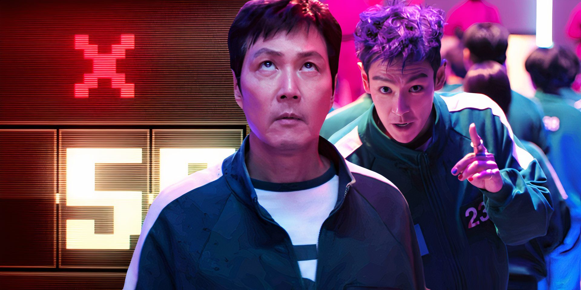
In the modern landscape of digital streaming, few properties have achieved the immediate, visceral recognition of Netflix’s Squid Game. While the narrative’s critique of late-stage capitalism and human desperation resonated with millions, the show’s meteoric rise was fueled significantly by its impeccable brand strategy. At the heart of this identity lies a series of simple geometric shapes—circles, triangles, and squares. Often mistaken by casual observers as the “X and O” of traditional gaming or PlayStation controllers, these symbols represent a masterclass in minimalist branding and corporate identity.

By dissecting the visual language of these symbols, we can uncover how a localized South Korean production transformed into a global powerhouse through the strategic application of design, color theory, and sensory branding.
The Power of Minimalist Iconography
In the world of brand strategy, simplicity is the ultimate sophistication. The most successful brands in history—think of Apple’s bitten fruit, Nike’s swoosh, or McDonald’s golden arches—rely on shapes that can be recognized in a fraction of a second. Squid Game utilized this principle by centering its entire visual identity around three basic shapes.
Decoding the Circle, Triangle, and Square
While viewers often associate these shapes with “X and O” gaming symbols, their origin is rooted in the Korean alphabet (Hangul). The symbols represent the letters “O,” “J,” and “M,” which together form the initials of the show’s title in Korean (Ojing-eo Geim). However, from a branding perspective, the show’s creators stripped away the linguistic context to focus on the geometric purity of the shapes.
In the hierarchy of the show’s fictional organization, each shape denotes a specific rank: the Circle is for workers, the Triangle for soldiers, and the Square for managers. This is a classic example of using visual hierarchy to establish a corporate structure without the need for verbal explanation. For a brand, this kind of “silent communication” is invaluable; it creates a sense of intrigue and mystery while remaining easily digestible for a global audience.
Cultural Resonance and Universal Recognition
The genius of using basic geometry is that it transcends language barriers. A square is a square in Seoul just as it is in New York or São Paulo. By leaning into these universal forms, the show’s brand became instantly exportable. The “X and O” confusion actually worked in the show’s favor, as it tapped into the collective subconscious of the global gaming community. Whether you grew up playing board games or using a PlayStation controller, the shapes felt familiar, yet their application in the show’s dark context felt refreshingly subversive.
Building a “Silent” Brand Strategy
A strong brand is more than just a logo; it is an atmosphere. Squid Game achieved this through a meticulous “silent” brand strategy, where the environment, the costumes, and the symbols did the heavy lifting of storytelling and marketing.
Color Theory and Visual Contrast
One cannot discuss the branding of Squid Game without addressing its iconic color palette. The juxtaposition of the players’ teal-green tracksuits against the guards’ hot-pink jumpsuits is a deliberate branding choice designed to create high visual contrast. In marketing, contrast is used to draw attention and create “pattern interrupts.”
The green represents the “everyman,” evoking nostalgia for old-school Korean school uniforms and the “Saemaul Undong” movement. The pink, conversely, is an aggressive, artificial color that signals danger and corporate detachment. By consistently applying these colors across all marketing collateral—from trailers to social media posts—Netflix created a visual shorthand. Even without seeing the title, a consumer seeing a specific shade of pink next to a triangle immediately associates the image with the Squid Game brand.
The Mask as a Corporate Identity
The masks worn by the guards are perhaps the most potent element of the show’s branding. By obscuring individual faces and replacing them with the Circle, Triangle, or Square, the show effectively turned human beings into “products” of the organization.
From a brand strategy perspective, the mask serves as a physical logo. It is reproducible, recognizable, and highly marketable. Much like the stormtroopers in Star Wars or the Guy Fawkes masks in V for Vendetta, the Squid Game mask became a wearable brand. This facilitated a massive wave of user-generated content, with fans recreating the masks for Halloween, cosplay, and social media filters, essentially providing Netflix with millions of dollars in free peer-to-peer advertising.
From Screen to Street: The Merchandising Flywheel
The transition from a successful television series to a lifestyle brand requires a robust merchandising strategy. Squid Game leveraged its symbolic “X and O” style icons to create a merchandising flywheel that sustained its relevance long after the initial binge-watching phase.
Gamifying the Consumer Experience
The branding of Squid Game was not just something to be watched; it was something to be participated in. The simplicity of the symbols allowed for easy integration into various consumer touchpoints. For example, the “Dalgona Candy” challenge became a viral sensation on TikTok. The shapes (including the circle and triangle) were etched into the honeycomb candy, turning a plot point into an interactive brand experience.
This is what brand strategists call “experiential branding.” By providing the audience with a tangible way to engage with the brand’s symbols, the show moved beyond the screen and into the real world. Every person attempting to carve out a circle from a piece of sugar was, in effect, interacting with the Squid Game corporate identity.
Viral Marketing and Social Proof
The “X and O” (or rather, the Circle, Triangle, and Square) became a form of social currency. During the height of the show’s popularity, influencers and brands across the globe adopted the iconography to tap into the trend. Because the symbols were so minimalist, they were incredibly easy to “remix.”
Luxury fashion brands, fast-food chains, and even government agencies used the shapes in their social media posts to show they were part of the cultural conversation. This “social proof” reinforced the brand’s dominance. When a brand’s symbols are so strong that other brands feel the need to imitate or reference them, that brand has reached the pinnacle of cultural saturation.
Lessons for Modern Corporate Branding
The success of the Squid Game aesthetic offers valuable lessons for businesses and brand managers looking to cut through the noise of a saturated market. Whether you are a tech startup or a personal brand, the principles of iconicity and consistency remain the same.
Consistency Across Touchpoints
One of the most impressive feats of the Squid Game brand was its consistency. Every episode, every promotional poster, and every piece of official merchandise adhered strictly to the established visual guidelines. The shapes were never altered; the colors never deviated.
For a corporate brand, this level of consistency builds trust and recognition. If a customer sees a brand’s logo in a different color or a slightly different font every time they encounter it, the brand’s equity is diluted. Squid Game showed that by picking a few core elements and sticking to them relentlessly, you can create a brand that is “unforgettable.”
Evoking Emotional Response through Design
Great branding is not just about being seen; it is about being felt. The symbols in Squid Game are inextricably linked to the emotions of the show: tension, nostalgia, fear, and hope. This emotional anchoring is what gives the “X and O” style shapes their power.
When developing a brand strategy, it is essential to consider the emotional baggage your visual identity carries. Does your logo evoke a sense of security? Innovation? Mystery? By aligning your design choices with the emotional core of your product or service, you create a deeper connection with your audience. The symbols of Squid Game work because they are not just pretty shapes; they are the keys to a specific, high-stakes emotional world.
Conclusion: The Legacy of Geometric Branding
In conclusion, the shapes that define Squid Game—the Circle, Triangle, and Square—are far more than simple “X and O” gaming icons. They are the pillars of a sophisticated brand strategy that utilized minimalism, cultural context, and psychological contrast to capture the world’s attention.
Through the lens of brand strategy, we see that the show’s success was not an accident. It was the result of a meticulously crafted visual identity that turned a niche Korean drama into a global icon. For marketers and business leaders, the lesson is clear: in an age of information overload, the brands that speak the loudest are often the ones that use the fewest words, relying instead on the universal power of the symbol. Squid Game did not just tell a story; it built an empire out of three simple shapes, proving that sometimes, the most basic designs are the ones that leave the deepest mark on the world.
aViewFromTheCave is a participant in the Amazon Services LLC Associates Program, an affiliate advertising program designed to provide a means for sites to earn advertising fees by advertising and linking to Amazon.com. Amazon, the Amazon logo, AmazonSupply, and the AmazonSupply logo are trademarks of Amazon.com, Inc. or its affiliates. As an Amazon Associate we earn affiliate commissions from qualifying purchases.