The humble olive plant, with its gnarled branches, silvery-green leaves, and ripening fruit, is far more than just an agricultural staple. For centuries, it has been a potent symbol, deeply embedded in the cultural and aesthetic consciousness of many societies. This visual language, the very essence of what an olive plant looks like, forms the bedrock of powerful brand identities, influencing everything from product packaging and logo design to marketing campaigns and the overall perception of quality, heritage, and well-being. Understanding the visual characteristics of the olive plant is therefore crucial for brands seeking to leverage its inherent symbolism and connect with consumers on a deeper, more resonant level.
The Enduring Aesthetics of the Olive Tree: A Visual Lexicon for Branding
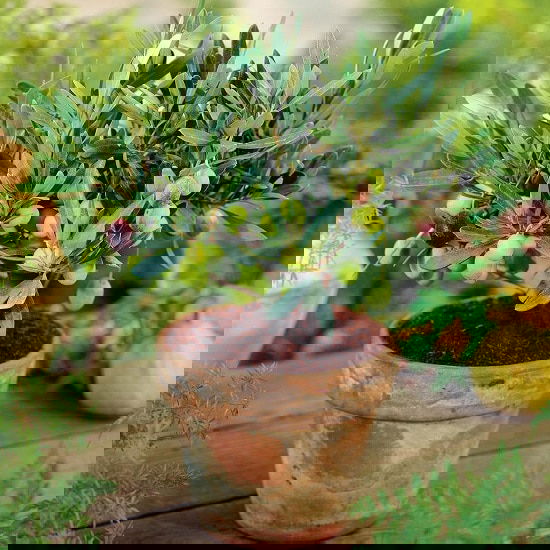
The visual appeal of the olive tree is multifaceted, offering a rich palette of imagery and symbolism that brands can effectively utilize. Its form, texture, and color all contribute to a distinct and recognizable aesthetic.
Form and Silhouette: Ancient Wisdom in Every Branch
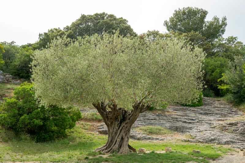
The most striking visual characteristic of an olive tree is its form. Mature olive trees are often ancient, their trunks twisted and weathered by time, bearing testament to resilience and longevity. This gnarled, contorted silhouette speaks of history, tradition, and enduring strength. For a brand, this translates into an association with authenticity, established expertise, and a sense of timeless quality. Think of olive oil brands that feature vintage illustrations or etchings of olive trees on their labels. This imagery immediately communicates a heritage-driven approach, suggesting a product that has been crafted with generations of knowledge and care.
Furthermore, the branches of an olive tree, often reaching outwards in a somewhat irregular yet balanced fashion, evoke a sense of natural harmony and organic growth. This can be leveraged in branding to convey a connection to nature, purity, and a healthy lifestyle. A brand using the silhouette of an olive branch, perhaps simplified and stylized, can suggest freshness, vitality, and a commitment to natural ingredients. The visual contrast between the rough, textured trunk and the delicate, silvery foliage creates a dynamic interplay that can be captured in logos and visual motifs, offering a sophisticated yet grounded aesthetic.
Color Palette: The Subtlety of Silvery Green and Earthy Tones
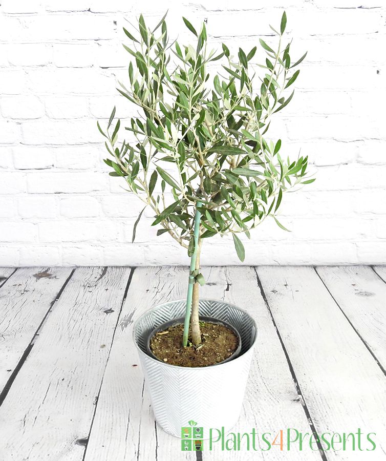
The color palette associated with the olive plant is equally significant in its branding potential. The leaves, typically a dusty, silvery-green, possess a unique luminescence that is both calming and sophisticated. This distinctive hue is instantly recognizable and evokes a sense of Mediterranean landscapes, sunshine, and the tranquil beauty of nature. Brands can utilize this color in various ways: from the primary color of their logo and packaging to accent colors that add a touch of natural elegance. For example, a skincare line emphasizing natural ingredients might adopt a silvery-green as its signature color, associating its products with the purity and rejuvenating qualities of the olive.
Beyond the leaves, the fruit itself presents a spectrum of colors as it ripens, from a pale green to a deep purple-black. These variations offer further branding opportunities. A brand focusing on the freshness of young olives might use brighter green hues, while one celebrating the rich, mature flavor of cured olives could incorporate deeper, more complex tones. The earthy tones of the trunk and the soil in which olive trees grow also contribute to a grounding and authentic visual identity. This connection to the earth reinforces notions of natural origin, organic processes, and sustainable practices, which are increasingly valued by consumers.
Texture and Detail: The Tactile Appeal of Authenticity
While visual branding primarily relies on sight, the implied texture of an olive plant can also be a powerful branding element. The rough, textured bark of the trunk suggests a tactile experience, a connection to the natural world that goes beyond mere visual representation. Brands can allude to this texture through graphic design elements, employing patterns or textures that mimic the aged bark. This can imbue a brand with a sense of rugged authenticity and handcrafted quality.
The delicate veins on the leaves, the subtle sheen of the olive fruit – these fine details, when captured or hinted at in branding, can elevate a product from the ordinary to the exquisite. They speak of meticulous attention to detail, a commitment to quality, and a deep appreciation for the natural world. A premium olive oil, for instance, might feature intricate illustrations of olive leaves and fruits, emphasizing the artisanal care that goes into its production and inviting consumers to appreciate the subtle complexities of its origin.
The Olive Branch as a Symbol: From Peace to Prosperity in Brand Narratives
Beyond its literal appearance, the olive plant, and specifically the olive branch, carries profound symbolic weight that brands can powerfully harness in their narratives. This symbolism transcends cultural boundaries and speaks to universal aspirations.
The Universal Emblem of Peace and Harmony
The most widely recognized symbolism of the olive branch is its association with peace, reconciliation, and harmony. This origin story, rooted in ancient Greek mythology and carried through biblical narratives, makes the olive branch a potent and instantly understood emblem. For brands, this can translate into a narrative of bringing people together, fostering understanding, or promoting a sense of calm and well-being. A company that emphasizes collaboration, community building, or conflict resolution might strategically incorporate the olive branch into its visual identity or marketing messages. Even indirectly, a brand that promotes a lifestyle of balance and tranquility can leverage the peaceful connotations of the olive.
Prosperity, Fertility, and Abundance
In many ancient cultures, the olive tree was also revered for its fertility and its ability to provide sustenance and prosperity. The abundant yield of olives symbolized wealth, good fortune, and a connection to the life-giving forces of nature. This aspect of the olive’s symbolism can be incredibly valuable for brands that aim to associate themselves with success, growth, and well-being. For instance, a financial institution might subtly employ olive motifs to convey stability, growth, and a prosperous future for its clients. Similarly, brands focused on food production and culinary excellence can draw on the olive’s association with abundance and deliciousness.
Health, Longevity, and Rejuvenation
The Mediterranean diet, heavily reliant on olive oil, has long been lauded for its health benefits, contributing to longevity and well-being. This association with health, vitality, and even rejuvenation offers another powerful layer of symbolism for brands. A health food company, a wellness retreat, or a natural beauty brand can all benefit from the inherent connection between the olive plant and a healthy lifestyle. The visual representation of the olive tree, with its enduring presence and life-sustaining fruit, can effectively communicate these values, positioning the brand as a promoter of health and longevity.
Translating Visual Cues into Brand Strategy: The Art of Olive-Inspired Branding
The understanding of what an olive plant looks like and the meanings it embodies is not merely an academic exercise; it is a crucial component of effective brand strategy. Brands that successfully integrate these visual and symbolic elements can achieve deeper consumer connection and a more potent market presence.
Logo Design and Visual Identity: The First Impression
The way an olive plant is depicted in a logo or a brand’s broader visual identity is often the very first impression a consumer has. A minimalist depiction of an olive branch can convey elegance and sophistication, while a more detailed illustration might speak of artisanal craftsmanship and authenticity. The choice of color is paramount. A brand opting for the silvery-green of the leaves will evoke a different feeling than one using the deep purple of ripe olives. The font choices, the overall layout, and the use of imagery all work in concert to translate the visual essence of the olive plant into a recognizable and memorable brand identity. For example, a premium olive oil brand might use a serif font for a classic feel, paired with a realistic illustration of an olive sprig, reinforcing its heritage and quality. Conversely, a modern organic food company might opt for a clean sans-serif font and a stylized, abstract olive shape in a vibrant green, highlighting its freshness and contemporary appeal.
Packaging and Product Design: The Tangible Experience
The packaging of a product is a physical manifestation of its brand. For olive-related products, such as olive oil, olives, or even cosmetics derived from olive ingredients, the packaging is a prime opportunity to leverage the visual language of the olive plant. The shape of the bottle, the texture of the label, the colors used – all can be designed to evoke the natural origins and inherent qualities of the olive. Consider the use of matte finishes to mimic the texture of olive leaves, or the incorporation of subtle patterns that resemble the veining of an olive branch. The color of the glass itself can play a role; dark green or amber glass for olive oil is not just functional but also visually cues the rich, natural content within. Even for non-olive-specific products, the subtle incorporation of olive motifs can lend a sense of naturalness, health, and sophisticated simplicity.
Marketing and Storytelling: Weaving the Olive Narrative
Beyond the visual elements, the story of the olive plant can be a powerful marketing tool. Brands can weave narratives that highlight the ancient origins of olive cultivation, the dedication of farmers, the sun-drenched landscapes where olives grow, and the health benefits derived from their consumption. Marketing campaigns can feature imagery of olive groves, the harvesting process, and the people behind the product, all reinforcing the brand’s connection to the olive. This storytelling approach allows consumers to connect with the brand on an emotional level, appreciating not just the product but also the values and heritage it represents. The “what does an olive plant look like” question, when explored through a brand’s lens, becomes an invitation for consumers to engage with a rich tapestry of history, nature, and well-being.
In conclusion, the visual characteristics of the olive plant – its distinctive form, its subtle color palette, and its implied textures – are not merely aesthetic qualities. They are powerful symbolic elements that, when thoughtfully integrated into branding, can communicate heritage, authenticity, natural purity, peace, prosperity, and health. Brands that understand and effectively translate the visual language of the olive plant into their logos, packaging, marketing, and overall narrative strategy can cultivate a deeply resonant and enduring connection with their audience. The olive plant, in its visual essence, offers a timeless foundation for building brands that are both beautiful and meaningful.
aViewFromTheCave is a participant in the Amazon Services LLC Associates Program, an affiliate advertising program designed to provide a means for sites to earn advertising fees by advertising and linking to Amazon.com. Amazon, the Amazon logo, AmazonSupply, and the AmazonSupply logo are trademarks of Amazon.com, Inc. or its affiliates. As an Amazon Associate we earn affiliate commissions from qualifying purchases.