
The peace sign, a universally recognized emblem, transcends language and borders. Its simple yet profound design has resonated across generations, evolving from a specific anti-war movement to a broader symbol of harmony, environmentalism, and social progress. For brands, understanding the visual nuances and the associated cultural connotations of the peace sign is crucial. It’s not just a graphic; it’s a loaded icon that can significantly influence brand perception, marketing strategies, and consumer connection. This article delves into the visual characteristics of the peace sign and explores its multifaceted impact within the realm of branding.

The Anatomy of a Symbol: Deconstructing the Peace Sign’s Visual Language
At its core, the peace sign is a deceptively simple geometric construct. However, its precise visual elements are fundamental to its recognition and impact. Understanding these components allows us to appreciate its enduring design efficacy and its adaptability across various branding applications.
The Circle: A Universal Container of Unity
The outermost element of the peace sign is a perfect circle. This shape is inherently symbolic, representing wholeness, infinity, eternity, and inclusivity. In branding, a circular motif often conveys a sense of completeness, community, and a continuous cycle. When applied to the peace sign, the circle acts as a unifying element, suggesting a world united in its desire for peace. It provides a defined boundary, making the internal design stand out while also reinforcing the idea of a shared global aspiration.
The use of a circle in branding can evoke feelings of trust, reliability, and interconnectedness. Brands that aim to foster a sense of belonging or emphasize their global reach might find the circular element of the peace sign particularly appealing. Its smooth, unbroken form suggests a lack of division, a concept directly aligned with the core message of peace.
The Internal Structure: Lines of Division and Connection
Within the circle, the peace sign features a distinct internal structure composed of three lines. These lines are not arbitrary; their specific arrangement is what gives the symbol its iconic form.
The Vertical Line: A Pillar of Direction and Hope
A single, unbroken vertical line runs from the top to the bottom of the circle. This element can be interpreted in several ways within a branding context. It can represent a clear path forward, a sense of purpose, or an unwavering commitment. In the context of the peace sign, it can also be seen as a beacon of hope, a steady presence amidst potential conflict or uncertainty. For brands, a strong vertical element often signifies leadership, stability, and a clear vision. Its integration into the peace sign adds a layer of directional aspiration to the symbol of peace.
The Downward-Pointing Diagonal Lines: Branches of Dissent and Dialogue
Two diagonal lines extend downwards from the center point of the circle, forming an inverted ‘Y’ shape. These lines are crucial to the symbol’s unique appearance. Historically, these lines have been interpreted as representing the semaphore signals for “N” (nuclear) and “D” (disarmament), formed by holding flags in specific positions. This origin story imbues the symbol with a powerful anti-war and anti-nuclear message.
From a branding perspective, these diagonal lines introduce a sense of dynamism and visual interest. They break the symmetry of the circle and vertical line, creating a unique and memorable form. They can be seen as representing divergent ideas or pathways that, when brought together within the circle, contribute to a larger, unified outcome. For brands, this can translate to an emphasis on open dialogue, the celebration of diverse perspectives, and the synthesis of different elements to achieve a collective goal.
The Interplay of Form: Balance, Harmony, and Impact
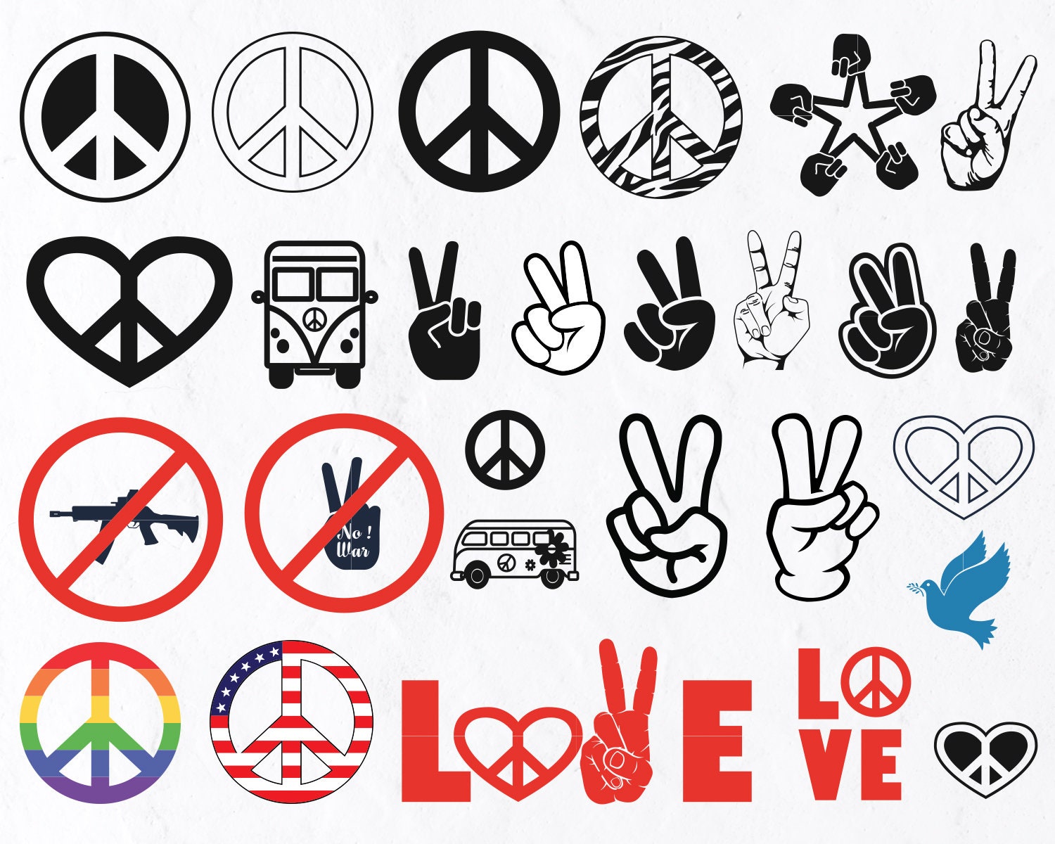
The true power of the peace sign lies in the harmonious interplay of its constituent elements. The circle provides a frame, the vertical line offers a central anchor, and the diagonal lines introduce complexity and meaning. This arrangement achieves a remarkable balance, making the symbol both aesthetically pleasing and deeply resonant.
From a design and branding standpoint, this balance is key. The symbol is instantly recognizable due to its simplicity, yet it carries a wealth of symbolic meaning. It avoids being overly complex, making it easily reproducible across various media, from digital logos to printed materials. The visual tension created by the intersecting lines within the circle also makes it dynamic and engaging, capturing attention without being jarring. This inherent visual strength makes it a potent tool for brands seeking to associate themselves with positive, universally understood values.
The Peace Sign as a Brand Asset: From Counter-Culture Icon to Corporate Identity
The journey of the peace sign from its origins in activism to its adoption by mainstream brands is a testament to its enduring appeal and its adaptability as a visual asset. Its evolution reflects changing societal values and the increasing desire for brands to align themselves with meaningful causes.
Historical Roots and Cultural Resonance: The Foundation of Brand Association
The peace sign was famously designed by Gerald Holtom in 1958 for the British Campaign for Nuclear Disarmament (CND). Its initial intent was to visually represent the interconnectedness of humanity and the stark reality of nuclear annihilation. The symbol quickly became synonymous with the anti-war and counter-culture movements of the 1960s, embodying a generation’s desire for a world free from conflict and violence.
This rich historical context provides brands with a powerful foundation for association. When a brand incorporates the peace sign, it taps into a collective consciousness deeply imprinted with these historical narratives. This association can lend credibility and authenticity to a brand’s message, suggesting that it stands for something more than just commerce – it stands for positive social values. Brands that emphasize themes of global unity, environmental stewardship, or social responsibility can leverage the peace sign to amplify these messages and connect with consumers who share these values.
Modern Adaptations and Brand Integration: Leveraging Symbolism for Marketing
In contemporary branding, the peace sign is no longer confined to overtly activist organizations. It has been embraced by a wide spectrum of businesses, from fashion labels and lifestyle brands to tech companies and even social enterprises. This widespread adoption highlights its versatility and its ability to be reinterpreted within different brand contexts.
- Fashion and Apparel: The peace sign is a perennial favorite in fashion, appearing on t-shirts, accessories, and even high-end designer collections. It’s used to convey a bohemian, liberal, or simply optimistic aesthetic. Brands in this sector often use it to appeal to a younger demographic seeking self-expression and a connection to cultural movements.
- Lifestyle and Wellness: Brands focused on mindfulness, sustainability, or holistic well-being frequently employ the peace sign. It reinforces their commitment to a harmonious lifestyle, both for individuals and for the planet.
- Social Enterprise and Non-Profits: For organizations with a direct social or environmental mission, the peace sign is a natural and powerful choice. It immediately communicates their core purpose and can attract like-minded donors and supporters.
- Tech and Digital Platforms: While less common, some tech companies have experimented with the peace sign in their branding, particularly those focused on community building, open-source collaboration, or digital tools aimed at fostering connection and understanding.
The key to successful integration lies in authenticity. Brands that use the peace sign superficially or without genuine alignment to its underlying values risk appearing disingenuous. However, when used thoughtfully, it can be an incredibly effective tool for building brand affinity and communicating a positive, aspirational identity.
Designing with Intention: Strategic Applications of the Peace Sign in Branding
The strategic application of the peace sign requires careful consideration of its visual and symbolic weight. Its effectiveness as a branding element hinges on how it is incorporated into the overall brand identity and marketing strategy.
Visual Integration: Logo Design, Color, and Scale
When using the peace sign in logo design or visual collateral, several factors come into play:
- Color Palette: While traditionally rendered in black or white, the peace sign can be adapted to fit a brand’s color scheme. Using colors associated with nature (greens, blues, earthy tones) can further enhance its environmental connotations. Brighter, more vibrant colors can inject a sense of optimism and youthful energy.
- Scale and Placement: The size and placement of the peace sign within a brand’s visual language are critical. It can be a primary logo element, a subtle accent, or a recurring motif. Its scale should be proportional to its intended impact. A large, prominent peace sign will convey a stronger message than a small, understated one.
- Stylization: While the classic peace sign is highly recognizable, brands can subtly stylize it to create a unique visual identity. This might involve slight modifications to the line thickness, the curvature of the circle, or the addition of subtle embellishments. However, designers must be cautious not to alter the fundamental geometry to the point of losing immediate recognition.
- Combination with Other Elements: The peace sign can be effectively combined with other brand elements, such as typography, slogans, or complementary graphics. The goal is to create a cohesive visual narrative where the peace sign supports and amplifies the brand’s overall message.

Messaging and Storytelling: Reinforcing Brand Values
The visual presence of the peace sign should be consistently reinforced through a brand’s messaging and storytelling.
- Brand Narrative: Brands that use the peace sign should weave it into their origin story, mission statement, and ongoing communication. This helps to establish a deeper connection with consumers who resonate with the symbol’s inherent values. For example, a brand might highlight its commitment to ethical sourcing or fair labor practices as an embodiment of peace and fairness in the global supply chain.
- Marketing Campaigns: Peace signs can be featured in advertising campaigns to evoke specific emotions and associations. A campaign might focus on themes of unity, global cooperation, or environmental sustainability, with the peace sign acting as a visual anchor for these messages.
- Community Engagement: Brands can foster a sense of community around the peace sign by encouraging its use in user-generated content or by supporting initiatives aligned with peace and social good. This can create a powerful feedback loop, where the brand’s values are reflected and amplified by its audience.
The peace sign, when wielded strategically, is more than just a graphic; it’s a powerful narrative tool that can imbue a brand with meaning, attract a loyal following, and contribute to a positive brand image in an increasingly conscious marketplace. Its enduring visual appeal and profound symbolic resonance ensure its continued relevance as a potent branding asset.
aViewFromTheCave is a participant in the Amazon Services LLC Associates Program, an affiliate advertising program designed to provide a means for sites to earn advertising fees by advertising and linking to Amazon.com. Amazon, the Amazon logo, AmazonSupply, and the AmazonSupply logo are trademarks of Amazon.com, Inc. or its affiliates. As an Amazon Associate we earn affiliate commissions from qualifying purchases.