
The Eiffel Tower stands not merely as an architectural marvel but as a paragon of enduring brand identity, its visual characteristics deeply etched into the global consciousness. To ask “what does the Eiffel Tower look like” is to probe beyond its physical dimensions and into the very essence of its brand – its design language, its symbolic power, and its indelible mark on cultural memory. Its appearance is a meticulously crafted, albeit initially contentious, statement that has evolved into one of the most recognizable and powerfully branded structures on earth. Understanding its visual attributes is key to grasping how a piece of engineering can transcend its function to become a universally understood symbol of a city, a nation, and an entire aesthetic movement.

An Architectural Marvel: Form and Function as Brand Pillars
The foundational elements of the Eiffel Tower’s appearance are rooted in its groundbreaking engineering, yet these practical considerations coalesce to form a striking visual brand. Gustave Eiffel’s audacious design presented a novel approach to large-scale construction, creating a structure that was both profoundly functional and aesthetically revolutionary.
The Lattice Structure: Engineering as Aesthetic
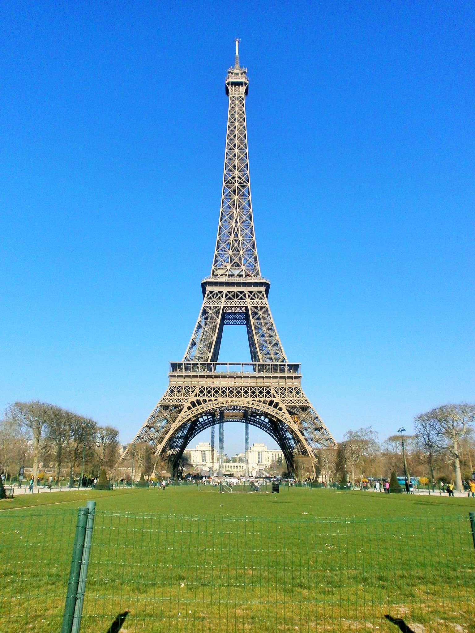
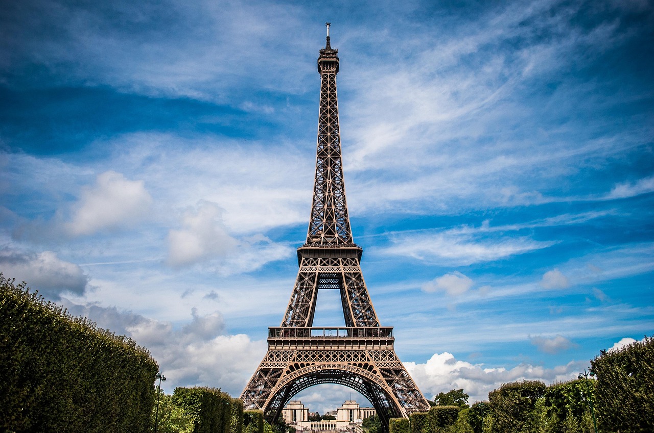
At first glance, the Eiffel Tower is defined by its intricate lattice work. Constructed from 18,038 pieces of wrought iron and held together by 2.5 million rivets, its open framework is its most distinguishing feature. This isn’t merely a structural necessity; it’s a deliberate design choice that imbues the tower with an unparalleled sense of lightness and transparency, despite its immense scale. The crisscrossing diagonal beams and girders create a complex yet harmonious pattern, a visual texture that changes with proximity and light. From afar, it forms a coherent, almost ethereal silhouette; up close, it reveals a meticulously organized network of metal, a testament to industrial precision and artistic composition. This visual openness allows light and sky to pass through, making it an integral part of its urban environment rather than an oppressive monolith. This engineering-as-art approach is a core part of its brand appeal: intelligent, sophisticated, and pioneering.
The Tapered Silhouette: Grace and Grandeur
The tower’s distinctive tapered silhouette, rising gracefully from its broad base, is another cornerstone of its visual brand. It ascends in four distinct sections, curving inward before culminating in a slender spire topped with an antenna. This parabolic curve isn’t just visually appealing; it’s a design optimized to withstand wind forces. However, its aesthetic impact is undeniable. The upward sweep gives it an impression of dynamic elegance, a sense of reaching for the heavens. It avoids the brutalist rigidity of many contemporary structures, instead embodying a fluid, almost organic form that evokes growth and aspiration. This graceful ascent contributes significantly to its iconic status, making it instantly recognizable even in simplified artistic representations. It speaks to a brand that combines strength with finesse, power with poise.
Color and Materiality: More Than Just Iron
While often perceived as grey, the Eiffel Tower’s color is a carefully chosen shade known as “Eiffel Tower Brown,” a custom-mixed paint applied in three graded tones – darkest at the base and lightest at the top – to counteract atmospheric haze and create an illusion of uniform color against the sky. This subtle chromatic variation enhances its perceived height and slenderness. The material itself, puddled iron, contributes a rich, industrial texture that ages with a dignified patina. It’s not the gleaming steel of modern skyscrapers but a material rooted in the industrial revolution, giving the tower a sense of history and permanence. The choice of a warm, earthy brown, rather than a stark metallic, grounds the tower visually within its Parisian context, making it less alien and more harmonious with the surrounding architecture. This thoughtful approach to color and material reinforces its brand as both monumental and integrated, a symbol of historical innovation rather than stark modernism.
Beyond the Blueprint: The Eiffel Tower’s Evolving Visual Narrative
The Eiffel Tower’s visual identity is not static; it is a dynamic brand narrative that shifts with time of day, season, and the viewer’s perspective. These evolving appearances add layers of complexity and emotional resonance to its global brand.
Day vs. Night: The Dual Persona
The contrast between its daytime and nighttime appearances is perhaps the most dramatic aspect of its visual evolution. By day, the tower is a testament to structural ingenuity, its iron framework catching the sunlight, revealing the intricate details of its construction. It stands as a powerful landmark, asserting its presence against the Parisian skyline. By night, however, it transforms. Adorned with 20,000 light bulbs and 336 projectors, it becomes a beacon of light, a shimmering golden spectacle. Every hour, for five minutes, it erupts in a dazzling display of twinkling lights, creating a magical, ephemeral experience. This dual persona – robust and grounded by day, ethereal and enchanting by night – significantly expands its brand appeal. It’s a landmark that offers different experiences, catering to varied emotional responses, from awe-inspired admiration to romantic wonder. This adaptability in presentation is a hallmark of a powerful brand that knows how to captivate its audience at all times.
Seasonal Transformations: A Dynamic Icon
The tower’s appearance also subtly changes with the seasons. In winter, against a crisp, often grey sky, its iron structure might appear starker, more defined, embodying a stoic grandeur. In spring and summer, surrounded by lush green foliage of the Champ de Mars, it can seem softer, more integrated into a vibrant landscape. The changing light, from the bright sun of summer to the soft glow of autumn, plays upon its surfaces, casting different shadows and highlighting different facets of its design. Even the weather conditions – a misty morning or a clear blue sky – can alter its perceived texture and color. This natural interplay adds a dynamic layer to its visual brand, showing it as a living, breathing entity that changes with its environment, preventing it from ever appearing monotonous.
Perspectives and Perceptions: How We ‘See’ the Brand
How one perceives the Eiffel Tower largely depends on the viewing angle and distance. From a distance, its elegant silhouette dominates the cityscape, a recognizable emblem. From beneath, looking up, its sheer scale and the dizzying complexity of its lattice work become overwhelming, evoking a sense of human ingenuity and aspiration. From its various platforms, the city of Paris unfurls below, framing the tower itself as the center of a grand tableau. This multiplicity of perspectives is crucial to its brand narrative. It’s not a singular image but a collection of experiences, each reinforcing its iconic status. Each angle offers a unique glimpse into its design, contributing to a holistic understanding of its visual brand.
The Eiffel Tower’s Brand Language: Design Principles in Action
The visual language of the Eiffel Tower, defining “what it looks like,” is built upon fundamental design principles that have ensured its lasting impact and iconic brand status.
Repetition and Pattern: Visual Cohesion
The repetitive use of geometric forms – the crisscrossing girders, the arched supports, the standardized iron sections – creates a powerful sense of visual cohesion and rhythm. This systematic repetition isn’t monotonous; instead, it creates a complex pattern that is both visually engaging and structurally sound. The inherent orderliness of these patterns contributes to a sense of reliability and strength, core attributes of its brand. This visual consistency ensures that even though it’s a massive structure, it doesn’t appear chaotic, but rather a meticulously organized masterpiece. The brand’s message is one of precision, careful planning, and robust execution.
Scale and Proportion: Dominance and Accessibility
At 330 meters (1,083 feet) tall, the Eiffel Tower’s scale is immense, designed to dominate the urban landscape. Yet, its proportions are expertly handled, preventing it from feeling cumbersome. The broad, grounded base gradually narrows as it ascends, creating a sense of uplift and elegance rather than bulk. This balance between monumental scale and refined proportion allows the tower to assert its dominance without appearing overly imposing. It is grand, but also inviting, offering multiple levels and viewing platforms that make it accessible to visitors. This blend of aspirational grandeur and welcoming accessibility is a potent component of its brand, appealing to both those who marvel from afar and those who wish to experience it intimately.
Light and Shadow: Defining Contours
The open lattice structure of the Eiffel Tower means that light and shadow play a crucial role in defining its appearance. As the sun moves across the sky, new shadows are cast, highlighting different aspects of its framework. The interplay of light filtering through the iron creates intricate patterns on the ground and within the tower itself, giving it a dynamic, ever-changing quality. This manipulation of light and shadow emphasizes its depth and three-dimensionality, adding visual intrigue. In branding terms, this demonstrates a design that leverages its environment, using natural elements to enhance its visual impact and create a sense of mystery and allure, making its ‘look’ constantly fresh and captivating.
The Global Impact of a Visual Brand: From Paris to Pop Culture
The answer to “what does the Eiffel Tower look like” extends beyond its physical attributes to encompass its widespread cultural representation and its role as a powerful global brand.
Symbol of Paris, Emblem of France
Visually, the Eiffel Tower has become synonymous with Paris and, by extension, France itself. Its image instantly evokes romanticism, history, art, and French sophistication. It is the visual shorthand for an entire culture, capable of communicating complex ideas and emotions in a single glance. This iconic status means that its form, its “look,” carries an immense weight of meaning and recognition. When people visualize Paris, they see the Eiffel Tower; it is the ultimate visual anchor for the city’s brand identity. This level of visual association is the pinnacle of successful branding.
Merchandise and Memorabilia: Extending the Brand
The Eiffel Tower’s distinct appearance makes it a prime subject for merchandise and memorabilia. From miniature replicas and keychains to haute couture and fine art, its image is endlessly reproduced and reinterpreted. This proliferation of branded products reinforces its visual identity, ensuring its “look” is recognized and carried across the globe. Each reproduction, regardless of scale or material, leverages the powerful visual shorthand of the original, expanding its brand reach and ensuring its visual omnipresence. This widespread commercialization, far from diluting its brand, amplifies it, making its visual form an even more ingrained part of global culture.
Cultural Referencing and Brand Reinforcement
The tower’s visual presence is ubiquitous in films, literature, advertising, and even emojis. It is referenced and reimagined in countless contexts, always instantly recognizable. This constant cultural referencing reinforces its visual brand, ensuring its image remains fresh and relevant across generations. It serves as a visual shortcut, a universal symbol that requires no explanation. Its enduring “look” has transcended its original purpose to become a powerful, self-sustaining visual brand that shapes perceptions and influences emotions worldwide.
Crafting Enduring Visual Identity: Lessons from the Iron Lady
The Eiffel Tower’s journey from a temporary exhibition piece to a permanent global icon offers invaluable lessons in crafting an enduring visual identity, a brand that defines “what it looks like” for centuries.
Originality and Innovation
The tower’s initial appearance was radical, challenging traditional architectural aesthetics. Its innovative use of wrought iron and its unprecedented height made it a statement piece. This originality, though controversial at first, eventually cemented its status as a visionary design. For any brand, embracing a distinctive and innovative visual identity is crucial for standing out in a crowded landscape and achieving long-term recognition. The Eiffel Tower teaches that a unique ‘look’ can be initially polarizing but ultimately enduring.
Adaptability and Resilience
Despite its fixed physical structure, the Eiffel Tower’s visual brand has demonstrated remarkable adaptability – through changing lighting, colors, and cultural interpretations. It has withstood shifts in architectural trends, public opinion, and technological advancements. Its resilience is a testament to a robust visual design that can be reinterpreted without losing its core identity. A strong brand’s “look” must be resilient, capable of adapting to new contexts while retaining its core essence.
Emotional Resonance Through Design
Ultimately, what the Eiffel Tower “looks like” evokes powerful emotional responses: awe, romance, wonder, and aspiration. This emotional connection is a direct result of its masterful design – its graceful form, its intricate details, its luminous presence. A brand’s visual identity must aim to forge such deep emotional ties, moving beyond mere recognition to inspire feelings that resonate with its audience. The Eiffel Tower’s appearance is not just a collection of iron beams; it is a meticulously crafted visual narrative that speaks to the human spirit, making it an irreplaceable icon in the global brand landscape. Its appearance is its brand, and its brand is its legacy.
aViewFromTheCave is a participant in the Amazon Services LLC Associates Program, an affiliate advertising program designed to provide a means for sites to earn advertising fees by advertising and linking to Amazon.com. Amazon, the Amazon logo, AmazonSupply, and the AmazonSupply logo are trademarks of Amazon.com, Inc. or its affiliates. As an Amazon Associate we earn affiliate commissions from qualifying purchases.