In the dynamic realm of digital marketing and online presence, your Facebook banner is far more than just a decorative image; it’s a powerful visual ambassador for your brand. It’s the digital storefront, the first handshake, and often the defining visual element that communicates your brand’s essence to a global audience. Understanding the optimal size for this crucial asset isn’t merely a technicality; it’s a strategic imperative for ensuring your message is delivered with clarity, professionalism, and impact. This article delves into the intricacies of Facebook banner sizes, exploring not just the dimensions but also the profound branding implications behind every pixel, ensuring your visual identity shines brightly on one of the world’s largest social platforms.

The Critical Role of Your Facebook Banner in Brand Identity
Your Facebook banner serves as the digital frontispiece of your page, whether it’s a personal profile, a business page, a community group, or an event. In an age dominated by visual content, this prime real estate offers an unparalleled opportunity to reinforce your brand’s identity, communicate its values, and engage your audience from the very first glance. Ignoring its potential or, worse, mismanaging its execution due to incorrect sizing, can undermine your entire online branding effort.
First Impressions and Digital Presence
The digital landscape is crowded, and attention spans are fleeting. When a user lands on your Facebook page, your banner is the very first visual cue they encounter. Within milliseconds, this image can convey professionalism, creativity, trustworthiness, or, conversely, amateurism and disinterest. A well-designed, perfectly sized banner creates an immediate positive impression, encouraging visitors to explore further. It’s your opportunity to visually articulate who you are and what you stand for before a single word is read. This initial visual engagement sets the tone for your brand’s entire digital presence, shaping user perception and influencing their decision to connect, follow, or convert.
Visual Storytelling and Brand Messaging
Beyond aesthetics, your Facebook banner is a potent tool for visual storytelling. It allows you to convey complex brand messages, highlight current campaigns, showcase product launches, or simply articulate your brand’s mission through imagery and minimal text. The right image, color scheme, and typography within the banner can instantly communicate your brand’s personality, whether it’s innovative and modern, traditional and reliable, or vibrant and community-focused. The limited space demands strategic thinking: what single visual narrative best encapsulates your brand at this moment? What core message do you want to embed in the minds of your audience? When sized correctly, the banner ensures this story is told without distortion or awkward cropping, maintaining the integrity of your visual narrative across various devices.
Consistency Across Platforms
While our focus here is squarely on Facebook, it’s vital to acknowledge that your brand exists across multiple digital touchpoints. Maintaining a consistent visual identity across Facebook, Instagram, LinkedIn, your website, and other platforms is a cornerstone of robust brand strategy. Your Facebook banner, therefore, should not operate in isolation. While the specific dimensions will vary by platform, the core design elements—logo placement, brand colors, typography, and overall aesthetic—should be harmonized. This consistency builds brand recognition, reinforces credibility, and creates a seamless user experience, allowing your audience to instantly identify and trust your brand regardless of where they encounter it online. The Facebook banner is a crucial piece of this broader puzzle, playing its specific role in a unified brand ecosystem.
Understanding Facebook Banner Size Specifications
The seemingly straightforward question “what size is the banner on Facebook?” is nuanced, as Facebook employs different optimal dimensions for various types of banners to ensure visual integrity across diverse device screens. Getting these specifications right is paramount for brand presentation, as incorrect sizing can lead to pixelation, awkward cropping, or crucial information being cut off.
Facebook Profile Cover Photo Dimensions (Personal and Page)
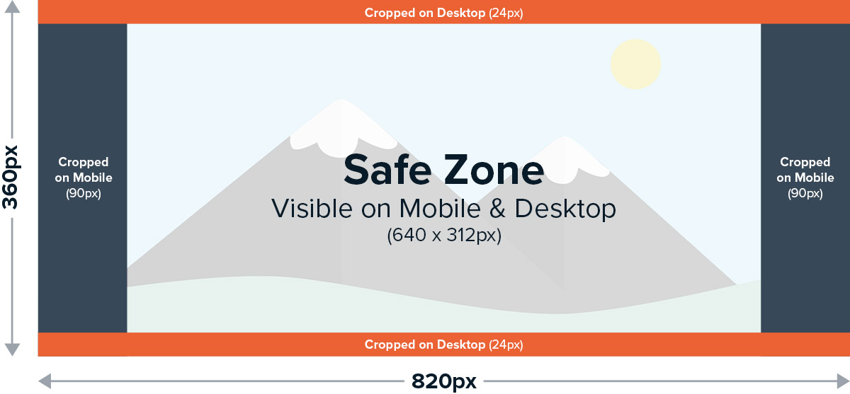
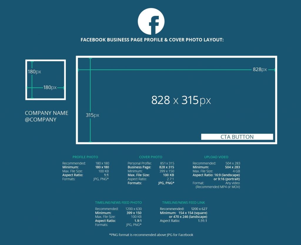
For both personal profiles and business pages, the recommended dimensions for the cover photo are typically 820 pixels wide by 312 pixels tall on desktop. However, it’s crucial to understand that Facebook displays these banners differently on mobile devices. On smartphones, the cover photo will appear as approximately 640 pixels wide by 360 pixels tall. This disparity means that the sides of your desktop-optimized image will be cropped on mobile. Therefore, designers must strategize to keep all essential elements—like logos, key text, and primary visuals—within a “safe zone” that is visible on both desktop and mobile. A commonly recommended safe zone is the central 560 pixels wide by 312 pixels tall area.
Facebook Group Cover Photo Dimensions
Facebook Groups often serve as vital community hubs or specialized interest groups, and their cover photos play a significant role in establishing the group’s identity. The recommended size for Facebook Group cover photos is considerably larger than page covers, typically 1640 pixels wide by 856 pixels tall. This wider aspect ratio (approximately 1.91:1) is designed to give group administrators more space to convey the group’s purpose and foster a sense of belonging. Similar to page covers, there can be slight variations in how this image is displayed across devices, but the larger canvas generally provides more flexibility.
Facebook Event Cover Photo Dimensions
When promoting an event on Facebook, the event cover photo is the primary visual draw, capturing attention and conveying the event’s theme or purpose. Facebook Event cover photos have their own specific dimensions, usually recommended at 1920 pixels wide by 1080 pixels tall. This 16:9 aspect ratio is similar to standard high-definition video, making event images look sharp and engaging. Given the promotional nature of event covers, it’s essential that all critical information—event title, date, key speakers, or visuals—is clearly visible and not obscured by Facebook’s interface elements.
Recommended Mobile vs. Desktop Display Ratios
The fundamental challenge with Facebook banner sizes is optimizing for both desktop and mobile viewing, which inherently have different aspect ratios and display priorities. Desktop browsers typically offer a wider, more panoramic view, while mobile apps prioritize a taller, more vertically oriented display. This means what looks perfect on a large monitor might appear truncated or poorly composed on a smartphone. Understanding these varying display ratios is key to strategic design. Designers must visualize how the image will be cropped and scaled on different devices, often creating designs with a “center-focus” approach where critical information is never near the edges that might be trimmed.
Key Considerations: Safe Zones and Text Placement
To navigate the mobile/desktop dilemma, the concept of a “safe zone” is invaluable. This is the central area of your banner that is guaranteed to be visible on both desktop and mobile. For a standard page cover, this might mean designing crucial elements to fit within the central area, leaving more decorative or less critical elements towards the edges.
Additionally, text placement requires careful thought. Overlapping text with your profile picture (on personal/page covers) or allowing it to be cropped off are common mistakes. Ensure text is legible, appropriately sized, and positioned within the safe zone, away from any potential overlays or crop lines. Facebook also compresses image files, so using high-quality JPEGs (with minimal compression) or PNGs for graphics with text can help maintain clarity. By adhering to these considerations, brands can ensure their banner delivers a consistent, high-quality visual experience across the entire Facebook ecosystem.
Design Principles for an Impactful Facebook Banner
Beyond merely adhering to technical specifications, the true art of an effective Facebook banner lies in its design. A well-sized banner is only half the battle; its visual content must be compelling, on-brand, and strategically crafted to resonate with your target audience. Applying sound design principles ensures your banner not only fits but also captivates.
High-Resolution Imagery and File Formats
The foundation of any visually appealing banner is high-resolution imagery. Pixelation, blurriness, or low-quality graphics instantly detract from your brand’s professionalism and credibility. Always start with source images that are larger than the final required dimensions, allowing for scaling down without loss of quality. For files, PNG is generally preferred for graphics with text, logos, or sharp edges, as it preserves crispness and supports transparency. JPEG is suitable for photographs or images with smooth color gradients, but ensure you save them at a high-quality setting to minimize compression artifacts. Facebook itself applies some compression, so beginning with a pristine image is crucial to combat this potential degradation.
Brand Color Palettes and Typography
Your Facebook banner should be an extension of your overall brand identity, and color and typography are central to this. Utilize your established brand color palette to evoke the right emotions and maintain visual consistency. Colors should be harmonious, reflecting your brand’s personality and values. Similarly, select typography that aligns with your brand guidelines—whether it’s modern sans-serif, elegant serif, or a bold display font. Ensure the text is highly legible against its background, avoiding overly complex fonts or small sizes that are difficult to read, especially on mobile devices. The goal is instant recognition and readability, reinforcing your brand’s aesthetic language without clutter or confusion.
Call to Action (CTA) Integration
While a Facebook banner’s primary role is visual branding, it can also subtly or explicitly guide audience action. Integrating a clear, concise Call to Action (CTA) can be highly effective. This could be anything from “Shop Now,” “Learn More,” “Visit Our Website,” to “Sign Up for Our Newsletter.” The CTA should be brief, prominently placed within the safe zone, and visually distinct but not overwhelming. It should act as a natural extension of your brand messaging, encouraging interaction without making the banner appear overly promotional or cluttered. Remember that Facebook provides dedicated CTA buttons below the cover photo, so your banner’s CTA can reinforce this or serve as an additional visual prompt.
A/B Testing Your Banner Designs
Even with the best design principles, predicting what will resonate most effectively with your audience can be challenging. This is where A/B testing becomes invaluable. Create two or more variations of your Facebook banner, changing elements such as the primary image, text, CTA placement, or color scheme. Rotate these banners over a set period, monitoring engagement metrics like clicks (if applicable), page visits, or even qualitative feedback. Analyzing which banner performs better in terms of reach, interaction, or conversion allows you to refine your visual strategy, ensuring your brand’s most impactful message is consistently displayed. A/B testing transforms banner design from a subjective art into a data-driven science, continually optimizing your brand’s visual appeal.
Common Pitfalls and How to Avoid Them
Even with the correct dimensions and a solid understanding of design principles, brands often stumble. Avoiding common mistakes is as crucial as knowing the best practices, ensuring your Facebook banner consistently elevates rather than diminishes your brand’s image.
Pixelation and Low-Quality Visuals
One of the quickest ways to erode brand credibility is through pixelated or blurry banner images. This usually stems from using low-resolution source images, improperly scaling smaller images to fit larger dimensions, or excessive file compression. To avoid this, always start with high-resolution imagery (ideally larger than the target dimensions). When resizing, use image editing software that maintains image quality, and save files in appropriate formats (PNG for text/graphics, high-quality JPEG for photos) to minimize artifacts caused by Facebook’s compression algorithms. Invest in quality stock photography or professional photo shoots to ensure your visuals are crisp and clear.
Overcrowding and Information Overload
In an attempt to convey too much, many banners become cluttered and overwhelming. Packing too many images, text blocks, logos, and calls to action into a single banner dilutes your message and makes it difficult for viewers to process information quickly. Remember the “less is more” principle. Focus on one primary visual and one core message. Use white space effectively to create visual breathing room. Prioritize clarity and impact over density. Your banner should invite exploration, not demand exhaustive deciphering. Simplicity often communicates sophistication and confidence, key brand attributes.
Ignoring Mobile Responsiveness
As highlighted earlier, the discrepancy between desktop and mobile display of Facebook banners is a significant challenge. A common pitfall is designing solely for desktop, leading to crucial elements being cropped or distorted on mobile devices. To avoid this, always design with mobile responsiveness in mind. Use the “safe zone” concept diligently, placing all critical information (logos, primary text, key visuals) within the area that is visible on both desktop and mobile. Preview your banner on various devices before publishing. Many design tools offer mobile preview options, allowing you to catch and correct potential issues before they impact your audience’s experience.
Outdated or Irrelevant Imagery
A static, unchanging banner can signal a stagnant brand. Displaying outdated promotions, old product lines, or seasonal imagery long past its prime can confuse your audience and make your brand seem disengaged. Your Facebook banner should be a dynamic representation of your brand’s current status, campaigns, or seasonal relevance. Regularly review and update your banner. Align it with current marketing initiatives, holidays, or significant company announcements. A fresh, relevant banner demonstrates that your brand is active, responsive, and attuned to current events, fostering a sense of vibrancy and engagement with your audience.
Tools and Resources for Creating Your Perfect Banner
Crafting an ideal Facebook banner doesn’t require a degree in graphic design, thanks to a plethora of accessible tools and resources. Leveraging the right platforms can empower even those with limited design experience to produce professional, on-brand visuals.
Graphic Design Software (Canva, Adobe Spark, Photoshop)
- Canva: An incredibly popular and user-friendly online design tool, Canva offers an extensive library of templates specifically sized for Facebook banners (pages, groups, events). Its drag-and-drop interface, vast collection of stock photos, icons, fonts, and customizable elements make it ideal for quick, professional-looking designs without needing advanced skills. Both free and paid (Pro) versions are available, with Pro offering more features and assets.
- Adobe Spark (now Adobe Express): Another excellent browser-based and mobile app, Adobe Express provides a streamlined experience for creating social graphics, including Facebook banners. It integrates well with other Adobe products and offers a range of templates, Adobe Stock photos, and design assets. It’s particularly good for users looking for a more design-led approach with ease of use.
- Adobe Photoshop/Illustrator: For professional designers or those with advanced skills, Photoshop (for raster images) and Illustrator (for vector graphics) offer unparalleled control and flexibility. These industry-standard tools allow for pixel-perfect precision, complex layering, custom typography, and intricate photo manipulation. While they have a steeper learning curve, they provide limitless creative possibilities for bespoke brand visuals.
Stock Photo Libraries and Licensing
Not every brand has the budget or resources for custom photography. High-quality stock photo libraries are invaluable for finding professional, relevant imagery.
- Free Resources: Websites like Unsplash, Pexels, and Pixabay offer a vast selection of high-resolution photos that can be used for free, often under generous licenses (e.g., Creative Commons Zero). Always check the specific license for each image to ensure proper usage.
- Paid Subscriptions: Services like Adobe Stock, Shutterstock, Getty Images, and iStock provide even larger, more curated collections of premium stock photography, illustrations, and videos. These often come with more robust licensing agreements, providing greater peace of mind for commercial use. When choosing stock photos, prioritize images that reflect your brand’s aesthetic, resonate with your target audience, and don’t look generic or overused.
Collaboration and Feedback Loops
Design is often an iterative process, and getting external perspectives can significantly improve your banner.
- Internal Teams: If you’re part of a larger organization, share your banner drafts with marketing colleagues, branding specialists, or even a diverse group of employees for feedback. Different perspectives can highlight areas for improvement or potential misinterpretations.
- Test Audiences/Focus Groups: For critical campaigns, consider testing banner designs with a small segment of your target audience. Their direct feedback can provide invaluable insights into what resonates and what falls flat.
- Online Tools: Platforms like Loom or Markup.io facilitate visual feedback, allowing collaborators to comment directly on specific areas of your design. This streamlines the review process and ensures clear communication, helping you refine your banner to perfection before its public debut.
By combining the right tools, leveraging quality resources, and embracing a collaborative design process, any brand can create a Facebook banner that is not only perfectly sized but also powerfully reflective of its unique identity and message. Your banner is your brand’s flag in the digital wind; make sure it flies high and proud.
aViewFromTheCave is a participant in the Amazon Services LLC Associates Program, an affiliate advertising program designed to provide a means for sites to earn advertising fees by advertising and linking to Amazon.com. Amazon, the Amazon logo, AmazonSupply, and the AmazonSupply logo are trademarks of Amazon.com, Inc. or its affiliates. As an Amazon Associate we earn affiliate commissions from qualifying purchases.