
In the realm of martial arts, where discipline, tradition, and identity intertwine, every element contributes to a holistic brand experience. For Taekwondo, a globally recognized Korean martial art, one such pivotal element stands out: its iconic uniform. Often simply referred to as a “Taekwondo uniform,” its proper name is the dobok. More than just attire, the dobok serves as a powerful symbol, a visual anchor, and a consistent branding tool that communicates the essence of Taekwondo to practitioners and the public alike. From its distinctive design to its deep-seated cultural significance, understanding the dobok is to understand a core component of Taekwondo’s enduring brand identity.

This article delves into how the dobok functions as a critical asset in Taekwondo’s overarching brand strategy, examining its role in reinforcing tradition, fostering community, and projecting a unified global image, while also allowing for individual dojang (school) branding. We will explore how this seemingly simple garment encapsulates the values, history, and future direction of a martial art that has captivated millions worldwide.
The Dobok: More Than Just Clothing – A Cornerstone of Taekwondo’s Brand Identity
At its core, branding is about identity, recognition, and the consistent communication of values. The dobok excels in all these aspects, acting as a silent, yet potent, ambassador for Taekwondo. It is a visual cue that immediately distinguishes Taekwondo from other martial arts, much like a corporate logo distinguishes a company. The standardization of the dobok’s design across the globe contributes significantly to Taekwondo’s ability to project a unified and recognizable brand.
Etymology and Significance: Why the Name Matters
The term “dobok” (도복) is derived from two Korean words: “do” (도), meaning “way” or “path” (as in Taekwondo, “the way of the foot and fist”), and “bok” (복), meaning “clothing” or “uniform.” Thus, a dobok literally means “clothing for the way.” This etymological foundation is crucial for understanding its branding power. It immediately elevates the garment beyond mere sportswear, imbuing it with philosophical depth and purpose.
From a branding perspective, assigning a specific, culturally rich name like “dobok” differentiates it from generic terms like “uniform” or “gi” (used in Japanese martial arts). This distinct terminology reinforces Taekwondo’s unique Korean heritage, establishing a specific nomenclature that becomes part of the global Taekwondo lexicon. It’s a subtle yet effective strategy for establishing proprietary identity and reinforcing the brand’s origins, making it clear that this uniform belongs unequivocally to Taekwondo and its practitioners. This precise naming contributes to a sense of belonging and exclusivity, forming an integral part of the Taekwondo brand experience from the very first lesson.
Visual Consistency: The Global Taekwondo Brand
One of the most powerful aspects of the dobok from a branding standpoint is its visual consistency. While there are slight variations depending on the federation (e.g., WTF/World Taekwondo vs. ITF/International Taekwon-Do Federation often dictate collar styles or specific patches), the fundamental design — a white, lightweight jacket and trousers, typically with a v-neck or cross-over front — remains largely consistent. This uniformity across thousands of dojangs in countless countries creates a powerful, cohesive global brand image.
This visual consistency is akin to a global corporation standardizing its logo, color palette, and corporate attire across all its international branches. When one sees a practitioner in a dobok, there is an immediate recognition that they are part of the Taekwondo community. This fosters a sense of unity and shared purpose among practitioners worldwide, enhancing the brand’s perceived strength and reach. For prospective students or external observers, this consistent visual identity projects professionalism, discipline, and a well-established global presence, acting as a powerful marketing tool for the art itself. The clean, unembellished white of most doboks also signifies purity, clarity, and a blank canvas for personal growth, aligning perfectly with the philosophical tenets Taekwondo seeks to embody in its brand narrative.
Weaving Tradition into Corporate Identity: The Dobok as a Brand Asset
Beyond its global recognition, the dobok plays a significant role in integrating tradition and philosophy into the everyday “corporate identity” of Taekwondo schools and organizations. It’s not just about looking the part; it’s about feeling the part and internalizing the values the brand represents. The uniform becomes a tangible representation of intangible brand attributes like discipline, respect, and perseverance.
Symbolism and Discipline: Internalizing the Brand Message
The dobok’s design is steeped in symbolism, which directly reinforces the Taekwondo brand’s core messages. The white color, as mentioned, often represents purity, new beginnings, and clarity of mind, aligning with the philosophical journey of a martial artist. The loose, comfortable fit allows for freedom of movement, symbolizing adaptability and the dynamic nature of Taekwondo techniques. The overall simplicity of the design encourages humility and minimizes distractions, drawing focus to the training itself rather than outward appearances.
From a branding perspective, this symbolism is a powerful way to communicate the brand’s ethos without words. When a student dons the dobok, they are not just putting on clothes; they are engaging in a ritual that signals their commitment to the discipline and values of Taekwondo. This act of wearing the uniform helps practitioners internalize the brand’s message, fostering a deeper connection and loyalty. It acts as a constant reminder of the principles they are striving to uphold, making them not just consumers of the brand, but active participants and advocates. This deep internal branding ensures that practitioners embody the values that Taekwondo’s global brand stands for.
Differentiating Dojangs: Sub-Branding Through Uniforms
While the dobok maintains a global standard, it also offers opportunities for individual dojangs or federations to express their unique “sub-brand” identity. This is typically achieved through specific embroidery, patches, or belt colors and stripe configurations. For instance, a school might have its emblem expertly embroidered on the dobok jacket, or a specific federation might mandate a particular trim color or sleeve length.
This allows dojangs to build a localized brand identity while still operating under the umbrella of the larger Taekwondo brand. It’s similar to how a franchise operation maintains core brand elements but allows for some localized marketing or menu items. These customizations serve several branding purposes:
- Identification: Clearly marks students as belonging to a specific school or organization.
- Community: Fosters a sense of unity and pride within the dojang, strengthening the local brand community.
- Differentiation: Allows dojangs to stand out in a competitive market, communicating their specific lineage, teaching philosophy, or accreditation.
- Progression: Belt colors, worn with the dobok, are the most prominent form of individual branding, indicating a practitioner’s rank and progress within the system. This visible progress is a powerful motivator and a key part of the Taekwondo brand’s reward system.
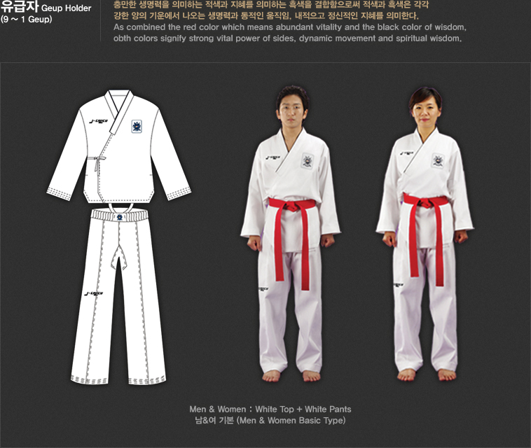
By allowing for these subtle branding variations, the dobok supports both the overarching Taekwondo brand and the unique identities of its countless practitioners and schools, demonstrating a flexible and adaptable brand architecture.
The Dobok in the Digital Age: Branding Beyond the Mat
In an increasingly digital world, a brand’s visual identity must transcend its physical presence. The dobok, with its strong visual cues, translates remarkably well into the digital space, continuing its role as a brand ambassador in online communities, social media, and digital marketing efforts.
Online Presence and Visual Recognition
In photographs, videos, and virtual training sessions, the dobok immediately communicates context and professionalism. When dojangs post content online, students in their doboks instantly identify the activity as Taekwondo, reinforcing the brand. This consistent visual language is invaluable for digital marketing, allowing schools to create engaging content that is easily recognizable and relatable to their target audience. Hashtags like #TaekwondoLife or #DobokPride often accompany images of practitioners, further intertwining the uniform with the online brand narrative.
For federations and national organizations, the dobok is a cornerstone of their digital assets. It features prominently in official logos, promotional materials, and event coverage, ensuring that the visual brand of Taekwondo is consistently projected across all digital platforms. This ubiquitous digital presence strengthens brand recall and ensures that Taekwondo maintains a strong, identifiable image in the crowded online landscape.
Community Building and Brand Loyalty
Social media platforms are increasingly used by martial arts schools to build and maintain community. Photos and videos of students training, testing, or competing in their doboks become shared experiences that reinforce belonging and brand loyalty. Practitioners often share their own photos in doboks, becoming informal brand ambassadors, extending Taekwondo’s reach and authenticating its brand message through peer-to-peer endorsement.
Furthermore, online forums and groups dedicated to Taekwondo often feature discussions about dobok types, care, and customization, demonstrating how deeply the uniform is integrated into the practitioner’s identity and loyalty to the art. This continuous engagement around a core brand element helps to foster a strong, active community that is invested in the Taekwondo brand. The dobok, therefore, becomes a focal point for digital interaction, turning individual practitioners into active participants in the brand’s online narrative.
Crafting the Future Brand: Evolution of the Dobok
Like any strong brand, Taekwondo must balance tradition with innovation to remain relevant and appealing. The dobok, as a central brand asset, is not immune to this evolution, with ongoing considerations for its design, materials, and symbolic representation in a modern context.
Innovation vs. Tradition: Balancing Brand Heritage with Modernity
The core design of the dobok is deeply rooted in tradition, and this heritage is a significant part of Taekwondo’s brand appeal. However, there is a continuous conversation within the Taekwondo community about how the uniform might evolve to meet contemporary needs without sacrificing its symbolic value. Innovations in fabric technology, for example, have led to doboks that are lighter, more breathable, and more durable, enhancing practitioner comfort and performance. While these functional improvements are welcomed, designers must ensure that any changes do not dilute the dobok’s iconic visual identity or its traditional significance.
From a branding perspective, this balancing act is crucial. Significant deviation from the traditional dobok design could alienate purists and weaken the global brand recognition that has been carefully cultivated. However, ignoring advancements could make the brand seem outdated or less competitive. The challenge lies in subtle enhancements that improve user experience while maintaining the dobok’s instantly recognizable form factor and core symbolic meaning. This careful evolution demonstrates a brand that is both respectful of its past and forward-looking, a compelling message for potential new practitioners.
The Practitioner as a Brand Ambassador
Ultimately, every individual who wears the dobok becomes a living embodiment of the Taekwondo brand. Outside the dojang, their behavior and presentation reflect upon the art. Within the dojang and at competitions, they represent their school, their federation, and the broader Taekwondo community. This makes the practitioner the ultimate brand ambassador.
By upholding the principles of courtesy, integrity, perseverance, self-control, and indomitable spirit – values deeply embedded in the Taekwondo philosophy – practitioners reinforce the positive brand image of the art. The dobok, in this context, is not just a uniform; it’s a mantle of responsibility. It signifies commitment to a way of life and a set of principles. The personal branding of each Taekwondo practitioner, guided by the discipline and values associated with their dobok, collectively strengthens and enriches the global Taekwondo brand, ensuring its continued appeal and legacy for generations to come.

Conclusion
The dobok, the unassuming uniform of Taekwondo, is far more than just a piece of clothing. It is a powerful and multifaceted branding tool that has been instrumental in shaping Taekwondo’s global identity. From its culturally rich name that anchors its Korean heritage to its visually consistent design that fosters global recognition, the dobok embodies the discipline, tradition, and community spirit of the martial art.
As a brand asset, it communicates core values, allows for unique sub-branding opportunities for individual schools, and seamlessly translates Taekwondo’s identity into the digital realm. As Taekwondo continues to evolve, the dobok will undoubtedly remain at the heart of its brand strategy, a constant reminder of its profound legacy and its dynamic future. When we ask “what is a Taekwondo uniform called?”, the answer “dobok” unlocks a deeper understanding of how a simple garment can wield such significant influence in building and sustaining a globally revered brand.
aViewFromTheCave is a participant in the Amazon Services LLC Associates Program, an affiliate advertising program designed to provide a means for sites to earn advertising fees by advertising and linking to Amazon.com. Amazon, the Amazon logo, AmazonSupply, and the AmazonSupply logo are trademarks of Amazon.com, Inc. or its affiliates. As an Amazon Associate we earn affiliate commissions from qualifying purchases.