
The vibrant and intoxicating allure of Mardi Gras is instantly recognizable, often evoked by a specific palette of colors that have become synonymous with the festival itself. While many associate these hues with simple revelry and celebration, a deeper dive reveals a rich history and a powerful connection to branding, identity, and strategic communication. Understanding the Mardi Gras colors, therefore, transcends mere aesthetic appreciation; it delves into the very essence of how symbols and colors are employed to create enduring brand recognition and foster a sense of collective belonging. This article will explore the origins and evolution of the iconic Mardi Gras color scheme, analyze their symbolic meanings, and discuss how this understanding can be leveraged within the realm of brand strategy.
The Genesis of a Celebratory Palette
The tradition of Mardi Gras, with its parades, costumes, and mask-wearing, has roots stretching back centuries. However, the distinct color combination we recognize today is a more recent development, intricately linked to the formalization of Mardi Gras celebrations, particularly in New Orleans. The establishment of organized krewes – secret societies that put on the parades and balls – played a pivotal role in standardizing and promoting the visual identity of Mardi Gras.
The Rex King of Carnival and the Adoption of Purple, Green, and Gold
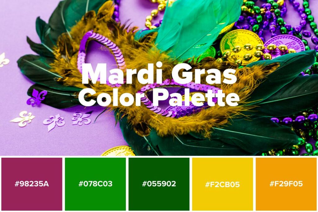
The turning point in defining the Mardi Gras color scheme is widely attributed to the Rex King of Carnival. In 1892, the Rex organization, one of the oldest and most prominent krewes, officially adopted the colors purple, green, and gold. This decision was not arbitrary; it was a deliberate act to imbue the festival with a deeper meaning and create a lasting visual signature.
-
The Royal Decree of Color: The choice of purple, green, and gold was reportedly inspired by a desire to assign symbolic meanings to the colors, aligning them with virtues associated with the Carnival. This strategic branding move aimed to elevate Mardi Gras beyond just a party into a more meaningful cultural event. The selection of these specific colors was a conscious effort to create a unified and recognizable visual language for the festival.
-
Establishing a Legacy of Recognition: By adopting these colors, Rex King of Carnival established a visual cue that would become instantly recognizable and associated with the grandeur and festivity of Mardi Gras. This move was a masterclass in early brand association, using color to forge a powerful connection in the public consciousness. Over time, this palette became universally adopted by other krewes and became the de facto visual identity of Mardi Gras celebrations worldwide, demonstrating the enduring power of consistent branding.
The Symbolic Resonance of Mardi Gras Colors
The lasting power of the Mardi Gras color scheme lies not only in its historical adoption but also in the profound symbolic meanings attributed to each hue. These meanings, once established, have been consistently reinforced, deepening their impact and solidifying their place within the Mardi Gras brand.
-
Purple: Justice and Royalty: Purple has long been associated with royalty, nobility, and power. In the context of Mardi Gras, it was chosen to represent justice. This imbues the festival with a sense of order and fairness, despite the boisterous and often chaotic nature of the celebrations. It suggests that beneath the surface of revelry, there is a structured and principled foundation to the traditions. This strategic use of color adds a layer of gravitas and historical continuity to the brand.
-
Green: Faith and Loyalty: Green, a color often linked to nature and growth, was designated to symbolize faith and loyalty. This meaning speaks to the enduring traditions of Mardi Gras, the loyalty of its participants and followers, and the faith in the continuation of these celebrations year after year. In terms of branding, this conveys a sense of stability, community, and a deep-rooted connection to heritage.
-
Gold: Power and Wealth: Gold, universally recognized as a symbol of wealth, prosperity, and success, represents power in the Mardi Gras lexicon. This hue reflects the extravagant nature of Mardi Gras parades, the elaborate costumes, and the overall sense of abundance and festivity. It contributes to the brand’s image of opulence and joyous extravagance, creating an aspirational and desirable perception.
Together, these three colors – purple, green, and gold – create a powerful and cohesive visual identity. They are not merely decorative; they are functional elements of the Mardi Gras brand, communicating core values and contributing to the overall experience and perception of the festival. The intentionality behind their selection and the consistent reinforcement of their meanings have made them an indispensable part of the Mardi Gras brand identity.

Leveraging Mardi Gras Color Psychology in Brand Strategy
The successful adoption and enduring power of the Mardi Gras colors offer valuable lessons for any brand seeking to build a strong and recognizable identity. The strategic application of color psychology can significantly influence consumer perception, emotional connection, and brand recall.
Building Brand Recognition and Memorability
The Mardi Gras color scheme is a prime example of how a well-chosen palette can become a powerful mnemonic device, instantly evoking a specific event or entity. Brands can learn from this by selecting colors that are not only aesthetically pleasing but also possess symbolic relevance to their core values and offerings.
-
Distinctiveness and Differentiation: In a crowded marketplace, distinctiveness is paramount. The Mardi Gras colors are unique and immediately identifiable, setting the festival apart from other celebrations. Brands should strive for a color palette that differentiates them from competitors, making them easily recognizable and memorable. This can involve exploring less common color combinations or using established colors in innovative ways.
-
Consistency Across Touchpoints: The Mardi Gras colors are consistently applied across all aspects of the festival, from parade floats and costumes to invitations and promotional materials. This consistency reinforces brand recognition and builds a cohesive brand experience. For brands, this translates to applying their chosen colors uniformly across their website, social media, packaging, advertising, and any other customer-facing materials. This unwavering consistency is crucial for establishing a solid brand identity.
Evoking Emotion and Communicating Values
Colors have a profound impact on human emotion and can effectively communicate a brand’s personality and values without a single word being spoken. The Mardi Gras colors, with their assigned meanings, demonstrate this powerfully.
-
Strategic Emotional Appeal: Purple’s association with justice can lend a brand an air of trustworthiness and ethical grounding. Green’s connection to faith and loyalty can foster a sense of community and dependability. Gold’s representation of power and wealth can communicate prestige and aspiration. Brands can strategically select colors that align with the emotions and values they wish to evoke in their target audience. For instance, a financial institution might lean towards gold and blue to convey stability and trustworthiness, while a lifestyle brand might opt for vibrant oranges and yellows to evoke energy and joy.
-
Storytelling Through Color: The Mardi Gras colors tell a story, weaving together elements of tradition, celebration, and a sense of shared identity. Brands can utilize their color palette to tell their own unique story, communicating their heritage, mission, and vision. The careful selection and application of color become a form of visual storytelling, enriching the brand narrative and making it more relatable and engaging for consumers. This narrative can be subtle, conveyed through the overall mood and feeling of the brand’s visual presentation.

The Enduring Legacy of Mardi Gras Colors as a Brand Powerhouse
The Mardi Gras colors are more than just a festive decoration; they are a testament to the enduring power of strategic branding through color. Their journey from a specific krewe’s decision to a globally recognized symbol of celebration highlights how intentional color choices can forge deep connections and create lasting brand equity.
-
Cultivating Community and Belonging: The shared understanding and appreciation of the Mardi Gras colors foster a sense of community and belonging among those who participate in or celebrate the festival. This collective recognition strengthens the bond between individuals and the event itself. Brands can aim to create a similar sense of belonging by developing a visual identity that resonates with their target audience, fostering a loyal community around their products or services.
-
Adaptability and Evolution of a Brand: While the core Mardi Gras colors remain consistent, their application and interpretation can evolve. This adaptability allows the brand to stay relevant across generations and adapt to changing cultural contexts. Similarly, strong brands are not static; they can evolve and adapt their visual elements while maintaining their core identity. This might involve introducing secondary colors or modernizing the design of their logo, ensuring the brand remains fresh and appealing without losing its established recognition.
-
A Masterclass in Cultural Branding: The Mardi Gras colors represent a profound example of successful cultural branding. They have transcended their origins to become an integral part of a global cultural phenomenon. This demonstrates that when colors are imbued with meaning, consistently applied, and strategically leveraged, they can become incredibly powerful branding tools, capable of evoking emotion, building recognition, and fostering a lasting legacy. The Mardi Gras color scheme serves as a compelling case study for brands aiming to achieve similar levels of recognition, impact, and enduring appeal. The lesson is clear: in the world of branding, color is not just seen; it is felt, understood, and remembered.