In the world of corporate identity and marketing, few symbols carry as much weight, recognition, and emotional resonance as the five interlocking rings of the Olympic Games. While most casual observers recognize the symbol as a representation of a sporting event, from a branding perspective, the Olympic symbol is a masterclass in visual communication, strategic longevity, and global intellectual property management.
What is the Olympic symbol? At its surface, it is a graphic composed of five rings of equal dimensions—blue, yellow, black, green, and red—interlaced on a white background. However, within the framework of brand strategy, it is a sophisticated “universal mark” that transcends language, culture, and borders to represent a complex suite of values: excellence, friendship, and respect. This article explores the Olympic symbol through the lens of brand identity, analyzing how it has maintained its status as one of the most powerful brands in human history.

The Anatomy of a Global Icon: Understanding the Visual Identity
The creation of a brand that lasts over a century is no small feat. The Olympic rings were designed in 1913 by Pierre de Coubertin, the founder of the modern Olympic Movement. From a design standpoint, the symbol adheres to the core principles of effective branding: simplicity, memorability, and versatility.
The Five Rings: Simplicity and Universality in Design
The strength of the Olympic symbol lies in its geometric simplicity. Circles are inherently inclusive; they represent wholeness, infinity, and unity. By interlocking these circles, the design creates a visual metaphor for the “interlinking” of the five continents of the world. In brand strategy, this is known as “visual shorthand.” A viewer does not need to read a tagline or hear an explanation to understand the core message of connectivity. This simplicity ensures that the logo remains legible whether it is printed on a tiny lapel pin, broadcast on a 4K digital screen, or embossed on a massive stadium facade.
Color Theory and the Rule of Five
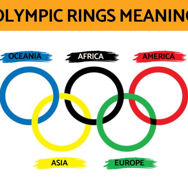
The color palette of the Olympic symbol is a strategic triumph. While many mistakenly believe each color represents a specific continent, the true brand intent was more inclusive. The colors—blue, yellow, black, green, and red—along with the white background, were chosen because at least one of these colors appeared on the national flag of every country in the world at the time of the symbol’s inception. This is a brilliant example of “inclusive branding.” By incorporating the visual DNA of its “customers” (the nations of the world) into the brand itself, the Olympic Movement ensured immediate psychological buy-in from a global audience.
The Evolution of the Olympic Visual System
While the core rings have remained largely unchanged, the brand identity system surrounding them has evolved to stay relevant in a digital-first world. In recent years, the International Olympic Committee (IOC) has modernized its visual identity, introducing custom typography (Olympic Headline) and a refined color palette. This evolution demonstrates how a legacy brand can maintain its heritage while adapting its “brand guidelines” to ensure consistency across social media, mobile apps, and immersive digital environments.
Brand Strategy and the Power of Universal Connection
A symbol is only as strong as the strategy behind it. The Olympic symbol functions as an “umbrella brand” under which thousands of sub-brands—ranging from individual sports federations to biennial host city committees—operate.
Communicating Values Without Words
In global marketing, language barriers are a significant hurdle. The Olympic rings solve this by utilizing “non-verbal branding.” Because the symbol is so deeply entrenched in the global consciousness, it communicates a premium brand promise—high-performance, peak human achievement, and international cooperation—without requiring a single word of copy. This allows the IOC to maintain a consistent brand voice in nearly 200 different countries simultaneously.
Global Reach: How the Symbol Transcends Language Barriers
The Olympic brand is a rare example of a “transcendent brand.” Most corporate identities are tied to a specific industry or product category. The rings, however, are tied to an ideology. This strategic positioning allows the brand to be flexible. It can be associated with high-fashion apparel (through team uniforms), luxury timepieces (official timekeepers), or grassroots community health programs. The symbol acts as a “seal of approval” that elevates any entity it touches.
Strategic Consistency Across Decades
One of the hallmarks of a successful brand is consistency. Since its first appearance at the 1920 Antwerp Games, the symbol has avoided the “rebranding” traps that plague many long-standing corporations. By resisting the urge to follow fleeting design trends, the IOC has built immense “brand equity.” The rings have become a permanent fixture of the global visual landscape, creating a sense of stability and institutional trust that few modern tech or finance brands can replicate.
![]()
Protecting the Brand: Trademark Integrity and Commercial Value
From a brand management perspective, the Olympic symbol is one of the most protected pieces of intellectual property (IP) in existence. Its value is not just in its meaning, but in its exclusivity.
Legal Safeguards of the Five Rings
The protection of the Olympic symbol is unique. Unlike most trademarks, which are protected by national patent offices, the Olympic rings are protected by a specific international treaty: The Nairobi Treaty on the Protection of the Olympic Symbol. This treaty requires participating nations to refuse or invalidate the registration of any mark that consists of or contains the Olympic symbol, except with the authorization of the IOC. This level of legal fortification is a “moat” that protects the brand from dilution and unauthorized commercial exploitation.
The Exclusive Rights of Olympic Partners
The commercial strategy of the Olympics is built on the concept of “exclusive association.” Through the TOP (The Olympic Partner) program, the IOC grants a limited number of global corporations the right to use the rings in their marketing. This creates a high-stakes “scarcity model.” Because only one brand in a category (e.g., only one beverage company, only one payment processor) can use the symbol, the brand’s value is driven upward. This strategy has turned the Olympic symbol into a multi-billion dollar asset.
Preventing Brand Dilution through Strict Guidelines
The IOC maintains an exhaustive “Brand Identity Manual” that dictates exactly how the rings must be displayed. They cannot be distorted, recolored, or integrated into other logos in a way that diminishes their prominence. This prevents “brand dilution.” When a brand is seen everywhere in various degraded forms, it loses its premium status. By maintaining “hyper-control” over the visual output, the IOC ensures that the rings always signify quality and prestige.
The Symbol as a Marketing Asset: Leveraging Heritage for Modern Audiences
In the contemporary marketing landscape, heritage is a powerful differentiator. The Olympic symbol leverages over a century of history to provide a “halo effect” for its partners and host cities.
Co-Branding and the Olympic “Halo Effect”
When a brand like Visa or Samsung aligns itself with the Olympic rings, they are participating in a “co-branding” exercise that transfers the values of the Olympics to their own products. Consumers who value the Olympic ideals of “faster, higher, stronger” subconsciously apply those same attributes to the partner brand. This emotional transfer is the pinnacle of brand strategy, moving the consumer relationship from a functional transaction to an aspirational connection.
Digital Adaptation: The Symbol in a Social-First World
Modern brand strategy requires a symbol to work in motion and in miniature. The Olympic symbol has been successfully transitioned into the digital age through “kinetic branding”—how the logo moves in broadcast graphics or transitions on a smartphone screen. The IOC has also embraced “flexible branding” for host cities, allowing cities like Paris 2024 or LA28 to create their own unique emblems that sit alongside the rings, creating a fresh brand narrative for every Olympic cycle while keeping the core identity central.
Creating Emotional Resonance in Competitive Markets
In an era of “brand fatigue,” where consumers are bombarded with advertisements, the Olympic symbol stands out because it tells a story. It is a “narrative brand.” It evokes memories of legendary athletes, moments of national pride, and the spectacle of the opening ceremonies. By focusing on storytelling rather than just product promotion, the Olympic brand maintains a deep emotional resonance that allows it to compete with the most modern, data-driven brands in the world.
Conclusion: The Ultimate Symbol of Brand Equity
What is the Olympic symbol? It is far more than a design of five rings. In the world of branding, it is the ultimate example of how visual identity, strategic consistency, and rigorous legal protection can create an asset of immeasurable value.
The Olympic rings prove that a brand does not need to be complex to be powerful. By rooting its identity in universal values and protecting that identity with unparalleled discipline, the Olympic Movement has created a symbol that is recognized by 90% of the world’s population. For brand strategists and marketing professionals, the Olympic symbol remains the gold standard of how to build, maintain, and monetize a global corporate identity that stands the test of time.
aViewFromTheCave is a participant in the Amazon Services LLC Associates Program, an affiliate advertising program designed to provide a means for sites to earn advertising fees by advertising and linking to Amazon.com. Amazon, the Amazon logo, AmazonSupply, and the AmazonSupply logo are trademarks of Amazon.com, Inc. or its affiliates. As an Amazon Associate we earn affiliate commissions from qualifying purchases.