In the world of global marketing and corporate identity, few symbols command the immediate recognition and emotional resonance of the five interlocking rings. To the casual observer, they represent a biennial sporting event. To a brand strategist, however, the Olympic rings represent the pinnacle of visual identity—a masterclass in minimalism, inclusivity, and enduring legacy. Created over a century ago, the symbol has transcended its origins to become one of the most valuable intellectual properties in human history.
Understanding what the rings on the Olympic flag stand for requires looking past the surface of colored ink and exploring the sophisticated brand architecture that has allowed this symbol to remain relevant across different eras, cultures, and technological revolutions. It is a story of how a singular vision of global unity was distilled into a graphic form that communicates a complex set of values without a single word of text.
The Origin of an Icon: Crafting a Global Visual Identity
The Olympic rings were not the result of a modern marketing agency’s focus group; they were the brainchild of Baron Pierre de Coubertin, the founder of the modern Olympic Games. In 1913, de Coubertin sought a symbol that could encapsulate the “Olympism” philosophy—a blend of sport, culture, and education. From a branding perspective, de Coubertin was decades ahead of his time. He understood that for the Olympic movement to succeed on a global scale, it needed a “corporate” identity that was independent of any single nation or language.
The Five Continents: A Masterclass in Geographic Representation
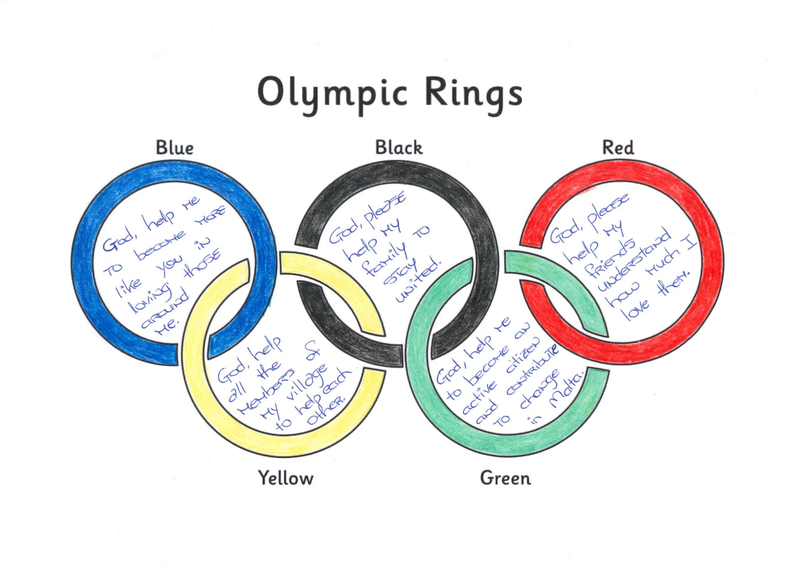
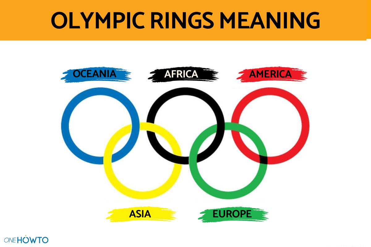
The most common explanation for the rings is their geographic representation. The five rings—colored blue, yellow, black, green, and red—represent the five inhabited continents of the world: Africa, the Americas, Asia, Europe, and Oceania. In terms of brand strategy, this was a move toward radical inclusivity. By claiming to represent the entire world through five simple circles, the Olympic brand positioned itself as the only truly global entity, predating the United Nations and other international organizations.
The interlocking nature of the rings is a deliberate design choice signifying the “union of the five continents” and the meeting of athletes from throughout the world. For a brand, this “interlocked” visual serves as a metaphor for synergy and connection, suggesting that the whole is greater than the sum of its parts.
The Six Colors of Inclusivity
A common misconception is that each specific color corresponds to a specific continent (e.g., green for Europe or yellow for Asia). De Coubertin’s actual strategy was much more sophisticated. He chose the five colors of the rings, plus the white background of the flag, because these six colors—when combined—included the colors of every single national flag in the world at that time.
This is a brilliant example of “universal brand design.” By incorporating the palette of every nation, the Olympic brand ensured that every person on earth could see a piece of their own national identity reflected in the global symbol. It reduced friction for brand adoption across borders, making the Olympic movement feel “local” in every country it entered.
Strategic Simplicity: Why the Olympic Brand Withstands the Test of Time
In an era where logos are frequently “refreshed” or rebranded to keep up with digital trends, the Olympic rings have remained virtually unchanged for over 100 years. This consistency is a testament to the power of strategic simplicity. The rings follow the fundamental principles of iconic branding: they are simple, memorable, and scalable.
Minimalism and Scalability
The geometric purity of the circle makes the Olympic logo one of the most versatile brand assets in existence. Whether it is embossed on a gold medal, stitched onto an athlete’s jersey, or rendered as a favicon on a smartphone screen, the symbol retains its integrity. From a design standpoint, the “white space” or negative space between the interlocking rings is as important as the rings themselves, providing a balanced aesthetic that feels modern even a century after its inception.
This scalability has allowed the International Olympic Committee (IOC) to license the brand across a vast array of touchpoints. The rings function effectively in monochrome, in 3D physical installations, and in high-definition digital broadcasts. This “future-proof” design is the dream of any brand manager, as it eliminates the need for costly overhauls as media consumption habits change.
Protecting the Intellectual Property: The Value of Exclusive Rights
The branding strategy behind the rings is reinforced by some of the strictest trademark protections in the world. The rings are protected by the Nairobi Treaty on the Protection of the Olympic Symbol, which means they are shielded from unauthorized commercial use in many jurisdictions without the need for traditional trademark registration.
The IOC’s “Rule 40” and other branding guidelines ensure that the rings are associated only with high-tier global partners (such as Coca-Cola, Visa, and Omega). By strictly controlling who can use the rings, the IOC maintains a “scarcity value.” This exclusivity allows the organization to command billions of dollars in sponsorship revenue, proving that a symbol’s meaning is only as strong as the legal and strategic framework protecting it.
Cultural Resonance: Branding Beyond the Arena
A successful brand does not just sell a product or an event; it sells an idea. The rings stand for more than just a track meet; they represent a set of core values: Excellence, Friendship, and Respect. In branding terminology, this is known as “Value-Based Branding.”
Emotional Connection and Brand Loyalty
The Olympic rings evoke a unique emotional response. Because they are associated with human achievement, national pride, and moments of historical significance, the brand carries an immense amount of “emotional equity.” When a brand can move beyond the functional (watching a game) to the aspirational (witnessing greatness), it achieves a level of loyalty that is immune to market fluctuations.
This resonance is why the rings are often used in humanitarian contexts. The “Olympic Refugee Team,” for instance, competes under the Olympic flag. In this context, the rings represent a “brand of last resort”—a symbol of belonging for those who have lost their national identity. This expands the brand’s narrative from “sports” to “humanity,” a transition that very few corporate identities could successfully navigate.
The Power of Neutrality
In a polarized world, the Olympic rings strive to maintain a “neutral” brand position. While the games are inherently political due to national rivalries, the brand itself—the rings—remains a neutral vessel. This neutrality is a deliberate strategic choice. By not aligning with any specific political ideology or region, the brand remains a “Safe Harbor” for global sponsors. Companies want to be associated with the rings because the symbol represents a rare moment of global consensus.
Modern Evolution: Keeping a Century-Old Brand Relevant
While the core symbol remains the same, the way the brand is “activated” has evolved. Modern brand strategy for the Olympics focuses on digital-first experiences and the integration of host-city identities with the universal rings.
Digital-First Visual Identity
In recent years, the IOC has standardized its digital branding. While the rings remain the centerpiece, they have introduced a custom typeface (Olympic Headline) and a more vibrant digital color palette. This is a common strategy for legacy brands: keep the “Core Identity” (the rings) static while updating the “Extended Identity” (typography and secondary graphics) to ensure the brand looks contemporary on social media and mobile platforms.
The Host City Synergy
Each Olympic Games features a unique emblem created by the host city (e.g., Paris 2024 or Tokyo 2020), but the five rings must always sit at the bottom of these designs. This creates a “Master-Sub Brand” relationship. The host city provides the “flavour” or the “campaign” (the sub-brand), while the rings provide the “authority” and “legacy” (the master brand). This allows the Olympics to feel fresh and different every four years without ever diluting the core meaning of the rings.
Conclusion: The Ultimate Legacy Brand
What do the rings on the Olympic flag stand for? On the surface, they are a map of the world’s unity. But through the lens of brand strategy, they are a masterclass in how to build a universal identity. They prove that a well-designed symbol, rooted in a clear philosophy and protected by rigorous strategic management, can become a shorthand for human aspiration.
The Olympic rings have survived world wars, boycotts, and the transition from the analog age to the AI era. They remain a potent reminder that the most effective branding is not about complexity, but about finding a simple, visual truth that resonates across every border. In the world of design and identity, the rings are not just a flag; they are the gold standard for how a brand can represent the world.
aViewFromTheCave is a participant in the Amazon Services LLC Associates Program, an affiliate advertising program designed to provide a means for sites to earn advertising fees by advertising and linking to Amazon.com. Amazon, the Amazon logo, AmazonSupply, and the AmazonSupply logo are trademarks of Amazon.com, Inc. or its affiliates. As an Amazon Associate we earn affiliate commissions from qualifying purchases.