
In the modern marketplace, a brand is no longer defined solely by its product or its mission statement; it is defined by its visual footprint. From the Favicon in a browser tab to the massive vinyl wrap on a corporate headquarters, images serve as the silent ambassadors of your brand. However, one of the most common pitfalls in brand management is the misunderstanding of picture sizes.
Understanding picture sizes—encompassing resolution, aspect ratio, and file format—is not merely a technical necessity; it is a strategic imperative. When a brand’s imagery is pixelated on a high-resolution display or awkwardly cropped on a social media feed, it signals a lack of professionalism and attention to detail. Conversely, a brand that masters its visual dimensions projects authority, reliability, and modern sophistication. This guide explores the intersection of design and strategy, detailing how to navigate picture sizes to maintain a cohesive and powerful corporate identity.
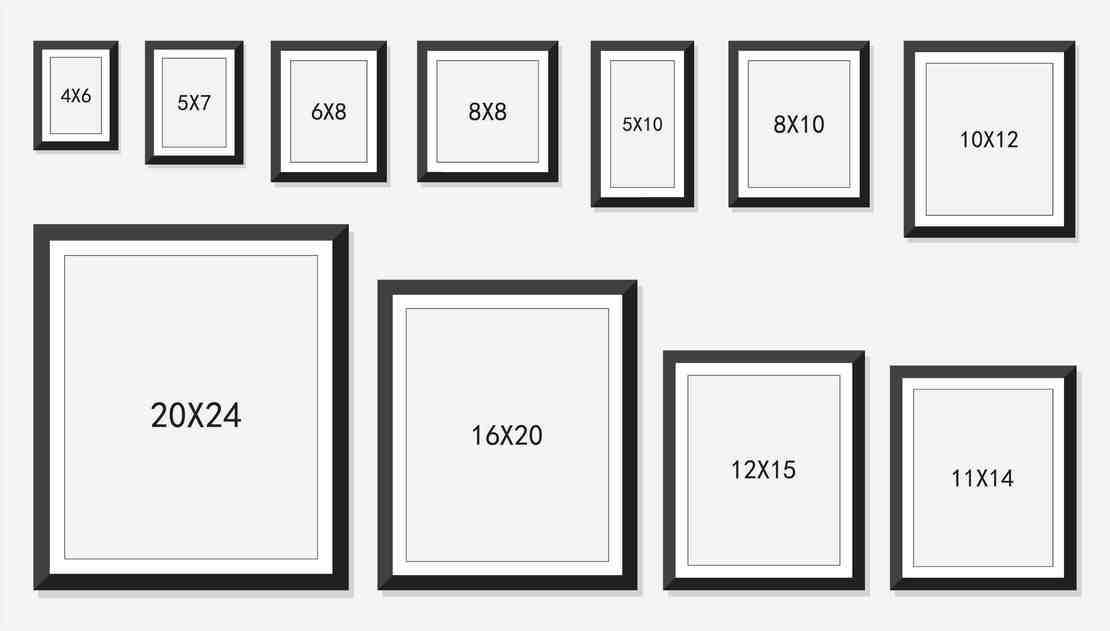
The Strategic Importance of Resolution and Aspect Ratio in Design
Before diving into specific platform requirements, a brand strategist must understand the two pillars of image sizing: resolution and aspect ratio. These elements dictate how a brand is perceived across different mediums and ensure that the visual narrative remains uninterrupted by technical glitches.
Maintaining Brand Consistency Across High-DPI Displays
In an era of Retina displays and 4K monitors, “standard” resolution is a moving target. For a brand, the standard is now high-definition or bust. Resolution refers to the density of pixels within an image, typically measured in pixels per inch (PPI). A brand’s digital assets must be designed with high pixel density to ensure that logos and photography remain crisp.
When a brand uses low-resolution images, it risks “visual dilution.” If a potential client visits a professional website and sees a blurry hero image, the subconscious association is one of stagnation or lack of technical competence. Strategic branding requires a “master asset” approach—creating visuals at the highest possible resolution and then scaling down for specific uses, rather than trying to upscale smaller files.
The Psychology of Aspect Ratios in Visual Storytelling
Aspect ratio—the proportional relationship between an image’s width and height—is a powerful tool for brand storytelling. A 1:1 square ratio, popularized by early Instagram, evokes a sense of balance and focus, often used for product shots and portraits. In contrast, a 16:9 cinematic widescreen ratio suggests movement, narrative, and expansiveness, making it ideal for lifestyle photography that aims to immerse the viewer in a brand’s world.
Choosing the wrong aspect ratio can lead to “auto-cropping,” where AI-driven platforms cut off essential brand elements, such as a logo or a call-to-action. By proactively defining aspect ratios within a Brand Style Guide, companies ensure that their visual message remains intact, regardless of where it is hosted.
Optimizing for Digital Touchpoints: Social Media and Web Presence
A brand’s digital presence is often the first point of contact with its audience. Each platform has specific “optimal” picture sizes that are constantly evolving. Staying ahead of these specifications is vital for maintaining a polished marketing presence.
The Social Media Hierarchy: From Thumbnails to Covers
Social media platforms are the primary battlegrounds for brand attention. However, each platform treats images differently.
- Instagram: While 1080×1080 pixels is the classic square, the 4:5 portrait ratio (1080×1350 pixels) is more strategically sound for brands because it occupies more vertical screen real estate, forcing the user to engage with the brand for a longer duration while scrolling.
- LinkedIn: As a professional network, LinkedIn requires a different aesthetic. Profile banners (1584×396 pixels) must be designed with a “safe zone” in mind, as profile pictures often overlap the cover art on mobile devices. A brand that fails to account for this overlap appears sloppy.
- X (formerly Twitter): On X, the 16:9 ratio dominates. Consistency here is key to ensuring that shared articles and promotional graphics display their most important information in the “preview” pane.
Website Hero Sections and the Balance of Quality vs. Speed
On a corporate website, the “Hero Image” is the centerpiece of the brand’s digital identity. Usually, these are full-width images requiring a minimum of 1920 pixels in width. However, there is a strategic tension here: high-quality images are large files, and large files slow down website loading times.
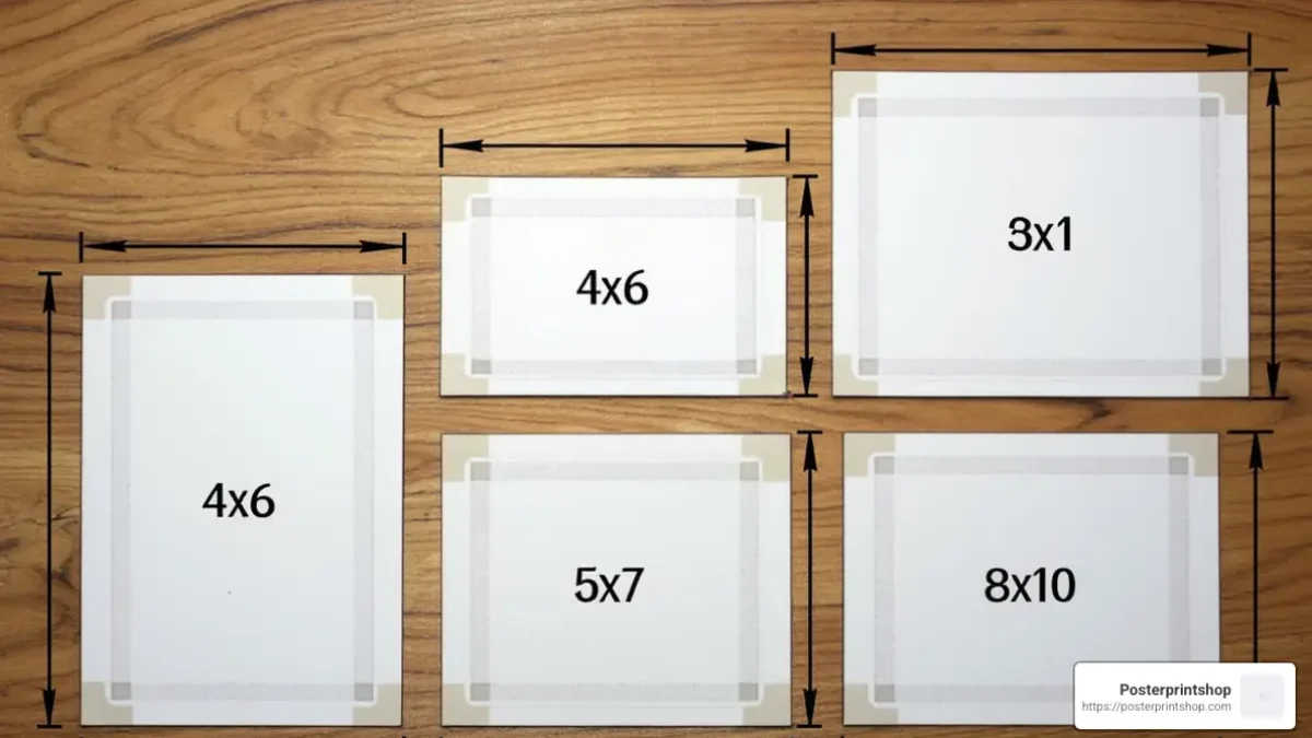
From a brand strategy perspective, a slow website is a brand killer. Studies show that users abandon sites that take more than three seconds to load. Therefore, optimizing picture sizes for the web involves using modern formats like WebP or SVG for logos. SVGs (Scalable Vector Graphics) are particularly crucial for branding because they are math-based rather than pixel-based, allowing a logo to be scaled from a business card to a billboard without any loss of quality or increase in file size.
Print vs. Digital: Navigating Corporate Identity Standards
While digital is dominant, print remains a tactile touchpoint that reinforces brand luxury and permanence. However, the rules for picture sizes in print are fundamentally different from those in digital media.
Understanding DPI for Tangible Assets
In the digital world, we speak in PPI (pixels per inch); in the print world, we speak in DPI (dots per inch). For a brand’s printed marketing collateral—brochures, annual reports, or trade show banners—the industry standard is 300 DPI.
If a marketing team takes an image optimized for the web (usually 72 PPI) and sends it to a printer for a physical brochure, the result will be a pixelated mess. This discrepancy is one of the most common failures in brand execution. A sophisticated Brand Strategy includes a repository of “Print-Ready” assets that are separate from “Web-Ready” assets, ensuring that the brand’s physical manifestations are as sharp as its digital ones.
CMYK vs. RGB: The Color Dimension of Sizing
While not strictly a “size” in terms of dimensions, the color profile of an image significantly affects its visual “weight” and appearance. Digital images use RGB (Red, Green, Blue) light, while print uses CMYK (Cyan, Magenta, Yellow, Black) ink. When transitioning brand assets between these mediums, the “size” of the color gamut changes. A brand must ensure that its signature colors are mapped correctly so that the blue on the website matches the blue on the corporate stationery. This technical alignment is the hallmark of a mature corporate identity.
Brand Asset Management (BAM) and Scalability
As a company grows, the number of visual assets it produces scales exponentially. Managing picture sizes becomes a logistics challenge that requires a systematic approach to Brand Asset Management (BAM).
The Role of Master Templates in Marketing Agility
To maintain speed in marketing without sacrificing quality, brands should utilize master templates. A master template for a social media post might be built at 2000×2000 pixels, with “safe margins” defined for different crops. This allows a design team to quickly export multiple versions—one for an Instagram Story (9:16), one for a Facebook post (1.91:1), and one for a LinkedIn update—without having to redesign the asset from scratch. This scalability is essential for maintaining a consistent brand voice across multi-channel campaigns.
Establishing a Global Brand Style Guide for Imagery
The final piece of the puzzle is the Brand Style Guide. This document should explicitly state the required picture sizes for every conceivable use case. It should include:
- Logo Variations: Minimum sizes for legibility (e.g., “The logo must never be smaller than 30px wide in digital or 0.5 inches in print”).
- Clear Space: The “breathing room” required around an image or logo to prevent visual clutter.
- File Naming Conventions: A system like
BrandName_Logo_FullColor_300dpi.pngensures that even non-designers in the organization use the correct size for their specific needs.
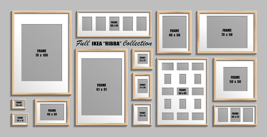
Conclusion: Precision as a Brand Virtue
In the digital economy, an image is often the only thing a customer sees before making a judgment about a company’s value. Mastering picture sizes is not a chore to be relegated to the IT department; it is a vital function of brand management. By understanding the nuances of resolution, the psychological impact of aspect ratios, and the technical requirements of different platforms, a brand can ensure its visual identity is consistently high-quality.
Precision in imagery translates to a perception of precision in business. When your brand looks sharp, your company looks sharp. Whether it is a tiny icon on a smartphone or a massive display in a corporate lobby, every pixel counts in the construction of a world-class brand. Investing the time to standardize and optimize your picture sizes is an investment in the long-term integrity and recognition of your corporate identity.
aViewFromTheCave is a participant in the Amazon Services LLC Associates Program, an affiliate advertising program designed to provide a means for sites to earn advertising fees by advertising and linking to Amazon.com. Amazon, the Amazon logo, AmazonSupply, and the AmazonSupply logo are trademarks of Amazon.com, Inc. or its affiliates. As an Amazon Associate we earn affiliate commissions from qualifying purchases.