
In the world of corporate identity and brand strategy, we often talk about color palettes, typography, and “voice.” However, one of the most fundamental yet overlooked elements of a brand’s visual DNA is the geometric shape. To a mathematician, a geometric shape is a figure defined by points, lines, and angles. To a brand strategist, a geometric shape is a vessel for psychological meaning, a silent communicator that dictates how a consumer perceives a company’s reliability, innovation, or friendliness before a single word of copy is read.
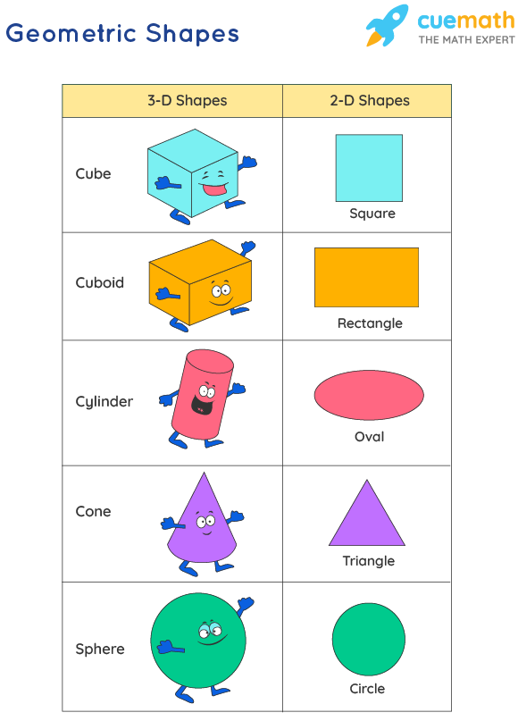
Understanding “what is a geometric shape” in the context of branding requires moving beyond the classroom definition. It is about understanding the subconscious cues that specific outlines send to the human brain. From the iconic bitten apple of Apple Inc. to the interlocking circles of Mastercard, geometry is the invisible scaffolding upon which global empires are built.
The Fundamental Language of Shapes in Brand Strategy
Every visual element in a brand’s portfolio serves a purpose. Geometric shapes are particularly powerful because they are universal. Unlike language, which can be a barrier, or color, which can have varying cultural interpretations, the structural integrity of a square or the fluid motion of a circle is recognized globally.
Beyond Simple Lines: The Psychological Trigger
Humans are evolutionarily hardwired to respond to shapes. Sharp angles can trigger a sense of alertness or danger, while soft curves evoke feelings of safety and comfort. In brand strategy, identifying the right geometric shape is the first step in “Shape Psychology.” When a brand chooses a logo or a layout, they are not just picking a pretty design; they are choosing which psychological trigger to pull. A tech startup looking to disrupt a market might lean into sharp, aggressive angles, while a childcare brand will almost certainly gravitate toward rounded, organic geometry.
Establishing Trust Through Mathematical Precision
Geometric shapes carry an inherent sense of order and precision. Because they are based on mathematical rules, they suggest a level of professional competence and stability. In industries like finance or law, where trust is the primary currency, the use of rigid, balanced geometry—such as perfect squares or symmetrical rectangles—communicates that the business is structured, dependable, and operates with integrity. This “mathematical ” trustworthiness is a cornerstone of corporate identity.
Decoding the Meaning of Primary Geometric Shapes
To master brand design, one must understand the specific “personality” of each primary shape. Each category of geometry carries its own set of associations that can either reinforce or undermine a brand’s message.
Squares and Rectangles: Stability, Efficiency, and Strength
The square is the most common geometric shape in the corporate world. It represents stability, balance, and reliability. Because squares and rectangles are the building blocks of our physical world—bricks, houses, and screens—they feel “grounded.”
Brands like Microsoft, LEGO, and American Express utilize quadrilaterals to convey a sense of structural strength. A square tells the consumer, “We are solid. We aren’t going anywhere.” However, the risk of using squares in brand strategy is that they can sometimes appear “boring” or overly traditional. To counter this, many modern brands use “rounded rectangles” to soften the edges, blending the stability of the square with the approachability of a circle.
Circles and Ovals: Unity, Community, and Timelessness
Circles have no beginning and no end. This mathematical property makes them the ultimate symbol of unity, eternity, and wholeness. In branding, circles are used to foster a sense of community and inclusivity.
Because circles are not found in the harsh angles of man-made architecture as often as they are found in nature (the sun, the moon, the eye), they feel more organic and “human.” Brands like NASA, Pepsi, and Target use circular geometry to project a friendly, accessible, and all-encompassing image. If your brand strategy revolves around bringing people together or offering a holistic solution, the circle is your most potent geometric tool.
Triangles: Innovation, Direction, and Power
Triangles are the most dynamic of all geometric shapes. Depending on which way they point, they can represent growth, tension, or direction. A triangle pointing upward suggests stability (like a pyramid) but also upward mobility and ambition. A triangle pointing to the right is the universal symbol for “Play” or “Forward Motion.”

High-performance brands such as Adidas, Delta Airlines, and Airbnb incorporate triangular elements to suggest movement and evolution. In brand strategy, the triangle is the shape of the “disruptor.” It is bold, directional, and inherently energetic. It suggests that the brand is leading the way toward the future.
Advanced Geometry: Polygons and Abstract Composition
As brands mature, they often move beyond primary shapes into more complex polygons and abstract geometric compositions to differentiate themselves in a crowded marketplace.
Hexagons and the Concept of Connectivity
The hexagon is a fascinating shape in brand design because of its ties to both nature (honeycombs) and industry (bolts and nuts). It represents high-level efficiency and connectivity. Brands in the data science, telecommunications, and logistics sectors often use hexagons to show how individual parts work together to create a powerful whole. The hexagon suggests that the brand is part of a larger ecosystem, highlighting cooperation and systemic intelligence.
Combining Shapes for Complex Brand Narratives
Sometimes, a single geometric shape is not enough to tell a brand’s story. Modern brand strategy often involves “geometric synthesis”—the overlapping or combining of different shapes to create a nuanced identity. For example, a logo that places a circle inside a square might be trying to communicate “innovation (circle) within a stable framework (square).”
These combinations allow designers to balance conflicting brand values. You can be both “strong” and “friendly” or “traditional” and “cutting-edge” by strategically layering your geometric choices. The key is maintaining visual hierarchy so the consumer’s eye knows which message to prioritize.
Implementing Geometry in Brand Collateral and UI/UX
A brand is not just a logo; it is an entire experience. The geometric choices made in a logo must be carried through to the website, the packaging, and even the physical office space.
Consistency Across Digital and Physical Touchpoints
Geometric consistency is vital for brand recognition. If your brand identity is built on circles, your website buttons should have rounded corners, and your social media templates should feature circular framing. This repetition reinforces the brand’s psychological profile. When a consumer sees a consistent geometric language across different platforms, it creates a “seamless” feel that enhances professional credibility.
Geometric Grids as the Foundation of Modern Design
In the digital age, geometry plays a massive role in User Interface (UI) and User Experience (UX) design. Most modern websites are built on a “grid system,” which is essentially a series of invisible geometric rectangles that organize information. A brand that uses a strict, minimalist grid conveys a sense of tech-savviness and ease of use. By aligning brand strategy with geometric layouts, companies can ensure that their digital presence is as organized and efficient as their physical products.
The Future of Brand Geometry: Minimalism and Dynamic Identities
As we look toward the future of branding, the definition of “what is a geometric shape” continues to evolve. We are moving away from overly complex, illustrative logos toward “Geometric Minimalism.”
The Rise of Flat Design and Geometric Simplicity
In a world of information overload, simplicity is a premium. Many global brands are “de-branding”—stripping away 3D effects, gradients, and shadows in favor of flat, pure geometric shapes. This shift makes logos easier to read on small mobile screens and ensures they remain iconic even at a glance. Geometric simplicity suggests a brand that is transparent, honest, and modern. It removes the “noise” and leaves only the essential identity.
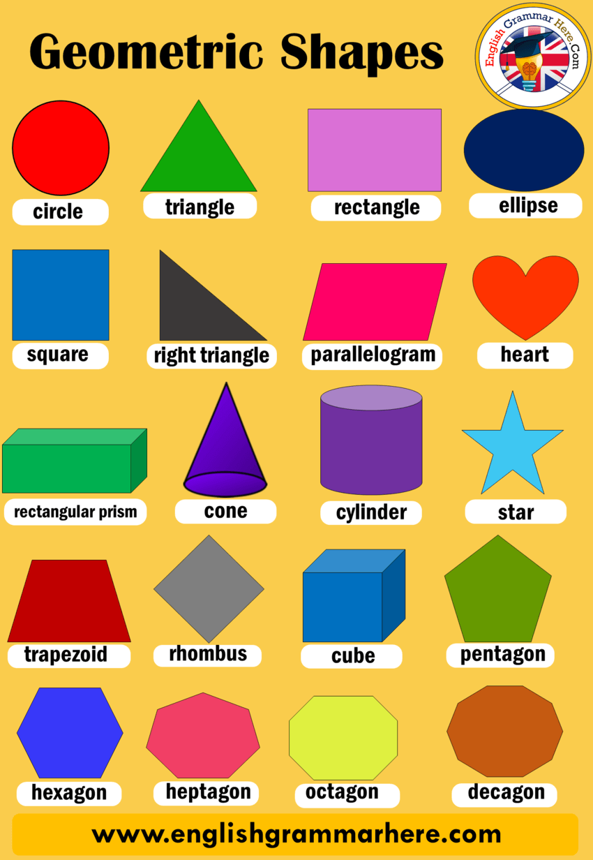
Generative Geometry in Evolving Brand Landscapes
We are also seeing the emergence of “dynamic identities,” where geometric shapes are not static. Through the use of AI and generative design, some brands now use shapes that shift and change based on the data they receive or the platform they are on. However, even these shifting shapes usually adhere to a specific “geometric logic” to ensure the brand remains recognizable. This represents the next frontier: geometry that breathes and reacts, making the brand feel like a living entity rather than a stagnant image.
In conclusion, a geometric shape is far more than a point in space. It is the silent language of brand strategy. Whether it is the reliability of a square, the unity of a circle, or the ambition of a triangle, geometry provides the visual foundation upon which all successful brands are built. By mastering this language, businesses can communicate their values, build trust, and create a lasting legacy in the minds of their audience.
aViewFromTheCave is a participant in the Amazon Services LLC Associates Program, an affiliate advertising program designed to provide a means for sites to earn advertising fees by advertising and linking to Amazon.com. Amazon, the Amazon logo, AmazonSupply, and the AmazonSupply logo are trademarks of Amazon.com, Inc. or its affiliates. As an Amazon Associate we earn affiliate commissions from qualifying purchases.