
In the world of marketing and design, a brand is far more than a logo; it is a visual shorthand for a set of values, a history, and a promise to the consumer. When we examine the American flag through the lens of brand strategy, we see one of the most successful and enduring corporate identities in human history. The “Stars and Stripes” functions as a master brand, utilizing a specific color palette to communicate a powerful narrative across the globe.
To understand what the colors on the American flag mean is to understand the fundamentals of visual storytelling and brand positioning. From the boardroom to the international stage, the deliberate selection of Old Glory Red, White, and Old Glory Blue serves as a masterclass in how color psychology can be used to build a cohesive and resonant identity.

1. The Core Palette: Establishing Brand Values Through Color Theory
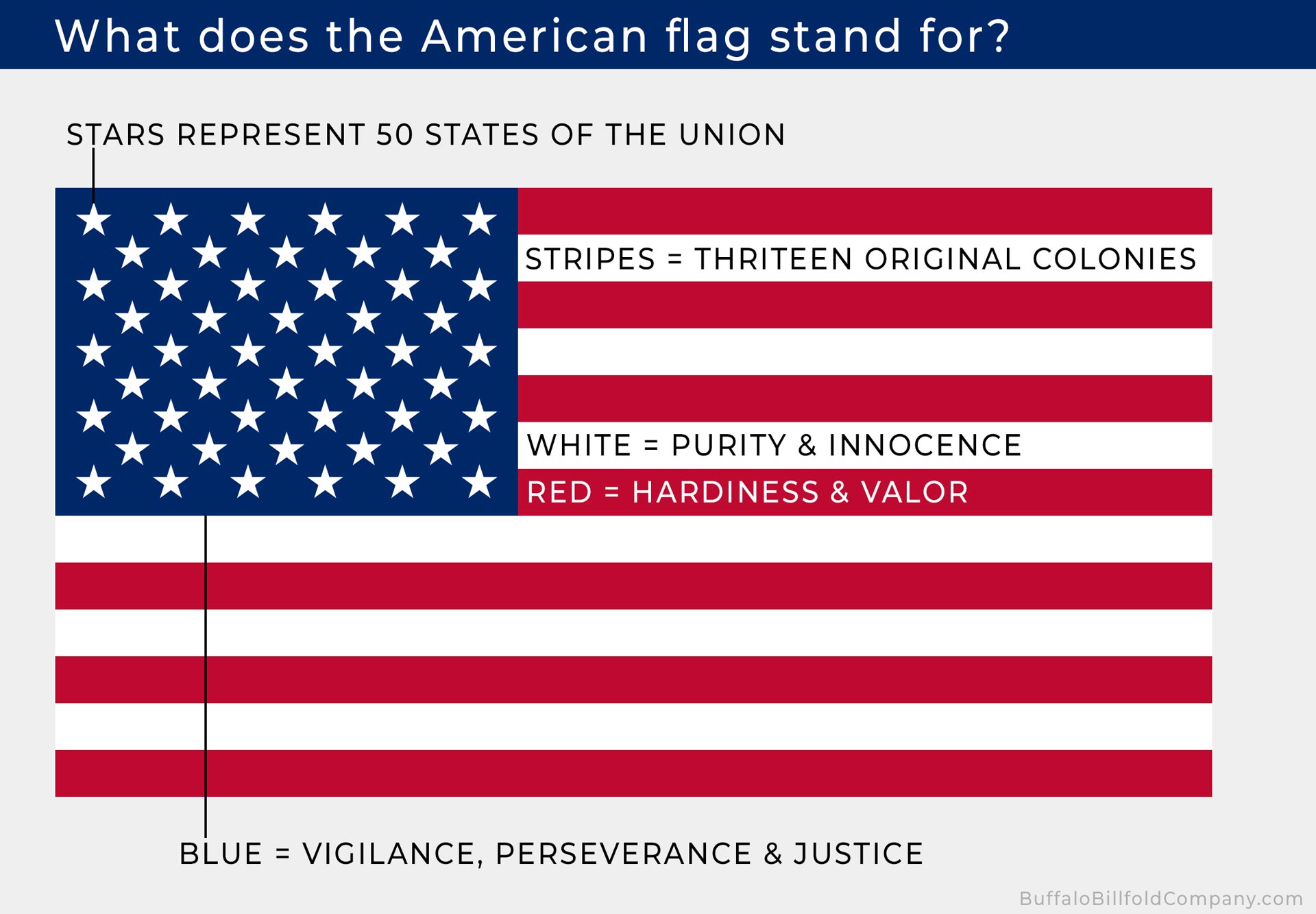
In brand strategy, colors are never chosen at random. They are selected based on the emotional response they elicit and the values they signify. The American flag’s palette was not officially defined in terms of meaning until 1782, when the Seal of the United States was presented to the Continental Congress. Charles Thomson, the Secretary of the Continental Congress, detailed a specific set of meanings that have since become the bedrock of the nation’s visual identity.
The Psychology of Old Glory Red
Red is a high-energy color. In corporate branding, companies like Coca-Cola and Netflix use red to signify passion, excitement, and action. Within the American brand, red—specifically “Old Glory Red” (Pantone 193 C)—represents hardiness and valor. It is the “active” component of the brand, signaling a willingness to defend the identity and endure challenges. From a strategic standpoint, the use of red ensures high visibility and commands attention, essential for a brand that seeks to lead on a global scale.
The Significance of White
White serves as the “negative space” that allows the other elements of the flag to breathe, but its symbolic meaning is just as critical. In branding, white often denotes transparency, simplicity, and premium quality (think Apple or Tesla). For the American flag, white signifies purity and innocence. It acts as the moral anchor of the brand, suggesting that the nation’s power and “hardiness” (represented by red) are guided by a clean and principled foundation.
The Depth of Old Glory Blue
Blue is the color of stability, trust, and intelligence. It is the most common color used by financial institutions and tech giants (like Chase or IBM) because it inspires confidence. “Old Glory Blue” (Pantone 282 C) was chosen to represent vigilance, perseverance, and justice. Within the brand architecture, the blue canton serves as the “foundation” for the stars, suggesting that the growth of the brand (the states) is supported by a steady and just framework.
2. Symbolism as Storytelling: How National Identity Mirrors Corporate Branding
A successful brand tells a story that consumers want to be a part of. The American flag does not just represent a territory; it represents an idea. This is the ultimate goal of “Brand Purpose”—moving beyond the product to the philosophy.
Creating a Value-Based Narrative
When a brand strategist develops a corporate identity, they start with “The Why.” Why does this company exist? The colors of the flag answer the “Why” of the United States. By assigning specific virtues to each color—valor, purity, and justice—the designers of the national identity created a value-based narrative. This allows citizens (the stakeholders) to align their personal values with the brand, fostering deep-seated brand loyalty that can last for centuries.
The Semiotics of the Stars and Stripes
Beyond the colors, the arrangement of elements—the 13 stripes and the 50 stars—functions as a visual infographic. In branding, this is known as “Data Visualization.” The stripes tell the story of the brand’s origins (the original 13 colonies), while the stars represent its current scale. This balance of “heritage” and “innovation” is a common strategy in legacy branding. It tells the audience that while the brand is growing and evolving, it remains rooted in its founding principles.
Brand Archetypes: The Hero and the Sage
The color choices align the American brand with specific “Brand Archetypes.” The Red and Blue combination often places the identity within the “Hero” archetype—one that overcomes adversity through courage and strength. Meanwhile, the White and Blue elements lean into the “Sage” archetype—one that seeks the truth and upholds justice. By blending these, the brand creates a complex, multi-dimensional persona that is both powerful and principled.
3. Visual Consistency and Recognition: The Power of a Global Style Guide
One of the hallmarks of a powerful brand is its consistency. Whether you see the logo on a massive billboard or a tiny social media icon, it must be instantly recognizable. The American flag is perhaps the most recognized visual asset in the world, largely due to strict adherence to its “Brand Style Guide”—better known as the U.S. Flag Code.
The U.S. Flag Code as a Brand Manual
In the corporate world, a brand manual dictates exactly how a logo can be used, which colors are permitted, and what constitutes “brand misuse.” The U.S. Flag Code functions in much the same way. It specifies how the flag should be displayed, how it should be folded, and what it should never touch. This level of “Brand Governance” ensures that the integrity of the visual identity remains intact, preventing the “dilution” of the brand’s meaning.
Universal Recognition and Scalability
The “Stars and Stripes” design is highly scalable. Even when reduced to a small lapel pin or a shoulder patch, the color blocking (the blue canton against the red and white stripes) remains distinct. This is a crucial lesson for modern brand designers: a logo must work across all mediums. The American flag’s design is so robust that it maintains its “brand equity” even when rendered in grayscale or adapted for different formats, proving that a strong color strategy is the foundation of global recognition.
Protecting the Brand Equity
Brand equity is the commercial value that derives from consumer perception of the brand name. For a nation, this equity translates to soft power, diplomatic influence, and economic trust. By maintaining the consistency of the colors and design, the U.S. protects its brand equity. When people see those specific shades of red, white, and blue, they immediately associate them with a specific set of expectations regarding freedom, opportunity, and strength.
4. Evolution and Rebranding: Lessons from the Flag’s Design History
Even the most successful brands must occasionally undergo a “brand refresh” or a “rebrand” to stay relevant to their growing audience. The American flag has undergone 27 official versions since its inception in 1777. This evolution offers a fascinating look at how a brand can adapt without losing its core identity.
Managing a Growing Portfolio
In corporate terms, each new state added to the Union was like a new product launch or a new subsidiary joining a parent company. The challenge for the “brand designers” was to incorporate these new elements without cluttered the design. The decision to keep the 13 stripes constant while only updating the stars in the blue canton was a brilliant strategic move. It allowed the brand to show growth (innovation) while maintaining its core heritage (the stripes).
The 1960 “Final” Rebrand
The current 50-star flag, designed by high school student Robert G. Heft, represents the longest-running version of the American brand identity. This version achieved a “Visual Balance” that feels complete. In branding, there is often a point of “Identity Maturity,” where the design reaches its most optimized form. The current flag has achieved this, becoming a timeless asset that no longer needs to change to reflect the brand’s power.
Lessons in Adaptability
The history of the flag’s colors teaches modern brand managers that you don’t need to change your core colors to stay modern. You can adapt the layout, add new symbols, or refine the geometry, but the “Brand Essence”—the colors and their meanings—should remain a constant thread that connects the past to the future.
5. Applying Flag-Based Color Strategy to Modern Brand Identity
For entrepreneurs, designers, and marketers, the American flag provides a blueprint for building a lasting brand. When selecting colors for a new corporate identity or a personal brand, the principles of valor, purity, and vigilance offer a timeless framework.
Strategic Color Selection for Startups
When launching a brand, don’t just pick colors that “look good.” Ask what those colors represent in the context of your industry. If you are in the security or legal space, the “Old Glory Blue” approach of vigilance and justice is essential. If you are a disruptor in a competitive market, the “Old Glory Red” of hardiness and valor will help you stand out.
Building Emotional Resonance
The reason people feel a deep emotional connection to the American flag is that the colors were tied to human virtues from the very beginning. Brands that succeed in the 21st century are those that can move beyond functional benefits and tap into emotional values. By defining what your brand’s “Red, White, and Blue” are, you create a shorthand for your company’s soul.
The Longevity of Simple Design
The ultimate lesson of the American flag’s visual identity is the power of simplicity. Three colors, two shapes (stars and stripes), and a clear set of meanings. In an era of over-complicated digital marketing, returning to these fundamental branding principles can help a business cut through the noise. Whether you are designing a logo or a national banner, the goal is the same: to create a symbol so potent that its colors speak for themselves.
In conclusion, what the colors on the American flag mean is more than a historical footnote; it is a testament to the power of strategic brand identity. By utilizing color theory, storytelling, and rigorous consistency, the United States has maintained a visual presence that is as recognizable as it is meaningful. For any brand looking to leave a lasting mark, the Stars and Stripes remains the ultimate case study in identity design.
aViewFromTheCave is a participant in the Amazon Services LLC Associates Program, an affiliate advertising program designed to provide a means for sites to earn advertising fees by advertising and linking to Amazon.com. Amazon, the Amazon logo, AmazonSupply, and the AmazonSupply logo are trademarks of Amazon.com, Inc. or its affiliates. As an Amazon Associate we earn affiliate commissions from qualifying purchases.