
In the world of brand strategy and corporate identity, few visual assets command as much recognition, emotional resonance, and consistency as the flag of the United States. While most citizens view the “Stars and Stripes” through a lens of patriotism and history, brand consultants and design experts view it as a masterclass in identity systems. The U.S. flag is, in many ways, the ultimate legacy brand. Its color palette—Red, White, and Blue—is not an accidental choice but a deliberate exercise in symbolism that has defined the American “corporate identity” for nearly 250 years.

To understand what the U.S. flag colors mean from a branding perspective, one must look beyond the fabric and into the psychology of color theory, market positioning, and the strategic communication of values.
The Visual Identity of a Nation: Decoding the Color Palette
Every world-class brand relies on a core set of values that their visual identity must communicate instantly. For the United States, these values were codified in 1782 when the Great Seal was established. While the flag itself was adopted earlier, the meanings assigned to the colors provide the “brand guidelines” that govern how the nation is perceived globally.
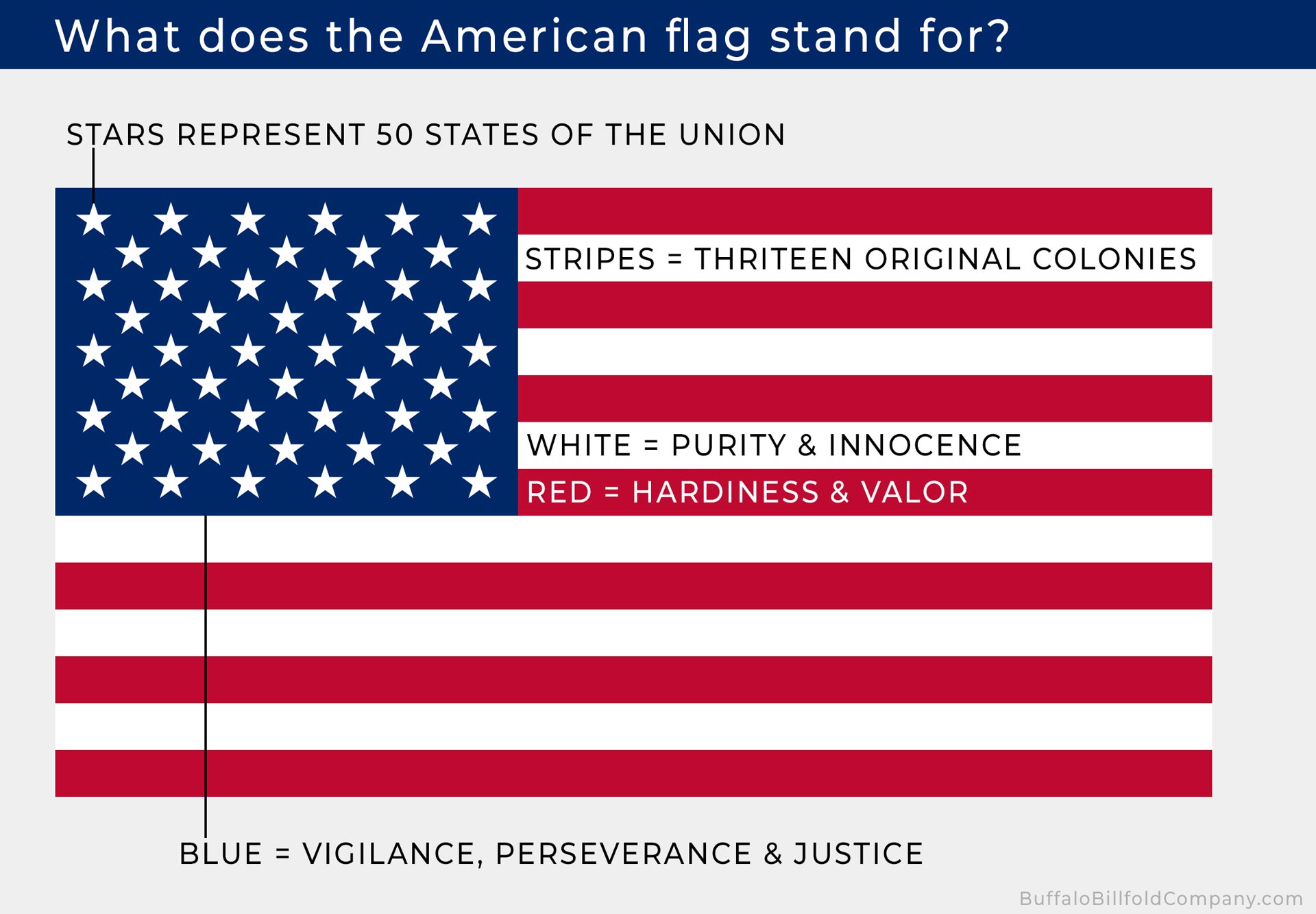
Red: Hardiness, Valor, and Emotional Engagement
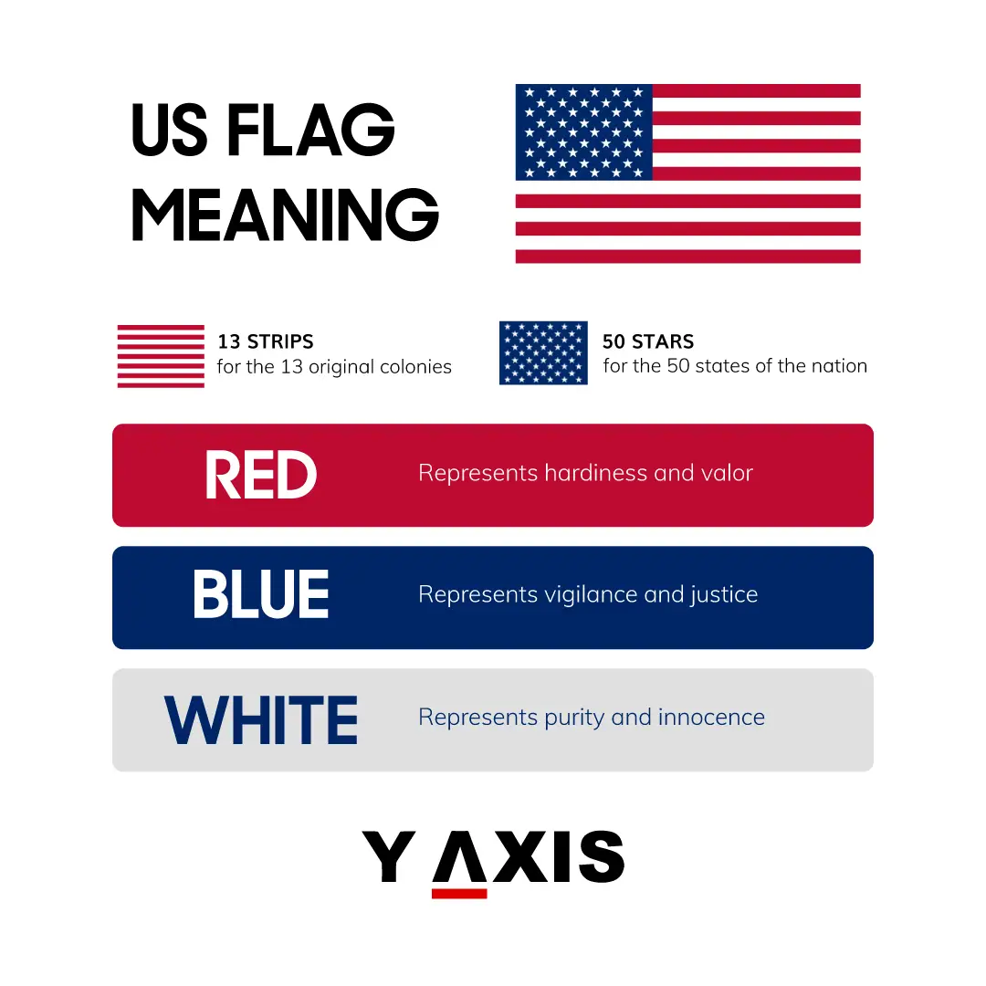
In the lexicon of branding, red is a “high-arousal” color. It is used by brands like Coca-Cola, Netflix, and Red Bull to signify energy, passion, and action. In the context of the U.S. flag, specifically “Old Glory Red,” the color represents hardiness and valor.
From a strategic standpoint, the use of red serves to command attention. It signals a brand that is brave, resilient, and unafraid of conflict. In the early days of the Republic, this color was essential for a “startup” nation looking to establish its presence among established European “corporate” empires. It communicates a willingness to endure hardship to protect the brand’s core mission.
White: Purity, Innocence, and the Blank Canvas of Opportunity
White is often the most overlooked element of a brand’s palette, yet it is arguably the most vital. In design, white space provides clarity and focus. For the U.S. flag, white symbolizes purity and innocence.
In professional branding, white represents a “blank slate”—the promise of a fresh start and the integrity of the organization’s intentions. It balances the aggression of the red and the somber weight of the blue, suggesting that the nation’s power is tempered by a moral compass. It tells the story of a brand that values transparency and the pursuit of an “ideal” state.
Blue: Vigilance, Perseverance, and the Foundation of Trust
“Old Glory Blue” is the anchor of the American identity. In corporate branding, blue is the most popular color for financial institutions and tech giants (think Chase, IBM, or LinkedIn) because it represents vigilance, perseverance, and justice.
By incorporating blue, the U.S. flag communicates stability. It suggests a brand that is watchful (vigilant) and committed to the long term (perseverance). It is the color of the “Chief,” representing leadership and the executive branch of the national identity. It provides the necessary “trust signal” that balances the revolutionary energy of the red.
Color Theory in National Branding: Why These Shades Work
The effectiveness of the U.S. flag’s branding lies in the synergy of its colors. Effective brand strategy relies on a “Primary Triad” that creates visual harmony while remaining distinct enough to be recognized from a distance.
The Psychology of Patriotic Hues
The combination of red, white, and blue is a classic “Power Palette.” Psychologically, this trio evokes a sense of tradition and authority. When a consumer (or a citizen) sees this combination, the brain automatically triggers associations with established institutions.
This is why so many political campaigns, regardless of party affiliation, utilize this specific color scheme. It is an attempt to “borrow equity” from the national brand. By aligning a personal brand with these colors, an individual signals that they are an extension of the nation’s core values—valor, purity, and justice.
Establishing Authority and Reliability Through Consistency
A brand is only as strong as its consistency. The U.S. government maintains strict specifications for the colors of the flag, known as the Standard Color Reference of America. These are not just “any” red or “any” blue; they are specific shades (Cable No. 70180 and Cable No. 70075) that ensure the brand remains cohesive across all “touchpoints,” from the patch on an astronaut’s sleeve to the flag flying over a post office.
This level of standardization is what professional brand managers strive for. It ensures that the emotional response remains the same regardless of the medium. This consistency has allowed the U.S. flag to become one of the most protected and respected “trademarks” in the world.
The Global Impact: How Corporations Adopt the “Old Glory” Aesthetic
Because the U.S. flag is such a potent symbol, commercial brands often leverage its color meanings to enhance their own market positioning. This is a common strategy in “Brand Association,” where a secondary brand aligns itself with a primary brand’s attributes to gain credibility.
The “Made in the USA” Brand Strategy
For many companies, the U.S. flag colors are synonymous with quality and ethical manufacturing. Brands like Levi’s, Ford, and Harley-Davidson have historically used red, white, and blue in their marketing to evoke the American “brand promise.”
When a company uses these colors, they are tapping into the “hardiness” (Red) of American labor and the “vigilance” (Blue) of American engineering. This is a deliberate marketing move to position the product as a reliable, rugged, and high-quality alternative to foreign competitors. The colors act as a visual shorthand for a specific set of industrial standards.
Replicating Flag Colors for Market Trust
Beyond just “patriotic” branding, the specific meanings of the flag colors influence corporate identity in diverse sectors. For example:
- Health and Safety: Red and white are often used to signify urgency and care (e.g., The Red Cross), echoing the “valor” and “purity” themes.
- Legal and Financial: Blue and white are used to project “justice” and “integrity,” mirroring the flag’s blue union and white stripes.
By understanding the “source code” of the U.S. flag’s colors, brand designers can create identities that feel inherently trustworthy to the American public without even featuring a star or a stripe.
Managing a Legacy Brand: Guidelines for Modern Usage
As any brand ages, it must navigate the balance between tradition and modernization. The U.S. flag has undergone several “rebrands” (adding stars as the “company” expanded), but the core colors have remained the constant “brand DNA.”
Protecting the Brand Equity of the Stars and Stripes
In the world of intellectual property, the U.S. flag is unique. It cannot be trademarked by a private entity, yet it is protected by the “U.S. Flag Code.” These guidelines are essentially the brand’s “Terms of Service.” They dictate how the logo (the flag) should be displayed, how it should be retired, and what constitutes “brand misuse.”
For professional brand managers, the Flag Code is a fascinating case study in maintaining brand dignity. It prevents the identity from being “cheapened” by improper use, ensuring that the visual representation of the nation always retains its symbolic weight.
Digital Adaptation and Hex-Code Precision
In the digital age, the U.S. flag brand has had to adapt to screens. Designers now use specific Hex codes (#B22234 for red and #3C3B6E for blue) to ensure that the “brand” looks the same on a smartphone as it does on a physical flagpole. This transition from physical fabric to digital pixels is a crucial step for any legacy brand. The colors must maintain their “mood” even when backlit by an LED screen. The “Old Glory Blue” must still feel heavy and authoritative, and the “Old Glory Red” must still feel vibrant and urgent.
Conclusion: The Flag as a Timeless Brand Asset
The colors of the U.S. flag are more than just a historical holdover from the British Union Jack; they are a calculated set of symbols that form the foundation of the American brand identity. Red for the courage to innovate and defend; White for the integrity of its mission; and Blue for the stability and justice of its laws.
For those in the field of brand strategy and corporate identity, the U.S. flag serves as a reminder that the most successful brands are those that tie their visual identity to deep-seated human values. By consistently applying these colors and protecting their meaning, the United States has maintained a global brand presence that is instantly recognizable, emotionally charged, and enduringly powerful. Whether you are designing a logo for a startup or managing the identity of a global corporation, there is much to be learned from the “Old Glory” palette: choose your colors with intent, define their meaning clearly, and never underestimate the power of a consistent visual narrative.
aViewFromTheCave is a participant in the Amazon Services LLC Associates Program, an affiliate advertising program designed to provide a means for sites to earn advertising fees by advertising and linking to Amazon.com. Amazon, the Amazon logo, AmazonSupply, and the AmazonSupply logo are trademarks of Amazon.com, Inc. or its affiliates. As an Amazon Associate we earn affiliate commissions from qualifying purchases.