
In the competitive landscape of modern commerce, a brand’s visual identity is often the first point of contact with a potential consumer. Among the vast spectrum of colors available to designers and brand strategists, maroon stands out as a shade of unique depth, sophistication, and psychological weight. But to leverage it effectively, one must first answer a fundamental question: What does the color maroon look like from a strategic design perspective, and how does it function within a corporate identity?
Maroon is a dark, brownish-red that exudes a sense of controlled power. Unlike the high-energy, almost frantic nature of a bright scarlet or the youthful vibrancy of a poppy red, maroon is grounded. It is the color of aged wine, mahogany, and heritage. In branding, choosing maroon is a deliberate move away from the “noise” of primary colors toward a more nuanced, authoritative presence.

Understanding the Visual Composition of Maroon
To define maroon for a brand, one must look beyond a simple visual description and move into the technical specifications that ensure consistency across various platforms. In the world of design, “maroon” is not a singular monolithic entity but a specific range of coordinates in color space.
The Science of the Shade: Hex Codes and Color Models
For a brand strategist, “looking like maroon” means adhering to specific digital and print formulas. The standard web-safe Hex code for maroon is #800000. In the RGB (Red, Green, Blue) model—used for digital screens, apps, and websites—maroon is composed of approximately 50% red and 0% green and blue. This lack of light makes it a “low-value” color, providing excellent contrast against white or light-gray backgrounds.
When transitioning to the CMYK (Cyan, Magenta, Yellow, Black) model for physical branding materials like business cards, packaging, and signage, maroon requires a heavy saturation of magenta and yellow with a significant black “key” component to achieve its characteristic depth. Understanding these technicalities is crucial for brand equity; if a brand’s maroon looks like a bright red on a smartphone and a muddy brown on a shipping box, the perceived reliability of the brand diminishes.
Maroon vs. Burgundy: Distinguishing the Differences for Brand Precision
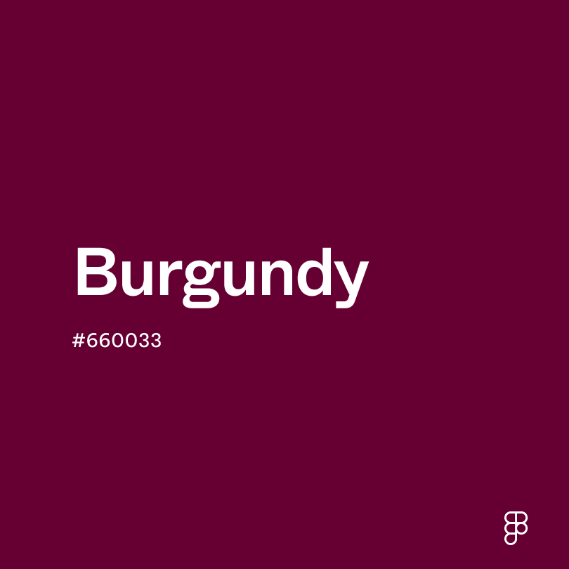
A common mistake in brand development is the conflation of maroon and burgundy. While they may appear similar to the untrained eye, their psychological impacts differ significantly. Maroon is a red mixed with brown, giving it a warm, earthy, and traditional undertone. Burgundy, conversely, is red mixed with purple, resulting in a cooler, more “regal” and flamboyant appearance.
From a brand strategy standpoint, choosing maroon over burgundy signals a preference for stability and timelessness over trendiness or luxury-clutter. Maroon feels “established,” making it a favorite for institutions that want to project a sense of history and unshakeable foundations.
The Psychology of Maroon in Corporate Identity
Color psychology is a pillar of brand strategy. Every hue triggers a subconscious response in the consumer, and maroon is particularly potent because it combines the biological urgency of red with the grounding stability of brown.
Authority and Sophistication: What Maroon Signals to Consumers
In the context of branding, maroon communicates “quiet luxury” and “serious intent.” It is a color often associated with the “Sage” or “Ruler” brand archetypes. When a consumer sees a brand anchored in maroon, they subconsciously associate it with maturity and expertise.
This is why maroon is a staple in the financial, legal, and academic sectors. It doesn’t scream for attention like an orange or a neon green; rather, it commands attention through its perceived weight. It suggests that the brand is not a “flash in the pan” but an entity with deep roots and a long-term vision. For personal branding, wearing or using maroon in professional collateral can project an image of confidence without the perceived aggression that a bright red might convey.
Cultural Context: Global Interpretations of the Color
A global brand must consider how maroon is perceived across different borders. In many Western cultures, it is associated with autumn, harvest, and academic prestige (the “Ivy League” aesthetic). However, in many Eastern cultures, variations of deep red and maroon signify prosperity and good fortune, though they are often used in more celebratory contexts than in the West.

For a brand strategist, understanding these nuances is vital when expanding into international markets. Maroon is a “safe” yet bold choice—it rarely carries the negative taboos associated with some other colors, making it a versatile tool for brands aiming for a global footprint while maintaining a premium feel.
Strategic Application: How to Use Maroon in Visual Design
Knowing what maroon looks like is only the beginning; the real value lies in knowing how to apply it within a visual system to drive brand recognition and user engagement.
Color Pairing: Creating High-Contrast Brand Palettes
Maroon is a “team player” in design, but it requires the right supporting cast to shine. Because it is such a dark, heavy color, it needs contrast to prevent the brand identity from feeling “heavy” or “gloomy.”
- Maroon and Gold/Cream: This is the gold standard for heritage branding. It evokes a sense of tradition, excellence, and elite status.
- Maroon and Grey/Silver: This creates a more modern, “tech-adjacent” feel. It is professional and sleek, perfect for corporate B2B services.
- Maroon and Teal: For a more contemporary, disruptive brand, pairing the warmth of maroon with the cool, vibrant edge of teal creates a sophisticated visual tension that stands out in a crowded marketplace.
Accessibility and UI/UX: Maroon in Digital Environments
In the digital age, a brand exists primarily on screens. This brings up the challenge of accessibility. Maroon is an excellent choice for typography and buttons because its dark value ensures it meets Web Content Accessibility Guidelines (WCAG) for contrast ratios against light backgrounds.
However, designers must be cautious when using maroon as a background color. If the text on top of it isn’t perfectly calibrated, it can cause eye strain. In mobile app design, maroon is often used for “active” states or call-to-action buttons where a sense of urgency is required, but a more refined aesthetic is desired. It tells the user “click here” with the authority of a seal of approval rather than the alarm of a warning sign.
Case Studies: Iconic Brands That Own the Maroon Space
To truly understand how maroon functions as a brand asset, we can look at organizations that have successfully claimed this territory.
Academic Excellence: The Influence of “Harvard Crimson” and Maroon
While Harvard technically uses “Crimson,” many other top-tier universities, such as the University of Chicago and Texas A&M, utilize maroon as their primary identifier. In the world of higher education branding, maroon represents the “life of the mind.” It is the color of old library books, graduation robes, and brick-and-mortar campuses. By using maroon, these institutions reinforce their status as keepers of knowledge and tradition. For a new brand in the education or consulting space, adopting a maroon-based palette can instantly borrow some of this “inherited authority.”
Consumer Goods: From Beverages to Luxury Automotive
Consider the branding of Dr. Pepper. The choice of a deep, maroon-adjacent red distinguishes it immediately from the bright red of Coca-Cola or the blue of Pepsi. It positions the product as “original” and slightly “alternative” while still feeling like a classic.
In the luxury automotive sector, maroon (often marketed under names like “Black Cherry” or “Bordeaux”) is used to signify custom craftsmanship. When a brand like Rolls-Royce or Bentley showcases a vehicle in a deep maroon, it isn’t just about the color; it’s about the light hitting the metallic flakes to show the curves of the design. This highlights maroon’s ability to communicate texture and quality—critical elements for any high-end brand strategy.
Conclusion: The Strategic Value of a Maroon Identity
So, what does the color maroon look like? To a consumer, it looks like a brand they can trust. To a designer, it looks like a versatile, high-contrast tool for creating sophisticated visual hierarchies. To a brand strategist, it looks like a long-term investment in an identity that will not go out of style.
Choosing maroon for a brand identity is a commitment to depth over surface-level flash. It is a color that rewards the viewer’s attention, offering a sense of warmth, history, and unwavering confidence. In an era of fleeting digital trends and “minimalist” white-label branding, the richness of maroon offers a path back to character and distinction. Whether you are building a personal brand or a corporate empire, understanding the visual and psychological nuances of maroon is the key to creating a visual identity that is as enduring as it is impactful.
aViewFromTheCave is a participant in the Amazon Services LLC Associates Program, an affiliate advertising program designed to provide a means for sites to earn advertising fees by advertising and linking to Amazon.com. Amazon, the Amazon logo, AmazonSupply, and the AmazonSupply logo are trademarks of Amazon.com, Inc. or its affiliates. As an Amazon Associate we earn affiliate commissions from qualifying purchases.