In the world of visual communication, a flag is the ultimate logo. It is the most condensed form of a “brand identity” that a collective group—in this case, a nation—can possess. Just as a global corporation uses specific colors and shapes to evoke trust, innovation, or luxury, a national flag serves as the primary visual anchor for a country’s values, history, and future aspirations.
When we analyze the colors of the German flag—black, red, and gold (Schwarz-Rot-Gold)—we are not simply looking at a piece of fabric. We are examining a masterclass in semiotics and nation branding. For designers, brand strategists, and corporate identity experts, the German flag offers a profound case study in how visual symbols can survive political upheaval, facilitate reconciliation, and eventually become a global hallmark of reliability and engineering excellence.
1. The Heritage of the Brand: The Historical Evolution of Black, Red, and Gold
Every iconic brand has an “origin story” that justifies its existence and provides emotional resonance. The German flag is no different. Its color palette was not chosen at random by a marketing agency; it was forged through centuries of social movements and the quest for a unified national identity. Understanding this heritage is crucial to understanding why these specific colors resonate so deeply in the German brand architecture.
The Lützow Free Corps and the Birth of a Visual Identity
The roots of the German “brand” can be traced back to the Napoleonic Wars in the early 19th century. During this time, the Lützow Free Corps, a volunteer unit of the Prussian Army, sought to represent a unified German front against French occupation. Because these volunteers came from various backgrounds, they lacked a standardized uniform. To create visual cohesion—a core principle of branding—they dyed their diverse clothing black, adorned it with red piping, and utilized brass (gold-colored) buttons. This practical solution created a striking visual identity that came to symbolize the struggle for freedom.
The Hambach Festival of 1832: Establishing the Brand Values
If the Lützow Free Corps provided the “logo” colors, the Hambach Festival of 1832 provided the “brand mission.” Over 30,000 people gathered at Hambach Castle to demand democracy, civil rights, and national unity. It was here that the black-red-gold tricolor was first flown as a symbol of the liberal movement. In brand strategy terms, this was the moment the visual identity became inextricably linked with the values of democracy and republicanism, distinguishing it from the monochromatic or dynastic colors of the past.
The Rebranding Conflict: Tricolor vs. the Imperial Colors
Germany’s history includes a significant “brand pivot.” During the German Empire (1871–1918) and later during the Third Reich, the black-red-gold flag was replaced by the black-white-red tricolor. This creates a fascinating study in brand perception: the black-white-red represented Prussian dominance and authoritarianism, while the black-red-gold represented the democratic alternative. When the Federal Republic of Germany was established after World War II, the decision to return to black-red-gold was a deliberate “brand restoration”—a signal to the world that Germany was returning to its democratic, liberal roots.
2. Semiotics and Color Theory: What the Palette Communicates
In corporate identity design, colors are selected for their psychological impact. Red often signals passion or energy; blue evokes trust; green suggests growth. The German flag, however, uses its colors to tell a chronological narrative of transformation, a concept summarized by the phrase: “Out of the blackness of servitude, through bloody battles, into the golden light of freedom.”
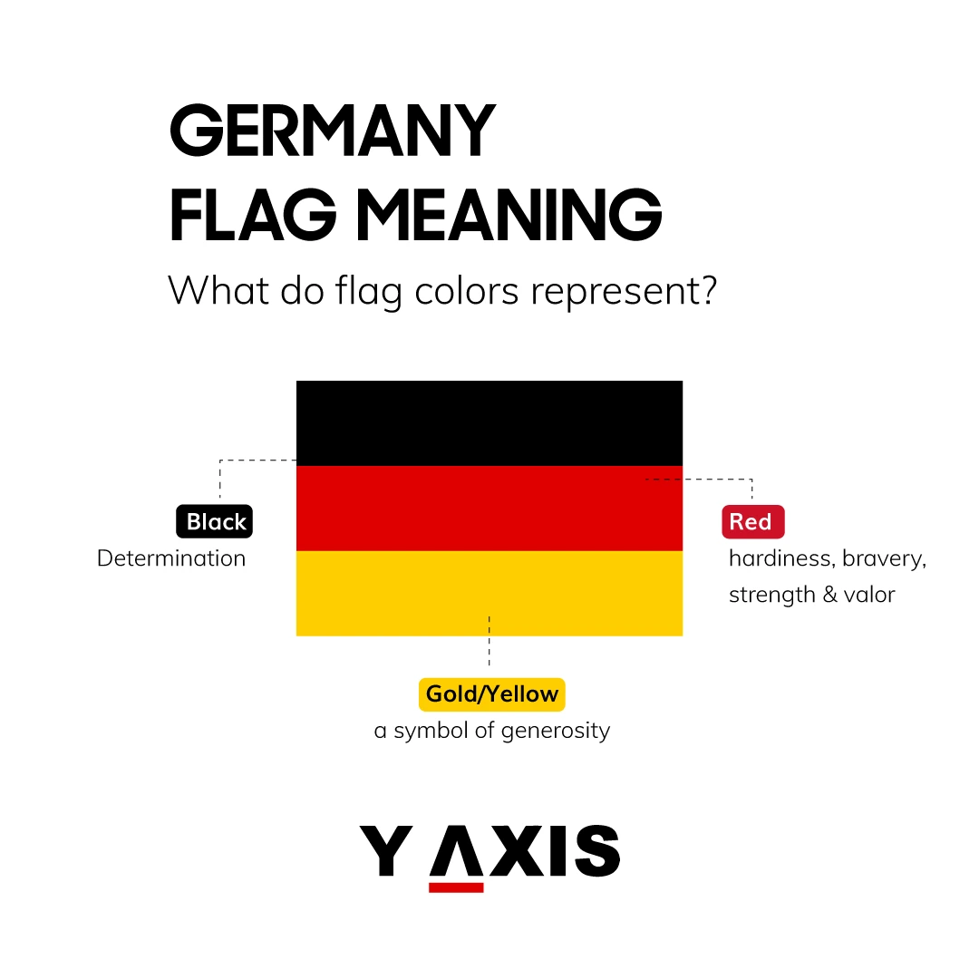
Black: The Foundation of Strength and History
In the context of the German flag, black (Schwarz) represents the foundation. Historically, it symbolized the “blackness of servitude” or the dark times before the dawn of a unified, free nation. From a modern branding perspective, black is the color of authority, elegance, and timelessness. It provides a heavy, stable base for the flag, anchoring the more vibrant colors above it. In the “Made in Germany” brand context, black reinforces the perception of solidity and high-quality craftsmanship.
Red: The Energy of Movement and Sacrifice
Red (Rot) is the “active” color in the German identity. Historically, it represents the “bloody battles” fought for democracy. In the language of marketing and design, red is used to capture attention and stimulate emotion. It represents the pulse of the nation—the human element and the passion for social progress. It serves as the bridge between the historical foundation (black) and the aspirational future (gold), acting as the catalyst for change within the visual composition.
Gold: The Aspiration for Prosperity and Enlightenment
The bottom stripe of the German flag is officially “Gold,” though it is often rendered as a deep yellow in digital media. This color represents the “light of freedom” and the prosperity that comes with a democratic society. In brand psychology, gold/yellow is associated with optimism, clarity, and value. By placing gold at the bottom, the flag suggests a trajectory of rising—ascending from the dark past toward a bright, enlightened future. It is the “premium” element of the brand, signaling the high standards and the “gold standard” of German industry and ethics.
3. Brand Consistency: Maintaining the Visual Standards
For a brand to be effective, it must be consistent across all touchpoints. In Germany, the use of the flag is governed by strict protocols to ensure that the “corporate identity” of the state is not diluted or misrepresented. This involves precise technical specifications that would be familiar to any modern brand manager.
Technical Specifications and Color Accuracy
The German government provides specific color codes to ensure the flag looks the same whether it is on a government building, a digital screen, or a diplomatic vehicle. The official colors are defined in the “Corporate Design of the Federal Government.” For example:
- Black: Jet Black (RAL 9005)
- Red: Traffic Red (RAL 3020)
- Gold: Melon Yellow (RAL 1028)
- CMYK Equivalents: These are used to ensure print consistency, preventing the “gold” from appearing as a dull “school bus yellow.”
The Federal Shield and Brand Hierarchy
In branding, we often see a hierarchy of logos (e.g., a corporate logo vs. a product logo). Germany employs a similar hierarchy. The simple tricolor is the “Civil Flag,” used by the public and private organizations. However, the “State Flag” (Bundesdienstflagge) includes the Bundesschild (Federal Shield)—an eagle on a gold background. This variation is reserved for federal authorities. This distinction helps manage the “brand authority,” ensuring that official government communications are instantly recognizable and distinguished from general patriotic displays.
Vexillology in the Digital Age: UI/UX Considerations
In the digital space, the German flag is often condensed into icons or favicons. Design teams must ensure that the proportions (3:5) are maintained to preserve the brand’s integrity. Because the German flag is a horizontal tricolor, it is exceptionally versatile for digital interfaces, fitting easily into circular avatars or rectangular buttons without losing its recognizable “brand DNA.”
4. The “Made in Germany” Brand: Flag Symbolism in Global Marketing
The colors of the flag extend far beyond the flagpole; they are the primary visual assets for Germany’s economic identity. The “Made in Germany” label is arguably one of the most powerful country-of-origin brands in history, and its visual association with the black-red-gold palette is a key component of its success.
Trust as a Brand Commodity
Germany’s brand strategy on the global stage is built on the pillars of reliability, precision, and efficiency. The colors of the flag have become a shorthand for these values. When a consumer sees the black-red-gold accents on a piece of high-end machinery, a luxury vehicle, or a financial tool, the “brand promise” is instantly communicated: this product is engineered to last, it is safe, and it is the result of rigorous standards.
Understated Patriotism and Corporate Identity
Unlike some nations that use their flag aggressively in branding, Germany often employs an “understated” approach. This is a strategic choice. Following the mid-20th century, Germany’s national brand focused on “soft power”—diplomacy, environmental leadership, and economic stability. Consequently, the flag is often used in corporate branding as a subtle accent (e.g., a small tab or a color-coded line) rather than a dominant graphic. This subtlety reinforces the brand personality of being modest yet highly capable.
The Flag as a Quality Seal
In the modern marketplace, many German companies (from Siemens to BMW) leverage the national colors in their marketing materials to tap into the “National Brand Equity.” By aligning their corporate identity with the colors of the flag, they inherit the historical weight and the positive associations of German democracy and industrial prowess. The flag acts as a “seal of quality” that bridges the gap between the state and the private sector.
Conclusion: The Endurance of a Visual Legacy
The colors of the German flag—black, red, and gold—represent a sophisticated brand identity that has survived the most turbulent chapters of human history. From its origins as a revolutionary uniform to its current status as a symbol of European stability and economic power, the German tricolor serves as a reminder that great branding is about more than just aesthetics; it is about storytelling and consistency.
For professionals in the fields of brand strategy and corporate identity, the German flag demonstrates how a simple palette can carry the weight of a nation’s soul. It shows that when visual symbols are rooted in authentic values and maintained with technical precision, they become more than just colors—they become a global language of trust and excellence. In an era of rapid change, the German “brand” remains a steadfast example of how to communicate identity, history, and aspiration through a unified visual vision.
aViewFromTheCave is a participant in the Amazon Services LLC Associates Program, an affiliate advertising program designed to provide a means for sites to earn advertising fees by advertising and linking to Amazon.com. Amazon, the Amazon logo, AmazonSupply, and the AmazonSupply logo are trademarks of Amazon.com, Inc. or its affiliates. As an Amazon Associate we earn affiliate commissions from qualifying purchases.