
In the vast landscape of visual communication, the shapes a brand chooses to represent itself are never accidental. From the soft, approachable curves of a startup’s wordmark to the rigid, stable rectangles of a traditional bank, geometry speaks a language that the human subconscious understands long before the conscious mind reads a slogan. Among these geometric tools, the acute angle—an angle measuring less than 90 degrees—stands out as one of the most potent elements in a designer’s arsenal.
But what do acute angles look like when translated into the world of brand strategy and corporate identity? They are the visual shorthand for speed, precision, innovation, and aggression. In a crowded marketplace, the “look” of an acute angle is the look of a brand that is cutting through the noise. This article explores the strategic application of angularity in branding, analyzing how these sharp intersections define the visual DNA of the world’s most forward-thinking companies.
The Geometry of Perception: Defining the Acute Aesthetic
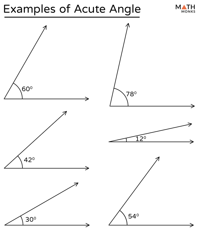
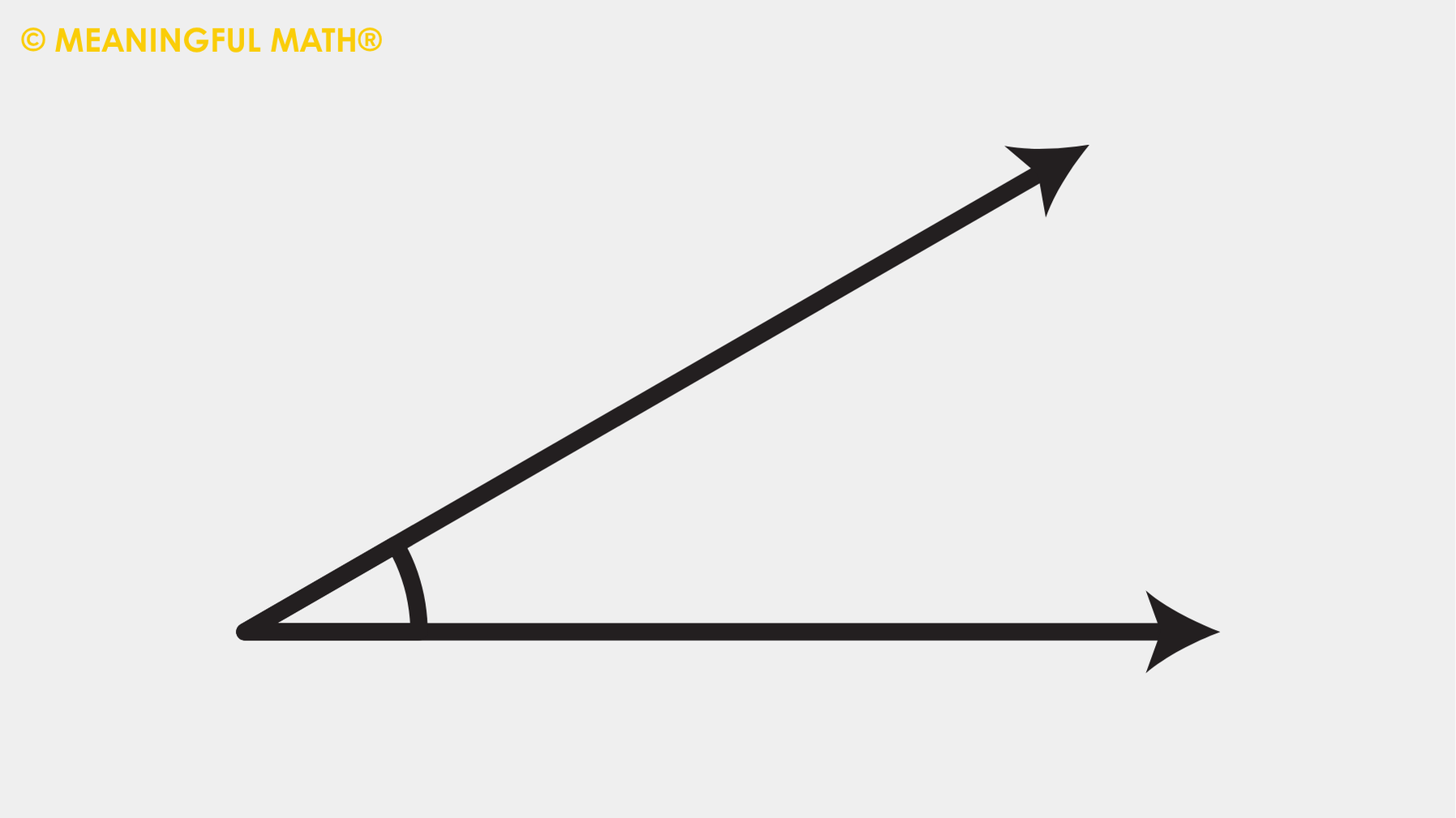
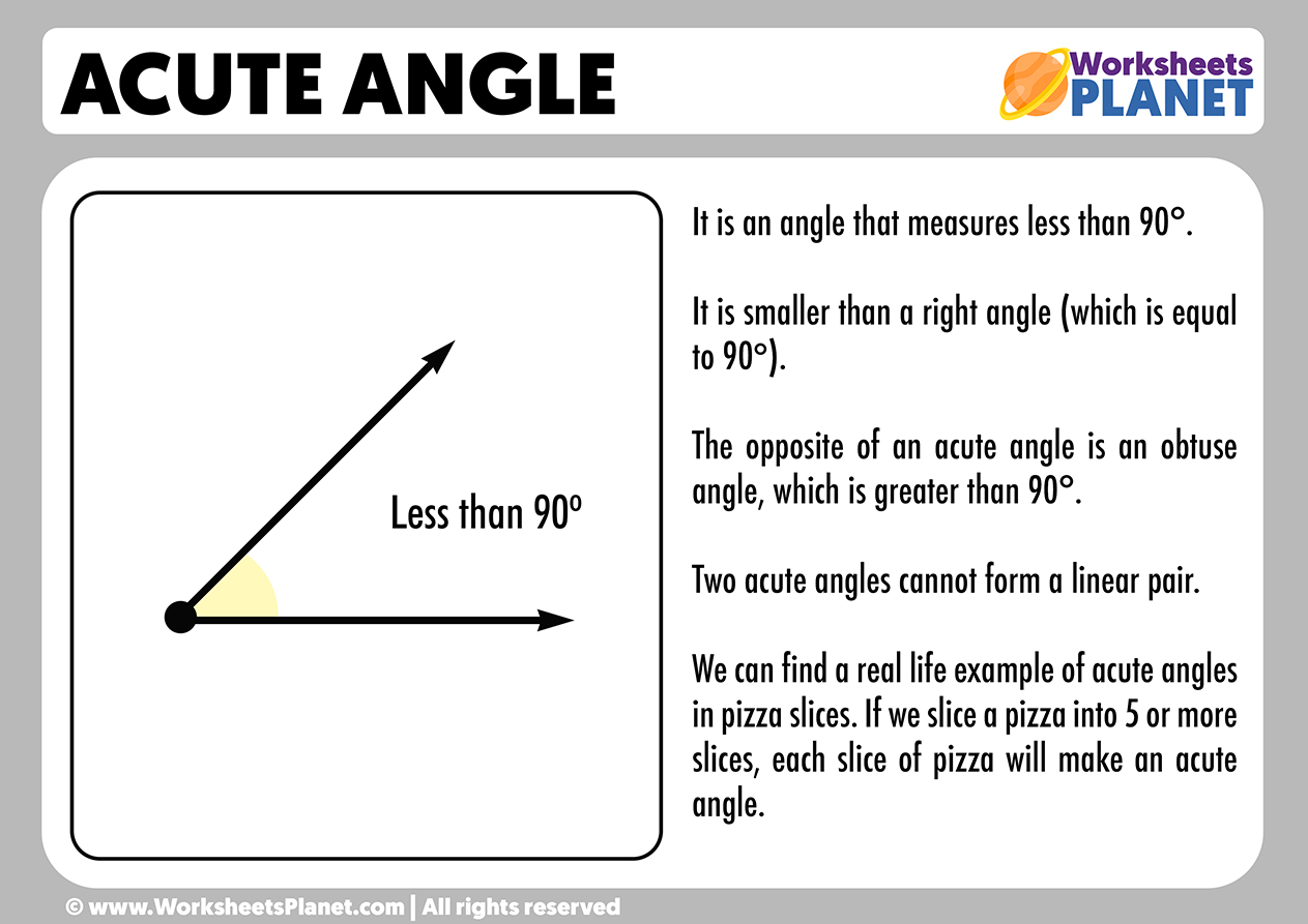
To understand what acute angles look like in a professional context, one must first look at the psychological response they trigger. Unlike right angles, which suggest stability and stagnation, or obtuse angles, which can feel passive or unwieldy, acute angles are inherently dynamic. They resemble arrows, blades, and peaks.
Beyond the 90-Degree Norm
Most of our built environment is constructed on the right angle. Architecture, paper sizes, and digital screens are predominantly rectangular. When a brand introduces an acute angle into its visual identity, it immediately breaks the “box.” This departure from the 90-degree norm signals that the brand is not interested in the status quo. In branding, an acute angle looks like a literal “point of difference.” It creates a sense of directionality, pulling the viewer’s eye toward a specific focal point, whether that is a call to action on a website or the forward-leaning slant of a logo.
The Psychology of Sharpness
Psychologically, humans are hardwired to notice sharp objects. In nature, acute angles are found in thorns, teeth, and mountain crags—things that demand our attention. In brand design, this translates to a “high-energy” aesthetic. An acute angle looks like movement; it suggests that a company is “on the cutting edge.” This is why we rarely see acute angles in brands that want to emphasize comfort or safety, such as baby products or healthcare providers. Instead, we see them in sectors where performance and “sharpness” of intellect or execution are paramount.
Acute Angles in Logo Design and Corporate Identity
The most direct manifestation of acute angles is found in logo design. When we ask what these angles look like in practice, we are often looking at some of the most iconic symbols in the global market.
Communicating Speed and Innovation
In industries like aerospace, automotive, and technology, acute angles are the standard. Consider the “V” or “A” shapes found in many tech logos. These are not just letters; they are chevrons pointing upward or forward. An acute angle in this context looks like a trajectory. It suggests a brand that is moving faster than its competitors. The sharpness of the angle dictates the perceived velocity: the narrower the angle, the more “aerodynamic” the brand appears. This visual strategy is used to convey that the company is a leader in innovation, slicing through market barriers with ease.
Case Studies in Angular Branding
Look at the Adidas three-stripe mountain or the Nike Swoosh. The Nike Swoosh, in particular, is defined by its acute interior angle where the “tail” meets the “hook.” It looks like a checkmark, but more importantly, it looks like a burst of energy.
Another prime example is Tesla. The “T” in the Tesla logo is composed of sharp, acute vertices. It doesn’t just represent the letter T; it looks like a cross-section of an electric motor, and its sharp points evoke a sense of high-voltage precision. Similarly, the Adobe “A” is a masterclass in using acute angles to create a sense of structural integrity combined with creative “pointiness.” These brands don’t just use angles; they own the “sharp” space in their respective industries.
Strategic Visual Communication: When to Choose Sharp over Soft
Choosing an acute aesthetic is a strategic brand decision that affects every touchpoint, from the physical product design to the digital interface. Knowing what these angles look like in different contexts is key to a cohesive brand strategy.
Precision vs. Approachability
There is a fundamental tension in design between “round” and “sharp.” Roundness is approachable, friendly, and soft. Sharpness—defined by acute angles—is precise, professional, and sometimes intimidating. A brand like Airbnb uses rounded soft edges to convey a sense of belonging and home. Conversely, a high-frequency trading firm or a cybersecurity company will lean into acute angles. To these brands, the acute angle looks like a shield or a needle—tools of precision and protection. It tells the client: “We are sharp, we are focused, and we do not miss the details.”
Niche Applications: Luxury, Tech, and Sport
In the luxury sector, acute angles often appear in “faceted” designs, mimicking the cut of a diamond. This gives the brand a look of “expensive sharpness.” In sports branding, acute angles look like aggression and competitive spirit. Think of the jagged lines in extreme sports apparel or the sharp-edged typography of energy drinks. In these niches, the acute angle is a badge of intensity. It appeals to a demographic that values high performance and “edgy” lifestyles.
Integrating Acute Angles into Multi-Platform Design
In the digital age, a brand’s identity must scale from a favicon on a smartphone to a billboard in Times Square. Acute angles present unique challenges and opportunities in this multi-platform environment.
Typography and Iconography
What do acute angles look like in text? They manifest as “slabs” or “serifs” that have been sharpened, or as “italic” fonts that lean forward at an acute angle to the baseline. Kinetic typography often utilizes these angles to create a sense of urgency in video marketing. In iconography, sharp-angled icons often represent “tools” or “actions”—a pen nib, a lightning bolt, or a play button. These elements provide a visual “spark” that keeps a user engaged with the interface.
Digital Interfaces and User Experience (UX)
In web and app design, the “look” of acute angles is often found in the use of diagonal sections and “hero” image masks. Instead of the traditional horizontal break between sections of a webpage, designers use an acute diagonal line to lead the user’s eye down the page. This creates a more immersive, “fast-paced” browsing experience. However, the use of these angles must be balanced. Too many sharp points can make a digital interface feel “prickly” or difficult to navigate. The goal is to use the acute angle as a directional guide, not a visual obstacle.
The Future of Angularity in Personal and Global Brands
As we look toward the future of branding, the role of geometry continues to evolve. The “look” of the acute angle is shifting from purely aggressive to more minimalist and sustainable.
Sustainability and Minimalist Geometry
Modern branding is moving away from complex, cluttered logos toward “primitive” shapes. In this minimalist movement, the acute angle looks like a structural necessity. Brands are using triangles and sharp chevrons to symbolize “building blocks” of a sustainable future. In the context of “green tech,” for example, an acute angle might represent a leaf or a solar ray, combining the sharpness of technology with the organic lines of nature.
Balancing Edge with Human-Centric Design
The most successful modern brands are those that can balance the “edge” of an acute angle with human-centric elements. What does this look like? It looks like a tech company that uses a sharp, angular logo but pairs it with warm, human photography and soft pastel colors. This “hybrid” approach allows a brand to project both competence (the sharp angle) and empathy (the soft context).
In conclusion, “what acute angles look like” is far more than a question of mathematics. In the world of branding, they look like the future. They represent the point of a spear, the peak of a mountain, and the precision of a laser. For a brand strategist, the acute angle is the ultimate tool for conveying motion, focus, and a “cutting-edge” identity. Whether they are used to slice through a crowded market or to point the way toward a new innovation, these sharp intersections remain the most dynamic elements in the visual language of business. As brands continue to vie for our limited attention, expect to see the world becoming a much sharper, more angular place.
aViewFromTheCave is a participant in the Amazon Services LLC Associates Program, an affiliate advertising program designed to provide a means for sites to earn advertising fees by advertising and linking to Amazon.com. Amazon, the Amazon logo, AmazonSupply, and the AmazonSupply logo are trademarks of Amazon.com, Inc. or its affiliates. As an Amazon Associate we earn affiliate commissions from qualifying purchases.