
In the competitive landscape of global commerce, visual identity serves as the silent ambassador of a brand. Among the primary colors, blue stands as the undisputed titan of corporate identity. From the deep navy of heritage financial institutions to the vibrant cyan of Silicon Valley startups, blue conveys a sense of stability, trust, and professionalism that few other hues can replicate. However, a brand is rarely defined by a single color alone. The true mastery of brand strategy lies in the selection of a secondary and tertiary palette—the colors that go best with blue to evoke specific emotional responses and drive consumer behavior.

Choosing the right color pairing for blue is not merely an aesthetic exercise; it is a strategic decision that influences brand recall, market positioning, and user experience. This article explores the psychological and strategic implications of pairing blue with various palettes to create a cohesive and impactful corporate identity.
The Psychology of Blue: Why It Anchors Modern Branding
Before examining specific pairings, it is essential to understand why blue serves as such a powerful foundation for branding. In the world of color psychology, blue is universally associated with the sky and the sea—elements that are vast, constant, and dependable. This translates into a brand personality rooted in reliability and intelligence.
Trust, Stability, and the Professional “Safe Bet”
For decades, blue has been the “safe bet” for industries where trust is the primary commodity. Banks like Chase and Barclays, or tech giants like IBM and Intel, utilize blue to signal that they are secure and established. In a brand strategy context, blue acts as a stabilizing force. When a company wants to appear authoritative without being aggressive (as red might be), blue is the logical choice. It lowers the heart rate and fosters a sense of calm, making it the ideal backdrop for complex information or high-stakes financial services.
From Deep Navy to Cyan: The Spectrum of Corporate Perception
Not all blues are created equal. The specific shade of blue chosen dictates the types of colors that will best complement it.
- Navy and Midnight Blue: These shades suggest tradition, luxury, and “old money” stability. They pair best with high-contrast neutrals or metallic accents.
- Royal and True Blue: These are energetic and versatile, often used in sports branding or mid-market consumer goods. They thrive when paired with vibrant, complementary colors.
- Sky and Baby Blue: These suggest openness, creativity, and friendliness. They are frequently seen in healthcare or software-as-a-service (SaaS) platforms and pair well with soft pastels or clean whites.
Creating Contrast: Bold Pairings for High-Impact Identities
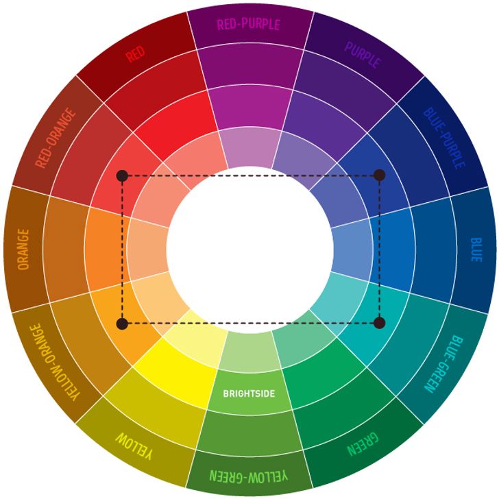
To stand out in a saturated market, brand strategists often look for high-contrast pairings. When we ask what colors go best with blue to create a “pop” or a memorable visual hook, we must look at the opposite side of the color wheel.
Blue and Orange: The Power of Complementary Opposites
On the traditional color wheel, orange is the direct complement to blue. This pairing creates a dynamic tension that is highly effective in marketing. Blue provides the professional foundation, while orange injects a sense of playfulness, innovation, and call-to-action energy.
Consider brands like Firefox or Gulf Oil. The orange cuts through the “coolness” of the blue, directing the eye toward specific elements like logos or “Sign Up” buttons. For a brand looking to appear both established and innovative, a navy blue paired with a burnt orange or coral can create a sophisticated yet energetic identity.
Blue and Yellow: Communicating Energy and Accessibility
Yellow and blue is a classic pairing that suggests optimism and clarity. In a corporate context, this combination is often used to signal accessibility and value. IKEA and Walmart are prime examples. The blue provides a sense of massive scale and reliability, while the yellow makes the brand feel approachable and friendly.
When implementing this in a modern brand strategy, it is vital to balance the saturation. A neon yellow paired with a deep navy can look avant-garde and tech-focused, whereas a goldenrod yellow paired with a slate blue feels more academic or artisanal.
Sophisticated Minimalist Palettes: Monochromatic and Analogous Approaches
While high-contrast pairings grab attention, many premium or technology-focused brands prefer a more harmonious approach. This involves choosing colors that sit next to blue on the color wheel or utilizing different shades of blue itself.
Blue on Blue: Building Depth Through Tonal Layers
A monochromatic blue palette is one of the most effective ways to communicate expertise and focus. By using a “hero” blue alongside lighter tints and darker shades of the same hue, a brand can create a sense of depth and sophistication without the visual clutter of multiple colors.
This strategy is particularly prevalent in the tech sector. Social media platforms like LinkedIn and Twitter (in its original iteration) utilized various shades of blue to create a cohesive environment that doesn’t fatigue the user’s eyes. In brand design, this is often referred to as “tonal layering,” and it allows for a highly organized information architecture where different shades of blue signify different levels of importance or interaction.
Blue and Green/Purple: Nature, Innovation, and Growth
Colors that sit adjacent to blue—green and purple—create what is known as an analogous color scheme.
- Blue and Green: This pairing is frequently used by brands focused on environmental sustainability, health, or growth. It blends the trust of blue with the vitality of green. It’s a “cool” palette that feels refreshing and modern.
- Blue and Purple: This is a rarer combination but highly effective for brands in the creative or luxury sectors. It suggests mystery, high-end technology (the “vaporwave” aesthetic), and premium quality. Using a deep royal blue with a vibrant violet can make a brand feel futuristic and exclusive.
Professional Neutrals: Elevating the Corporate Aesthetic
For many corporate identities, the best colors to pair with blue are not “colors” at all, but rather professional neutrals. This approach allows the blue to remain the undisputed star of the brand while providing a clean, high-end framework.
Blue and White: The Gold Standard for Modernist Design
There is perhaps no cleaner or more effective combination than blue and white. It is the hallmark of the “Modernist” design movement. This pairing communicates transparency, hygiene, and efficiency. It is the dominant palette for the healthcare industry and digital interfaces (UI/UX).
In brand strategy, the “white space” is just as important as the color itself. A blue logo on a vast white background suggests a brand that is confident enough not to hide behind complex graphics. It feels breathable and easy to navigate, which is essential for modern mobile app design.
Blue and Metallic Accents: Luxury, Finance, and Premium Positioning
When blue is paired with silver, gold, or copper, the brand immediately moves into the “Premium” or “Luxury” category.
- Navy and Silver: Communicates high-tech precision and modern elegance. It is often used in the automotive and aerospace industries.
- Navy and Gold: The ultimate symbol of prestige and heritage. This is the “Ivy League” aesthetic, perfect for law firms, private equity groups, and luxury hotels.
The metallic accent provides a tactile quality to the brand, suggesting that the company’s services are an investment of high value.
Strategy and Implementation: Choosing the Right Blue for Your Brand
Selecting the colors that go best with blue requires more than just an eye for design; it requires a deep dive into market positioning and technical requirements.
Identifying Your Industry Archetype
Before finalizing a palette, a brand strategist must analyze the competitive landscape. If every competitor in the fintech space is using “Navy and White,” a brand might choose “Blue and Electric Lime” to signal a disruptive, “Challenger Brand” identity. Conversely, if a startup wants to appear more established to attract venture capital, it might adopt a more traditional “Blue and Slate” palette to align with industry leaders.
Testing Accessibility and Digital Readability
In the digital age, a brand color palette must do more than look good on a business card; it must be functional. When pairing colors with blue, designers must ensure there is enough contrast for accessibility (WCAG standards).
For example, placing light blue text on a dark blue background may look sophisticated, but it can be illegible for users with visual impairments. A successful brand strategy ensures that the chosen pairings work across all touchpoints—from high-resolution retina displays to matte-finish recycled paper.

Conclusion: The Strategic Versatility of Blue
Determining what colors go best with blue depends entirely on the brand’s ultimate objectives. Whether the goal is to disrupt a market with a high-contrast orange, establish heritage with gold, or project digital efficiency with white, blue remains the most versatile anchor in a brand strategist’s toolkit.
By understanding the psychological nuances of different blue shades and the strategic impact of their complements, brands can build a visual identity that is not only aesthetically pleasing but also a powerful driver of corporate equity. In the world of branding, blue isn’t just a color—it’s a foundation for trust, a canvas for innovation, and a bridge to the consumer’s confidence.
aViewFromTheCave is a participant in the Amazon Services LLC Associates Program, an affiliate advertising program designed to provide a means for sites to earn advertising fees by advertising and linking to Amazon.com. Amazon, the Amazon logo, AmazonSupply, and the AmazonSupply logo are trademarks of Amazon.com, Inc. or its affiliates. As an Amazon Associate we earn affiliate commissions from qualifying purchases.