
In the world of corporate identity, few symbols are as instantly recognizable as the twin-tailed mermaid that adorns billions of coffee cups worldwide. Whether you are in the heart of Seattle, the bustling streets of Tokyo, or a quiet corner of London, the green Siren of Starbucks serves as a beacon for caffeine seekers and a masterclass in brand strategy. For marketing professionals and brand designers, the Starbucks logo is more than just a graphic; it is an evolving entity that has navigated the complexities of global expansion, cultural shifts, and the transition from a local roastery to a lifestyle powerhouse.
Understanding what the Starbucks logo means requires a deep dive into the intersection of mythology, maritime history, and the psychology of visual branding. It is a story of how a company used a 16th-century Norse woodcut to build a multi-billion dollar corporate identity that thrives on the “allure” of the experience as much as the product itself.
The Origins of the Siren: Symbolism and Corporate Identity
The Starbucks logo was never intended to be a corporate, sterile emblem. When the original founders—Jerry Baldwin, Zev Siegl, and Gordon Bowker—launched the company in 1971, they wanted a brand identity that reflected the nautical history of Seattle and the seafaring tradition of the early coffee traders.
The 16th-Century Norse Woodcut
The search for a visual identity led the founders to old marine books, where they discovered a 16th-century Norse woodcut of a twin-tailed siren (or Melusine). In mythology, sirens were creatures that lured sailors with their enchanting music and voices to shipwreck on the rocky coasts of their islands.
From a brand strategy perspective, this was a bold and somewhat unconventional choice. Most brands seek to project safety or reliability. However, Starbucks chose a symbol of “allure.” The idea was that the siren was as seductive as the coffee itself. By adopting this figure, the brand positioned its product not merely as a commodity, but as an irresistible temptation.
Why a Mermaid? Connecting Sea and Coffee
The choice of a sea creature was deeply rooted in the origins of the coffee trade. Historically, coffee traveled long distances across the ocean to reach its destination. Seattle, being a major port city, shared this intrinsic link with the sea. The Siren functioned as a metaphorical bridge between the “Old World” origins of the beans and the “New World” consumption in the Pacific Northwest.
By grounding the brand in maritime mythology, Starbucks established a sense of heritage and mystery. This is a classic branding technique: creating a “brand story” that feels ancient and established, even when the company is new. It gave the brand a soul that distinguished it from the generic, mass-produced coffee brands of the 1970s.
Evolutionary Design: A Case Study in Visual Branding
One of the most impressive aspects of the Starbucks brand is its ability to evolve without losing its core identity. The logo has undergone four major transformations, each reflecting a specific shift in the company’s business strategy and global footprint.
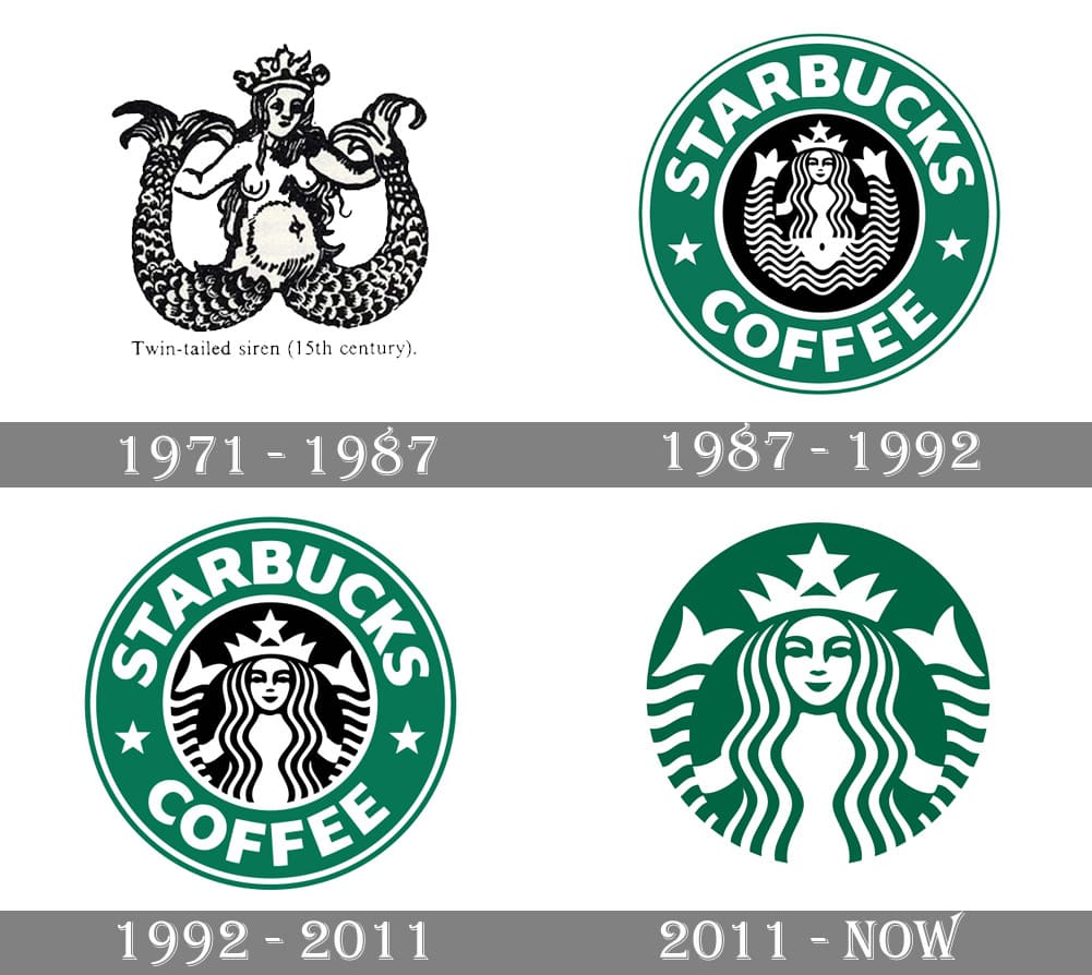
1971–1987: The Original Brown Siren
The first iteration of the logo was a far cry from the sleek green icon we see today. It was a detailed, woodcut-style illustration of the siren, featuring her bare chest and fully visible twin tails. The color palette was a dark, earthy brown—intended to represent the coffee beans themselves.
In this era, the brand was a specialized coffee bean roaster, not the “third place” social hub it would later become. The logo was literal and rustic, focusing on the raw product and the maritime history of the Pike Place Market.
1987–1992: The Green Transition and Minimalism
The most significant shift in Starbucks’ corporate identity occurred in 1987 when Howard Schultz acquired the company. Schultz, who had started his own coffee house called Il Giornale, merged the two identities.
This era introduced the iconic “Starbucks Green.” The color change was a strategic move to signify growth, freshness, and prosperity. The siren was also streamlined; her hair was moved to cover her chest, making the logo more palatable for a wider, more conservative audience as the company began to scale. The design moved from a “roastery” feel to a “corporate brand” feel, enclosed in a circular badge that suggested a seal of quality.
2011–Present: Removing the Wordmark
On the company’s 40th anniversary in 2011, Starbucks took a risk that few brands can afford: they removed their name from the logo entirely. The words “Starbucks Coffee” and the outer ring were discarded, leaving only the Siren in a larger, borderless green circle.

This move was a testament to the brand’s immense “equity.” Like Nike’s Swoosh or Apple’s bitten apple, the Starbucks Siren had become so globally recognized that it no longer needed a linguistic label. This change also signaled a strategic pivot. By removing the word “Coffee,” Starbucks freed itself to expand into other product categories—teas, food, and even alcohol—without the brand name feeling restrictive.
The Art of Imperfection: Psychology Behind the Design
Great branding often utilizes subtle psychological cues that the average consumer may never consciously notice. In the case of the Starbucks Siren, the secret to her “human” appeal lies in a deliberate design choice involving asymmetry.
The “Uncanny Valley” and Asymmetry
During the 2011 redesign, the design team at Lippincott noticed something unsettling about the Siren as they modernized her features. When they made her face perfectly symmetrical, she looked “too perfect,” bordering on robotic or cold. This is often referred to in design as the “uncanny valley,” where something looks almost human but “off” enough to cause discomfort.
To fix this, the designers introduced a slight asymmetry. If you look closely at the modern logo, the shadow on the right side of her nose is slightly longer than on the left. This “imperfection” made the Siren appear more approachable, mysterious, and ultimately, more human. In branding, this builds a subconscious emotional connection with the consumer, making the logo feel like a “person” rather than a cold corporate entity.
Color Psychology: The Iconic Starbucks Green
The choice of Pantone 3425 (Starbucks Green) is another masterclass in marketing psychology. While brown is the color of coffee, it can often feel heavy or “dirty” in a retail environment. Green, conversely, is associated with nature, healing, and tranquility.
For Starbucks, this color supports the “Third Place” strategy—the idea that the store is a sanctuary between work and home. The green logo promises a moment of rest and rejuvenation. Furthermore, green is the color of the “Go” signal in most cultures, subconsciously encouraging consumers to stop and enter the store.
Strategic Impact: How the Logo Drives Global Brand Equity
A logo is only as strong as the strategy behind it. The Starbucks Siren has become a global symbol of status and lifestyle, largely due to how the company leverages its visual identity across different touchpoints.
Cultivating Brand Loyalty through Visual Recognition
In the age of social media, the Starbucks logo functions as a piece of “social currency.” The white cup with the green Siren is a highly visible accessory. When a customer walks down the street holding a Starbucks cup, they are not just carrying a beverage; they are signaling their membership in a specific global lifestyle.
The logo has become a shorthand for consistency. Whether you are in New York or Dubai, the Siren guarantees a specific level of service and product quality. This consistency builds deep brand equity, allowing Starbucks to maintain premium pricing in a highly competitive market.
Scalability and Versatility in Modern Marketing
As digital marketing becomes the primary way brands interact with consumers, the 2011 simplification of the logo has proven to be a visionary move. The “Wordless Siren” is highly scalable. It looks just as clear on a tiny mobile app icon as it does on a massive billboard or a piece of merchandise.
This versatility allows the brand to remain modern and “digital-first.” By stripping away the clutter, Starbucks ensured that its corporate identity could live comfortably on digital payment screens, reward program interfaces, and social media avatars.
Conclusion: The Power of a Living Brand
The Starbucks logo is far more than a decorative mark; it is a sophisticated piece of brand architecture that has successfully navigated five decades of change. From its roots as a brown, provocative woodcut to its current status as a minimalist green icon, the Siren has remained the “soul” of the company.
What we can learn from the Starbucks logo is that a brand should never be static. It must be rooted in a deep, meaningful story—like the maritime history of coffee—but it must also be flexible enough to evolve with the times. By balancing mythology with modern design principles and psychological insights, Starbucks has created a symbol that doesn’t just represent coffee, but an global experience that billions of people want to be a part of. The Siren continues to do exactly what she was designed to do centuries ago: she allures, she enchants, and she brings people back to the shore, time and time again.
aViewFromTheCave is a participant in the Amazon Services LLC Associates Program, an affiliate advertising program designed to provide a means for sites to earn advertising fees by advertising and linking to Amazon.com. Amazon, the Amazon logo, AmazonSupply, and the AmazonSupply logo are trademarks of Amazon.com, Inc. or its affiliates. As an Amazon Associate we earn affiliate commissions from qualifying purchases.