
In the competitive landscape of modern commerce, a brand is far more than a logo or a product line; it is a psychological ecosystem designed to evoke specific emotions and drive consumer behavior. Among the most potent tools in a brand strategist’s arsenal is color. While often dismissed as a mere aesthetic choice, color theory is a fundamental pillar of corporate identity. One of the most misunderstood yet strategically powerful colors in the branding spectrum is pink.
When a strategist asks, “What does the colour pink mean?” they are not looking for a simple definition of a hue. They are exploring a complex web of cultural associations, emotional triggers, and market positioning strategies. Far from being relegated to niche “feminine” markets, pink has evolved into a symbol of disruption, luxury, and modern inclusivity.
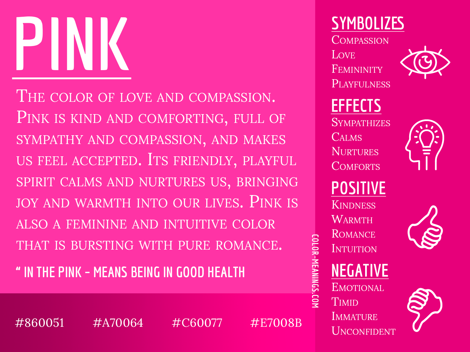
The Psychology Behind Pink: Beyond Traditional Gender Roles
To understand pink’s role in branding, one must first deconstruct its psychological foundations. Color psychology suggests that every shade communicates a silent message to the subconscious. Historically, pink has been associated with compassion, nurturing, and approachability. However, the modern brand landscape has reclaimed pink, utilizing its unique frequency to communicate everything from high-energy innovation to sophisticated luxury.
The Evolution of Pink in Marketing
The history of pink in branding is a masterclass in shifting social constructs. In the early 20th century, pink was often marketed as a “stronger” color suitable for boys, while blue was seen as delicate for girls. The mid-century shift toward gendering pink as exclusively feminine created a powerful, albeit limiting, marketing niche.
Today, we are witnessing a “de-gendering” of the color. In the context of brand strategy, pink is no longer a gender marker; it is an emotional marker. It signifies a brand that is approachable yet bold, empathetic yet confident. Brands that understand this evolution use pink to signal that they are forward-thinking and unafraid to challenge traditional norms.
Emotional Resonance and Consumer Trust
Pink occupies a unique space between the aggressive energy of red and the tranquil stability of white. From a psychological standpoint, it provides a “calming” effect while maintaining a sense of urgency. This makes it an ideal choice for brands that want to build immediate trust without appearing passive.
In marketing, pink is often used to soften the “corporate” edge of a business. It humanizes a brand, suggesting a level of care and customer-centricity that colder colors like blue or grey may fail to convey. For a startup looking to disrupt a legacy industry, pink can be the visual bridge that makes innovation feel accessible rather than intimidating.
Pink in Corporate Identity: Building a Differentiated Brand
In a world of “corporate blue” and “tech grey,” pink is a radical differentiator. Choosing pink for a corporate identity is a strategic move designed to secure “mental real estate” in a crowded marketplace. When a consumer sees a specific shade of magenta or dusty rose, the brand association should be instantaneous.
Soft Pink vs. Neon Pink: Finding Your Brand Personality
The meaning of pink shifts dramatically depending on its saturation and value. A brand strategist must carefully select the specific tone to align with the company’s core values:
- Pastel and Dusty Pinks: These shades suggest elegance, wellness, and sophistication. They are frequently used in the skincare, luxury goods, and high-end lifestyle sectors to convey a sense of calm and premium quality.
- Magenta and Neon Pinks: These are high-vibrancy “disruptor” colors. They signify energy, youth, and a refusal to follow the status quo. These shades are designed to grab attention on a digital screen and project a sense of “loud” confidence.
Case Studies: Brands That Own Pink
Several global giants have successfully “claimed” pink, using it to define their market position:
- T-Mobile: By choosing “Magenta,” T-Mobile positioned itself as the “Un-carrier.” In a sea of blue (AT&T) and red (Verizon), T-Mobile’s pink was a visual declaration of war against the telecommunications establishment. It signaled that they were different, bold, and customer-focused.
- Lyft: In the early days of the ride-sharing wars, Lyft’s iconic pink mustache (and later its glowing “Amp” dashboard light) served as a friendly alternative to Uber’s sterile black-and-white aesthetic. Pink was used to communicate community, safety, and a more personable experience.
- Barbie (Mattel): Perhaps the most famous use of the color, “Barbie Pink” is a trademarked powerhouse. It demonstrates how a color can become synonymous with a brand’s entire universe, driving multi-generational loyalty through visual consistency.
Strategic Implementation: How to Use Pink in Marketing Assets

Integrating pink into a brand’s visual identity requires a nuanced understanding of design harmony and user experience (UX). It is rarely about making everything pink; it is about using the color as a strategic lever to guide the consumer’s eye and influence their decision-making process.
Pink in Digital Interfaces and UX
In digital marketing and web design, pink is an incredibly effective tool for “Call to Action” (CTA) buttons and highlight elements. Because it stands out against neutral backgrounds, a pink button often yields higher click-through rates (CTR) in specific demographics.
However, designers must be wary of “color fatigue.” Overusing high-saturation pink can lead to eye strain and may cause users to bounce from a site. The most successful digital brands use pink as an accent—a “pop” of personality that guides the user through the sales funnel without overwhelming the senses.
Packaging and Physical Touchpoints
In the physical world, pink packaging can influence the “unboxing” experience. Pink has a tactile quality; it feels warm and inviting. For e-commerce brands, using pink mailers or tissue paper can increase “shareability” on social media platforms like Instagram and TikTok. This is often referred to as “Instagrammable branding,” where the color itself becomes a marketing vehicle through user-generated content.
Furthermore, pink is highly effective in shelf-differentiation. In a retail environment where consumers make split-second decisions, a pink box among a row of white or brown packaging creates a natural focal point, drawing the consumer’s hand toward the product.
The Future of Pink: Gen Z, Inclusivity, and Global Markets
As we look toward the future of brand strategy, the meaning of pink continues to broaden. It is becoming the flagship color for a new era of inclusivity and ethical consumerism.
The Rise of “Millennial Pink” and Beyond
A few years ago, “Millennial Pink” took the world by storm. It wasn’t just a trend; it was a cultural shift. This muted, gender-neutral shade became the calling card for a generation that valued authenticity over artifice. It paved the way for brands like Glossier and Acne Studios to build cult-like followings.
Now, we are moving into the “Gen Z Pink” era—a more vibrant, acidic, and expressive version of the color. This shift mirrors the transition from curated perfection to raw, high-energy self-expression. Brands targeting younger demographics must adapt their palettes to reflect this need for boldness and individuality.
Cultural Nuances: Using Pink Internationally
For global brands, the question “What does the colour pink mean?” must be answered through a cultural lens. While Western markets may see pink as a symbol of romance or disruption, other cultures view it differently:
- In Japan: Pink is associated with the cherry blossom (Sakura) and represents spring, the transience of life, and masculinity (historically linked to young warriors).
- In Latin America: Pink is often used in architecture and fashion to symbolize vitality and community.
- In Korea: It is frequently associated with trust and high-tech innovation.
A brand strategist must ensure that their use of pink resonates with the specific cultural values of their target market to avoid unintended brand friction.

Conclusion
Pink is no longer a color that can be dismissed as “soft” or “niche.” In the realm of brand strategy, it is a high-octane tool for differentiation, emotional connection, and market disruption. Whether it is the bold magenta of a tech giant or the soft blush of a luxury skincare line, pink communicates a brand’s willingness to be seen and felt.
By understanding the deep psychological roots and the evolving cultural context of pink, marketers can move beyond superficial design choices. They can use pink to build identities that are not just visually striking, but emotionally resonant and strategically sound. In the modern economy, the brands that win are those that understand how to use color to tell a story—and pink is one of the most compelling stories a brand can tell.
aViewFromTheCave is a participant in the Amazon Services LLC Associates Program, an affiliate advertising program designed to provide a means for sites to earn advertising fees by advertising and linking to Amazon.com. Amazon, the Amazon logo, AmazonSupply, and the AmazonSupply logo are trademarks of Amazon.com, Inc. or its affiliates. As an Amazon Associate we earn affiliate commissions from qualifying purchases.