
The allure of red is undeniable. From the vibrant blush of a sunset to the commanding presence of a stop sign, red evokes passion, energy, urgency, and power. It’s a color that commands attention and often carries deep emotional and cultural significance. For designers, marketers, and technologists alike, understanding how to effectively wield red is a crucial skill. But the question of “what colors make red color” isn’t as straightforward as it might seem, especially when we delve into the digital realm. While in traditional pigment mixing, red is a primary color, its manifestation and creation in digital interfaces are a fascinating interplay of light, code, and artistic intent. This article will explore the technical underpinnings of how red is generated and perceived in the context of technology, examining the underlying principles that allow us to experience this potent hue on our screens.

The Digital Spectrum: Red as a Primary Light Component
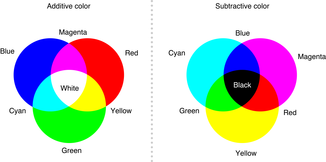
In the world of digital displays, the creation of color is fundamentally different from how pigments interact. Instead of subtractive color mixing (where pigments absorb light), digital screens utilize additive color mixing, where light is emitted. This means that combining different colored lights results in a brighter, often whiter, outcome. At the heart of this process lies the RGB color model, a standard used by most electronic displays, including monitors, televisions, smartphones, and even LED lighting.
Understanding the RGB Color Model
RGB stands for Red, Green, and Blue. These three colors are considered the primary colors of light. By varying the intensity of each of these primary components, a vast spectrum of other colors can be created. Think of it like a sophisticated dimmer switch for each individual color. A digital display is essentially composed of millions of tiny pixels, and each pixel is equipped with three sub-pixels: one red, one green, and one blue. By controlling the brightness of these sub-pixels, the display can generate any color within the RGB gamut.
When we talk about “what colors make red color” in a digital context, it’s crucial to understand that red itself, as a pure, saturated hue, is typically generated by activating only the red sub-pixel at its maximum intensity. The green and blue sub-pixels would be turned off, or set to their minimum intensity. This is why, in the RGB model, red is often referred to as a “primary” color of light.
The Role of Intensity and Value
The true magic of digital color creation lies in the ability to control the intensity of each primary light source. This intensity is usually represented by a numerical value, often ranging from 0 to 255.
- Pure Red: To achieve a pure, vibrant red on a screen, the red component would be set to its maximum value (e.g., 255), while the green and blue components would be set to their minimum value (0). This can be represented by the hexadecimal code
#FF0000or the RGB valuergb(255, 0, 0). - Variations of Red: By adjusting the intensity of the red light in conjunction with the other primary colors, we can create an astonishing array of shades and tints that fall under the broad umbrella of “red.”
- Pink: A lighter, less saturated version of red is created by mixing red light with a significant amount of white light. In RGB terms, this means increasing the intensity of the green and blue sub-pixels alongside the red. For instance,
rgb(255, 192, 203)(a common representation of pink) has maximum red but also significant green and blue light contributing to its pastel appearance. - Maroon/Burgundy: Deeper, darker reds are achieved by reducing the overall intensity of red light, often while slightly increasing other components or keeping them at a minimum. An example of maroon might be
rgb(128, 0, 0), where the red component is halved. - Orange: While orange is often perceived as a distinct color, it is created in the RGB model by mixing red and green light. The more red light there is relative to green, the more reddish the orange will appear. A bright orange could be
rgb(255, 165, 0). - Brown: Browns are typically created by mixing red, green, and blue light in specific proportions, usually with a lower overall intensity and a greater balance between the red and green components. A dark brown might be
rgb(139, 69, 19).
- Pink: A lighter, less saturated version of red is created by mixing red light with a significant amount of white light. In RGB terms, this means increasing the intensity of the green and blue sub-pixels alongside the red. For instance,
The interplay of these three light primaries, with their variable intensities, allows for an almost infinite spectrum of colors to be rendered on a screen.
The Technical Foundation: Color Spaces and Bit Depth
Beyond the fundamental RGB model, the way red color is precisely defined and reproduced on digital devices is governed by more sophisticated concepts related to color spaces and bit depth. These technical specifications ensure consistency and accuracy in color representation across different platforms and devices.
Exploring Different Color Spaces
A color space is essentially a framework that defines a range of colors and how they are represented numerically. Different color spaces are optimized for various applications and devices, influencing how red and other colors are displayed.
- sRGB (Standard Red Green Blue): This is the most common color space and is the default for most web content and consumer-grade displays. sRGB defines a specific set of red, green, and blue primaries and a gamma curve, aiming for a consistent appearance across a wide range of devices. When you see red on a typical website, it’s likely being rendered within the sRGB color space. The “red” in sRGB is defined by its specific chromaticity coordinates and luminance, ensuring that
#FF0000generally looks like a recognizable red. - Adobe RGB: This color space offers a wider gamut (range of colors) than sRGB, particularly in the cyan-green and red areas. This means it can represent more saturated and vibrant greens and reds that might not be achievable in sRGB. Designers working with print media often prefer Adobe RGB because printing processes can reproduce a wider range of colors than typical displays.
- ProPhoto RGB: This is an even wider color space, designed for professional photography and graphic design. It encompasses almost all the colors visible to the human eye, offering the greatest flexibility for editing and manipulation. However, very few displays can actually reproduce the full range of colors within ProPhoto RGB, so its benefits are primarily realized during the editing process.
The choice of color space influences the exact perceived hue and saturation of red. A red that appears brilliantly vibrant in Adobe RGB might look slightly duller or less saturated when displayed on an sRGB monitor if the color was originally defined outside the sRGB gamut.
The Impact of Bit Depth
Bit depth refers to the amount of information that can be stored for each color channel (red, green, and blue) per pixel. Higher bit depth allows for finer gradations of color, leading to smoother transitions and more realistic renderings.
- 8-bit Color (24-bit total): This is the standard for most displays, offering 256 possible intensity levels for each of the red, green, and blue channels. This results in approximately 16.7 million distinct colors (256 x 256 x 256). For most purposes, 8-bit color is sufficient to create a convincing red.
- 10-bit Color (30-bit total) and beyond: Displays with higher bit depth, such as 10-bit or 12-bit, offer significantly more intensity levels per channel (1024 for 10-bit, 4096 for 12-bit). This translates to billions of colors. In high-end applications like professional video editing or advanced graphics, higher bit depth can lead to smoother color gradients, preventing “banding” (visible steps between colors) and allowing for more subtle variations of red. For example, a subtle gradient from a dark crimson to a bright scarlet might appear seamless on a 10-bit display, whereas on an 8-bit display, one might notice distinct bands of color.
The precise “red” we see is thus a product of the defined color space and the bit depth of the display rendering it, contributing to the technical nuances of color creation.
Red in User Interface (UI) and User Experience (UX) Design
The effective use of red in digital interfaces goes beyond its technical generation; it’s deeply intertwined with psychological impact and user interaction design. Understanding how red is perceived and the technical limitations of its display is paramount for UI/UX designers aiming to create intuitive and engaging experiences.
Psychological and Emotional Associations of Red
Red is a color with a rich tapestry of psychological and emotional associations. Its impact on user perception can be harnessed to guide attention, convey urgency, or evoke specific feelings.
- Attention-Grabbing: Red is one of the most visible colors in the spectrum and has a strong tendency to grab attention. This makes it ideal for critical UI elements like error messages, warning notifications, “buy now” buttons, or urgent alerts. The brain is hardwired to notice red, making it an effective tool for directing user focus.
- Energy and Excitement: Red is often associated with energy, passion, and excitement. In marketing and e-commerce, a red “sale” banner or a red call-to-action button can create a sense of urgency and encourage immediate engagement.
- Danger and Warning: Conversely, red is universally understood as a color of warning or danger. In applications, red icons or text are commonly used to indicate errors, system failures, or prohibited actions. This immediate association helps users quickly identify and address critical issues.
- Love and Romance: While less common in purely functional interfaces, red also carries connotations of love, passion, and romance, which can be leveraged in specific branding contexts.
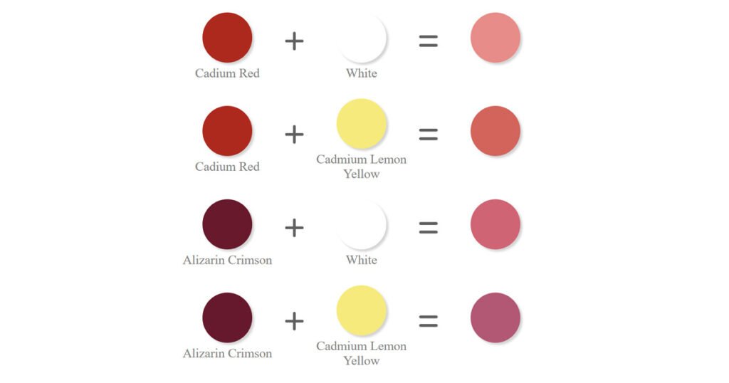
The technical rendering of red plays a crucial role in its psychological impact. A bright, saturated red, generated with high intensity in the RGB model, will naturally convey a stronger sense of urgency or excitement than a muted, desaturated red.
Strategic Implementation in Digital Interfaces
Designers strategically employ red within digital interfaces to guide user behavior and enhance usability. This involves a careful consideration of context and the technical aspects of color rendering.
- Call-to-Action (CTA) Buttons: A vibrant red CTA button can significantly increase click-through rates, particularly in contexts where urgency or a limited-time offer is being promoted. However, excessive use of red for CTAs can lead to user fatigue or desensitization.
- Error States and Validation: Red is the de facto standard for indicating errors. A red border around a form field that has failed validation, or red text for an error message, immediately alerts the user to a problem that needs their attention.
- Notifications and Alerts: Important notifications or urgent alerts are often highlighted with red elements to ensure they are not overlooked. This could be a red badge on an icon or a prominent red banner at the top of an interface.
- Branding and Identity: Many brands use red as a core part of their identity, leveraging its powerful associations. Think of iconic brands like Coca-Cola, Netflix, or Red Bull. The specific shade of red used by these brands is carefully chosen and technically defined within their brand guidelines.
- Interactive Elements: Red can also be used to indicate interactive elements or states, such as a progress bar, a play button on a video player, or a highlighted selection.
The choice of red hue, its saturation, and its brightness are all technically controlled through RGB values and color profiles. A designer must understand how these technical choices will translate across different devices and color spaces to ensure their intended message is effectively communicated. For example, a designer might specify a particular shade of red using a HEX code, knowing that this code will be interpreted by the display according to the underlying color space and bit depth. The goal is to ensure that this red reliably conveys the intended emotion or information, whether it’s a critical warning or an exciting offer.
aViewFromTheCave is a participant in the Amazon Services LLC Associates Program, an affiliate advertising program designed to provide a means for sites to earn advertising fees by advertising and linking to Amazon.com. Amazon, the Amazon logo, AmazonSupply, and the AmazonSupply logo are trademarks of Amazon.com, Inc. or its affiliates. As an Amazon Associate we earn affiliate commissions from qualifying purchases.