
In the competitive landscape of modern branding, color is far more than an aesthetic choice; it is a psychological tool used to communicate values, evoke emotions, and drive consumer behavior. When a brand decides to anchor its visual identity in brown, it often faces a unique set of challenges and opportunities. Long associated with the earth, stability, and reliability, brown is a “heavy” neutral that requires a strategic secondary palette to truly resonate in a digital-first marketplace. Understanding what color goes with brown is not merely a question of taste, but a fundamental exercise in brand strategy and corporate identity design.
The Psychology of Brown in Brand Strategy
Before determining which colors best complement brown, a brand strategist must first understand the inherent psychological associations of the color itself. In a world of bright, neon tech startups and stark monochrome minimalism, brown offers a grounded alternative that can differentiate a brand as established, organic, or exceptionally dependable.
Stability and Reliability
Brown is the color of the earth and the foundations of the physical world. In the context of corporate identity, this translates to reliability and resilience. Brands like UPS (United Parcel Service) have famously utilized brown to communicate that they are a dependable backbone of global commerce. When a brand uses brown, it signals to the consumer that it is not a “flash-in-the-pan” entity but a grounded organization built to last.
Organic and Sustainable Roots
In the modern era of ESG (Environmental, Social, and Governance) awareness, brown has seen a resurgence as a primary brand color for sustainable and organic industries. It evokes a sense of “unprocessed” authenticity. From specialty coffee roasters to eco-conscious skincare brands like Aesop, brown suggests a connection to nature and a rejection of synthetic artificiality.
Luxury and Heritage
When executed with high-quality materials or specific shade variations (like chocolate or mahogany), brown moves into the realm of luxury. It suggests leather, fine wood, and aged spirits. For high-end heritage brands, brown serves as a sophisticated alternative to black, offering warmth and a sense of history that black often lacks.
Strategic Color Pairings for Visual Impact
The success of a brown-centric brand identity depends heavily on its secondary and accent colors. Because brown is a composite color—often containing elements of red, yellow, and blue—it is remarkably versatile but also prone to looking “muddy” if paired incorrectly.
Brown and Gold: The Luxury Standard
The combination of deep brown and metallic gold is one of the most effective pairings for luxury brand strategy. Gold provides the “light” to brown’s “weight,” creating a sense of prestige and exclusivity. This pairing is frequently seen in high-end chocolate packaging, luxury real estate, and premium investment firms. The gold acts as a highlighter, drawing the eye to logos or calls to action, while the brown provides a rich, stable backdrop.
Brown and Teal: The Modern Contrast
For brands looking to appear contemporary and innovative while maintaining a grounded feel, teal is the ideal partner for brown. Teal sits opposite many shades of brown on the color wheel, providing a sophisticated contrast that feels “designed” rather than accidental. This combination is particularly popular in the wellness and boutique tech sectors, where the warmth of brown balances the clinical, cool nature of blue-greens.
Brown and Cream: Timeless Sophistication
In minimalist brand design, pairing brown with cream or off-white—rather than a stark, clinical white—creates a softer, more inviting identity. This palette is a staple for lifestyle brands, interior design firms, and artisanal food products. It communicates cleanliness and organization without the coldness often associated with high-contrast black-and-white identities.
Industry-Specific Applications of Brown Palettes
Choosing what color goes with brown also depends on the specific industry and the target demographic. A palette that works for a construction firm may fail for a financial services provider.
Food and Beverage Branding
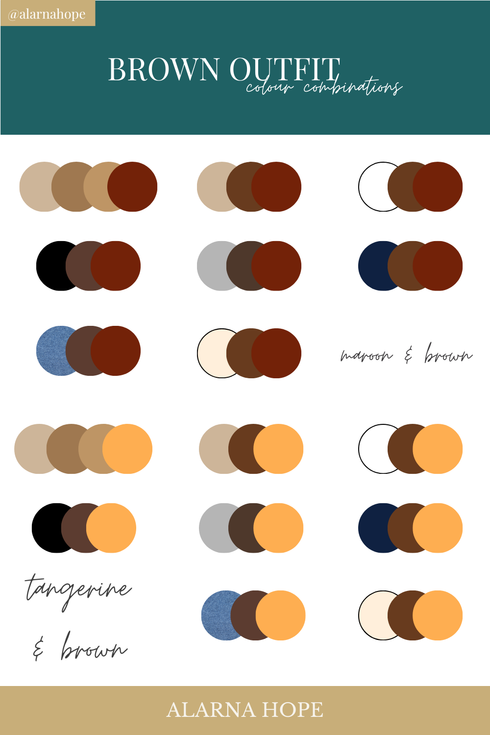
In the food industry, brown is most commonly associated with rich, indulgent flavors like chocolate, coffee, and roasted grains. To prevent the brand from looking too heavy, strategists often introduce “appetite-stimulating” accents. A splash of burnt orange or terracotta can make a brown brand feel more energetic and flavorful, whereas a pairing with sage green can emphasize the organic and plant-based origins of a product.
Professional Services and Finance
While blue is the traditional choice for finance, brown is making inroads in wealth management and “old money” consulting firms. In these sectors, brown is often paired with navy blue or forest green. These “academic” pairings suggest wisdom, tradition, and a long-term perspective. It tells the client that their assets are being managed by an institution with deep roots and a conservative, stable approach to growth.
Outdoor and Adventure Brands
For brands centered on the “great outdoors,” brown is the literal color of the path ahead. To avoid looking like a military brand, outdoor companies often pair brown with high-visibility accents like safety orange or bright sky blue. This ensures that while the brand feels rugged and “at home” in nature, it also remains visible, modern, and energetic.
Digital Implementation and Accessibility
In the digital age, a brand’s color palette must do more than look good on a business card; it must perform across various screens and devices. Implementing brown in a digital environment requires a technical understanding of contrast and user experience (UX).
Contrast Ratios and Readability
One of the primary challenges with brown is ensuring high enough contrast for text readability. Dark brown backgrounds often require very light text (cream or white) to meet WCAG (Web Content Accessibility Guidelines) standards. Brand strategists must carefully select the “hex codes” for their brown to ensure they don’t lose the richness of the color when it is viewed on back-lit mobile screens.
Color Balance in UI Design
In digital brand identity, the 60-30-10 rule is essential. Sixty percent of the interface should be a dominant neutral (often the cream or light brown), thirty percent should be the primary brown, and ten percent should be the “pop” color (the teal, gold, or orange discussed earlier). Using brown as a primary background for a website can feel heavy and dated, but using it as a sophisticated accent for buttons, borders, and typography can create a premium feel.
The Role of Texture in Digital Brown
Unlike primary colors like red or blue, brown often benefits from “implied texture” in digital branding. High-resolution imagery of wood grain, recycled paper, or leather can enhance the brown palette, making the digital experience feel more tactile and premium. This strategy is frequently used by boutique brands to bridge the gap between their physical products and their digital storefronts.
Case Studies: Successful Brown-Centric Brands
To truly understand what color goes with brown, we must look at global brands that have successfully integrated the color into their corporate DNA.
UPS: The Power of “Pulling” Brown
UPS is perhaps the most famous example of “owning” brown. Their tagline “What can Brown do for you?” turned a color often associated with dirt into a symbol of global logistics efficiency. By pairing their signature Pullman Brown with a bright, energetic yellow-gold, they created a high-contrast identity that is instantly recognizable on every street in the world. The gold prevents the brown from appearing dull, while the brown gives the gold a serious, professional anchor.
Aesop: Earthy Minimalism
The skincare brand Aesop utilizes brown glass bottles and earthy packaging to create a “pharmaceutical-chic” aesthetic. Their brand strategy relies on pairing deep amber-browns with cream labels and black typography. This creates an environment of calm and clinical precision. By choosing brown over the bright whites typical of the beauty industry, Aesop stands out as a sophisticated, science-led alternative that values natural ingredients.
Hershey’s: Indulgent Heritage
Hershey’s uses brown to represent its core product: chocolate. However, their brand strategy uses a specific shade of “silver-grey” as an accent. This pairing is vital; the silver provides a metallic, clean contrast to the warm, matte brown of the logo and packaging. It evokes the feeling of unwrapping a foil-covered treat, combining the heritage of the product with a clean, modern finish.

Conclusion: The Strategic Future of Brown
As brands move away from the “tech-blue” fatigue of the last decade, brown offers a sophisticated, grounded, and versatile path forward. Deciding what color goes with brown is a strategic pivot that can define a brand’s personality—whether it is the luxury of brown and gold, the innovation of brown and teal, or the reliability of brown and cream.
When used correctly, brown is not just a neutral; it is a statement of stability and authenticity. By carefully selecting complementary colors that balance brown’s inherent weight with light and energy, brand strategists can create a corporate identity that feels both timeless and perfectly suited for the modern market. The key lies in understanding the balance: use brown for the foundation, and use your accent colors to tell the story of where the brand is going next.
aViewFromTheCave is a participant in the Amazon Services LLC Associates Program, an affiliate advertising program designed to provide a means for sites to earn advertising fees by advertising and linking to Amazon.com. Amazon, the Amazon logo, AmazonSupply, and the AmazonSupply logo are trademarks of Amazon.com, Inc. or its affiliates. As an Amazon Associate we earn affiliate commissions from qualifying purchases.