
In the competitive landscape of modern commerce, visual identity acts as a silent ambassador for a company. Among the spectrum of colors available to designers and marketing strategists, gold occupies a unique and potent position. It is not merely a color; it is a metallic signifier that carries millennia of human history, cultural weight, and psychological depth. For a brand, the decision to incorporate gold into its visual language is never casual. It is a calculated move to communicate specific values: prestige, excellence, and a legacy of quality.
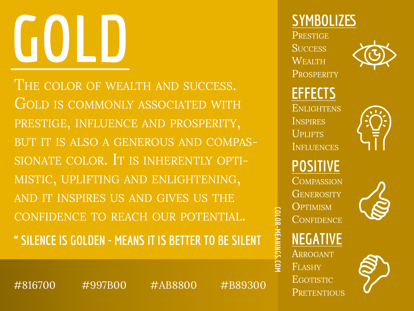
Understanding what the color gold symbolizes in a branding context requires a deep dive into color psychology, consumer behavior, and the strategic positioning of products in a global market. When used correctly, gold can elevate a brand to the status of an icon; when misused, it can appear gaudy or out of touch. This exploration examines the multifaceted symbolism of gold and how it serves as a cornerstone for premium brand identities.
The Psychology of Gold: More Than Just a Precious Metal
The human response to gold is deeply rooted in our evolutionary and cultural history. Unlike primary colors like red or blue, gold carries a “metallic” association that triggers thoughts of value and rarity. In brand strategy, leveraging these psychological triggers is essential for establishing an emotional connection with the target audience.
The Perception of Value and Rarity
At its core, gold symbolizes wealth. Because the metal itself is scarce and difficult to extract, the color has become synonymous with “the best.” In branding, this translates to a perception of high value. When a consumer sees gold in a logo or packaging, their subconscious registers that the product is likely a “premium” offering. This psychological shortcut allows brands to justify higher price points and occupy a “prestige” niche in the marketplace.
Optimism, Warmth, and Solar Energy
Psychologically, gold is also a cousin to yellow, inheriting its associations with sunshine, warmth, and optimism. However, gold adds a layer of maturity and “tempered” energy that bright yellow lacks. It suggests a brand that is successful and confident rather than just energetic. This sense of “enlightenment” or “the golden touch” can make a brand feel more approachable yet aspirational, promising the consumer a “golden” experience or a brighter future.
The Association with Success and Achievement
Gold is the color of the first-place trophy, the Olympic medal, and the hallmark of excellence. By using gold, brands align themselves with the concept of winning and being the industry leader. This symbolism is particularly effective for service-based brands or consultants who want to project an image of proven results and unparalleled expertise.
Strategic Implementation: Positioning Your Brand with Gold
Choosing gold as a brand color is a strategic decision that affects every touchpoint of the customer journey. It dictates how the brand is positioned against competitors and how it communicates its “Brand Equity.”
Luxury Positioning and Premium Pricing
The most common use of gold in branding is to signal a luxury status. Brands such as Rolex, Porsche, and various high-end hotel chains use gold to distinguish themselves from mass-market competitors. In these instances, gold acts as a barrier to entry; it tells the consumer that the brand is for those who appreciate—and can afford—the finer things in life. By symbolizing exclusivity, gold helps maintain the “allure” that is vital for luxury brand longevity.
Tradition vs. Modernity: The Two Faces of Gold
Gold can be used to symbolize two very different brand archetypes.
- The Heritage Brand: When paired with deep greens, maroons, or navy blues, gold symbolizes tradition, history, and stability. It suggests a brand that has stood the test of time (e.g., historical banks or heritage fashion houses).
- The Modern Innovator: When used as a sleek, metallic accent against a minimalist white or matte black background, gold symbolizes “the new gold standard.” It represents cutting-edge luxury and sophisticated modernism. This is often seen in high-end tech accessories or “boutique” digital services.
Building Trust Through Perceived Longevity
Gold does not tarnish in the way other metals do, and this physical property translates into a symbolic brand value: permanence. In an era of “disposable” brands and fast fashion, using gold can signal that a brand is built to last. For corporate identities in the financial or legal sectors, this symbolism of “unfailing value” is crucial for building long-term trust with clients.
Visual Design and Color Theory in Branding

The technical application of gold is just as important as its symbolic meaning. Because gold is technically a reflection of light rather than a flat pigment, representing it in digital and print media requires a sophisticated understanding of color theory.
Complementary Palettes and Visual Balance
Gold is rarely used in isolation. Its symbolic power is amplified by the colors it accompanies:
- Gold and Black: The ultimate symbol of high-end luxury, mystery, and power. It is the palette of night-time elegance and elite memberships.
- Gold and White: Symbolizes purity, clarity, and “attainable” luxury. This is common in the beauty and wellness industries.
- Gold and Navy Blue: Projects authority, trust, and professional excellence. This is a staple for “white-shoe” law firms and prestigious educational institutions.
Digital vs. Print: The Challenges of the Gold Gradient
In branding, “gold” is often represented as a gradient to simulate the way light hits a metallic surface. In digital environments (websites and apps), designers use hex codes and CSS gradients to create a sense of shine. However, the true symbolism of gold is often best realized in physical branding through “Foil Stamping” or “Metallic Inks.” The tactile experience of feeling a raised gold foil on a business card or product box reinforces the brand’s message of quality in a way a screen cannot.
Minimalism and the “Less is More” Rule
The symbolic weight of gold is so heavy that it can easily overwhelm a design. Modern brand strategy often dictates a “minimalist” approach to gold. Using it as an accent—on a logo mark, the edge of a page, or a single button—often carries more “prestige” than an entirely gold-colored interface. Overuse can lead to a brand being perceived as “try-hard” or “tacky,” which diminishes the very sense of luxury the brand is trying to cultivate.
Case Studies: Brands That Mastered the Golden Touch
To understand how gold functions in the real world, we can look at several iconic brands that have integrated the color into their core identity for different strategic reasons.
Rolex: The Standard of Excellence
Rolex is perhaps the quintessential “gold” brand. Their logo—a five-pointed crown in gold—symbolizes their “crowning achievement” in horology. For Rolex, gold isn’t just a color; it’s a material they actually forge in their own foundry. Symbolically, the gold in their branding represents an investment, a legacy, and the ultimate reward for success. It reinforces their position as the world’s most recognized luxury watchmaker.
The Golden Arches: Approachability and Consistency
McDonald’s provides a fascinating counter-example. Here, “Gold” is used in its yellow-leaning form. The “Golden Arches” do not symbolize “exclusive luxury” but rather “the golden opportunity” and “the gold standard of consistency.” It represents a friendly, bright, and reliable experience. This demonstrates how the symbolism of gold can be pivoted from “Elite” to “Universal” depending on the brand’s mission.
Versace and High Glamour
In the fashion world, Versace uses gold to symbolize “Neo-Classical” glamour and decadence. By using the gold Medusa head, the brand taps into ancient mythology and the “Gilded Age.” For Versace, gold symbolizes power, seduction, and a refusal to be subtle. It caters to a demographic that wants their wealth and status to be visible and celebrated.
Ethical Considerations and Cultural Nuances
Finally, a professional brand strategist must consider that gold does not mean the same thing in every market. The symbolism is subject to cultural interpretation.
Global Interpretations of Gold
In many Eastern cultures, particularly in India and China, gold is deeply tied to symbols of luck, prosperity, and auspicious beginnings. A brand entering these markets using gold will be seen as “bringing good fortune.” In contrast, in some Western contexts, excessive gold can be viewed with skepticism, sometimes associated with “excess” or “greed.” Understanding these nuances is vital for global brand consistency.

Avoiding the “Tacky” Trap
The greatest risk in using gold is the “nouveau riche” effect. If the branding feels superficial—using gold to mask a lack of substance—consumers will quickly sense the inauthenticity. In modern brand strategy, the gold must be backed by a “Golden Product.” The symbolism only works if the brand’s service or quality matches the high expectations that the color gold naturally sets.
In conclusion, the color gold is one of the most powerful tools in a brand designer’s arsenal. It symbolizes a rich tapestry of success, quality, and timelessness. When applied with a nuanced understanding of psychology and design, gold does more than just decorate a logo—it imbues a brand with an aura of excellence that can resonate across cultures and generations. By mastering the symbolism of gold, a brand can truly claim its place at the top of its industry.
aViewFromTheCave is a participant in the Amazon Services LLC Associates Program, an affiliate advertising program designed to provide a means for sites to earn advertising fees by advertising and linking to Amazon.com. Amazon, the Amazon logo, AmazonSupply, and the AmazonSupply logo are trademarks of Amazon.com, Inc. or its affiliates. As an Amazon Associate we earn affiliate commissions from qualifying purchases.