In the competitive landscape of modern branding, color is far more than a decorative choice; it is a psychological tool used to communicate values, elicit emotions, and drive consumer behavior. While vibrant reds and trustworthy blues often dominate the conversation, the color brown has emerged as a sophisticated powerhouse in brand strategy. Often misunderstood as “dull” or “uninspiring,” brown represents a unique blend of stability, heritage, and organic authenticity that few other colors can replicate.
For brand strategists and designers, understanding what brown represents is essential for positioning a company in niche markets—from luxury leather goods and gourmet coffee to global logistics and sustainable tech. This article explores the multifaceted role of brown in corporate identity and how it can be leveraged to build deep-seated brand equity.
The Psychology of Brown in Brand Identity
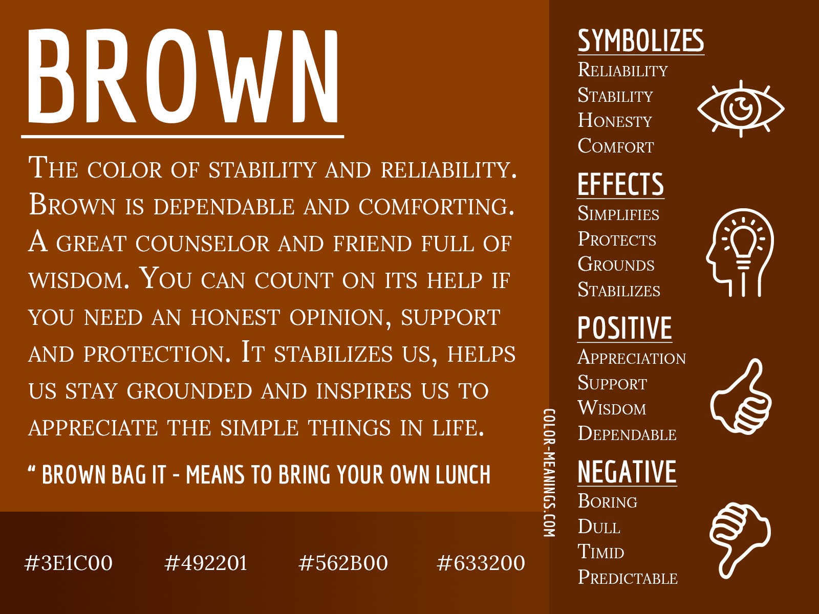
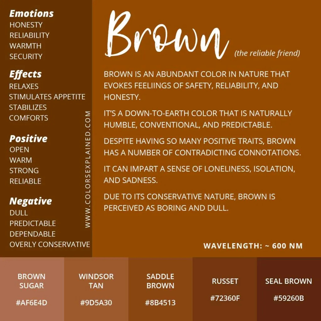
To understand what brown represents in a brand context, we must first look at its psychological roots. Brown is the color of the earth, wood, and stone. It is fundamentally grounding, providing a sense of security that flashier colors lack.
Stability, Reliability, and Earthiness
In an increasingly digital and volatile world, consumers often gravitate toward brands that feel “real.” Brown communicates a sense of permanence and reliability. It suggests that a brand is rooted in tradition and isn’t a “fly-by-night” operation. When a brand uses brown as its primary identifier, it is often making a promise of durability. This is why it is a staple for outdoor gear, construction firms, and heritage brands. It evokes the feeling of the rugged outdoors and the dependability of natural materials.
The Sophistication of Neutrality
Beyond its rugged associations, brown possesses a hidden layer of sophistication. When executed correctly through specific shades like mocha, taupe, or espresso, brown transforms into a symbol of understated luxury. Unlike the starkness of black or the clinical nature of white, brown offers warmth. In the realm of personal branding and corporate identity, this warmth fosters a sense of approachability while maintaining a professional “premium” feel. It suggests quality without the need to scream for attention.
Strategic Industry Applications: Where Brown Shines
Not every brand can pull off a brown-centric palette. However, in certain sectors, brown is not just a choice—it is a strategic necessity that aligns with consumer expectations and industry standards.
The Logistics Sector: Trust and Efficiency
Perhaps the most famous example of brown in branding is UPS (United Parcel Service). Their long-standing slogan, “What can Brown do for you?” turned a potentially mundane color into a global symbol of efficiency and trust. In logistics, brown represents the “no-nonsense” reliability required to move goods across the globe. It hides dirt (practical for trucks) and symbolizes the cardboard packaging that is central to the shipping industry. By leaning into brown, UPS carved out a distinct identity that feels industrious and dependable.
Luxury and High Fashion: The Texture of Heritage
In the luxury sector, brown represents craftsmanship. Think of Louis Vuitton’s iconic monogram canvas or the rich leather hues of Hermès. Here, brown isn’t just a color; it’s a representation of high-quality materials like calfskin, suede, and mahogany. For these brands, brown signals a connection to history and the “old world” artisan techniques that justify premium price points. It communicates that the product is an investment meant to age gracefully, much like a fine leather patina.
Organic and Sustainable Products: The Call of the Earth
As the global market shifts toward sustainability, brown has become the go-to color for organic and “green” brands. While green represents growth, brown represents the soil and the source. For brands like Whole Foods or various fair-trade coffee roasters, brown signifies a lack of artificiality. It suggests that the product is minimally processed, eco-friendly, and derived directly from nature. In this niche, brown is the visual shorthand for “authentic” and “transparent.”
Visual Design and Color Pairing in Branding
Using brown in a brand’s visual identity requires a delicate balance. Because it is a composite color, its meaning changes drastically depending on its tone and the colors it is paired with.
Balancing Brown with Contrasting Palettes
A common mistake in brand design is using brown in a way that feels “muddy.” To prevent this, strategists often pair brown with high-contrast accents.
- Brown and Gold: Represents ultimate luxury, wealth, and tradition.
- Brown and Turquoise: A modern, “boho-chic” look that suggests creativity and natural energy.
- Brown and Cream: Evokes a sense of comfort, warmth, and classic elegance, often used in the food and beverage industry (think chocolate and cream).
- Brown and Lime Green: Signals environmental consciousness and modern sustainability.
By carefully selecting these pairings, a brand can steer the perception of brown from “old-fashioned” to “timeless.”
Texture and Materiality: Beyond the Hex Code
In brand strategy, especially for physical products, the representation of brown is heavily tied to texture. A matte brown finish on a tech gadget (like certain premium headphones) feels vastly different from a glossy brown finish on a cosmetic bottle. Strategists must consider the tactile experience. Does the brown represent the rough bark of a tree, the smooth surface of a coffee bean, or the soft grain of leather? The “representation” of the color is often completed by the material it lives on.
Cultural Nuances and Global Brand Perception
In a globalized economy, brand managers must be aware that the representation of brown is not universal. Cultural context can shift the meaning of a brand’s palette overnight.
Western vs. Eastern Interpretations
In many Western cultures, brown is associated with the domestic sphere, comfort, and the “hearth.” It is a safe, stable color. However, in some Eastern and Southern Asian cultures, certain shades of brown can be associated with mourning or a lack of vitality. Conversely, in many African cultures, brown is celebrated as the color of fertility and the earth’s bounty. When a brand expands internationally, its “brown” identity must be audited to ensure it doesn’t accidentally communicate “stale” or “lifeless” instead of “natural” and “reliable.”
Modern Rebranding: The Comeback of Earth Tones
We are currently witnessing a “Brown Renaissance” in digital branding. After a decade of “Millennial Pink” and “Tech Blue,” brands are returning to earth tones to appear more grounded and human. Direct-to-consumer (DTC) brands in the wellness and home space are utilizing terracotta, clay, and sand tones to distance themselves from the “coldness” of big tech. In this modern context, brown represents a move away from the digital void and a return to the physical, tactile world.
Implementing Brown into Your Brand Strategy
If you are considering brown for a corporate identity or personal brand, you must do so with intentionality. It is a color that demands a narrative.
Defining Your “Why”
Why does your brand need to be brown? If the answer is “to look different,” that may not be enough. If the answer is “to emphasize our 50-year history of craftsmanship” or “to highlight our commitment to biodegradable packaging,” then brown is a powerful choice. Brown works best when it supports a story of substance. It is not a color for “hype” brands; it is a color for “legacy” brands.
The Role of Typography and White Space
Because brown is a “heavy” color, it requires thoughtful graphic design. Using plenty of white space (negative space) prevents the brand from feeling heavy or dated. Minimalist, clean typography paired with rich brown tones can create a “Modern Heritage” aesthetic—one of the most successful trends in current brand strategy. This allows a company to look established but not “stuck in the past.”

Conclusion: The Power of the Grounded Brand
What does the color brown represent? It represents the intersection of the natural world and human industry. It is the color of the earth we walk on and the buildings we call home. In the world of branding and marketing, brown is a sophisticated tool for those who want to project stability, authenticity, and timeless quality.
While other colors may trend and fade, brown remains a constant. By leveraging its associations with reliability, organic beauty, and heritage, brands can build a visual identity that feels less like a temporary advertisement and more like a permanent institution. Whether it is the deep mahogany of a law firm’s office or the recycled kraft paper of an eco-startup, brown tells the consumer one important thing: this brand is built on solid ground.
aViewFromTheCave is a participant in the Amazon Services LLC Associates Program, an affiliate advertising program designed to provide a means for sites to earn advertising fees by advertising and linking to Amazon.com. Amazon, the Amazon logo, AmazonSupply, and the AmazonSupply logo are trademarks of Amazon.com, Inc. or its affiliates. As an Amazon Associate we earn affiliate commissions from qualifying purchases.