
Scatter plots are fundamental data visualization tools that offer a powerful way to explore and understand the relationships between two numerical variables. While their application spans across numerous disciplines, from scientific research to business analytics, their true value lies in their ability to reveal patterns, trends, and outliers that might otherwise remain hidden within raw data. In the realm of technology, scatter plots are indispensable for developers, data scientists, and product managers to glean insights, optimize performance, and make data-driven decisions. This article delves into the core uses of scatter plots within the technology landscape, exploring how they illuminate connections and drive innovation.

Understanding the Fundamentals of Scatter Plots in a Tech Context
At its heart, a scatter plot displays individual data points as markers on a two-dimensional graph. Each axis represents a distinct numerical variable, and the position of each point is determined by the values of these two variables for a specific observation. The visual dispersion of these points is what provides the insights. In technology, this simple yet profound visualization technique is employed to analyze a wide array of phenomena, from the performance of software algorithms to the user engagement patterns with a digital product.
Identifying Relationships Between Variables
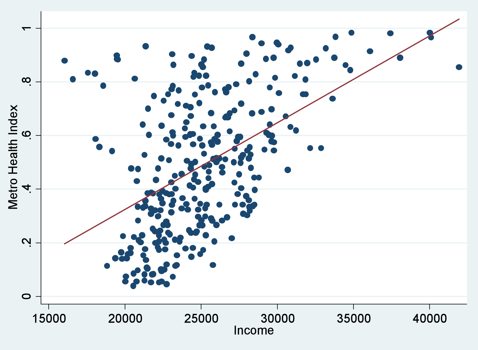
The primary function of a scatter plot is to expose correlations between two continuous variables. In tech, this translates to understanding how different metrics interact. For instance, a scatter plot can reveal if increased server load (one variable) correlates with a rise in response times (another variable). This immediate visual feedback is crucial for performance monitoring and troubleshooting.
Correlation vs. Causation: A Critical Distinction
While a scatter plot can vividly demonstrate a correlation – indicating that two variables tend to move together – it’s imperative to remember that correlation does not imply causation. A strong visual relationship on a scatter plot might be driven by a third, unobserved variable, or it could be purely coincidental. Tech professionals must exercise critical thinking when interpreting scatter plots, using them as a starting point for further investigation rather than a definitive answer. For example, observing a correlation between the number of new features released and customer churn might tempt one to blame the features, but deeper analysis could reveal that both are influenced by a concurrent shift in market demand.
Detecting Trends and Patterns
Beyond simple correlations, scatter plots are excellent at highlighting broader trends and patterns within data. These patterns can manifest as linear relationships, curvilinear trends, or even cyclical behaviors. In software development, a scatter plot could illustrate how the complexity of code modules (one variable) relates to the number of bugs reported (another variable) over time.
Linear Relationships: Positive and Negative
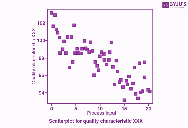
A clear upward trend in a scatter plot indicates a positive linear relationship: as one variable increases, the other tends to increase as well. Conversely, a downward trend signifies a negative linear relationship: as one variable increases, the other tends to decrease. For example, analyzing the relationship between the amount of memory allocated to a process and its execution speed might reveal a positive linear correlation up to a certain point, after which the relationship might plateau or even degrade due to memory management overhead.
Non-Linear and Cluster Patterns
Not all relationships are linear. Scatter plots can also reveal curvilinear relationships, where the rate of change between variables is not constant, or clusters of data points, suggesting distinct groups or behaviors. In application development, plotting user session duration against the number of features used might show a non-linear pattern, indicating that while more features generally lead to longer sessions, there’s a point of diminishing returns. Clusters could highlight different user segments with distinct engagement profiles.
Optimizing Performance and Resource Allocation with Scatter Plots
In the fast-paced world of technology, optimizing performance and efficiently allocating resources are paramount. Scatter plots provide invaluable insights into system behavior, enabling teams to identify bottlenecks, predict future needs, and make informed decisions about infrastructure and development priorities.
Analyzing System Performance Metrics
Scatter plots are frequently used to visualize the interplay between various system performance metrics. This can range from tracking CPU usage against application response times to monitoring network latency in relation to data transfer rates. By plotting these metrics, developers and operations teams can quickly identify performance degradation and pinpoint potential causes.
Throughput vs. Latency Analysis
A classic application in system performance analysis is plotting throughput (the number of requests processed per unit of time) against latency (the time it takes for a single request to be completed). A scatter plot can vividly illustrate the trade-offs: as throughput increases, latency might also increase, indicating a potential bottleneck. Identifying the point at which latency becomes unacceptable allows for proactive tuning and scaling.
Resource Utilization and Efficiency
Understanding how resources like CPU, memory, and disk I/O are being utilized is critical for efficiency. Scatter plots can show the relationship between the number of active users and the CPU load, or the size of a database and the time taken for queries. This data helps in capacity planning and ensuring that resources are neither over-provisioned (leading to waste) nor under-provisioned (leading to performance issues).
Debugging and Error Identification
When things go wrong, scatter plots can be powerful allies in the debugging process. By visualizing data points related to errors or failures against other relevant metrics, patterns can emerge that guide developers toward the root cause.
Error Rates Against Feature Usage
Plotting the rate of errors encountered by users against the usage of specific features can quickly highlight problematic functionalities. If a particular feature shows a high error rate in its corresponding data points on the scatter plot, it immediately becomes a prime candidate for investigation and refactoring.
Performance Anomalies and Outliers
Scatter plots excel at revealing outliers – data points that deviate significantly from the general trend. In a performance context, these outliers can represent critical incidents or anomalies that require immediate attention. For example, a scatter plot of transaction times might show a few points with extremely high latency, indicating a specific transaction that experienced an issue, prompting a detailed investigation into that particular event.
Enhancing User Experience and Product Development
Beyond the technical infrastructure, scatter plots play a vital role in understanding user behavior and guiding product development. By visualizing how users interact with software, designers and product managers can identify areas for improvement, personalize experiences, and drive engagement.
Understanding User Engagement Patterns
Scatter plots can be used to explore the relationship between different aspects of user engagement. For instance, plotting the number of sessions a user has against the time spent per session can reveal patterns of engagement. Are highly engaged users spending longer sessions, or are they simply accessing the product more frequently?
Feature Adoption vs. Retention Rates
Analyzing the adoption rate of new features against user retention can provide insights into the impact of those features. If a scatter plot shows that features with higher adoption rates also correlate with higher user retention, it suggests that these features are contributing positively to the user experience. Conversely, low adoption coupled with low retention might indicate that a feature is not resonating with the target audience.
User Segmentation and Behavior Analysis
By plotting various user attributes and behavioral metrics, scatter plots can help in segmenting users into distinct groups. For example, plotting user activity level against the number of support tickets filed could reveal a segment of highly active users who also frequently encounter issues, suggesting a need for improved in-app guidance or more robust error handling for that group.
Guiding Product Iteration and Design Decisions
Data-driven insights derived from scatter plots are crucial for iterative product development. They provide objective evidence to support design changes and feature enhancements, ensuring that development efforts are focused on areas that will yield the greatest positive impact.
A/B Testing Result Visualization
When conducting A/B tests, scatter plots can be used to visualize the distribution of key metrics for each variation. For example, plotting conversion rates against user demographics for two different website layouts can help determine which layout is more effective for specific user segments.
Identifying Usability Issues
By mapping user task completion times against error occurrences, scatter plots can visually highlight tasks that are proving difficult or problematic for users, indicating potential usability issues within the user interface.
Advanced Applications and Considerations in Tech
As data complexity grows, so too does the sophistication of scatter plot applications. Beyond basic visualization, advanced techniques and careful consideration of context are essential for extracting maximum value.
Handling Large Datasets and High Dimensionality
Modern tech applications often generate massive datasets. Directly plotting millions of points can result in overplotting, where points obscure each other, making patterns difficult to discern. Techniques like sampling, aggregation, or using hexbin plots (which color hexagonal bins based on the density of points) can help manage large datasets effectively.
Overplotting and Mitigation Strategies
When numerous data points overlap, it becomes impossible to see the density or distribution of the data. Strategies to mitigate overplotting include reducing the size of the markers, increasing their transparency (alpha blending), using smaller random samples of the data, or employing density plots and heatmaps that represent the concentration of points in different areas.
Dimensionality Reduction and Pairwise Plots
While scatter plots are inherently for two variables, analyzing datasets with many variables often involves creating a matrix of scatter plots, known as a pairwise plot or scatter plot matrix. This allows for the visual inspection of relationships between all possible pairs of variables, giving a comprehensive overview of interdependencies within a high-dimensional dataset.
The Role of Interactivity and Modern Tools
The utility of scatter plots is significantly enhanced by interactive visualization tools. Modern software platforms allow users to hover over points to see detailed information, zoom in on specific regions of interest, and even filter data dynamically, transforming static charts into powerful exploratory environments.
Interactive Exploration and Filtering
Interactive scatter plots enable users to explore the data in real-time. Hovering over a point can reveal the specific values of the variables, along with associated metadata. The ability to select a region and zoom in allows for detailed examination of clusters or outliers. Filtering data dynamically based on specific criteria further refines the analysis.
Integration with Machine Learning Workflows
Scatter plots are not just for descriptive analysis; they also play a role in machine learning. Visualizing model outputs, feature importance, or the results of clustering algorithms often involves scatter plots. For instance, after applying a clustering algorithm, a scatter plot can visualize the data points colored according to their assigned cluster, helping to assess the quality and interpretability of the clustering.
In conclusion, scatter plots are a versatile and indispensable tool in the technology sector. From understanding fundamental relationships between system metrics to guiding user experience design and optimizing product development, their ability to visually represent data patterns empowers tech professionals to make more informed, data-driven decisions, ultimately leading to more robust, efficient, and user-centric technological solutions.
aViewFromTheCave is a participant in the Amazon Services LLC Associates Program, an affiliate advertising program designed to provide a means for sites to earn advertising fees by advertising and linking to Amazon.com. Amazon, the Amazon logo, AmazonSupply, and the AmazonSupply logo are trademarks of Amazon.com, Inc. or its affiliates. As an Amazon Associate we earn affiliate commissions from qualifying purchases.