
In the landscape of global intellectual property, few icons command as much immediate recognition as Godzilla. Since his debut in 1954, the “King of the Monsters” has transcended the boundaries of Japanese cinema to become a cornerstone of international pop culture. However, to view Godzilla merely as a successful film franchise is to overlook one of the most sophisticated examples of brand evolution in history. What inspired Godzilla was not just a desire for spectacle, but a strategic imperative to personify national trauma, create a distinct corporate identity for Toho Co., Ltd., and establish a brand archetype that could survive decades of shifting market sentiment.
To understand the inspiration behind Godzilla is to understand how a brand can be built on the foundation of a “monstrous” truth, effectively turning a localized cultural anxiety into a global symbol of power, resilience, and warning.
The Core Identity: Historical Tragedy as a Brand Catalyst
Every enduring brand requires a “Why”—a core purpose that resonates with its audience on an emotional level. For Godzilla, the inspiration was rooted in a specific, harrowing historical context. The brand was born out of the intersection of post-war reconstruction and the looming shadow of the nuclear age.
The Lucky Dragon No. 5 Incident
While the atomic bombings of Hiroshima and Nagasaki provided the broader backdrop, the immediate spark for the 1954 film was the Daigo Fukuryū Maru (Lucky Dragon No. 5) incident. In March 1954, a Japanese fishing boat was exposed to nuclear fallout from the United States’ “Castle Bravo” hydrogen bomb test at Bikini Atoll. This event reignited the collective trauma of the Japanese people. Producer Tomoyuki Tanaka envisioned a brand that could give a face to this invisible, radioactive threat. By grounding the character in a real-world tragedy, Toho created a brand with “authentic weight,” ensuring it was more than just a creature feature; it was a cultural mirror.
Transmuting National Trauma into a Visual Icon
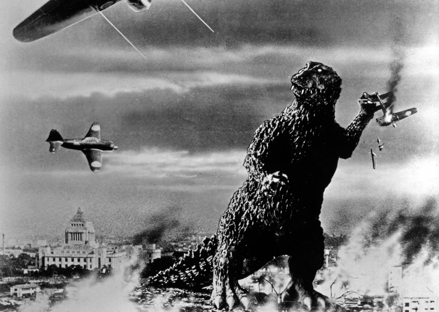
The inspiration for Godzilla’s physical design was a deliberate attempt to visualize the effects of nuclear radiation. The “keloid scars” texture of Godzilla’s skin was inspired by the scarring seen on survivors of the atomic blasts. From a brand strategy perspective, this was a bold move in visual identity. It moved the character away from the smooth, “Hollywood” aesthetic of monsters like King Kong and toward something visceral and uniquely Japanese. This distinct visual language allowed Toho to own a specific aesthetic niche: the “Kaiju,” or strange beast, which became the cornerstone of their corporate identity.
Strategic Brand Positioning: Building the “King of the Monsters”
Once the initial inspiration was solidified, Toho had to position Godzilla within a competitive entertainment market. This required more than just a scary monster; it required a brand architecture that could support sequels, merchandise, and international licensing.
Defining the Brand Archetype: From Villain to Anti-Hero
One of the most remarkable aspects of Godzilla’s brand history is its flexibility. The brand has successfully navigated several “repositions.” In the 1954 original, Godzilla was a pure villain—a walking metaphor for nuclear destruction. However, as the 1960s and 70s progressed and the target demographic shifted toward younger audiences, Toho repositioned the brand as a “Protector of the Earth.” This transition from “Shadow” to “Hero” archetype allowed the brand to remain relevant across different eras without losing its core identity. The inspiration for this pivot was market necessity: to sustain the franchise, the brand had to evolve from a source of terror into a source of empowerment.
Competitive Differentiation and the Kaiju Niche
In the 1950s, the dominant monster movie brand was RKO’s King Kong. Toho’s strategy was to differentiate Godzilla by emphasizing scale and “otherness.” While Kong was biological and empathetic, Godzilla was elemental and unstoppable. The inspiration here was to create a “Force of Nature” brand. This positioning was reinforced by Godzilla’s unique “Atomic Breath”—a trademarked visual and auditory cue that serves as a brand “sonic logo.” Much like the chime of an Intel processor or the roar of an MGM lion, Godzilla’s roar and the hum of his glowing dorsal fins are high-equity brand assets that signify the product’s presence before it even appears on screen.

Global Expansion: Toho’s Multi-Generational Brand Strategy
The inspiration behind Godzilla’s global journey was a masterclass in how a localized brand can be adapted for international consumption without losing its soul. Toho understood that for Godzilla to become a global brand, it needed to balance its Japanese heritage with universal themes.
Localization vs. Standardization in Global Markets
When Godzilla was first exported to the United States in 1956 as Godzilla, King of the Monsters!, the brand underwent significant localization. The insertion of Raymond Burr as an American protagonist was a strategic move to make the “product” more accessible to Western consumers. While purists often debate these changes, from a brand management perspective, this was an essential step in “market entry.” It established the Godzilla brand in the American consciousness, paving the way for the character to become a permanent fixture in the global “MonsterVerse.”
Licensing and the Power of Consistent Visual Identity
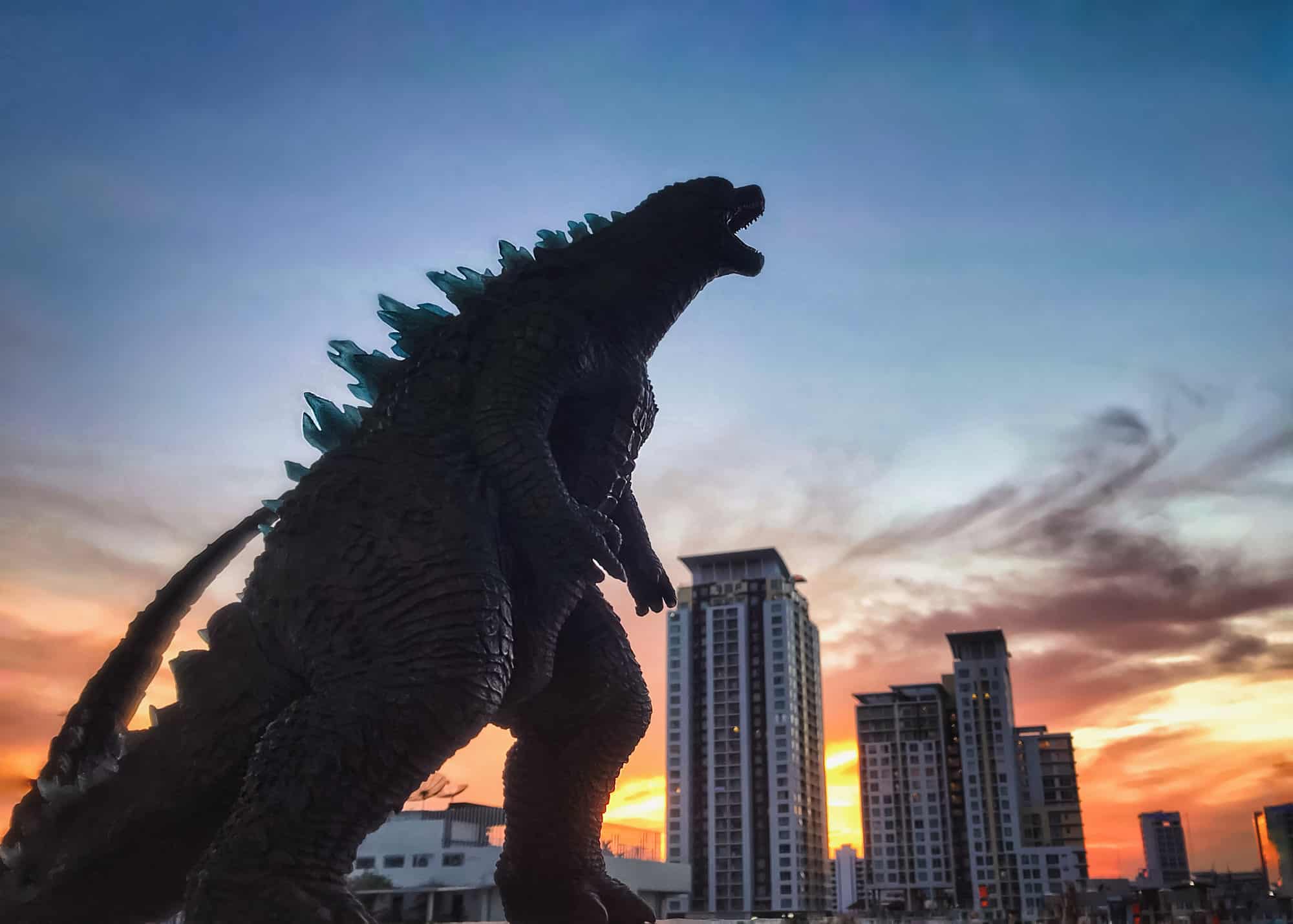
Toho has maintained rigorous control over the Godzilla brand through strict licensing guidelines. The “inspiration” for these controls is the protection of brand equity. Whether in a comic book, a video game, or a Hollywood blockbuster, there are non-negotiable elements: the upright posture, the four toes (historically), and the specific shape of the dorsal plates. By maintaining this consistency, Toho ensures that the Godzilla brand remains unmistakable. This is the same principle used by brands like Coca-Cola or Apple; despite changing platforms or containers, the core identity must remain inviolate to maintain consumer trust and recognition.
Modern Brand Evolution: Rebranding for a Digital Audience
In the 21st century, the inspiration for Godzilla has shifted toward exploring the complexities of modern governance and environmental crisis. The brand has moved beyond simple nuclear metaphors to address contemporary anxieties.
The Shin Godzilla Rebirth
The 2016 film Shin Godzilla served as a corporate “rebrand” for a new generation. Inspired by the 2011 Fukushima Daiichi nuclear disaster and the subsequent bureaucratic response, the film reimagined Godzilla not as a traditional movie monster, but as a fast-evolving biological nightmare. This was a strategic return to the brand’s roots—using the character to critique current societal failings. By doing so, Toho demonstrated that the Godzilla brand is most potent when it is used as a tool for social commentary, rather than just mindless action.
Cross-Media Synergy and the MonsterVerse
The recent collaboration between Toho and Legendary Pictures to create the “MonsterVerse” represents the ultimate brand scaling. By integrating Godzilla into a shared cinematic universe alongside Kong and other “Titans,” the brand has achieved a level of synergy usually reserved for comic book giants like Marvel. The inspiration here is the “Platform Strategy.” Godzilla is no longer just a character in a movie; he is a platform upon which an entire ecosystem of content, toys, and digital experiences is built. This ensures the brand’s financial viability and cultural presence for the next several decades.
Conclusion: The Enduring Legacy of an Inspired Brand
The story of what inspired Godzilla is a profound case study in brand resilience. It began as an inspired response to national tragedy, evolved into a strategic corporate asset, and eventually became a global cultural shorthand for power and consequence.
For brand strategists and marketing professionals, Godzilla offers several key lessons:
- Authenticity Matters: The brand’s longevity is rooted in its genuine connection to real-world issues.
- Adaptability is Essential: A brand must be able to shift its archetype (from villain to hero) to meet the needs of new generations.
- Visual Consistency is Key: By protecting the “King of the Monsters” visual identity, Toho has created a global icon that transcends language barriers.
Godzilla’s inspiration was never just about a giant lizard destroying a city. It was about creating a vessel for human emotion, a brand that could stand the test of time by constantly reinventing itself while staying true to its terrifying, radioactive heart. As long as there are societal anxieties to mirror and a human desire for awe-inspiring spectacle, the Godzilla brand will continue to reign supreme.
aViewFromTheCave is a participant in the Amazon Services LLC Associates Program, an affiliate advertising program designed to provide a means for sites to earn advertising fees by advertising and linking to Amazon.com. Amazon, the Amazon logo, AmazonSupply, and the AmazonSupply logo are trademarks of Amazon.com, Inc. or its affiliates. As an Amazon Associate we earn affiliate commissions from qualifying purchases.