
Blue. It’s a color that permeates our lives, from the vast expanse of the sky and the depths of the ocean to the logos of some of the world’s most influential technology companies. While its ubiquity is undeniable, the deeper implications of blue, particularly within the realm of technology, are often overlooked. This article delves into the multifaceted significance of blue in the tech industry, exploring how its psychological associations, cultural interpretations, and practical applications contribute to brand identity, user experience, and even the very fabric of digital innovation.
The Psychological Resonance of Blue in Tech
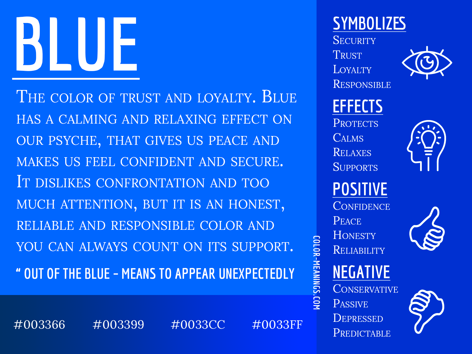
Blue, as a color, carries a profound psychological weight. Its inherent properties evoke feelings of calmness, trust, stability, and reliability. These are not merely aesthetic choices; they are deliberate strategies employed by tech companies to cultivate specific emotional responses in their users. In a landscape often characterized by rapid change and potential uncertainty, the presence of blue can act as an anchor, fostering a sense of security and predictability.
Trust and Credibility: Building Digital Foundations
In the digital realm, where intangible products and services are the norm, trust is a currency of paramount importance. Users entrust their personal data, financial information, and critical communications to technology platforms. Blue, with its long-standing association with dependability and authority, plays a crucial role in establishing this trust. Think of the ubiquitous blue logos of financial institutions, cybersecurity firms, and enterprise software providers. These brands leverage blue to project an image of unwavering stability and trustworthiness, reassuring potential customers that their digital interactions are in safe hands. This association is deeply ingrained, stemming from its use in uniforms of authority figures like police officers and its presence in historical symbols of power and governance.
Calmness and Clarity: Enhancing User Experience
Beyond trust, blue is also recognized for its calming and serene qualities. In a world saturated with stimuli, technology interfaces can often feel overwhelming. The strategic use of blue in user interfaces (UIs) can mitigate this, creating a more tranquil and focused experience. Lighter shades of blue can promote a sense of spaciousness and clarity, while darker blues can convey sophistication and depth. This is particularly evident in operating systems, productivity apps, and design software. The aim is to reduce cognitive load, making it easier for users to navigate complex systems and engage with their tasks without feeling stressed or fatigued. The subtle interplay of blue hues in a well-designed interface can guide the user’s eye, highlight important information, and create a sense of order amidst digital complexity.
Openness and Innovation: The Digital Frontier
Paradoxically, while blue signifies stability, it also carries connotations of openness, vastness, and the infinite possibilities of the sky and sea. This duality makes it an ideal color for the technology sector, which is inherently about exploration, innovation, and pushing boundaries. The “blue sky thinking” phenomenon, where creativity is encouraged without immediate constraints, is a testament to this. Tech companies often use blue to symbolize their forward-thinking nature and their commitment to exploring new frontiers in innovation. From the expansive blues of abstract digital art to the sleek, minimalist interfaces of cutting-edge gadgets, blue invites users to imagine what’s next.
Blue in Branding: Crafting Digital Identities
The significance of blue extends far beyond its psychological impact; it is a cornerstone of brand strategy in the tech industry. Companies meticulously choose shades of blue, and the context in which it’s used, to communicate specific brand values and differentiate themselves in a crowded marketplace.
The Power of Blue Logos: Recognition and Recall
Blue is arguably the most popular color for tech logos. Giants like IBM, Microsoft, Dell, Facebook (Meta), Twitter (X – though its recent shift is notable), and Samsung all prominently feature blue in their branding. This widespread adoption is not accidental. It speaks to the color’s inherent ability to foster recognition and recall. When consumers see a blue logo, they often subconsciously associate it with technology, innovation, and reliability. This consistent visual cue helps build brand familiarity and strengthens brand equity over time. The specific shade of blue chosen also communicates nuance; a bright, electric blue might suggest dynamism and speed, while a deeper, more muted blue might convey professionalism and gravitas.
Navigating the Spectrum: Blue’s Diverse Meanings
The meaning of blue isn’t monolithic; it can vary depending on the shade and the context.
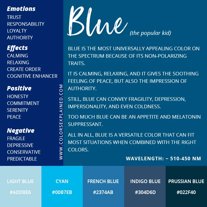
- Light Blue: Often associated with approachability, clarity, and openness. Think of the light blue used in many customer service platforms or collaborative tools, aiming to make communication feel easy and accessible.
- Medium Blue: Typically conveys trustworthiness, dependability, and stability. This is a common choice for enterprise software and hardware manufacturers who want to project a sense of reliability and long-term commitment.
- Dark Blue/Navy: Evokes authority, professionalism, sophistication, and depth. This shade is often employed by companies in the cybersecurity or data analytics space, where a serious and authoritative presence is crucial.
- Electric/Bright Blue: Can signify innovation, energy, and dynamism. This shade is often used by companies at the forefront of emerging technologies or those aiming for a more youthful and cutting-edge brand image.
Understanding these nuances allows tech brands to fine-tune their visual identity and communicate more effectively with their target audience.
Beyond the Logo: Blue in User Interface and Experience Design
The influence of blue isn’t confined to logos; it’s deeply integrated into the very fabric of how we interact with technology. UI designers leverage blue to create intuitive and engaging experiences.
- Call-to-Action Buttons: Blue is frequently used for primary call-to-action buttons (e.g., “Sign Up,” “Buy Now,” “Learn More”). This is because blue is often perceived as a neutral yet inviting color, drawing attention without being overly aggressive, and subtly reinforcing the idea of moving forward in a trusted environment.
- Links and Navigation: Historically, blue has been the standard color for hyperlinks on the internet. While this convention has evolved, blue still often signifies clickable elements, guiding users through digital pathways.
- Status Indicators: Blue is commonly used to indicate a neutral or informational status. For example, a blue notification icon might signify a new message, or a blue progress bar might indicate that a process is underway.
The strategic application of blue in UI design contributes to a seamless and intuitive user experience, making technology more accessible and less intimidating.
Blue’s Cultural and Global Significance in Tech
The interpretation of color is not universal, and while blue holds many positive connotations in Western cultures, its significance can shift in other parts of the world. However, within the globalized tech industry, there’s a discernible trend towards embracing blue for its universally perceived qualities of trust and openness, even as cultural nuances are acknowledged.
The Western Dominance of Blue in Tech
In many Western cultures, blue is deeply associated with stability, authority, and calmness. These are precisely the attributes that tech companies aim to project. The historical context of blue as the color of royalty, nobility, and established institutions has translated into a perception of reliability and trustworthiness in the modern business landscape. This cultural predisposition has undoubtedly played a role in blue’s overwhelming popularity among tech brands in North America and Europe.
Navigating Global Perceptions: When Blue Might Differ
While blue is generally a safe bet in the tech world, it’s important to acknowledge that color perception can vary globally. In some cultures, certain shades of blue might be associated with mourning or negativity. For instance, in Iran, blue can be associated with mourning. In some East Asian cultures, blue can sometimes be linked to the divine or immortality, but also to healing or sadness depending on the shade and context.
However, the pervasive influence of Western culture and globalization has led to a degree of standardization in color associations within the global tech industry. Many multinational tech corporations opt for blue precisely because its positive associations with trust and professionalism are widely understood, even if local interpretations might exist. The key for global brands is often to ensure that the chosen shade of blue doesn’t clash with any strong negative local connotations, while still leveraging its inherent strengths.

The Future of Blue in a Diverse Digital World
As the tech industry continues to expand its reach into diverse global markets, the use of blue will likely continue, but with a greater awareness of cultural sensitivities. Brands might employ more universally accepted shades of blue or ensure that their core branding elements are flexible enough to accommodate regional interpretations. Furthermore, the ongoing evolution of color theory in design means that new interpretations and applications of blue within technology will undoubtedly emerge, further solidifying its enduring significance.
In conclusion, blue is more than just a color; it’s a strategic choice that underpins much of the technology we interact with daily. From fostering trust and enhancing user experience to shaping brand identities and signaling innovation, blue’s multifaceted significance makes it an indispensable element in the digital age. As technology continues to evolve, so too will our understanding and application of this profound and pervasive hue.
aViewFromTheCave is a participant in the Amazon Services LLC Associates Program, an affiliate advertising program designed to provide a means for sites to earn advertising fees by advertising and linking to Amazon.com. Amazon, the Amazon logo, AmazonSupply, and the AmazonSupply logo are trademarks of Amazon.com, Inc. or its affiliates. As an Amazon Associate we earn affiliate commissions from qualifying purchases.