The ubiquitous peace symbol, a circular emblem with a downward-pointing trident, is instantly recognizable worldwide. For decades, it has been a potent visual shorthand for harmony, non-violence, and environmentalism. However, like many symbols, its meaning can be fluid, evolving with context and, in some instances, taking on drastically different interpretations. When this familiar icon is inverted – with the trident pointing upwards – a new layer of meaning emerges, often shifting from a message of peace to one of critique, subversion, or even a deliberate rejection of its original intent. Understanding the implications of an upside-down peace symbol requires a deep dive into its historical origins, its appropriation by counter-cultures, and its modern-day usage, particularly within the realm of design and visual communication that falls under the purview of Brand strategy.

This exploration delves into the significance of the inverted peace symbol, examining how it has been recontextualized and what it communicates to audiences today. We will dissect its historical roots to understand the foundation upon which its later transformations were built, explore how it has been wielded as a tool of dissent and irony, and finally, analyze its contemporary presence in branding and design, where its meaning is most critically scrutinized and leveraged.
The Genesis and Evolution of the Peace Symbol
To grasp the meaning of an upside-down peace symbol, it is essential to first understand the creation and initial purpose of its upright counterpart. The symbol’s journey from a specific protest against nuclear armament to a universal emblem of peace is a fascinating narrative in itself, providing the fertile ground from which its inverted meaning would later sprout.
From Nuclear Disarmament to Global Icon
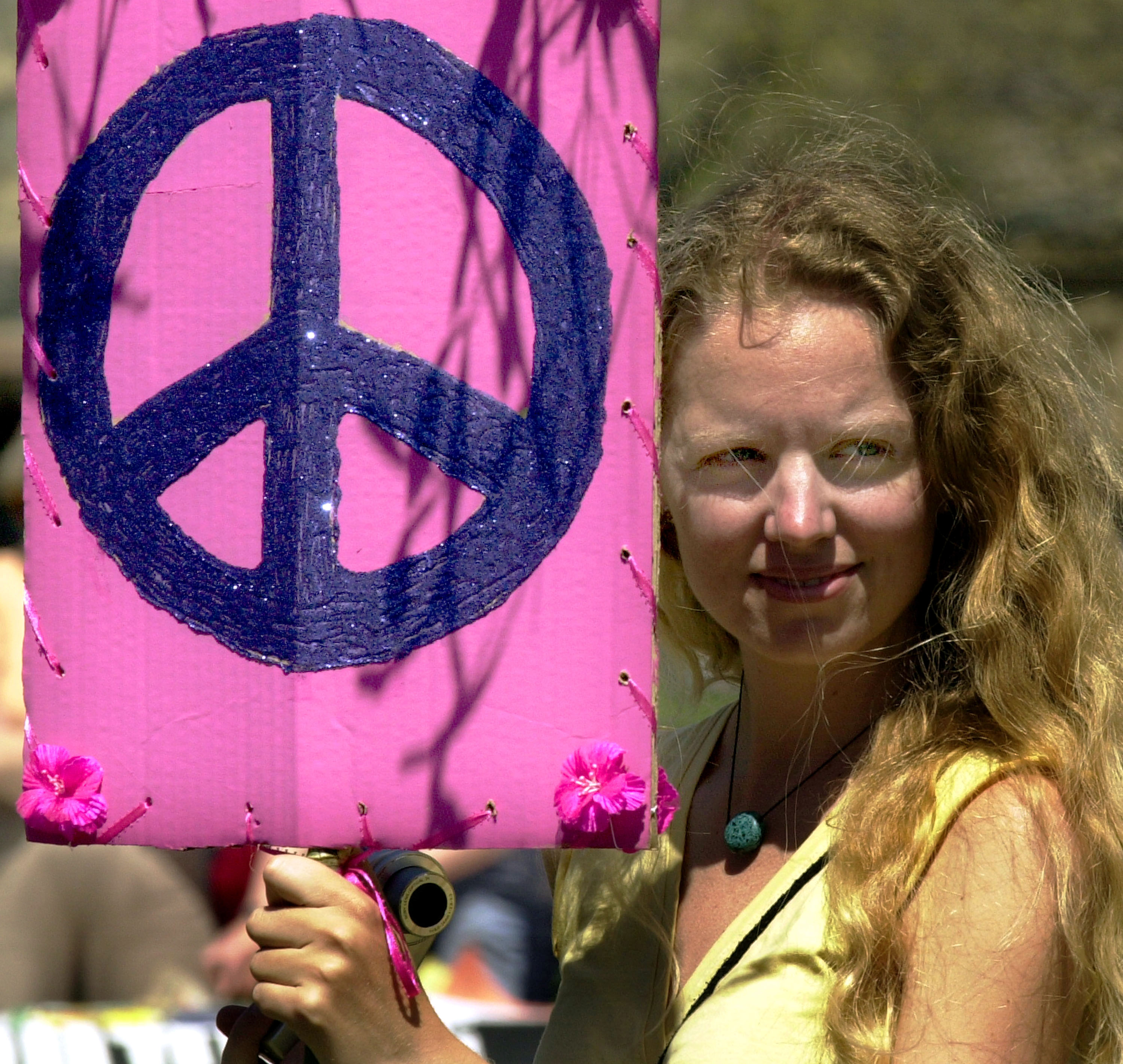
The peace symbol, as we know it, was designed in 1958 by British artist Gerald Holtom. It was commissioned by the Campaign for Nuclear Disarmament (CND) for use in anti-nuclear protests in Britain. Holtom’s design was a clever amalgamation of semaphore signals. The inner circle represents a person with arms outstretched downwards, a gesture of surrender or despair, signifying the futility of nuclear war. The two diagonal lines extending from the circle represent the semaphore signals for “N” (nuclear) and “D” (disarmament), formed by holding a flag in each hand pointed downwards at a 45-degree angle. These two signals, superimposed within the circle, created the iconic image.
The symbol’s initial impact was profound within the anti-nuclear movement. It became a rallying point, a visual declaration of opposition to the existential threat of nuclear weapons. Its stark simplicity and emotional resonance allowed it to transcend language barriers, making it an effective tool for widespread protest.
The Symbol’s Expansion Beyond CND
As the anti-war movement gained momentum throughout the 1960s, particularly in the United States during the Vietnam War, the peace symbol was widely adopted. Its association with CND, and by extension, with pacifism and opposition to militarism, made it a natural fit for this broader counter-cultural wave. It was embraced by hippies, students, and activists as a symbol of love, freedom, and resistance against established authority and conflict.
This period saw the symbol’s meaning diversify. While still fundamentally representing peace and non-violence, it also became intertwined with broader themes of social change, environmentalism, and a rejection of mainstream societal norms. Its widespread adoption, however, also began to dilute its specific connection to nuclear disarmament and opened the door for reinterpretation and appropriation in various contexts.
The Inverted Symbol: A Subversion of Meaning
When the peace symbol is inverted, its established connotations undergo a dramatic transformation. The simple act of flipping the icon can alter its message from one of positive aspiration to critique, defiance, or even nihilism, depending on the intent and context of its use. This subversion often leverages the original symbol’s widespread recognition, using familiarity to then disrupt and provoke.

The Semaphore Reimagined: From Surrender to Defiance
From a purely graphic perspective, flipping the peace symbol alters the semaphore interpretation. The downward-pointing lines, initially representing “N” and “D” in a gesture of despair or surrender (in the context of nuclear threat), now point upwards. This shift can be interpreted in several ways. Some argue it transforms the gesture from one of despair to one of defiance. The upward-pointing lines could be seen as reaching towards something, a questioning or a challenge rather than an admission of defeat.
More critically, the inversion directly challenges the original intent. If the upright symbol signifies peace, then its inversion can be seen as signifying the opposite of peace. This is where the symbol’s power to provoke lies – by taking a universally understood sign of goodwill and turning it on its head, it forces viewers to re-evaluate their assumptions and confront a potentially negative or disruptive message.
Historical and Cultural Appropriations
Throughout history, symbols have been frequently appropriated and reinterpreted by various groups to serve their own agendas. The inverted peace symbol is a prime example of this phenomenon. While not as widely documented as the upright version, it has appeared in various subcultures and artistic expressions to signify a departure from mainstream pacifist ideals.
In some instances, the inverted peace symbol has been associated with anti-establishment sentiments that go beyond mere pacifism. It can represent a rejection of what is perceived as a false or hypocritical peace, or a desire for radical, even disruptive, change. This can manifest in punk culture, underground art movements, or even in contexts where the symbol is used ironically to critique the very idea of peace or its perceived ineffectiveness in a chaotic world. The deliberate inversion becomes a statement of intent, signaling a rejection of conventional discourse and an embrace of alternative, perhaps more aggressive, forms of expression or thought.
The Inverted Peace Symbol in Contemporary Branding and Design
In the dynamic landscape of branding and visual communication, the inverted peace symbol offers a unique and often provocative tool. Its inherent duality—a universally recognized symbol twisted into something else—makes it a potent choice for brands seeking to convey a specific, often edgy, message. This deliberate subversion can be employed to attract attention, challenge norms, and establish a distinct brand identity that resonates with a particular audience.
Strategic Subversion for Brand Identity
Brands that choose to incorporate the inverted peace symbol often do so with a clear strategic intent. It is rarely an accidental design choice. Instead, it signifies a deliberate attempt to carve out a niche by associating with certain values or attitudes that diverge from mainstream expectations. For instance, a fashion brand might use it to signal a rebellious, anti-establishment ethos, appealing to consumers who identify with a similar spirit. Similarly, an art collective might employ it to provoke thought and challenge conventional perceptions of peace and conflict within their exhibitions or promotional materials.
The effectiveness of such a strategy hinges on the brand’s ability to articulate and consistently embody the meaning behind the inverted symbol. If a brand uses it to represent critique or subversion, its broader messaging and product offerings must align with this stance. Failure to do so can lead to confusion or a perception of inauthenticity, undermining the very brand identity the symbol was intended to establish. The key is not just to use the symbol, but to imbue it with relevant meaning that complements and enhances the brand’s narrative.
Navigating the Nuances of Interpretation
The power of the inverted peace symbol in branding also comes with inherent risks. Because its meaning is not universally fixed, and can be perceived negatively, brands must carefully consider their target audience and the potential interpretations of their design choices. What might be seen as a clever nod to subversion by one demographic could be perceived as offensive or ignorant by another.
For example, a brand aiming for a broad, family-friendly appeal would likely steer clear of such a symbol. However, a brand targeting a more niche, edgy market might find it an effective way to communicate a daring or progressive identity. The brand’s designers and marketers must engage in thorough research and audience analysis to ensure that the use of the inverted peace symbol elicits the desired response and contributes positively to the brand’s overall perception. This often involves understanding the cultural and historical baggage the symbol carries and how it might be received by different consumer groups. The goal is to leverage its disruptive potential without alienating a significant portion of the intended market, making it a delicate but potentially rewarding design element when executed thoughtfully.
aViewFromTheCave is a participant in the Amazon Services LLC Associates Program, an affiliate advertising program designed to provide a means for sites to earn advertising fees by advertising and linking to Amazon.com. Amazon, the Amazon logo, AmazonSupply, and the AmazonSupply logo are trademarks of Amazon.com, Inc. or its affiliates. As an Amazon Associate we earn affiliate commissions from qualifying purchases.