
In the world of high-end fashion and global commerce, few acronyms carry as much weight, prestige, and historical significance as “YSL.” For the uninitiated, YSL stands for Yves Saint Laurent, a name that has become synonymous with Parisian elegance, revolutionary design, and a masterclass in corporate identity. However, understanding what these three letters stand for requires looking beyond the literal translation of the founder’s name. In the context of brand strategy and marketing, YSL represents a blueprint for how a personal identity can be transformed into a multi-billion-dollar global powerhouse that survives its creator.

The Architect of Modern Luxury: The Man Behind the Monogram
To understand the brand, one must first understand the individual who lent his initials to the legacy. Yves Saint Laurent was not merely a designer; he was a disruptor who redefined the relationship between gender and clothing. His name became a brand because of the specific values he injected into the market: audacity, liberation, and high art.
The Personal Brand as a Corporate Asset
The transition from a person to a brand is a delicate maneuver in brand strategy. When Yves Saint Laurent founded his eponymous house in 1961 alongside his partner Pierre Bergé, they weren’t just selling clothes; they were selling a specific perspective on modern femininity. By using his own name, Saint Laurent utilized “personal branding” long before it became a buzzword in digital marketing. The name “Yves Saint Laurent” promised a level of craftsmanship and avant-garde thinking that a generic corporate name could never achieve.
From Dior to Global Independence
The origin of the YSL name is also a story of professional resilience. After a successful but tumultuous stint at Christian Dior, Saint Laurent’s decision to launch his own house was a pivotal moment in fashion history. It established a precedent for “star designers” to become independent entities. In the branding world, this is a classic case study of moving from “employee equity” to “founder equity,” where the individual’s creative vision becomes the primary engine for business growth.
The Anatomy of a Visual Identity: The Iconic YSL Logo
While the letters stand for a person, the visual representation of those letters—the monogram—is a triumph of graphic design and brand recognition. The YSL logo is often cited by designers as one of the most successful examples of corporate identity in the 20th century.
Cassandre’s Vertical Masterpiece
In 1963, the brand commissioned the legendary graphic designer Adolphe Mouron Cassandre to create the logo. Cassandre’s challenge was to harmonize three letters—Y, S, and L—which are inherently difficult to stack or intertwine due to their different shapes. The result was a vertical, interlocking monogram that broke traditional rules of typography.
From a brand strategy perspective, the logo achieved three things:
- Distinctiveness: It looked like nothing else in the luxury sector, which was then dominated by serif fonts and crests.
- Versatility: It functioned equally well on a garment label, a lipstick tube, or a towering billboard.
- Elegance: The way the letters “flow” into one another suggests a sense of continuity and fluidity, mirroring the movement of the fabrics the brand produced.
Maintaining Heritage in a Digital World
In the modern era, the YSL monogram remains a cornerstone of the brand’s marketing. Even as digital trends lean toward “blanding”—the simplification of logos into generic sans-serif fonts—the YSL monogram persists as a mark of authenticity. It serves as a visual shorthand for luxury, allowing the brand to command a premium price point simply by the application of these three interlocking letters.
Strategic Evolution: Rebranding from YSL to Saint Laurent Paris
One of the most controversial and discussed moves in recent brand history occurred in 2012, when then-Creative Director Hedi Slimane announced a major rebranding. The ready-to-wear line would no longer be called “Yves Saint Laurent” but rather “Saint Laurent Paris.” This move offers profound insights into corporate identity management.
The Hedi Slimane Shift
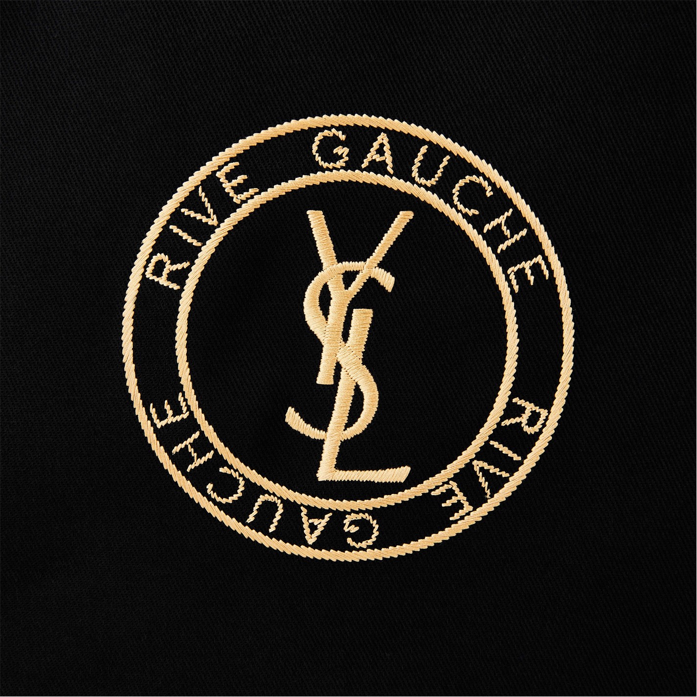
The decision to drop the “Yves” from the ready-to-wear line was met with significant backlash from traditionalists. However, from a strategic standpoint, it was a calculated effort to modernize the brand’s image and return to the roots of its “Rive Gauche” (ready-to-wear) line launched in 1966. Slimane wanted to strip away the “dusty” associations of the past and align the brand with a younger, rock-and-roll aesthetic.
Balancing Tradition with Contemporary Appeal
Interestingly, while the corporate name changed to Saint Laurent Paris, the iconic YSL monogram was never retired. This created a dual-brand strategy:
- Saint Laurent Paris: Used for the modern, edgy, and streamlined retail experience.
- YSL Monogram: Retained for accessories, beauty, and heritage products.
This hybrid approach allowed the brand to innovate and stay relevant to Gen Z and Millennial consumers while simultaneously leveraging the massive brand equity built over the previous five decades. It is a lesson in “brand elasticity”—knowing how far you can stretch or change a brand’s identity without breaking its connection to its history.
Brand Equity and the Power of the Monogram
What YSL “stands for” today extends into a massive empire of fragrances, cosmetics, and leather goods. The acronym has evolved from representing a fashion designer to representing a lifestyle of “cool luxury.”
Marketing the “YSL” Lifestyle
In modern marketing, YSL Beauty (now managed under license by L’Oréal) and the fashion house (owned by Kering) work in tandem to create a cohesive narrative. The letters YSL have become a symbol of rebellion and Parisian chic. Whether it is the “Black Opium” fragrance or the “Touche Éclat” concealer, the branding focuses on “effortless beauty” and “magnetic personality.” This psychological positioning ensures that the brand remains aspirational.
The Psychological Impact of Luxury Acronyms
In the luxury sector, acronyms like YSL, LV (Louis Vuitton), and CC (Chanel) act as cognitive shortcuts for quality. For the consumer, wearing the YSL logo is a form of “identity signaling.” It communicates status, taste, and an appreciation for a specific aesthetic lineage. The brand’s ability to maintain the value of these three letters through decades of changing trends is a testament to its disciplined marketing and high-level brand management.
Lessons for Modern Brand Strategy
The story of what YSL stands for provides several key takeaways for entrepreneurs, marketers, and brand strategists looking to build a lasting identity.
Authenticity as a Value Driver
The enduring success of YSL is rooted in its authenticity. The brand has stayed true to its core DNA—blending the masculine and feminine, the classic and the provocative. For a brand to survive sixty years, it must have a “North Star” that guides its decisions. For YSL, that star is the spirit of Yves Saint Laurent himself, which continues to inform every collection and campaign.
Adaptation and Longevity
The 2012 rebrand proved that even the most established brands must be willing to evolve. Stagnation is the death of luxury. By periodically refreshing its visual language and product offerings, YSL has managed to stay at the forefront of the cultural conversation. The brand demonstrates that you can respect your heritage without being a prisoner to it.
The Importance of Visual Consistency
Despite various creative directors—from Tom Ford and Stefano Pilati to Hedi Slimane and Anthony Vaccarello—the visual anchor of the brand remains the YSL logo. This consistency provides a “safety net” for the brand. Even when the clothing styles change drastically, the logo provides a recognizable point of contact for the consumer, ensuring that brand loyalty remains intact.

Conclusion: More Than Just Three Letters
In conclusion, while YSL literally stands for Yves Saint Laurent, in the world of brand strategy, it stands for a sophisticated architecture of legacy, design, and market positioning. It is a case study in how to build a brand that is both personal and institutional, historical and contemporary.
From the vertical ingenuity of Cassandre’s monogram to the bold strategic pivot of the 2012 rebrand, YSL has shown that a brand’s name is its most valuable asset. It is a mark of quality that transcends the garments it is sewn into, representing a standard of excellence and a specific Parisian “art de vivre” that continues to captivate the global market. For any business looking to understand the intersection of art and commerce, the three letters YSL remain the ultimate reference point.
aViewFromTheCave is a participant in the Amazon Services LLC Associates Program, an affiliate advertising program designed to provide a means for sites to earn advertising fees by advertising and linking to Amazon.com. Amazon, the Amazon logo, AmazonSupply, and the AmazonSupply logo are trademarks of Amazon.com, Inc. or its affiliates. As an Amazon Associate we earn affiliate commissions from qualifying purchases.