
In the competitive landscape of modern business, a brand’s visual identity is often the first point of contact with a potential consumer. Among the various elements that constitute a brand—logo, typography, and voice—color remains one of the most psychologically potent. While a child in an art class might simply tell you that mixing red and blue makes purple, for a brand strategist or designer, the answer is significantly more complex. Understanding what colors to mix to make purple is not just a lesson in pigment; it is an exploration of color theory, brand psychology, and the technical precision required to maintain a global corporate identity.
The Fundamentals of Color Theory in Brand Strategy
To understand how to create the perfect purple for a brand, one must first look beyond the basic color wheel. In the professional world of design and branding, we operate within two primary systems: the Subtractive Model (RYB and CMYK) and the Additive Model (RGB).
Understanding Primary and Secondary Colors
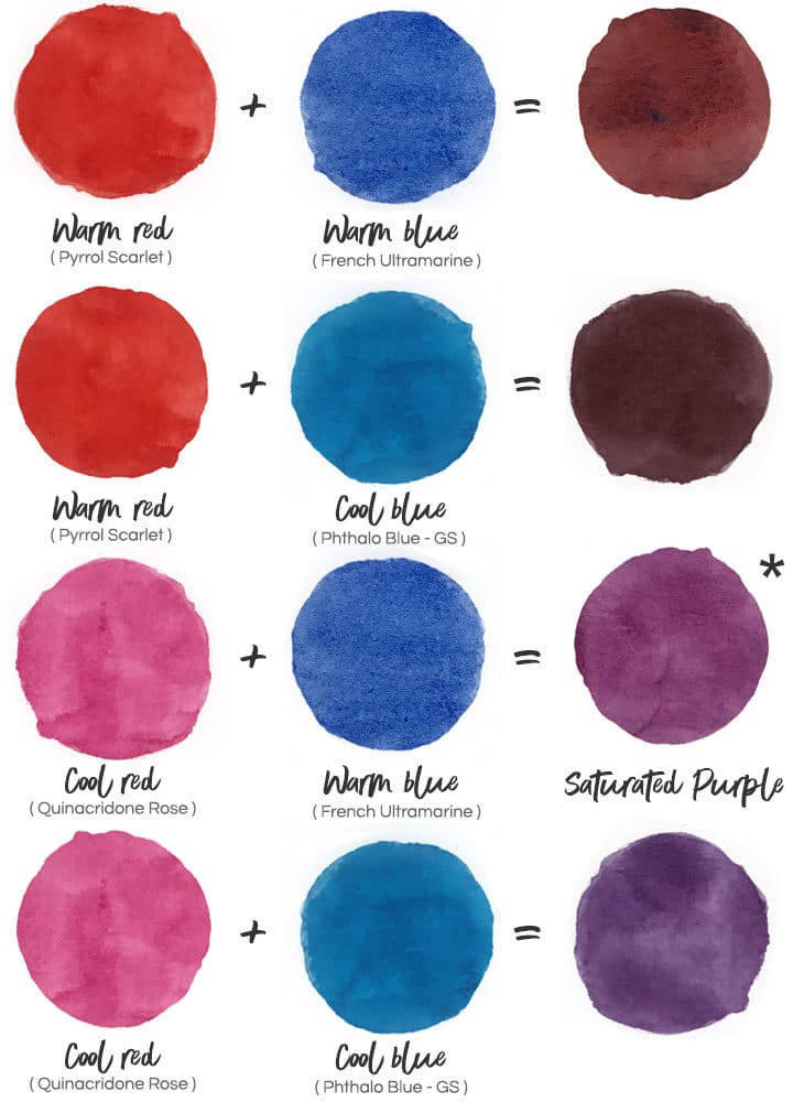
In traditional color theory, purple is a secondary color created by mixing two primaries: red and blue. However, the specific “temperatures” of these primaries dictate the resulting shade of purple. A “warm” red mixed with a “cool” blue will produce a different result than a “cool” red mixed with a “warm” blue. For a brand, these nuances are critical. A brand looking to project authority might lean toward a deeper, bluer violet, while a brand targeting a youthful, creative demographic might opt for a brighter, redder magenta-purple.
Why Red and Blue Aren’t Always Enough: Subtractive vs. Additive
When a designer asks what colors to mix to make purple, they must first ask: Where will this color live?
- The RGB Model (Digital): On screens, we use the additive model where light is combined. Here, purple is created by combining red and blue light.
- The CMYK Model (Print): In corporate printing (business cards, packaging), we use the subtractive model. Interestingly, the most vibrant purples in print are often achieved by mixing Cyan and Magenta rather than traditional Red and Blue.
Understanding these technical distinctions ensures that a brand’s “Purple” remains consistent whether it is viewed on an iPhone screen or a cardboard shipping box.
The Psychology of Purple: Defining Your Brand’s Voice
Once the technical mixing is understood, a brand must decide why they are mixing a specific shade of purple. Color psychology suggests that purple occupies a unique space in the human psyche, sitting at the intersection of the stability of blue and the energy of red.
Luxury, Royalty, and Sophistication
Historically, purple pigment was incredibly expensive to produce—originally derived from the Murex sea snail. This “Tyrian Purple” was reserved for emperors and royalty. Today, brands use deep, rich purples to signal luxury and premium positioning. When a brand mixes a purple with a higher ratio of blue and a touch of black (creating a shade), they are signaling exclusivity. This is common in high-end skincare, premium confectionery, and luxury automotive branding.
Creativity, Mystery, and Innovation
On the lighter end of the spectrum, mixing purple with white creates lavender or lilac. These shades evoke a sense of mystery, spirituality, and creativity. Modern tech startups and creative agencies often utilize vibrant, “electric” purples to differentiate themselves from the “corporate blue” of traditional firms. In this context, mixing purple is about breaking the mold and suggesting that the company operates on a different, more imaginative plane than its competitors.
Practical Mixing: Achieving the Perfect Brand Purple
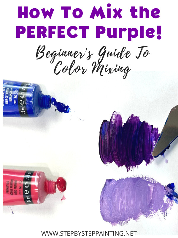
Creating a brand’s signature purple requires more than a one-time mix; it requires a formulaic approach to ensure scalability. When a brand identity is developed, the “recipe” for their purple must be codified in a Brand Style Guide.
Warm Purples vs. Cool Purples
The balance of the mix determines the emotional “temperature” of the brand:
- Warm Purples (Red-Dominant): These shades, such as plum or burgundy-purple, feel active, inviting, and visceral. They are often used in food and beverage branding to stimulate a sense of richness and taste.
- Cool Purples (Blue-Dominant): These shades, like violet or indigo, feel stable, professional, and calming. They are frequently used in the healthcare and finance sectors to provide a sense of security while remaining distinct from the standard blue.
Maintaining Consistency Across Print and Digital Media
A common pitfall in brand strategy is a color that looks beautiful in a PDF but “muddy” when printed on a brochure. This happens when the mixing process doesn’t account for the “gamut” of different mediums.
To solve this, professional brand designers use the Pantone Matching System (PMS). Instead of just mixing red and blue, a brand selects a specific Pantone chip (e.g., Pantone 2685C). This ensures that the manufacturer uses a pre-mixed ink, providing a level of consistency that manual mixing of CMYK or RGB values cannot match.
Case Studies: Brands That Successfully Own Purple
Looking at market leaders provides a masterclass in how mixing the right purple can lead to “brand salience”—the degree to which a brand is noticed or thought of in buying situations.
Cadbury and the Power of Exclusivity
Perhaps no brand is more associated with purple than Cadbury. Their specific shade (Pantone 2685C) was mixed specifically to evoke a sense of royalty and high quality, dating back to the early 20th century as a tribute to Queen Victoria. Cadbury’s use of purple is so integral to their brand strategy that they famously engaged in legal battles to trademark the specific shade, illustrating that “mixing purple” is a high-stakes business asset.
Twitch and the Modern Digital Vibe
In the digital space, the streaming platform Twitch uses a vibrant, “electric” purple. This color wasn’t chosen by accident; it was mixed to stand out against the dark modes of gaming interfaces and the white backgrounds of social media competitors. By mixing a high-saturation purple, Twitch captures the energy of live entertainment and the “always-on” nature of the gaming community.
FedEx: The Strategic Contrast
FedEx provides a unique example of color mixing in brand architecture. Their logo uses a mix of purple and orange (FedEx Express) or purple and green (FedEx Ground). In this case, the purple acts as the “anchor” color. It provides a professional, corporate foundation that allows the secondary colors to pop, demonstrating that how you mix and pair purple is just as important as the color itself.
Implementing Color Strategy in Your Corporate Identity
For businesses looking to refresh their identity or launch a new product, the process of determining what colors to mix to make their “signature” purple should be methodical and data-driven.
Creating a Unified Brand Style Guide
Once the perfect purple is mixed, it must be documented. A comprehensive brand guide will list:
- HEX Code: For web and digital applications.
- RGB Values: For screen-based software.
- CMYK Percentages: For standard commercial printing.
- Pantone (PMS) Number: For high-end printing and physical manufacturing.
By providing these specific “recipes,” a brand ensures that its visual identity remains “on-brand” regardless of the vendor or platform.

The Impact of Color on Consumer Conversion
Finally, the choice of purple must be tested. A/B testing different shades of purple in digital marketing can reveal surprising insights into consumer behavior. A “redder” purple might drive more urgent click-throughs on a “Buy Now” button, while a “bluer” purple might increase the time spent reading an “About Us” page by fostering a sense of trust.
In conclusion, “what colors to mix to make purple” is a foundational question that leads into the heart of brand strategy. It is a blend of art and science, requiring an understanding of historical context, psychological impact, and technical execution. When mixed correctly, purple becomes more than just a color—it becomes a silent ambassador for the brand, communicating values of luxury, innovation, and reliability without a single word being spoken.
aViewFromTheCave is a participant in the Amazon Services LLC Associates Program, an affiliate advertising program designed to provide a means for sites to earn advertising fees by advertising and linking to Amazon.com. Amazon, the Amazon logo, AmazonSupply, and the AmazonSupply logo are trademarks of Amazon.com, Inc. or its affiliates. As an Amazon Associate we earn affiliate commissions from qualifying purchases.